

Choosing the Right Paper and Frame for Every Photographer
Table of Content
-
Introduction to Paper Surfaces in Fine Art Photography
-
Glossy vs. Lustre vs. Matte vs. Baryta vs. Metallic vs. Canvas
-
How surface texture affects perception, mood, and detail
-
-
Matching Paper Type to Subject Matter
-
Glossy: Ideal for high-contrast, vibrant images (e.g. fashion, cityscapes)
-
Lustre: Balanced sheen, great for portraits and events
-
Matte: Best for minimalism, black-and-white, or soft-toned landscapes
-
Baryta: Traditional feel, used in gallery-grade B&W work
-
Metallic: Best for surreal or pop-inspired color work
-
Canvas: Painterly presentation—used for large-format decor
-
-
How Paper Choice Influences Framing Decisions
-
Glossy papers and glare issues: Not ideal under standard glass
-
Matte papers under non-glare or UV-protective acrylic
-
Whether heavy textures (canvas, fine rag) need matting at all
-
-
Framing Materials and Glazing Options
-
Comparison: Standard glass vs. non-reflective vs. museum glass
-
When to use UV-filtering acrylic instead of glass
-
How to choose spacers, mats, and backing based on paper surface
-
-
Do Certain Frames Suit Certain Subjects?
-
Black wood for minimalist or monochrome
-
Ornate frames for painterly-style prints or classical subjects
-
Floating frames for canvas
-
Is framing a matter of genre or just collector preference?
-
-
Practical Tips for Artists and Collectors
-
How to test paper and frame pairings before committing
-
Coordinating paper, ink, and frame to preserve tonal depth
-
Should artists pre-select frame and paper combos for exhibitions?
-
-
Case Examples
-
How iconic photographers present different works
-
Examples from Heart & Soul Whisperer Art Gallery
-
-
Conclusion: Harmonizing Medium and Message
-
Paper, glazing, and frame choices as an extension of artistic intent
-
Balancing aesthetics, preservation, and emotional impact
-
Get to Know the Creative Force Behind the Gallery
About the Artist ➤ “Step into the world of Dr. Zenaidy Castro — where vision and passion breathe life into every masterpiece”
Dr Zenaidy Castro’s Poetry ➤ "Tender verses celebrating the bond between humans and their beloved pets”
Creative Evolution ➤ “The art of healing smiles — where science meets compassion and craft”
The Globetrotting Dentist & photographer ➤ “From spark to masterpiece — the unfolding journey of artistic transformation”
Blog ➤ “Stories, insights, and inspirations — a journey through art, life, and creative musings”
As a Pet mum and Creation of Pet Legacy ➤ “Honoring the silent companions — a timeless tribute to furry souls and their gentle spirits”
Pet Poem ➤ “Words woven from the heart — poetry that dances with the whispers of the soul”
As a Dentist ➤ “Adventures in healing and capturing beauty — a life lived between smiles and lenses”
Cosmetic Dentistry ➤ “Sculpting confidence with every smile — artistry in dental elegance”
Founder of Vogue Smiles Melbourne ➤ “Where glamour meets precision — crafting smiles worthy of the spotlight”
Unveil the Story Behind Heart & Soul Whisperer
The Making of HSW ➤ “Journey into the heart’s creation — where vision, spirit, and artistry converge to birth a masterpiece”
The Muse ➤ “The whispering spark that ignites creation — inspiration drawn from the unseen and the divine”
The Sacred Evolution of Art Gallery ➤ “A spiritual voyage of growth and transformation — art that transcends time and space”
Unique Art Gallery ➤ “A sanctuary of rare visions — where each piece tells a story unlike any other”
Introduction to Paper Surfaces in Fine Art Photography
In the world of fine art photography, the choice of printing paper is not merely a technical decision—it is a vital artistic one. Paper surfaces shape how light interacts with an image, influence color reproduction and texture, and play a crucial role in determining the mood and emotional impact of a photograph. While many photographers focus on camera equipment and post-processing, paper choice is the final, often overlooked, medium through which a photographic vision is brought to life.
Broadly speaking, photographic printing papers are categorized by their surface characteristics: glossy, lustre (or satin), matte, baryta, metallic, and canvas. Each of these offers distinct aesthetic qualities and practical considerations, and each pairs differently with various photographic genres.
Glossy Paper
Glossy paper has a smooth, highly reflective surface that gives photographs a sleek, vibrant appearance. It offers deep blacks and brilliant whites, which enhances contrast and color saturation. This paper is especially popular for images with rich, detailed color—such as fashion photography, product advertising, commercial work, or vibrant cityscapes. It creates a modern, polished feel.
However, glossy paper also reflects a lot of light, which can produce unwanted glare under glass and make fingerprints and dust more visible. These issues can reduce its suitability for fine art gallery settings unless paired with non-reflective or museum-grade glazing. Additionally, glossy finishes can feel overly synthetic for subjects that benefit from a more tactile or textured presentation.
Lustre Paper
Often described as a hybrid between matte and glossy, lustre (or satin) paper has a lightly textured surface that reduces glare while maintaining strong color fidelity. It is an ideal all-purpose paper and is often used for portraiture, weddings, lifestyle shoots, and events. The surface resists fingerprints better than glossy, and the subtle texture adds a touch of depth without overpowering the image.
Lustre is also a common choice for prints intended for albums or light-framed displays, and it works well in varied lighting conditions. While not as striking as glossy paper in terms of contrast, it balances vibrancy and durability—making it highly appealing for both consumer and collector markets.
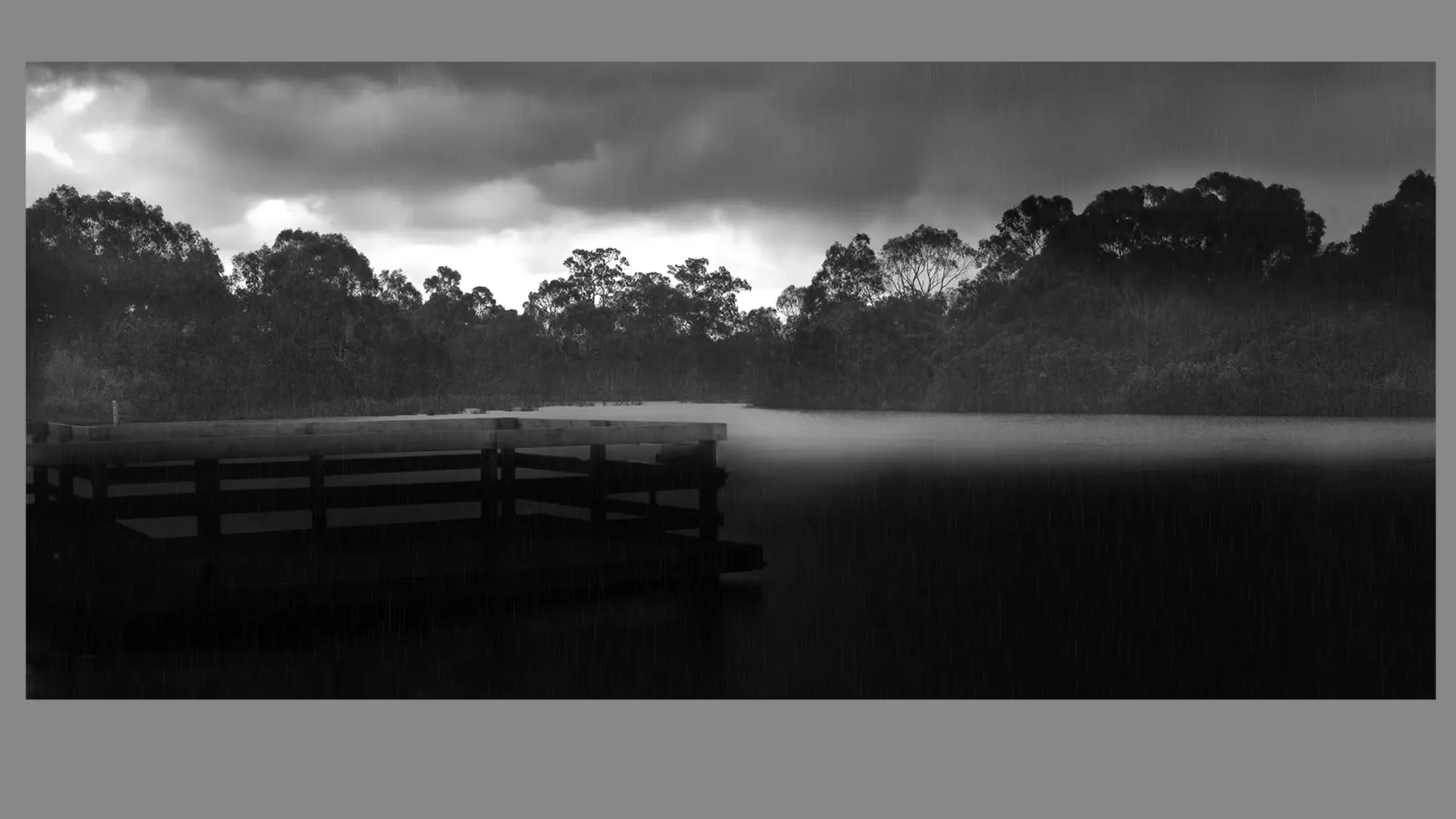
Matte Paper
Matte paper has a completely non-reflective surface, offering a soft, natural appearance. It mutes contrast slightly and absorbs more ink, which can give prints a velvety, fine art look. Matte paper is widely used for black and white photography, minimalist compositions, vintage aesthetics, and soft-toned landscapes.
This type of paper is especially valued for its tactile quality and understated elegance. It is also more forgiving in brightly lit environments, as it avoids reflections. However, matte prints can appear less sharp compared to glossy counterparts and are more prone to scuffing or surface abrasion if handled roughly.
Baryta Paper
Baryta paper mimics traditional darkroom fiber-based papers and is often used for gallery-grade black and white photography. It has a smooth surface with a rich tonal range, excellent depth, and mild reflectivity. Baryta prints exhibit a unique depth and dimensionality that makes them ideal for both monochrome and rich-toned color works.
This paper offers a balance between the classic aesthetics of analog photography and the stability of modern inkjet technology. It requires careful handling and framing to maintain its integrity, but it is highly prized among fine art photographers and collectors.
Metallic Paper
Metallic paper has a glossy finish with a pearlescent or iridescent effect. It amplifies color intensity and lends a surreal or three-dimensional feel to the image. This makes it ideal for fantasy, sci-fi, automotive, pop culture, or conceptual work where visual impact is prioritized.
While highly engaging in the right context, metallic paper can feel out of place in traditional gallery settings unless used strategically. It requires thoughtful pairing with modern frames or acrylic face-mounting to fully realize its effect.
Canvas
Canvas is textured and stretchable, offering a painterly, frameless aesthetic. It is typically used for large-format prints, lifestyle imagery, and decorative interior art. Though not as sharp or color-accurate as fine art papers, canvas lends itself well to abstract, impressionistic, or storytelling works where texture and presence matter more than technical perfection.
Canvas prints can be mounted as gallery wraps or framed, though they are often displayed without glazing. Protective coatings are typically applied to ensure surface durability, but their archival qualities can vary based on material and print method.
Choosing the Right Paper: Factors Beyond Aesthetics
While aesthetics are central to paper selection, other considerations should influence the choice as well:
- Lighting environment: Highly reflective papers can create glare under gallery lights or in sunlit rooms.
- Handling and framing: Glossy and metallic papers are more sensitive to touch and require careful framing.
- Ink compatibility: Some papers perform better with pigment-based inks, affecting longevity.
- Surface preservation: Matte and baryta papers require protective framing to avoid abrasion or fading.
Photographers often print test proofs across different papers to observe how a particular image responds to surface variation. These tests are especially helpful when preparing for gallery exhibitions, client presentations, or print competitions.
Ultimately, the paper surface is not just a medium—it is a message. It enhances or softens, dramatizes or calms, sharpens or diffuses. Choosing the right paper is about aligning presentation with photographic intent, ensuring that the viewer’s experience is emotionally, aesthetically, and materially resonant.
Lesson: Paper choice is a critical artistic and archival decision. Each surface type—from glossy to canvas—enhances specific subjects and moods while requiring its own display and care strategy.
Summary of Key Points:
- Glossy paper offers high contrast and vibrancy but causes glare and is sensitive to touch.
- Lustre paper balances vibrancy with reduced reflections; great for portraits and general use.
- Matte paper has a soft, non-reflective look ideal for fine art and black-and-white work.
- Baryta paper provides gallery-grade tone and depth, favored for monochrome and archival prints.
- Metallic paper delivers high impact with a 3D effect; best for bold, conceptual images.
- Canvas has a painterly texture suited for large or decorative prints, often displayed without glass.
- Practical factors—like light exposure, framing, ink type, and preservation—should inform paper choice.
- Each paper type supports a different emotional and visual experience that must align with the intent of the image.
Matching Paper Type to Subject Matter
Selecting the right paper for a photographic print is about more than surface texture or archival durability—it’s about enhancing the message and mood of the photograph itself. Each paper type interacts differently with light, contrast, and color fidelity, which makes it better suited for specific genres, subjects, and artistic goals. This section outlines how various photographic subjects can be optimally matched to the surface and finish of fine art printing papers.
Glossy Paper: Best for High Contrast and Vibrant Color Subjects
Glossy paper, with its reflective finish and rich tonal range, is ideal for images that demand brilliance and clarity. It excels at delivering high-impact visuals with saturated colors, sharp details, and deep blacks. Photographic genres that pair well with glossy paper include:
- Fashion Photography: Bold textures, glistening fabrics, and vibrant makeup pop under the glossy surface.
- Urban Landscapes: Night cityscapes with neon lights, reflections, and deep shadows shine with enhanced clarity.
- Product Photography: When precision and visual punch are paramount, glossy paper enhances sharpness and vibrancy.
However, glossy paper’s reflectivity can be a liability in some environments. If the final work is to be displayed under direct light or behind standard glass, the visual experience can suffer from glare. In such cases, combining glossy prints with museum-grade anti-reflective glazing is essential.
Lustre Paper: Versatile for Portraiture, Events, and Mixed Subjects
Lustre paper offers the best of both worlds—a gentle sheen that preserves color integrity without the overwhelming gloss. It is the favored surface for:
- Portraiture: Skin tones appear soft yet well-defined, making this finish ideal for family, wedding, and lifestyle photography.
- Documentary Work: Lustre provides a naturalistic appearance that doesn’t distract from the content.
- Travel and Event Photography: The semi-gloss texture resists fingerprints and allows prints to be handled more frequently.
Its subtle texture also enhances mid-tones and softens transitions between highlights and shadows. For photographers whose portfolios span a variety of genres, lustre is often the most flexible and display-friendly paper choice.
Matte Paper: Ideal for Fine Art, Black and White, and Minimalist Photography
Matte paper provides a completely non-reflective, velvety surface that reduces contrast slightly while maintaining a tactile, painterly feel. It is best suited for photographs with emotional subtlety and artistic restraint:
- Black and White Photography: The surface reduces glare and preserves detail across shadow and highlight zones.
- Minimalist Landscapes: Matte paper softens transitions, making it ideal for fog, mist, and other low-contrast scenes.
- Vintage and Analog-Inspired Images: Matte papers mimic the appearance of older photographic prints.
Matte prints are especially powerful in well-lit rooms or large-scale displays where visual calm and texture are more desirable than dramatic color intensity.
Baryta Paper: Gallery-Grade Choice for Tonal Richness
Baryta paper, with its slight gloss and exceptional tonal depth, is prized by master printers and serious collectors. It is often reserved for high-value or exhibition-grade works. Subject pairings include:
- Monochrome Portraits: Delivers a luminous skin tone range and expressive depth.
- Classic Street Photography: Enhances the grittiness and grain of analog-style imagery.
- Still Life and Architectural Detail: The paper’s smooth finish reveals fine textural nuances.
Its resemblance to fiber-based darkroom paper makes it especially appealing for photographers drawing inspiration from mid-century masters like Edward Weston or Ansel Adams.
Metallic Paper: Bold Subjects with Dramatic Color and Light
The pearlescent finish of metallic paper amplifies contrast and imbues images with a luminous, 3D effect. This paper is visually assertive and best suited for subjects where aesthetic drama is intentional:
- Automotive and Aviation Photography: Highlights metallic surfaces and sharp reflections.
- Fantasy and Conceptual Art: Enhances surreal color palettes and digital manipulations.
- Pop Art or High-Saturation Portraiture: Boosts color fidelity and skin tones in avant-garde portraiture.
Metallic prints are often face-mounted behind acrylic for maximum visual depth and contemporary presentation.
Canvas: Best for Storytelling, Texture-Heavy, or Painterly Images
Canvas isn’t always the first choice for traditional photographers, but for interior decor or narrative-driven pieces, it serves a unique role. Ideal subject matter includes:
- Lifestyle and Family Portraits: Canvas lends a warm, intimate feel suitable for personal storytelling.
- Impressionistic Landscapes: The textured weave echoes the softness of painting.
- Spiritual or Meditative Themes: Enhances serenity and timelessness in symbolic or abstract compositions.
Because canvas prints are usually frameless (gallery wraps), they suit environments that favor casual, immersive, or contemporary decor over classical exhibition presentation.
Choosing with Intention
Ultimately, paper should not be chosen arbitrarily or based on trends. Instead, photographers should reflect on the story the image tells, the space it will inhabit, and the emotional tone they wish to convey. A glossy surface may make a print “pop,” but that same surface may feel disruptive to a quiet, contemplative composition. Likewise, matte might absorb some visual intensity but add an atmosphere of sophistication and reflection.
By consciously matching paper to subject, photographers and collectors enhance the authenticity of the visual experience—where material and meaning align seamlessly.
Lesson: Paper surfaces aren’t just about texture—they’re interpretive tools. Matching the paper to the photographic subject amplifies the message, style, and viewing experience.
Summary of Key Points:
- Glossy paper is best for high-impact, vibrant images like fashion, cityscapes, and product photos.
- Lustre paper suits portraits, weddings, and general-purpose photography with balanced sheen.
- Matte paper enhances soft, fine art, monochrome, and minimalistic works.
- Baryta paper delivers gallery-quality depth for rich black and white or analog-inspired imagery.
- Metallic paper heightens drama, contrast, and surreal color—perfect for bold concepts.
- Canvas works best for painterly, lifestyle, or emotionally expressive storytelling pieces.
- Choosing the right paper reinforces emotional tone, complements subject matter, and improves collector appeal.
═════════════════════════════════════════════════════
Elevate your collection, your spaces, and your legacy with curated fine art photography from Heart & Soul Whisperer. Whether you are an art collector seeking timeless investment pieces, a corporate leader enriching business environments, a hospitality visionary crafting memorable guest experiences, or a healthcare curator enhancing spaces of healing—our artworks are designed to inspire, endure, and leave a lasting emotional imprint. Explore our curated collections and discover how artistry can transform not just spaces, but lives.
Curate a life, a space, a legacy—one timeless artwork at a time. View the Heart & Soul Whisperer collection. ➤Elevate, Inspire, Transform ➔
═════════════════════════════════════════════════════
How Paper Choice Influences Framing Decisions
The selection of photographic paper doesn’t exist in a vacuum—how a print is displayed is just as vital to its presentation and preservation. While photographers often prioritize image quality and archival stability in their printing choices, the interaction between paper type and framing materials can profoundly influence how a work is experienced. Different paper finishes respond uniquely to lighting, glazing materials, and mounting techniques. This section explores how paper surfaces guide framing decisions, especially regarding glare, texture, contrast, and overall viewer experience.
Glossy Paper and Glazing Challenges
Glossy prints are known for their vibrant colors and deep contrast, but their reflective surface poses significant framing challenges. When placed behind standard glass or even conventional acrylic, these prints can suffer from double reflections and glare. Viewers often find themselves distracted by ambient reflections rather than immersed in the image.
To mitigate these issues, glossy prints should ideally be paired with museum-grade anti-reflective glazing, such as:
- Optium Museum Acrylic
- Tru Vue Museum Glass
These materials not only reduce glare but also block over 99% of harmful UV rays, enhancing archival longevity. Spacers or matting must be used to keep the print from coming into direct contact with the glazing, preventing Newton rings (a visual distortion caused by the pressure between glossy surfaces).
In brightly lit environments, glossy prints may still pose a viewing challenge, regardless of anti-reflective treatment. This makes them more appropriate for controlled gallery spaces with dim lighting or private collections that employ spotlights and blackout curtains.
Lustre Paper: Framing Flexibility
Lustre paper strikes a balance between sheen and functionality. Its light texture diffuses reflections subtly, making it less susceptible to glare under glass. This flexibility allows collectors and photographers to choose from a broader range of framing materials without compromising visual integrity.
While museum-grade glazing is still ideal, lustre prints also perform well under:
- Standard UV-filtering glass or acrylic
- Non-glare acrylic for open public spaces
Lustre surfaces also resist fingerprinting, which makes them easier to handle during matting and mounting. They are less likely to produce Newton rings, and their surface finish allows for tighter framing options.
Matte Paper and Non-Reflective Display
Matte papers are naturally non-reflective, making them the least problematic when it comes to glare. However, their soft surface is more susceptible to abrasion, moisture, and environmental pollutants. For this reason, they must always be framed behind glazing—preferably with UV protection.
Matte prints pair well with:
- Non-glare or museum acrylic/glass
- Deep, cotton rag mat boards to create visual breathing space
These choices highlight the paper’s velvety texture and absorbent tone, drawing the viewer in for a more contemplative viewing experience. Because matte paper softens high-contrast images, using white or off-white mats and minimalist black or wood frames further enhances the image’s quiet strength.
Baryta Paper and Gallery Presentation
Baryta prints, known for their luminous depth and darkroom feel, deserve gallery-grade framing. Their semi-gloss finish benefits from anti-reflective glazing to reduce surface glare while maintaining vibrancy. Because baryta prints are typically used for exhibition and collector-grade work, framing is an essential component of value presentation.
Framing options often include:
- Museum acrylic with float mounting
- Deep-set shadow box frames with airspace between print and glazing
This combination enhances the traditional aesthetic of baryta prints while ensuring preservation. Collectors should avoid direct face-mounting or pressure-based mounts, as the baryta surface is sensitive to contact and pressure.
Metallic Paper: Modern Framing for High Impact
Metallic paper’s sheen can either captivate or overwhelm depending on framing. To showcase its 3D effect and vibrant depth, photographers often employ:
- Acrylic face-mounting: Laminates the print directly to acrylic with no air gap, enhancing the metallic vibrancy.
- Float frames: Create space around the print while keeping it protected and visually isolated.
Because of the high-glare potential, metallic prints are rarely framed with standard glass. The face-mount method also requires precision and professional services, as improper mounting can create bubbles or uneven adhesion. Once mounted correctly, however, these prints become bold, museum-ready showpieces.
Canvas Prints: Often Frameless, Sometimes Framed
Canvas prints are typically stretched and presented as gallery wraps, where the image extends over the sides of the frame. These are often displayed without glazing, making them susceptible to dust, abrasion, and UV damage unless a protective coating is applied.
When framing canvas, consider:
- Floating frames: Offer a clean, modern edge while maintaining the frameless look.
- Deep-set wooden box frames: Provide structural protection and enhance visual weight.
Since canvas prints are not usually glazed, placement becomes vital. They should not be hung in humid or high-traffic areas where surface contact or environmental damage could occur.
Paper Texture and Matting Decisions
Another dimension to consider is how surface texture affects matting. For example:
- Glossy and metallic papers benefit from more breathing space (wide mats) to isolate their intensity.
- Matte and rag papers may integrate more seamlessly into minimal matting or borderless designs.
- Highly textured or canvas prints may be overwhelmed by overly ornate frames, so simpler framing is often preferred.
The goal is to complement, not compete with, the surface quality and subject matter. Frames and mats should act as silent collaborators—enhancing tone, focus, and message.
Lesson: Paper surface affects how a photograph should be framed, from glare control to visual harmony. Selecting the right glazing, matting, and frame elevates both preservation and presentation.
Summary of Key Points:
- Glossy paper requires museum-grade, anti-reflective glazing to minimize glare.
- Lustre paper is versatile and performs well with standard UV-filtering glass or acrylic.
- Matte paper benefits from non-glare glazing and deep matting to enhance softness.
- Baryta prints are best framed in gallery-style float mounts with museum acrylic.
- Metallic prints often use acrylic face-mounting or float frames for high-impact display.
- Canvas is typically displayed without glazing, using floating or box frames.
- Frame and mat choices should complement paper surface and photographic subject.
- Avoid direct contact between glazing and print surfaces to prevent damage.
- Thoughtful framing enhances archival protection and elevates visual storytelling.
Framing Materials and Glazing Options
Framing is not just about aesthetics—it’s a preservation strategy. The materials chosen for a photographic frame, especially the glazing that protects the surface, have profound effects on both the visual presentation and the archival integrity of a photograph. With a growing awareness of light sensitivity, humidity, and long-term degradation, photographers and collectors are turning to conservation-grade framing components to ensure the longevity of their prints.
Glass vs. Acrylic: A Critical Decision
The first major choice is between glass and acrylic glazing. Both serve the same fundamental purpose: to protect the print from dust, moisture, air pollutants, and physical damage. However, they differ in weight, clarity, UV protection, and cost.
- Standard Glass: Heavy and more fragile, but inexpensive. Offers minimal UV protection unless treated. Not recommended for large-format works due to breakage risk.
- Acrylic (Plexiglass): Lightweight and shatter-resistant, making it ideal for large or transported works. Can attract dust due to static and scratch more easily than glass, but when treated for anti-glare and UV protection, it becomes a superior conservation material.
Conservation-Grade and Museum-Quality Glazing
Archival and museum-grade glazing products are designed to offer both visual clarity and long-term protection. These include:
- Tru Vue Museum Glass®: Provides 99% UV protection with virtually no reflection. It’s often used for framing high-value works.
- Optium Museum Acrylic®: Combines shatter resistance, anti-reflective coating, and UV filtering. Ideal for sensitive or traveling exhibitions.
- Conservation Clear Glass® or Acrylic: Offers UV protection without anti-reflective coating. More affordable but less ideal for gallery settings.
- Non-Glare (Matte) Glass or Acrylic: Diffuses reflections, but can slightly soften image detail. Works well for matte or low-contrast prints.
Matching Glazing to Paper Type
Glazing should always be matched to the surface finish of the print. Here’s how:
- Glossy prints: Require anti-reflective glass or acrylic to reduce double reflections.
- Matte prints: Work well with both museum glass and non-glare acrylic, preserving their soft aesthetic.
- Metallic prints: Perform best with acrylic face-mounting or museum acrylic to enhance visual punch without glare.
- Canvas prints: Often displayed without glazing but can be shadow-boxed for additional protection.
The Role of Matting and Spacers
No print should come into direct contact with the glazing, regardless of its paper type. To prevent this:
- Use archival mat boards to separate print and glass.
- Include spacers within the frame for borderless or float-mounted prints.
- Matting also helps absorb moisture and pollutants, protecting the edges of the artwork.
Mat boards should be:
- 100% cotton rag or alpha-cellulose
- Acid-free, lignin-free, and buffered
For high-end framing, four-ply or eight-ply boards are often used to create dimensional depth and a museum-style presentation.
Frame Moulding: Material, Style, and Stability
The outer frame not only defines the aesthetic but also contributes to structural stability. Common materials include:
- Hardwood frames (oak, maple, walnut): Sturdy, natural appearance, preferred for gallery exhibitions.
- Aluminum frames: Lightweight, clean lines, often used for modern prints.
- Engineered wood: More affordable but may off-gas unless sealed with archival varnish.
The style of the frame can either echo or contrast the subject matter. For example:
- Minimalist black frames: Common for monochrome or documentary work.
- Natural wood finishes: Complement landscapes or warm-toned images.
- Ornate or gilded frames: Reserved for historical, painterly, or classical portraiture.
Framing Longevity: What Museums and Collectors Use
Museums and top collectors universally follow conservation standards:
- No acidic backing boards or glues
- Dust seals applied to the rear of the frame
- Hanging hardware that supports long-term wall stability
Many include archival framing as part of provenance documentation. This not only protects the work but also reinforces its value in the eyes of curators, appraisers, and buyers.
Lesson: The frame is not a final touch—it is an integral part of the artwork’s life. Choosing the right glazing and frame materials ensures both protection and aesthetic harmony.
Summary of Key Points:
- Glass is heavier and fragile; acrylic is lighter and shatterproof but more prone to static and scratches.
- Museum-grade glazing (Tru Vue, Optium) offers anti-glare, UV protection, and visual clarity.
- Glazing must be matched to paper finish—glossy needs anti-reflective, matte can use non-glare.
- Prints must never touch glazing; use acid-free matting or spacers to maintain airspace.
- Mat boards should be 100% cotton rag or alpha-cellulose and at least four-ply.
- Hardwood or aluminum frames provide structural and aesthetic strength.
- Frame style should complement the photograph’s subject and tone.
- Conservation framing is essential for preservation and collector appeal.
- Museums apply sealing, UV filtering, and archival mounts to meet long-term display standards.
- Thoughtful framing elevates the work’s archival value and market presentation.
═════════════════════════════════════════════════════
Elevate your collection, your spaces, and your legacy with curated fine art photography from Heart & Soul Whisperer. Whether you are an art collector seeking timeless investment pieces, a corporate leader enriching business environments, a hospitality visionary crafting memorable guest experiences, or a healthcare curator enhancing spaces of healing—our artworks are designed to inspire, endure, and leave a lasting emotional imprint. Explore our curated collections and discover how artistry can transform not just spaces, but lives.
Curate a life, a space, a legacy—one timeless artwork at a time. View the Heart & Soul Whisperer collection. ➤Elevate, Inspire, Transform ➔
═════════════════════════════════════════════════════
Do Certain Frames Suit Certain Subjects, or Is It All Personal Preference?
The relationship between a photograph and its frame is not always governed by rigid rules—but that doesn’t mean the pairing is arbitrary. While some photographers and collectors prioritize personal taste when selecting frames, others believe that different photographic genres or subject matter benefit from complementary framing styles. In truth, the answer lies somewhere in between: frame selection can reflect artistic intent, reinforce the mood of the image, and serve archival functions, while still offering room for subjective expression.
When the Frame Serves the Subject
Certain frame styles have become culturally or historically linked with specific photographic themes. These traditions persist for good reasons—they enhance visual harmony and context:
- Minimalist black metal or wood frames are often paired with monochrome prints, documentary images, or architectural photography. Their clean lines don’t distract from composition and tonality.
- Natural wood frames work beautifully with landscape photography, complementing organic elements and earthy palettes. Maple, walnut, or oak add warmth and weight.
- White frames often accompany contemporary color work or abstract compositions, adding freshness and modern appeal.
- Ornate gilded frames are occasionally used for fine art portraiture, classical-styled images, or pictorialist works, where the visual richness of the frame echoes the image’s aesthetic.
These choices aren’t about conformity—they’re about resonance. A cohesive visual language between frame and subject enhances immersion and reinforces narrative tone.
When the Frame Becomes the Statement
Conversely, some photographers intentionally break convention to make the frame a statement piece:
- Using bold-colored or high-gloss lacquered frames for black-and-white photos creates modern contrast.
- Floating frames for metallic prints emphasize dimensionality and texture.
- Oversized matting and minimal frames may create a feeling of spaciousness or reverence, especially in conceptual or meditative work.
In such cases, the frame is part of the artistic identity—a conscious design element rather than a neutral presentation tool.
Gallery Standards vs. Home Decor
Photographs displayed in galleries typically follow curatorial consistency. Uniform frame styles ensure cohesion across a show and prevent distraction. These often include:
- Black or white wood mouldings
- Neutral archival mats
- Museum-grade glazing
However, collectors displaying artwork at home often consider interior design preferences alongside artistic genre. A print may be re-framed to match wall color, lighting, or furniture, especially when preservation measures are already integrated through archival glazing and matting.
This intersection of formality and domesticity is important—art needs to coexist with life. The challenge is in balancing personal expression with professional preservation.
Frame Size, Thickness, and Positioning
Another dimension is scale and proportion:
- Large landscapes benefit from substantial, grounded frames that mirror horizon lines.
- Small portraits often use thinner frames and wide mats to create intimacy.
- Square or panoramic formats may require custom framing that draws attention to their unique aspect ratio.
Positioning also plays a role. A dramatic frame can feel out of place in a quiet space. Likewise, a delicate print can be overwhelmed by an imposing or elaborate frame.
Artist and Collector Collaboration
Some photographers provide suggested framing options or even sell their works pre-framed to control presentation. Others leave framing decisions to the buyer. For collectors, it’s often helpful to consult the artist, gallery, or framer to choose a frame that respects the original vision while harmonizing with the display setting.
Ultimately, frame choice should elevate—not compete with—the photograph. Whether through matching mood, contrasting boldly, or preserving unobtrusively, the frame becomes a bridge between the artist’s intent and the viewer’s experience.
Lesson: While there are genre-based framing traditions, personal preference plays a critical role. The best frame respects the subject, enhances preservation, and aligns with the viewing environment.
Summary of Key Points:
- Frame styles often complement specific genres (e.g., natural wood for landscapes, black metal for monochrome).
- Personal expression allows for contrast or unexpected combinations that reinforce artistic intent.
- Galleries favor consistency; home collectors balance décor and artwork.
- Frame size, thickness, and proportion influence perception and emotional tone.
- Artist-framer collaboration ensures visual coherence and collector confidence.
- The frame is a storytelling tool—used consciously, it strengthens the artwork’s narrative and presence.
═════════════════════════════════════════════════════
Transform your spaces and collections with timeless curated photography. From art collectors and investors to corporate, hospitality, and healthcare leaders—Heart & Soul Whisperer offers artworks that inspire, elevate, and endure. Discover the collection today. Elevate, Inspire, Transform ➔
═════════════════════════════════════════════════════
Practical Tips for Artists and Collectors When Pairing Paper and Frame
Choosing the right paper and frame combination is both an art and a science. For artists, it’s about preserving intent, enhancing emotional tone, and elevating presentation. For collectors, it’s about safeguarding investment value while ensuring the work resonates in its intended display environment. Below are practical guidelines that can assist both groups in making informed, intentional choices when pairing photographic paper and frame materials.
Test Across Multiple Papers
Artists should never assume that one type of paper suits all subjects. Before settling on a final print edition, it’s wise to produce small test prints across different paper surfaces:
- Observe how highlights, shadows, and mid-tones appear on each.
- Evaluate color richness and detail rendering under gallery or natural lighting.
- Consider the mood the paper texture imparts—gloss enhances drama, matte softens impact.
Side-by-side comparisons can often reveal subtle but powerful differences that determine whether a work feels finished or dissonant
.
Consider Where the Work Will Be Displayed
Both artists and collectors must consider environmental conditions when choosing paper and frame pairings:
- Glossy or metallic papers may produce glare under direct sunlight or harsh artificial light.
- Matte or baryta papers are better suited for rooms with fluctuating lighting.
- UV-protective glazing is a must in sun-exposed areas.
- In humid environments, avoid frameless canvas unless sealed and coated.
Knowing whether the print will live in a museum, home gallery, or office will inform both aesthetic and conservation decisions.
Use Archival-Grade Framing Materials
No matter how beautiful the image and paper combination is, improper framing can permanently damage the print. Artists selling to collectors should:
- Recommend or offer framing with acid-free mats, UV-glazing, and cotton rag backboards.
- Warn against hardware store frames with acidic foam core or non-archival glass.
Collectors should work with professional framers who understand fine art standards and materials. An investment in proper framing is a safeguard against environmental damage and a mark of commitment to the work.
Harmonize the Frame Style with the Image
Though subjective, frame selection should be intentional:
- Use minimal, dark frames for moody black and white prints.
- Choose lighter or natural wood for landscapes or bright color compositions.
- Use float or box frames to emphasize depth or texture in prints like canvas or metallic.
Frames are not just decorative—they are communicative. Their weight, color, and form speak volumes about how the image should be read.
Don’t Overcrowd the Presentation
Especially when printing large-format or high-texture images:
- Leave breathing room between image and glazing via deep matting or spacers.
- Avoid over-ornate frames that distract from the subject.
- Choose consistent presentation formats for series or portfolio prints.
Clean presentation strengthens the impression of professional curation and draws attention to the image itself.
Maintain Documentation and Consistency for Editions
When producing a limited edition series:
- Maintain a log of which paper type, printer, ink, and frame style was used.
- Include framing specs on the certificate of authenticity if applicable.
Collectors benefit from this transparency and may prefer purchasing pre-framed pieces when consistency is assured.
Revisit Pairings as Trends and Contexts Change
Artworks, like environments, evolve. An image originally framed in silver metal may take on new life in warm walnut wood. Artists and collectors should not be afraid to revisit earlier framing decisions—so long as archival standards are maintained.
A new setting or exhibition theme might call for an updated presentation that realigns the work with current aesthetic goals or conservation needs.
Lesson: Paper and frame pairing is a dynamic conversation between artistic intent, environment, and preservation. Informed, intentional decisions elevate both the visual and archival strength of photographic art.
Summary of Key Points:
- Print tests across multiple paper types help identify the ideal surface for each image.
- Environmental lighting, humidity, and setting inform paper and frame selection.
- Always use archival framing materials to preserve artwork over time.
- Frames should visually complement and not compete with the photograph.
- Matting, spacing, and clean finishes ensure a polished, professional display.
- Document materials and methods when producing limited edition works.
- Be open to reframing works to align with new contexts or aesthetic preferences.
- Paper and frame choices reflect a philosophy of care—both creative and custodial.
Case Examples: How Iconic Photographers Present Their Work
Studying how renowned photographers present their work offers invaluable insight into the nuanced art of pairing paper types with frames. Each artist’s choice is a reflection of their stylistic voice, narrative intention, and desire to preserve their work for future generations. These case examples highlight how paper and frame choices contribute to the identity and legacy of fine art photographs.
Ansel Adams – Fiber-Based Prints in Classic Frames
Ansel Adams’ legendary black-and-white landscapes were printed using fiber-based silver gelatin paper, known for its rich tonal range and archival permanence. His presentation style was unmistakable:
- Paper Type: Fiber-based baryta paper with selenium toning for longevity
- Framing: Classic black wooden frames, often with white cotton rag mats
- Glazing: Museum glass to reduce glare and protect tonal integrity
Adams believed that the frame should never compete with the image. His clean presentation emphasized depth, subtle texture, and timeless elegance, a strategy that has influenced generations of landscape photographers.
Cindy Sherman – High-Impact Color and Acrylic Mounting
Cindy Sherman, known for her conceptual portraits and self-transformations, presents her work in a way that enhances its theatricality:
- Paper Type: Glossy or metallic paper for vibrant color and detail
- Framing: Minimalist aluminum or box frames that don’t distract
- Glazing: Acrylic face-mounting for a sleek, contemporary look
Her large-format prints often demand attention. By using bold surfaces and clean presentation, Sherman’s framing choices support her conceptual narratives without overpowering the image.
Sebastião Salgado – Monochrome Grandeur with Archival Discipline
Sebastião Salgado, master of black-and-white social documentary photography, transitioned from silver gelatin to pigment-based printing. His current practices are meticulous:
- Paper Type: Hahnemühle Photo Rag for deep blacks and velvety mid-tones
- Framing: Simple black wood or metal frames with ample matting
- Glazing: UV-filtered museum acrylic to preserve detail
Salgado’s prints often carry emotional weight, and his presentation reflects restraint and reverence. His choice of matte surfaces complements the gravity and humility of his subjects.
Andreas Gursky – Diasec Mounting for Monumental Scale
Known for his hyper-detailed, large-format color compositions, Andreas Gursky relies on modern, high-tech display solutions:
- Paper Type: C-type (chromogenic) prints or Lambda prints on glossy materials
- Framing: Frameless Diasec face-mounted to acrylic
- Glazing: Integral to the mount; no additional frame necessary
This method enhances clarity and color, allowing viewers to immerse themselves in Gursky’s architectural and abstract vistas without visual interruption.
Yousuf Karsh – Classical Portraiture Framed with Elegance
Yousuf Karsh’s dignified portraits of 20th-century icons were printed traditionally and framed with sophistication:
- Paper Type: Silver gelatin prints
- Framing: Polished hardwood frames, often mahogany or walnut
- Glazing: Conservation glass or museum acrylic
Karsh believed that the frame should reflect the stature of the subject. His portraits of Churchill, Hemingway, and Einstein remain benchmarks for timeless, respectful presentation.
Hiroshi Sugimoto – Minimalist Precision in Monochrome
Hiroshi Sugimoto’s seascapes and architectural series embody minimalist aesthetics and precision:
- Paper Type: Baryta or matte fiber-based prints
- Framing: Thin black frames with deep white matting
- Glazing: Museum-grade non-glare acrylic
Sugimoto’s framing enhances the philosophical stillness of his work. The restrained visual language helps the viewer contemplate the image without distraction.
Lessons from the Masters
These photographers teach us that presentation isn’t an afterthought—it’s an extension of the work itself. Their framing and paper choices serve as tools to:
- Reinforce narrative
- Protect archival quality
- Enhance emotional resonance
- Define the work’s presence in space
Lesson: Iconic photographers tailor paper and frame choices to support their vision. Presentation is part of the storytelling process, where form meets intent.
Summary of Key Points:
- Ansel Adams used baryta prints in black wood frames to emphasize tonal purity.
- Cindy Sherman pairs bold prints with acrylic mounts to enhance theatricality.
- Sebastião Salgado uses matte cotton rag paper and subdued frames for emotional resonance.
- Andreas Gursky mounts large-format prints with acrylic to maximize impact.
- Yousuf Karsh framed silver gelatin portraits in polished hardwood for elegance.
- Hiroshi Sugimoto uses minimalist frames to match the meditative nature of his images.
- Each master aligns paper, frame, and presentation to support content, emotion, and archival quality.
═════════════════════════════════════════════════════
Transform your spaces and collections with timeless curated photography. From art collectors and investors to corporate, hospitality, and healthcare leaders—Heart & Soul Whisperer offers artworks that inspire, elevate, and endure. Discover the collection today. Elevate, Inspire, Transform ➔
═════════════════════════════════════════════════════
Conclusion: Harmonizing Material and Meaning in Photographic Presentation
The art of selecting photographic paper and framing is about far more than materials—it is a dialogue between artistic vision, viewer experience, and preservation. Just as a painter chooses the right canvas or sculptor the ideal stone, a photographer must align their presentation with the essence of their subject. Every decision, from paper finish to frame molding, from mat board to glazing, shapes how the work is perceived and how long it will endure.
Glossy, lustre, matte, baryta, metallic, and canvas surfaces each evoke distinct emotional and aesthetic responses. They speak differently in light, shadow, and scale. Framing, meanwhile, translates that voice into a visible structure—supporting or elevating, containing or liberating. Together, paper and frame create a unified message that viewers intuit as both visual and tactile.
When paper, frame, and image are chosen with intention, the result is a harmonious expression that enhances depth, atmosphere, and authenticity. Whether one seeks bold contrast or soft resonance, museum formality or contemporary minimalism, there is a perfect intersection where technical preservation meets poetic storytelling.
For artists, these choices define how their work is interpreted. For collectors, they determine how the work is preserved. And for curators, designers, and framers, these elements are tools to translate a flat image into a lasting experience.
In a world saturated with digital screens and transient visuals, the photograph in its printed and framed form endures as an object of substance and memory. By understanding the interplay of paper and frame, we not only protect these works—we elevate them.
Lesson: Great photographic presentation doesn’t happen by default—it emerges from deliberate, informed, and intuitive choices that honor the photograph’s message, material, and legacy.
Summary of Key Points:
- Paper and frame pairings should reflect and reinforce artistic intent.
- Every material choice—from paper texture to glazing type—affects viewer experience.
- Matching subject to surface and frame improves emotional clarity and visual depth.
- Archival decisions ensure the longevity and value of photographic prints.
- Thoughtful presentation turns a photographic image into a lasting work of art.
Why Buy Art at Heart & Soul Whisperer: The Ideal Choice for Luxurious, Premium Fine Art Decor
When choosing art that aligns with colour psychology and elevates workplace performance, Heart & Soul Whisperer Art Gallery offers unmatched value. As a destination for Luxury Art Decor: Fine Photography for Interior Designers, it caters to the nuanced needs of sophisticated commercial spaces.
Our collection of limited-edition fine art photography is designed for those who seek distinction. Whether you are a luxury interior designer sourcing for a high-profile client, an architect curating visual harmony, or a discerning buyer with an eye for emotional depth—our gallery offers you more than just beautiful images. We offer you legacy, meaning, and collectibility.
In the curated world of luxury interiors, art is not a finishing touch—it is the soul of the space. At Heart & Soul Whisperer Art Gallery, we believe fine art photography should do more than match a palette or fit a frame. It should inspire. It should elevate. It should linger in the hearts of those who experience it.
For interior decorators, architectural studios, and high-end furniture galleries, each piece from Heart & Soul Whisperer is crafted with emotional depth and visual harmony to complement premium interiors. Whether it’s calming black and white photography or abstract compositions designed to align with psychological design principles, every artwork enhances colour coordination and cognitive flow.
In the world of boutique hotels & luxury resorts, art becomes a branding tool. Heart & Soul Whisperer curates photographic artwork that tells stories—perfect for guest suites, lounges, or spa areas where ambiance is critical. Each piece complements colour palettes crafted to soothe, energize, or inspire.
Real estate developers & property stylists benefit from elegant, scalable pieces that increase visual appeal and emotional impact. Heart & Soul Whisperer’s artwork adds marketable sophistication to showrooms, model apartments, and commercial developments.
For hospitals and healthcare facilities, the gallery offers calming fine art photography that aligns with evidence-based design strategies aimed at improving patient comfort and recovery. Combined with therapeutic wall colours, this art enhances wellness outcomes and emotional tranquility.
In every case, Heart & Soul Whisperer provides gallery-quality works that are:
- Created by Dr. Zenaidy Castro with a deep understanding of art psychology and luxury presentation
- Ideal for pairing with office-specific wall colours to support mood and function
- Backed by a mission-driven ethos that includes philanthropic contributions to animal health research
Each artwork on our site has been meticulously created by visionary artist Dr. Zenaidy Castro and is printed to museum-grade archival standards. Every print comes with a Certificate of Authenticity, and many works are available in custom sizes or framing options tailored to the specific spatial and visual needs of your project.
When you purchase from Heart & Soul Whisperer, you’re not just acquiring a piece of décor—you’re investing in a story, in an atmosphere, in a timeless conversation between art and space. Our pieces have graced boutique hotels, luxury residences, and curated showrooms, quietly enriching environments with elegance, calm, and emotional resonance.
We invite you to explore the collection and discover photography that doesn’t just fit your walls—it transforms them.
From executive offices to reception spaces, Heart & Soul Whisperer is the smart choice for designers and decision-makers seeking beauty, wellness, and productivity in perfect balance.
Visit www.heartandsoulwhisperer.com.au to discover the full collection and customize your professional space with meaningful, museum-quality fine art.
Exclusive Benefits for Design & Hospitality Professionals
Tailored Fine Art Solutions
We understand the intricate needs of professionals. That’s why we offer more than a trade discount—we provide fully customized, concierge-style services built to support your creative and commercial success.
Explore the exclusive services we offer to:
- Interior Designers
- Architectural Studios
- Boutique Hotels & Luxury Resorts
- Real Estate Developers & Property Stylists
- High-End Furniture Galleries & Showrooms
1. White-Label & Private Branding Options
Present our artwork as part of your exclusive service offering. With unbranded packaging, discreet labeling, and optional co-branded certificates, our white-label solutions allow you to deliver elegance while keeping your brand front and center.
2. Designer-Exclusive Editions
Access limited-edition prints made only for trade collaborators. These artworks will not appear in our public collection, ensuring that your interiors are always one-of-a-kind and unmatched by off-the-shelf alternatives.
3. Bespoke Commissions with the Artist
Partner directly with Dr. Zenaidy Castro to co-create custom fine art photography. From conceptual development to print execution, we tailor the work to your client’s story, space, and design palette.
4. Consignment & On-Approval Art Placement
Borrow art on consignment for showrooms, staging, or luxury project previews. We’ll deliver selected pieces for trial placement—buy only what fits the vision, and return or refresh as needed
.
5. High-Resolution Mockups & Spatial Visualization
Pitch ideas or finalize room designs with photorealistic mockups. We provide layered, high-resolution art-on-wall renderings to insert into your interior presentations, helping clients visualize the finished space.
6. Designer Feature Opportunities
We proudly promote our creative collaborators through our website, blog, email campaigns, and social channels. Join our “Designers Who Inspire” series and position your firm as a tastemaker in curated environments.
7. VIP Invitations to Private Art Releases
Gain early access to new collections, private previews, and gallery events curated exclusively for our design and hospitality partners. Be first to source new work for your most exclusive projects.
Let’s Build Something Beautiful Together
Discover how Heart & Soul Whisperer can help you craft interiors that evoke emotion, elegance, and exclusivity.
Reach out today at heartandsoulwhisperer.com.au to schedule a private call, request samples, or access our exclusive designer portal.
════════════════════════════════════════════════════
Discover Profiles of Legendary Photographers and Find Inspiration
Andreas Gursky: Visionary Art & Lessons for Photographers ➤
Cindy Sherman: Visionary Art & Lessons for Photographers ➤
Peter Lik: Landscape Master & Lessons for Photographers ➤
Ansel Adams: Iconic Landscapes & Lessons for Photographers ➤
Richard Prince: Influence & Lessons for Photographers ➤
Jeff Wall: Constructed Realities & Lessons for Photographers ➤
Edward Steichen: Modern Photography & Artistic Legacy ➤
Sebastião Salgado: Humanitarian Vision Through the Lens ➤
Edward Weston: Modern Form and Pure Photography Legacy ➤
Man Ray: Surrealist Vision and Experimental Photography ➤
Helmut Newton: Provocative Glamour in Fashion Photography ➤
Edward Steichen: Pioneer of Art and Fashion Photography ➤
Richard Avedon: Defining Style in Portrait and Fashion ➤
Alfred Stieglitz: Champion of Photography as Fine Art ➤
Irving Penn: Elegance and Precision in Studio Photography ➤
Robert Mapplethorpe: Beauty, Provocation, and Precision ➤
Peter Beard: The Wild Visionary of Photographic Diaries ➤
Thomas Struth: Architect of Collective Memory in Photography ➤
Hiroshi Sugimoto: Time, Memory, and the Essence of Light ➤
Barbara Kruger: Power, Text, and Image in Contemporary Art ➤
Gilbert and George: Living Sculptures of Contemporary Art ➤
Elliott Erwitt: Iconic Master of Candid Street Photography ➤
Henri Cartier-Bresson: Mastermind of the Decisive Moment ➤
Diane Arbus: Unmasking Truth in Unusual Portraits ➤
Yousuf Karsh: Legendary Portraits That Shaped History ➤
Eugene Smith: Photo Essays That Changed the World ➤
Dorothea Lange: Portraits That Defined American Hardship ➤
Jim Marshall: Rock & Roll Photography’s Ultimate Insider ➤
Annie Leibovitz: Iconic Portraits That Shaped Culture ➤
Dan Winters: Brilliant Visionary of Modern Portraiture ➤
Steve McCurry: Iconic Storyteller of Global Humanity ➤
Michael Kenna: Masterful Minimalist of Silent Landscapes ➤
Philippe Halsman: Bold Innovator of Expressive Portraiture ➤
Ruth Bernhard: Visionary Icon of Sensual Light and Form ➤
James Nachtwey: Unflinching Witness to Global Tragedies ➤
George Hurrell: Master of Timeless Hollywood Glamour ➤
Lewis Hine: Visionary Who Changed the World Through Images ➤
Robert Frank: Revolutionary Eye That Redefined America ➤
Harold Edgerton: Capturing the Invisible with Precision ➤
Garry Winogrand: Bold Street Vision That Shaped America ➤
Arnold Newman: Master of Environmental Portraiture ➤
Andy Warhol: Revolutionary Eye of Pop Portrait Photography ➤
Resources for Visual Artists and Photographers
Signs a Photographer Is Bound for Fame and Success ➤
Building an Artist Reputation: Key to Success in the Art Market ➤
Secrets of Photography’s Most Successful Icons Revealed PART 1 ➤
Secrets of Photography’s Most Successful Icons Revealed PART 2 ➤
Artist’s Guide to Getting Gallery and Curator Attention ➤
Art and Intellectual Property Rights Explained - Intellectual Property Rights in Art ➤
Concise Guide to Art Law for Artists, Collectors, and Curators ➤
How Artists Can Build a Thought Leadership Brand ➤
History of Photography, Modern Cameras, and Buyer’s Guide ➤
Art Market Players - Key Industry Professionals & Roles ➤
The Role of Artist Reputation in Artwork Pricing ➤
Legal Guidance for Art Collection Ownership and Sales ➤
Photographic Legacy Planning for Artists and Collectors ➤
Posthumous Fame: The Lives & Lessons of Lost Masters ➤
Protecting Your Photographic Prints for Generations ➤
Legacy Lessons from Iconic Photographers Through the Ages
Best-Selling Fine Art Photographs and Their Stories ➤
Mastering Landscape : Top 50 Photographers & Their Traits ➤
Enduring Legacy of Iconic Landscape Photographers ➤
Lik Claims Most Expensive Photo with ‘Phantom’ ➤
The Canvas of Trauma: 1940s Arts and Artists After War ➤
The Introspective Decade: 1950s Art Demystified ➤
Icons and Irony: The Visual Language of 1960s Pop Art ➤
1970s Pop Art: Bold Icons and Cultural Shifts ➤
The Flashy Visual Language of 80s Pop Art and Artist ➤
Iconic & Influential Artist of the 1930s to 1970s: A Decade-by-Decade Look. Part 1 ➤
70S - 90S RETRO STYLE ART RETURNS TO MODERN WORLD ➤
A Journey Through 1930s–70s Photography Legends - Part 1 ➤
Art Legends of the 1980s to 2020s: A Decade-by-Decade Look ➤
References
- Wilhelm, Henry (1993). The Permanence and Care of Color Photographs. Preservation Publishing. ISBN 978-0911515007
- Reilly, James M. (1986). Care and Identification of 19th-Century Photographic Prints. Kodak Publication. ISBN 0879854607
- Tru Vue Inc. (2022). Glazing Products for Museum and Archival Framing. Tru Vue Technical Guides.
- Getty Conservation Institute (2002). The Atlas of Water Damage on Photographic Materials. Getty Publications. ISBN 0892367004
- Library of Congress (2023). Care, Handling, and Storage of Photographs. www.loc.gov/preservation
- Hahnemühle FineArt (2023). Paper and Ink Compatibility Standards for Archival Printing. Hahnemühle White Paper Series.
- Optium Museum Acrylic Product Manual (2021). Framing and Conservation for Photographic Art. Tru Vue.
- Epson (2022). Fine Art Printmaking: Pigment Ink & Paper Selection Guide. Epson Pro Imaging.
- Canson Infinity (2023). Choosing the Right Paper for Fine Art and Photography. Canson Technical Resources.
- MoMA Collection Catalogs (Various Years). Framing and Display Practices for Modern Photography. Museum of Modern Art Publications.
__________________________________________________________


Globetrotting Dentist and Australian Artists and Emerging Photographer to watch in 2025 Dr Zenaidy Castro. She is a famous cosmetic dentist in Melbourne Australia. Australia’s Best Cosmetic Dentist Dr Zenaidy Castro-Famous cosmetic dentist in Melbourne Australia and award-winning landscape photographer quote: Trust me, when you share your passions with the world, the world rewards you for being so generous with your heart and soul. Your friends and family get to watch you bloom and blossom. You get to share your light and shine bright in the world. You get to leave a legacy of truth, purpose and love. Life just doesn’t get any richer than that. That to me is riched fulfilled life- on having to discovered your life or divine purpose, those passion being fulfilled that eventuates to enriching your soul. Famous Australian female photographer, Australia’s Best woman Photographer- Dr Zenaidy Castro – Fine Art Investment Artists to Buy in 2025. Buy Art From Emerging Australian Artists. Investing in Art: How to Find the Next Collectable Artist. Investing in Next Generation Artists Emerging photographers. Australian Artists to Watch in 2025. Australasia’s Top Emerging Photographers 2025. Globetrotting Dentist and Australian Artists and Emerging Photographer to watch in 2025 Dr Zenaidy Castro. She is a famous cosmetic dentist in Melbourne Australia.
Globetrotting Dentist and Australian Artists and Emerging Photographer to watch in 2025 Dr Zenaidy Castro. She is a famous cosmetic dentist in Melbourne Australia. Australia’s Best Cosmetic Dentist Dr Zenaidy Castro-Famous cosmetic dentist in Melbourne Australia and award-winning landscape photographer quote: Trust me, when you share your passions with the world, the world rewards you for being so generous with your heart and soul. Your friends and family get to watch you bloom and blossom. You get to share your light and shine bright in the world. You get to leave a legacy of truth, purpose and love. Life just doesn’t get any richer than that. That to me is riched fulfilled life- on having to discovered your life or divine purpose, those passion being fulfilled that eventuates to enriching your soul. Famous Australian female photographer, Australia’s Best woman Photographer- Dr Zenaidy Castro – Fine Art Investment Artists to Buy in 2025. Buy Art From Emerging Australian Artists. Investing in Art: How to Find the Next Collectable Artist. Investing in Next Generation Artists Emerging photographers. Australian Artists to Watch in 2025. Australasia’s Top Emerging Photographers 2025. Globetrotting Dentist and Australian Artists and Emerging Photographer to watch in 2025 Dr Zenaidy Castro. She is a famous cosmetic dentist in Melbourne Australia.
═══════════════════════════════════════════════════
At Heart & Soul Whisperer Art Gallery, every coloured and black and white photograph tells a story beyond sight—an emotional journey captured in light, shadow, and soul. Founded by visionary artist Dr Zenaidy Castro, our curated collections—spanning landscapes, waterscapes, abstract art, and more—offer a timeless elegance that transcends fleeting trends. Whether enriching private residences, corporate offices, healthcare facilities, hospitals, or hospitality spaces, our artworks are designed to transform environments into sanctuaries of memory, beauty, and enduring inspiration. Let your walls whisper stories that linger—reflections of art, spirit, and the love that connects us all.
Whispers in Monochrome — The Artist’s Signature Collection
Limited Editions ➤ “Treasures of Time, Rare Whispers on Canvas — Art as Unique as Your Soul”
Infrared ➤ “Beyond the Visible: Worlds Revealed in Fiery Hues and Hidden Radiance”
Vintage & Retro ➤ “Echoes of Elegance, Timeless Stories Wrapped in Nostalgic Light”
Film Emulation Photography ➤ “Where Grain Meets Grace — Classic Souls Captured in Modern Frames”
Minimalism ➤ “Pure Essence, Quiet Power — Beauty Found in the Art of Less”
Chiaroscuro Landscapes ➤ “Light and Shadow’s Dance: Landscapes Painted in Dramatic Contrast”
Moody Landscapes ➤ “Whispers of Storm and Silence — Nature’s Emotions in Every Frame”
Mystical Landscapes ➤ “Enchanted Realms Where Spirit Meets Horizon, Dream and Reality Blur”
Moody and Mystical ➤ “A Symphony of Shadows and Spirit — Landscapes That Speak to the Soul”
Discover the Vibrance of Landscapes and Waterscapes
Country & Rural ➤ “Sun-kissed fields and quiet homesteads — where earth and heart meet in vibrant harmony”
Mountain ➤ “Majestic peaks bathed in golden light — nature’s grandeur painted in every hue”
Trees & Woodlands ➤ “Whispers of leaves and dappled sunlight — a living tapestry of green and gold”
At The Water’s Edge ➤ “Ripples of color dance on tranquil shores — where land and liquid embrace in serene beauty”
Ethereal Landscapes and Waterscapes in Monochrome
Country & Rural Landscapes ➤ “Monochrome whispers of earth and toil — the quiet poetry of open lands”
Australian Rural Landscapes ➤ “Shadowed vistas of sunburnt soil — raw beauty in timeless contrast”
The Simple Life - Country Living ➤ “Essence distilled — moments of calm in stark black and white”
Cabin Life & shacks ➤ “Silent shelters bathed in light and shadow — stories carved in wood and time”
Mountain Landscapes ➤ “Peaks etched in silver and shadow — grandeur carved by nature’s hand”
Trees & Woodlands ➤ “Branches weaving tales in shades of gray — forests alive in monochrome breath”
At The Water’s Edge ➤ “Edges where light and dark meet — reflections of stillness and flow”
Lakes & Rivers ➤ “Flowing grace captured in stark clarity — water’s endless journey in shades of gray”
Waterfalls ➤ “Cascades frozen in black and white — movement captured in eternal pause”
Beach, Coastal & Seascapes ➤ “Silent shores and textured tides — nature’s drama in monochrome waves”
Reflections ➤ “Mirrored worlds in shades of shadow — where reality blurs into dream”
Snowscapes ➤ “White silence pierced by shadow — frozen landscapes of quiet wonder”
Desert & The Outback ➤ “Vastness distilled into contrast — endless horizons in black and white”
A Journey Through Curated Beauty
Black and White Photography ➤ “Timeless tales told in shadow and light — where every tone speaks a silent story”
Colour Photography ➤ “A vivid symphony of hues — life captured in its most radiant form”
Abstract Art & Abstracted Labdscapes ➤ “Beyond form and figure — emotions and visions woven into pure expression”
Digital Artworks ➤ “Where imagination meets technology — digital dreams crafted with artistic soul”
People ➤ “Portraits of the human spirit — stories told through eyes, expressions, and silent moments”
═══════════════════════════════════════════════════