


-

- Languages
No block ID is set
No block ID is set
SETISFACTION
AFTERPAY
TRADE COURTASY


Looking for actionable tips and inspiration?
Discover how the strategic use of color can transform healthcare environments, soothe patients, and even aid in the healing process. Get quick answers to your most pressing questions below!
Q: What are the top healing colors for hospitals and why?
Yellow and green are powerful healing colors. Yellow is bright and cheerful, stimulating intelligence, detoxifying the body, and is particularly good for skin issues. Green offers balanced healing, promotes rest, symbolizes growth, and benefits the heart, lungs, and circulatory system.
Q: How can color choices in patient rooms speed up recovery?
Patient rooms thrive with calming colors. Blues can help lower the heart rate, while greens encourage restfulness – both vital for healing. Incorporating “Biophilic design,” which brings elements of nature into the room (like views of nature), has been shown to reduce hospital stays by up to 8.5%.
Q: Are there specific colors that help doctors in operating rooms?
Yes! Green or a blue/green combination on operating room walls is ideal. Since green is opposite red on the color spectrum, it helps relieve eye stress for surgeons who frequently see blood. Cooler, less saturated colors are preferred.
Q: What’s the best way to use color in pediatric units?
Pediatric units should be engaging and energetic! Use vibrant splashes of color, balanced with bluish tones. These bluish hues can help reduce anxiety and lower the pulse rate in children without causing confusion.
Q: How can color make a dentist’s office less anxiety-inducing?
The right colors can create a calming and soothing atmosphere in a dentist’s office, easing patient anxiety. Even the signboard color and refreshing lights at the entrance play a crucial role in making a positive first impression.
Q: What colors are best for creating a calming environment in Intensive Care Units (ICUs)?
ICUs require a relaxing and calming atmosphere. Walls should be painted in neutral colors to avoid a cold feeling. Light coffee and light green tones can be used as soothing accents, with cool colors also suitable for floors and accessories.
Q: How can colors improve navigation and recognition in hospitals?
Strategic color use in corridors and reception areas is key. Strong accent colors, especially at the end of long corridors, help with wayfinding and distinguishing units. Reception and front desk areas benefit from stronger hues on back walls to make them easily recognizable to visitors.
Q: How do colors affect patients’ healing and mood in healthcare settings?
Research shows that the right colors can lower stress, reduce anxiety, and even promote faster recovery. Blues help lower heart rates; greens foster restfulness and equilibrium. Incorporating nature-inspired designs (biophilia) and calming colors in patient rooms can significantly improve healing and patient outcomes.
Q: What color schemes are recommended for examination and dentists’ rooms?
For examination rooms, neutral or calm tones (e.g., terra cotta, brownish tones) are comfortable for patients. Dentists’ offices benefit from calming colors that ease anxiety—research suggests entrance sign colors and refreshing lighting make a good first impression, while wall colors with calming effects help patients feel at ease.
Q: How does connecting patients with nature aid their recovery in hospitals?
Biophilic design—bringing nature into the hospital, even visually—has proven benefits. Patients with natural views recover faster and are released earlier than those with views of plain hospital walls. Even small additions like plants or nature-inspired art make a measurable difference.
Q: What colors should be avoided in healthcare facilities?
Overuse of yellow should be avoided as it can hamper digestive health and lead to stomach problems and insomnia. Heavy, dark tones should also be avoided in examination rooms as they can increase anxiety. Cold, sterile whites without warm accents should be minimized to prevent creating psychologically uncomfortable environments.
Discover more evidence-based strategies for creating healing environments in our comprehensive guide below. Learn how to implement therapeutic color schemes that improve patient outcomes, reduce staff fatigue, and create more efficient healthcare facilities.
Colors are an integral part of our life and their absence makes life dull and lifeless. Nature is composed of multiple colors, and so is the world around us. This reality has inspired interior designers to use colors in the presentation of a healthcare space which is often pale and colorless.Colors are an integral part of our life and their absence makes life dull and lifeless. Nature is composed of multiple colors, and so is the world around us. This reality has inspired interior designers to use colors in the presentation of a healthcare space which is often pale and colorless.
It is pure science when we say colors are infused with healing power, and they could influence patients’ response towards medical care and their actual recovery too. Chromotherapy, also known as chromatherapy or colorology, is an alternative method in medicine that explains the healing properties of colors
Colour therapy is a non-invasive and holistic treatment that brings balance and health to your mind and body. The vibrations of the colour in colour therapy class improve your mood and overall health.
Colours are made up of reflected lights that hit our retinas as the wavelengths vibrate. Our brain interprets these wavelengths, which ultimately makes our perception of colour as a physical and sensory experience.
Colour therapy is based on the idea that colours create an electrical impulse in our brain, which stimulates hormonal and biochemical processes in our body. These processes either stimulate or calm us.
The shades of colours used in your colour therapy session will vary depending upon the type of ailment you are trying to correct. For example, blue or purple lights are anti-inflammatory and calming. Green colour helps to purify and cleanse, white and yellow colour light stimulates the lymphatic system. Red light is invigorating but it may cause agitation if you are already tense.
According to Indian philosophy, the chakras are considered the centres of spiritual power and energy within our bodies. There are seven chakras and different colours represent a different chakra:
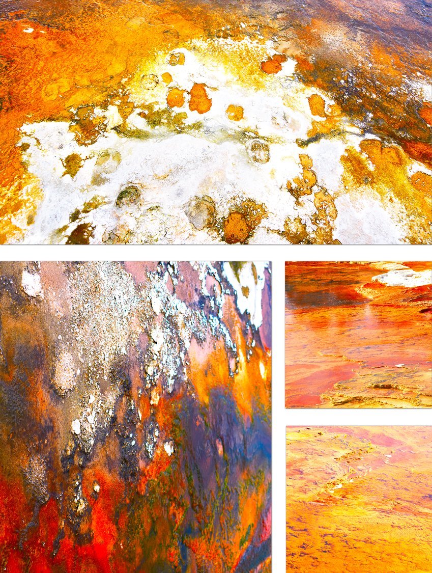
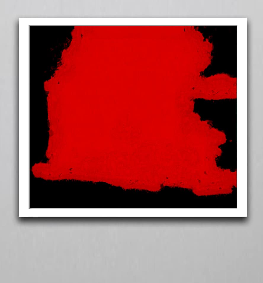
– Red colour: The root chakra located at the base of the spine is represented by red colour. The chakra has to do with our connection with the Earth. raises blood temperature and stimulates circulation. Red is used to care for people with anemia, fatigue, paralysis, and exhaustion. The color red is even more stimulating than orange. It influences emotional issues like financial independence and physical survival. Red orange may also produce similar effects. It’s mostly used for physical healing because its emotional effects can be extreme. Color therapists avoid shining red light on your head, as this can cause intense agitation. Infrared can also be used by a skilled color therapist if done so with caution. Neither red nor infrared is used for someone who has severe mental conditions.
About the Artist ➤ “Step into the world of Dr. Zenaidy Castro — where vision and passion breathe life into every masterpiece”
Dr Zenaidy Castro’s Poetry ➤ “Tender verses celebrating the bond between humans and their beloved pets”
Creative Evolution ➤ “The art of healing smiles — where science meets compassion and craft”
The Globetrotting Dentist & photographer ➤ “From spark to masterpiece — the unfolding journey of artistic transformation”
Blog ➤ “Stories, insights, and inspirations — a journey through art, life, and creative musings”
As a Pet mum and Creation of Pet Legacy ➤ “Honoring the silent companions — a timeless tribute to furry souls and their gentle spirits”
Pet Poem ➤ “Words woven from the heart — poetry that dances with the whispers of the soul”
As a Dentist ➤ “Adventures in healing and capturing beauty — a life lived between smiles and lenses”
Cosmetic Dentistry ➤ “Sculpting confidence with every smile — artistry in dental elegance”
Founder of Vogue Smiles Melbourne ➤ “Where glamour meets precision — crafting smiles worthy of the spotlight”
The Making of HSW ➤ “Journey into the heart’s creation — where vision, spirit, and artistry converge to birth a masterpiece”
The Muse ➤ “The whispering spark that ignites creation — inspiration drawn from the unseen and the divine”
The Sacred Evolution of Art Gallery ➤ “A spiritual voyage of growth and transformation — art that transcends time and space”
Unique Art Gallery ➤ “A sanctuary of rare visions — where each piece tells a story unlike any other”
– Orange colour: The Sacral Chakra, which is located 2 or 3 inches below the navel is represented by orange colour. This chakra is said to be associated with reproduction, kidneys, adrenals and pleasure. The chakra is the mind-body chakra. gives vitality to the body and is associated with the kidneys, urinary tract, and reproductive organs. Orange signifies abundance, pleasure, well-being, and sexuality. Orange may be used to stimulate different organs in the human body for physical healing. It revitalizes you and gives you increased mental energy. It can increase your feeling of connectedness between your mind and body. However, color therapists usually avoid this color for you if you’re prone to anxiety.
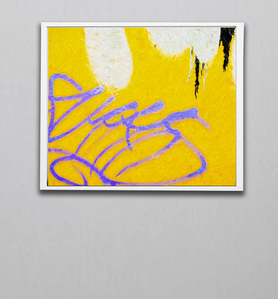
– Yellow colour: The solar plexus chakra is associated with liver, pancreas, digestive system, gallbladder, empowerment and well-being. The chakra is located between the navel and sternum. Yellow is used to aid digestion as well as the liver and intestine process. Yellow is thought to have decongestant and antibacterial properties to act as a cleanser for the body. It has been known to help relieve rheumatism and arthritis.
Yellow can be used in color therapy to bring energy and encourage action. This color can make you feel happier. It can bring out your intelligence and wisdom. Too much or too-bright yellows are associated with betrayal, cruelty, and deceit. It can remind us of our mortality. Yellow is the most intense color in the spectrum.
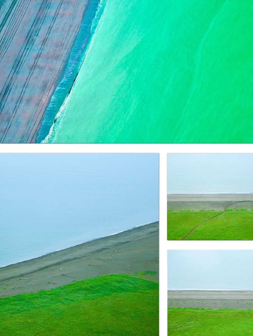
– Green colour: The colour represents the Heart Chakra. It’s associated with heart, lungs and immune system, energy, nervous system, mental focus, compassion and empowerment. Green creates balance and harmony within the body. It is especially good for heart and blood problems. It is known to influence the human cell structure and muscles. Green is the most balancing of all the colors. Color therapists usually consider green the safest color and typically start color therapy with it. When you’re feeling sad, hopeless, or depressed, green can improve your mood. However, it’s important to have a pure green color, as a light green can cause you to tip into anxiety.
Green is said to enhance the emotions of love, joy, and inner peace. It can bring you hope, strength, and serenity. Green is said to increase your wisdom and facilitate change and independence.

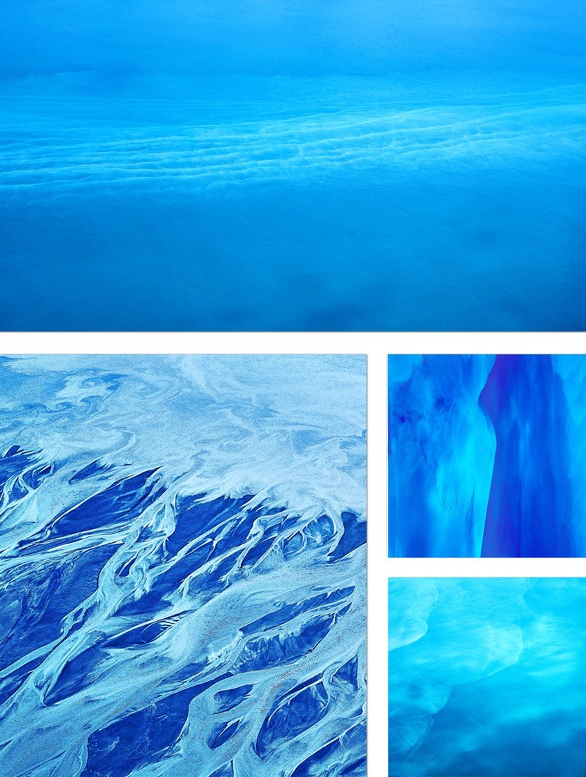
– Blue colour: The chakra is associated with thyroid and metabolism and also with a peaceful expression. Blue is soothing, symbolizes the sky and sea. It lowers the heart rate, therefore allowing the body quiet time to heal itself. In addition, blue helps alleviate tension, stress, and problems with the immune system. It is believed to relieve insomnia, anxiety, high blood pressure, migraines, and skin irritation.
Blue is a color that must be used with extra care, as it can zap your energy if you’re feeling low. Blue does help you express your feelings, though, and is related to your inner truth. Blue is a cold color that can be used to help you become more peaceful and relaxed. Primary blue is often used in therapy settings used for meditation and relaxation.
Blue can also be associated with wisdom, creativity, loyalty, and spirituality. Too much blue or blue that is too dark can lead to sadness, depression, and a feeling of emptiness. Light blue promotes serenity. It can also be used to help with insomnia.

– Indigo colour: The third eye chakra is located between the eyebrows. It is associated with the pituitary gland and pineal gland. It influences our sleep cycle, clarity, wisdom, self-esteem and intuition.
– Violet colour: It is associated with the Crown Chakra and is located at the top of the head. It is associated with clarity, dreams, spirituality, sleep cycles, dreams, pineal gland and light sensitivity. Purple is associated with the eyes, ears, nose, and mouth. It helps with head congestion and sinuses, and is known to calm the nervous system. Purple is most strongly associated with beauty, spirituality, and bliss. In color therapy, violet is often used on the forehead and neck to initiate feelings of calm and relaxation within the human body. However, it’s recommended for use on any part of the body.
Red is a passionate and warm color which induces vitality and stimulates energy. It increases adrenaline and elevates blood pressure-so avoid using it when the patient is suffering from hypertension. This could be the reason why red is used only moderately in hospitals. At home though, you can use this color for stimulating appetite in weak patients. Red can also alleviate depression. It is one of the top healing colors for enhancing sexual appetite and overall vitality.
According to color healing therapy, orange is one of the best colors for hospitals and particularly for children’s rooms. Orange radiates warmth and is associated with joy and happiness. In fact: even oranges which are packed with Vitamin C-the powerful antioxidant- are known to heal and fight free radicals to boost immunity. Therefore, as far as cancer healing colors go, orange is an important color in the color healing chart.
Search for healing colors for hospitals and yellow would be high up in the list. This bright and cheerful color can help stimulate intelligence and also detoxify the body and mind to heal patients quickly. Yellow is particularly recommended for patients with skin problems. It can inspire creativity in people who feel sluggish or lethargic. Avoid overuse of yellow as it can hamper the digestive health and lead to stomach problems and insomnia.
Green color is known for its balanced healing properties. It is a restful color that symbolizes growth and renewal. It also encourages comfort and equilibrium and is particularly beneficial for the heart, lungs and circulatory system.
This spiritual color is also the color of the sky and sea. Blue is an important healing color as it is linked with calm and serenity. It helps lower blood pressure and can reduce rapid heart rate. Blue is relaxing for the mind and body. It is associated with organs like eyes, ears and nose and involved with the senses of smell, sight and sound.
Pink is feminine yet a soothing color that shows caring and affection. It is a protective and compassionate color that heals and soothes. This lighthearted color can stimulate happiness. Too much of bright pink might stimulate energy and incite passionate behavior just like its distant cousin Red. Pink can be however be safely useful in hospitals and prisons to reduce erratic behaviour.
Both, purple and violet, as well as its related shades like lilac and lavender are connected with spirituality. These healing colors are also linked with perception, higher consciousness and insight. Health wise, these colors are linked with the cerebral and nervous systems.
Color healing for cancer patients can be implemented in the radiology suite. Use cheerful colors in the drapes, upholstery or the accessories in the waiting rooms as well as in the therapy rooms to reduce anxiety and claustrophobia in patients.
It is very important to use color healing therapy in pediatric environments as well. Bright and cheerful colors can help keep little ones calm and relieve stress in both- the young patients as well as their caregivers or parents.
In elders, the use of colors for healing therapy must take into account the vision problems in older patients. Avoid using excessively bright colors and bright focus lights. Instead, make use of colors that help the patients in focusing. Yellow, orange and red could be safely used in poorly lit conditions as they can help older patients focus better.
In critical care units, colors like blue, violets and greens are recommended. Not only are these healing colors calming and soothing-they also have stress reducing effect. In such an environment, avoid the use of bright and energy inducing colors like red, yellow and orange
.

The alternative healing practice of color therapy relies on the delivery of the light frequencies of color to the body. The light enters the eyes to get into the human body or color therapy equipment may be used.
Through Eyes
One way to take advantage of light therapy is to view the color simply. You look at the color for a few minutes and receive the therapeutic effects as light enters your eyes. That’s all there is to the delivery. What you need to be careful with are the colors you choose. Green is considered the safest color. Red and orange may cause you too much excitement and agitation.
Color therapy is individualized as well. What works to help you might make someone else feel worse. For example, if you have a lot of anxiety and need to calm down, blue or blue light might be a good color to use. If someone else were depressed, though, blue wouldn’t be a color they should use in color therapy. Red light is generally associated with negative emotions, but someone working to process anger may find it potentially useful.
The color of healing is generally considered to be green. Green represents the beauty and serenity of nature. It also represents the earth. Many cultures recognize green as the primary color of healing due to its connection to balance and stability in nature. Because of the associations attached to it, an individual might find green to be soothing or produce a calming effect.
The color blue is also sometimes considered to have healing properties, as it is said to encourage relaxation. Blue light may be used in a variety of ways in color therapy to promote a calm and comforting environment. Blue light may be used to light up a room, for example. Blue light can also be delivered through specific color therapy devices. Other than blue light, other uses might include blue décor or room furnishings, using blue in artwork, or others.

Generally soft, neutral (or perhaps even muted) colors are considered beneficial for addressing anxiety. Because of their associations with tranquility, both blue and green are specific colors that are often referred to when looking to promote mental and physical relaxation.
Increased relaxation may impact the physical body or human body in some beneficial ways (short-term; there aren’t any proven links between color and long-term health benefits for now). Because blood pressure may be influenced in part by stress or anxiety, reducing the effects of these emotions during color therapy may temporarily lower or stabilize blood pressure. Blue light therapy might be used in this case.
Artwork for Every Healthcare Facility➤ “Transform healing spaces with art that nurtures the spirit and soothes the soul”
Colour Theraphy in Healthcare ➤ “Harnessing the power of color to heal, uplift, and inspire wellness”
Healing Wall Art for Every Room in the Hospital ➤“Visual balm for every space — art designed to comfort, calm, and restore”
Corporate Art For Business Offices- Office Wall Art for sale ➤ “Elevate your workspace with refined artistry that inspires success and creativity”
Office and Business Art – Corporate Spaces with Elegance ➤ “Where sophistication meets motivation — curated art for discerning professional spaces”
How to Choose Art for Your Office ➤ “A guide to selecting pieces that balance beauty, purpose, and productivity”
Office Wall Colours and Artwork Choices for Productivity ➤ “The subtle dance of hues and imagery — crafting environments that foster focus and flow”
Art and Colour in Architecture ➤ “Intertwining structure and soul — the art of integrating color into built spaces”
Styling Cruise Interiors with Fine Art Photography ➤ “Setting sail with elegance — bespoke art to enrich luxurious voyage interiors”
Affordable luxury art for corporate art procurement ➤ “Exquisite art within reach — premium pieces crafted for visionary businesses”
Hospitality Art ➤ “Creating welcoming atmospheres with art that invites, enchants, and delights”
Best Wall Art for Every Hotel Type ➤ “Tailored visual experiences for boutique charm, grand luxury, and everything between”
Art and Colour in Boutique Hotels & Luxury Resorts ➤ “Curated palettes and imagery that define elegance and comfort in exclusive spaces”
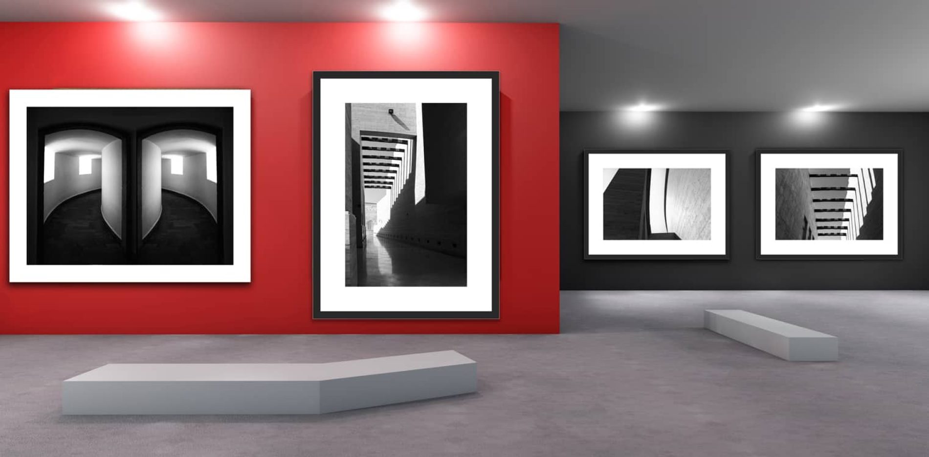
B&W Photography ➤ “Timeless contrasts to craft spaces of depth, drama, and sophisticated elegance”
Celebrity Homes and B&W Photography: Iconic Style Secrets ➤ “Discover how monochrome masterpieces shape the allure of star-studded sanctuaries”
The Psychology of Visual Rhythm in Art Display ➤ “Unlocking harmony and flow — art arranged to resonate with mind and soul”
Emotional Luxury: Where Art Meets Interior Design ➤ “Elevate spaces with artworks that stir feeling, enrich atmosphere, and define opulence”
Art and Colour in Luxury Properties ➤ “The alchemy of hues and form — crafting immersive environments of refined taste”
Transform Interiors with Fine Art Photography and Style ➤ “From vision to reality — infusing interiors with narrative, emotion, and light”
Fine Art Photography: Capturing Emotion, Ideas, and Vision ➤ “Frames that transcend the image — storytelling through every captured moment”
Giclée Fine Art Print ➤ “Precision and passion united — prints that honor the artist’s original vision with unmatched clarity”
Attract Good Luck with Lucky Feng Shui Art and Vastu Art ➤ “Harmonize your space, invite fortune — where sacred art meets ancient wisdom”
Harness Vastu Shastra and Art to Invite Good Fortune ➤ “Align your surroundings with cosmic flow — art that draws prosperity and peace”
Feng Shui Art to Attract Good Luck ➤ “Embrace balance and abundance — artworks designed to channel positive energy and blessings”
Yellow is often referred to as a color of hope, and this symbolic usage is frequently present on flags. The color green is sometimes considered to represent hope, as its overall essence is connected to peace and tranquility in times of disarray. Yellow’s brightness and connection to other parts of our natural world – the sun, for example – might be a beneficial part of color treatment focused on improving mood.
Different colors might be represented or referred to in different ways throughout color treatment and colour therapy even if the colors themselves aren’t associated with positive memories or emotions.
Colors that might be beneficial for mental health or the human body can be those associated with calmness and relaxation, like blue indigo or green, or neutral colors that promote similar effects. Blue light might be used to focus on tranquility.
In Eastern medicine or natural healing, colors may be used often to impact the physical body as well. It may be used in conjunction with other methods, like vibrational healing. Vibrational healing utilizes specific, deliberate vibrations throughout different parts of the human body to promote restoration of energy fields and stabilization. The intent of vibrational healing is to balance the vibrations that happen in the body at a molecular level (an “energy field”). In this way, vibrational healing is thought to re-balance the state of the human body. Charged water may be used to promote similar results. Charged water is often thought of in relation to chakras, as discussed earlier in our guide.
For some, healthcare facilities such as hospitals and doctors’ offices can cause overwhelming stress and fear. Sometimes these feelings are self-induced, but sometimes the setting can amplify such emotions. Many hospital rooms are focused on frightening – to the patient – medical equipment surrounded by practical, yet depressing, white walls. Sure, maybe nothing can be done about the equipment in the room, but the walls demand color.
Color is all around us — from green grass and blue skies to beautiful orange sunsets and freshly bloomed flowers — and it impacts our lives more than we realize. But it can affect our thinking, mood, and most importantly, our overall health. According to The Healthy Home Economist, “Modern research suggests that, yes, color does have a profound impact on how we feel and our biological functions.”
Determining which colors are best suited for significant areas within the healthcare industry should be done with plenty of consideration for not only the facility type, but for the impacts on those that will be seeing it the most.
Here, calming and relaxing colors should dominate. Blues can help lower heart rate while greens promote restfulness — both can aid in a patient’s healing.
In relation to design, these can be some of a hospital’s most important rooms. To encourage serenity and calmness, patient rooms should be as peaceful and pleasant as possible. Biophilic design, a strategy of implementing nature into the environment, can help.
Biophilia, first introduced by Edward O. Wilson in 1984, examines the relationship between nature and healing. Catie Ryan, senior project manager at Terrapin Bright Green, states, “On average, patients whose windows overlooked a scene of nature were released after 7.96 days, compared with the 8.71 days it took for patients whose views were of the hospital’s exterior walls to recover sufficiently to be released — a decrease of 8.5%.” Therefore, even small implementations can progress the healing process.
To achieve biophilic design, patient rooms should consider natural lighting from windows that overlook gardens or other hospital-created scenic views. Presenting artwork with trees, mountains, or beaches in patient rooms can also be used to improve patient perception and satisfaction with ongoing health care.
Patient rooms should be painted in colors which inspire calm and serenity, and are not too heavy on the senses, evoking familiarity. The lighting and the colors should not be too bright. Overly bright colors can be both tiring and disturbing for patients who spend most of their time in their rooms. With patients taken fresh out of the operating room into their rooms, doctors may experience issues with checking their eyes if the room is too brightly illuminated and colored.
Using green or the combination blue/green for the walls of operating rooms is good for relieving the eyes of doctors who see lots of blood every day. As green sits on the opposite end of the color spectrum to red, it is the perfect choice for relieving the stress on the eyes of the doctors. Cooler colors with less saturation should be chosen for these areas.
Child services must be engaging and energetic. Children are usually thrilled by energetic splashes of color supplemented by colors in bluish tones that help relieve anxiety, lower the pulse rate and do not create confusion.
Intensive care rooms should be relaxing and calming. Walls should be painted in neutral colors to avoid creating a cold environment both physically and psychologically while light coffee and light green tones with a soothing effect can be used to accentuate the colors’ impact. Aside from walls, cool colors can be used for floors and other accessories.
Calming neutral colors can also be used in the examination rooms. If it is not an eye examination room, stronger but calm tones can be used on walls to form a contrast with the doctor’s or the secretary’s desk. The walls of examination rooms can be painted terra cotta or brownish tones that are not too heavy on the eyes.
Even the idea of walking into a dentist’s office may cause feelings of anxiety and distress. Some people report having had their worst medical experiences at a dentist’s office. More than 125 studies were conducted in the USA on this subject and the parameters such as appropriate light, color, sound control, space have been taken into account. The color of the signboard at the entrance and refreshing lights are very important in making a first good impression.
The following wall colors can be used as main wall and accent colors in a dentist’s office. These colors have a calming and soothing effect.
Hospitals cafes and restaurants should be designed to given an energetic vibe, being spaces designed for leisure time. In areas where warm colors are used, people feel more relaxed and comfortable. Using warm colors in such areas turns those spaces into convenient places for chatting, eating, and having a good time. Dark accents may be chosen for columns, if there are any.
Since most people waiting in hospitals spend most of their time at waiting areas, those areas should be painted colors that look appealing, spiriting and pleasing to the eye but care should be taken to ensure that they give comfort to onlookers without overstimulating the senses. Using visually striking accents is also handy when it comes to segregating units.
Shades of pale green, skin tones, golden yellow and marine blue can be used for sterilized rooms and laboratories. If the laboratory or sterile room is used for color discrimination, pearly gray tones are appropriate.
Shades of light blue and marine blue can be used for physical therapy or radio therapy rooms. They reduce muscle tension and add liveliness and brightness to skin color aside from creating a cold and hygienic atmosphere. Shades of pale orange or yellow inspire happiness and joy for work and occupational therapy.
The corridors of hospitals and healthcare facilities can sometimes seem eerily unfamiliar and confusing. Strong accents need to be used especially at the end of long and winding corridors to help people find their way around the hospital more easily. These accents may both be used for giving directions and segregating units from each other. The back walls of reception and front desk areas need to painted in colors with stronger hues to make them easily recognizable by visitors to the hospital. The use of warm and cool colors may vary according to departments. While warm colors such as light orange, pale yellow-orange, and beige-orange can be used for pediatric corridors, cool colors such as moss green or blue-green can be considered for intensive care units. If peach tones are being considered for long corridors, a different shade of the same tone can be used for the other end of the corridor while the opposite end of the same corridor can be painted middle shades of blue. If you are aiming for that cold impact, one end of the wall can be painted light beige while the other end can be painted pale green, with the corridor end painted orange or red.
EEG brain scans have been performed on patients to find out whether the color of hospital corridors in psychiatric wards has a positive impact on patient relationships and communication, or their social skills and speech patterns; and the scans point to a positive change in their speech patterns. Edgerton, Ritchie, and McKechnie (2010).
Design shortcuts that many healthcare facilities take are doing their visitors a disservice. Hospital waiting rooms are usually the first interaction that many have within a hospital. Rarely thought of as appealing, they’re often small, overcrowded, uncomfortable, and often feature bleak industrial carpeting, squeaky chairs, and dull wall-to-wall shades of the same color. These conditions can be enough to ruin the entire patient experience before even seeing a doctor.
Unique taste and style doesn’t just have to be used in private spaces. Waiting rooms need to be comfortable. Soothing earth tones, turquoise, and shades of blue are known to relax and calm moods, which could alleviate the anxiety that most patients feel when entering a hospital.
Devoted to the rehabilitation of patients with various neurological, musculoskeletal, and other medical conditions following the stabilization of their diagnosis, physical therapy centers improve function, reduce symptoms, and improve the overall well-being of the patient.
In an environment where physical movement is required, bright and bold colors can promote energy and adrenaline. Walls should feature neutral and relaxing colors such as beige or grey while a feature wall could be painted blue, purple or even a bold red or orange. A rainbow of colored exercise floor matting can encourage patients to push through exercises.
═══════════════════════════════════════════════════
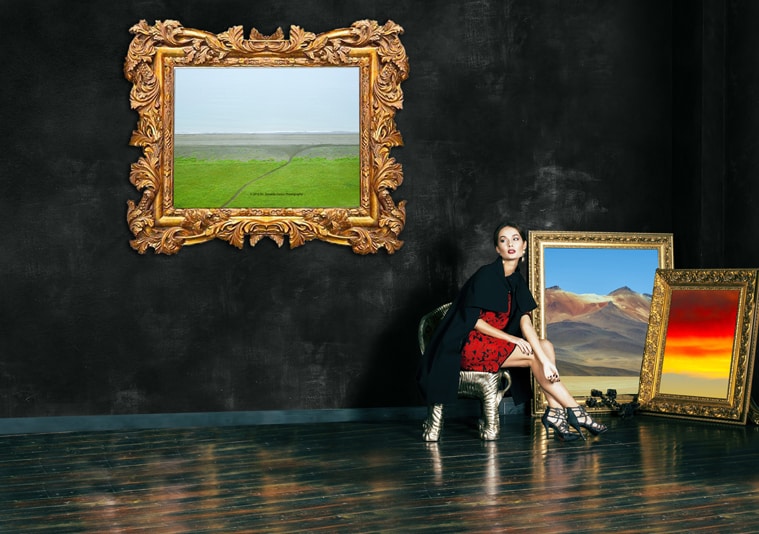
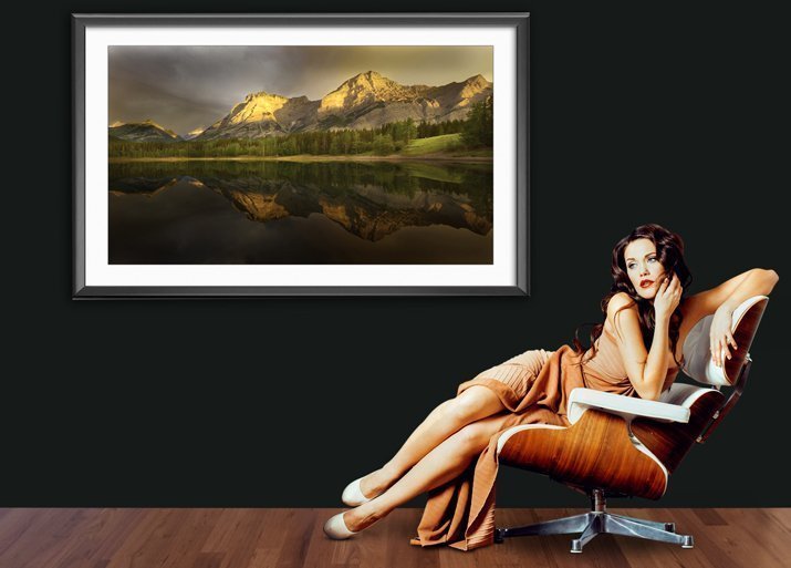
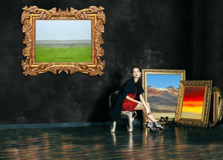
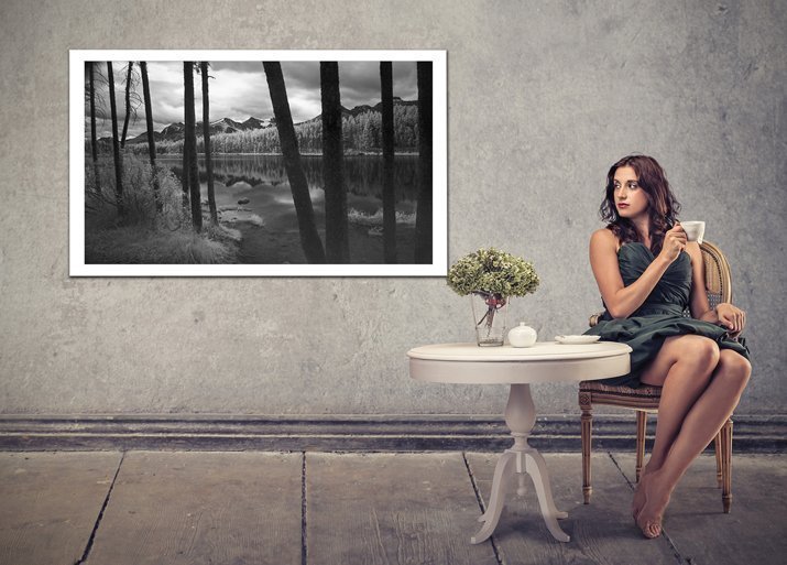
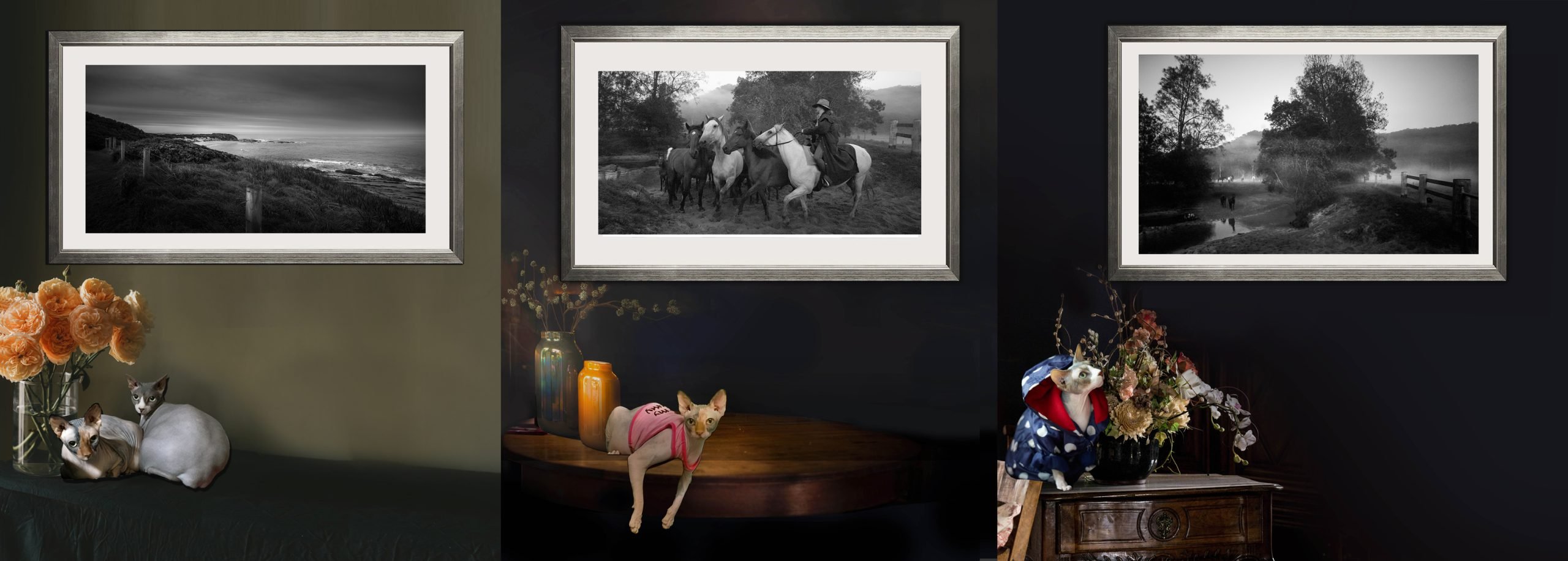
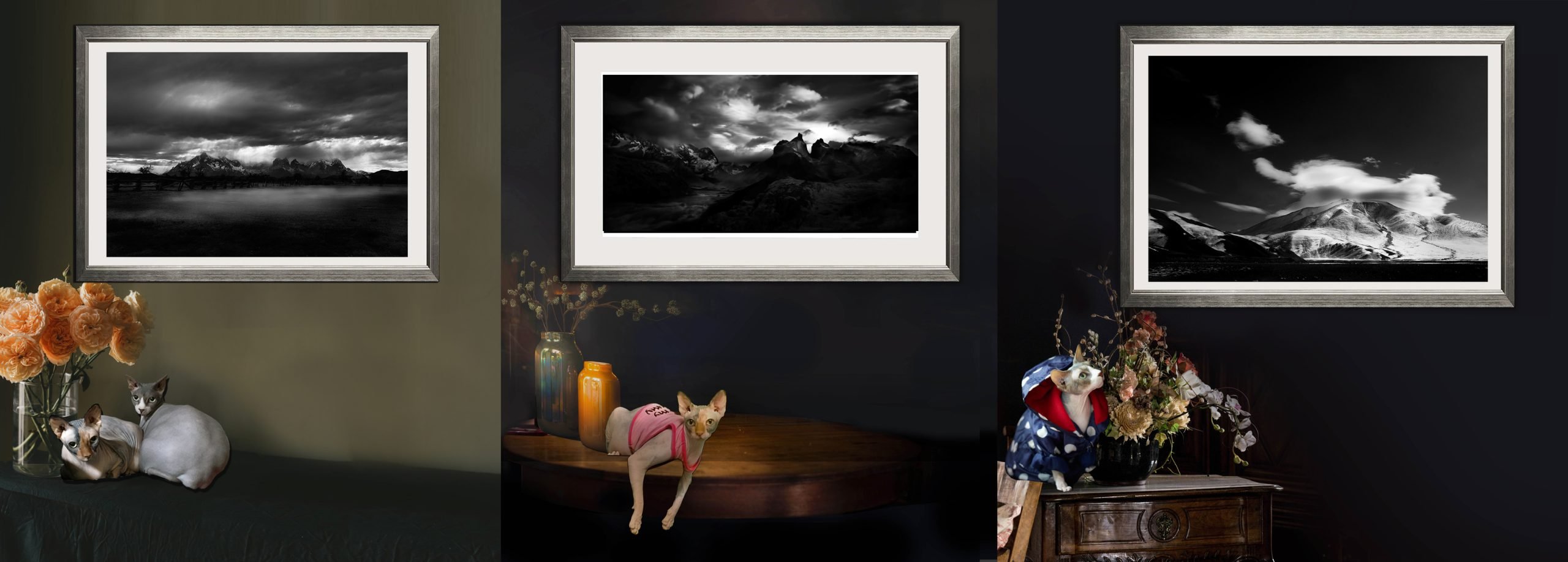
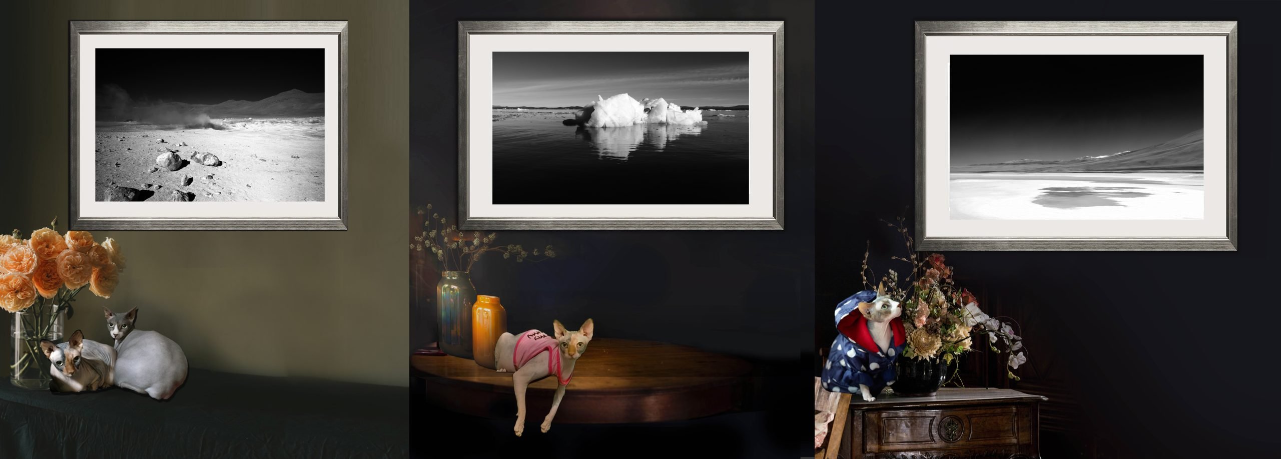
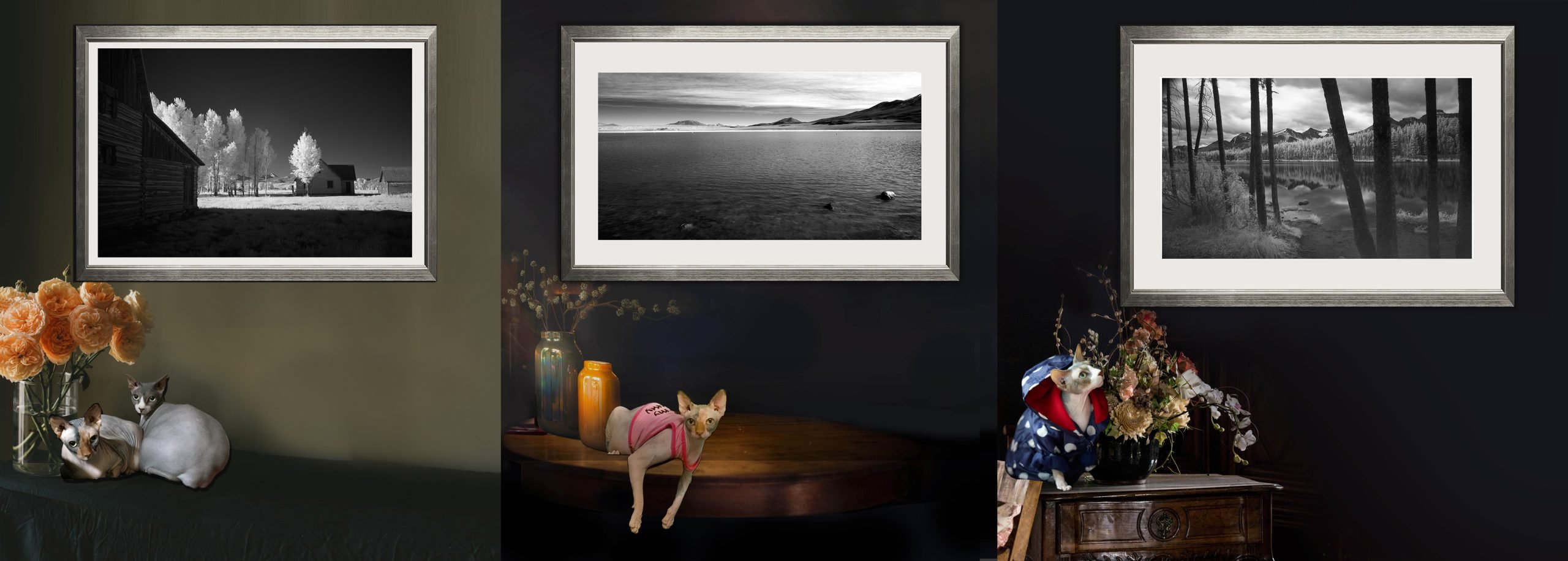
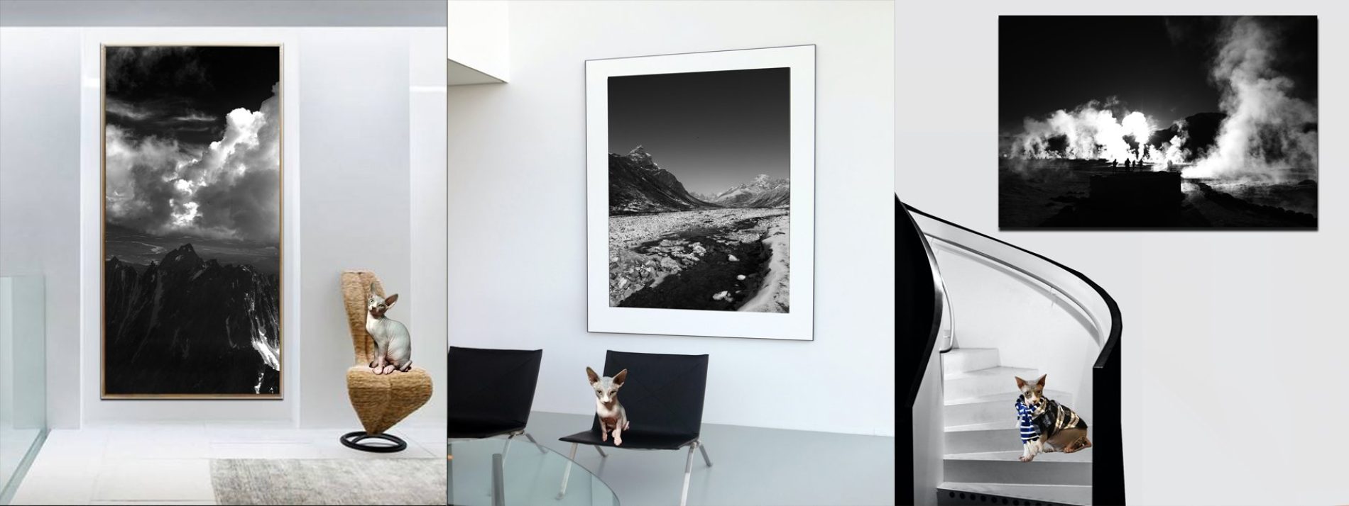
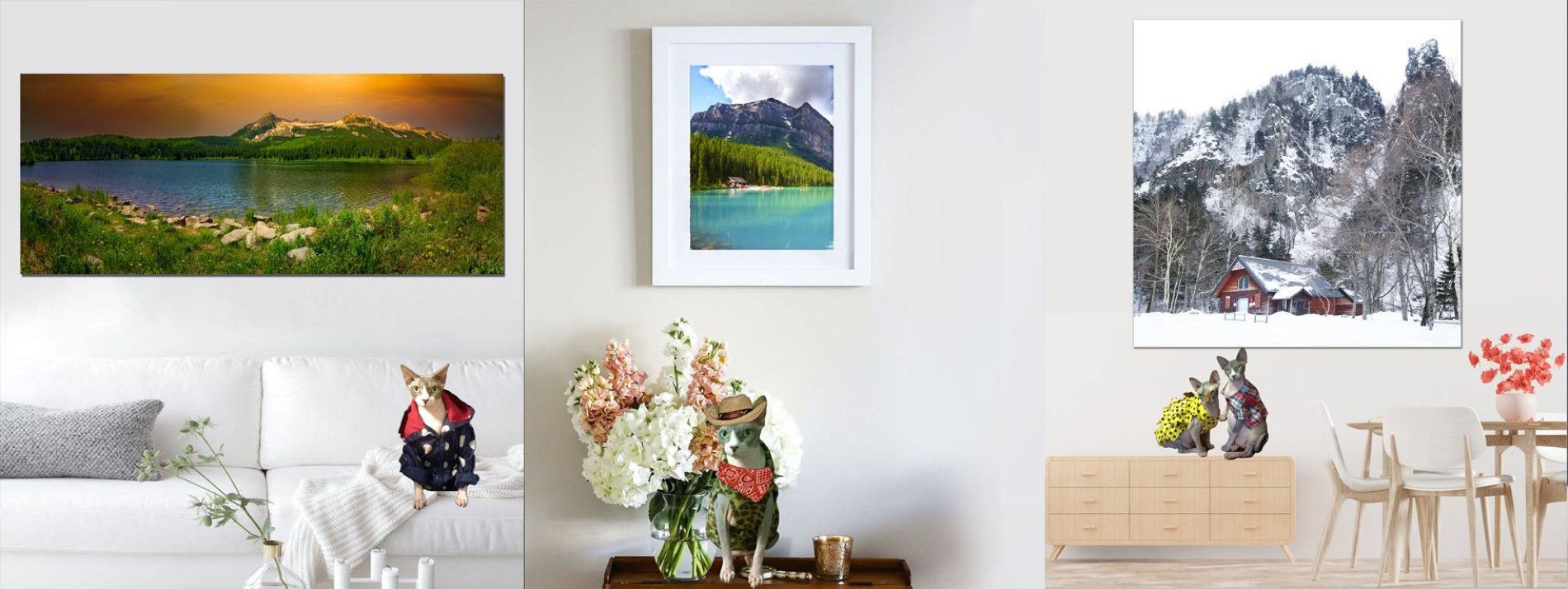
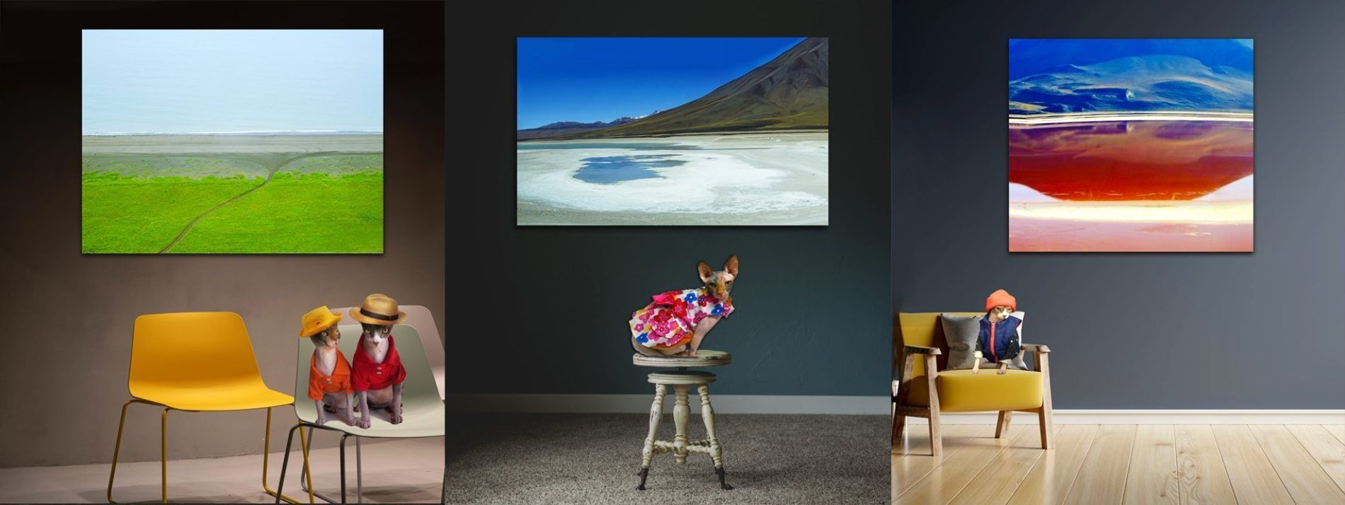
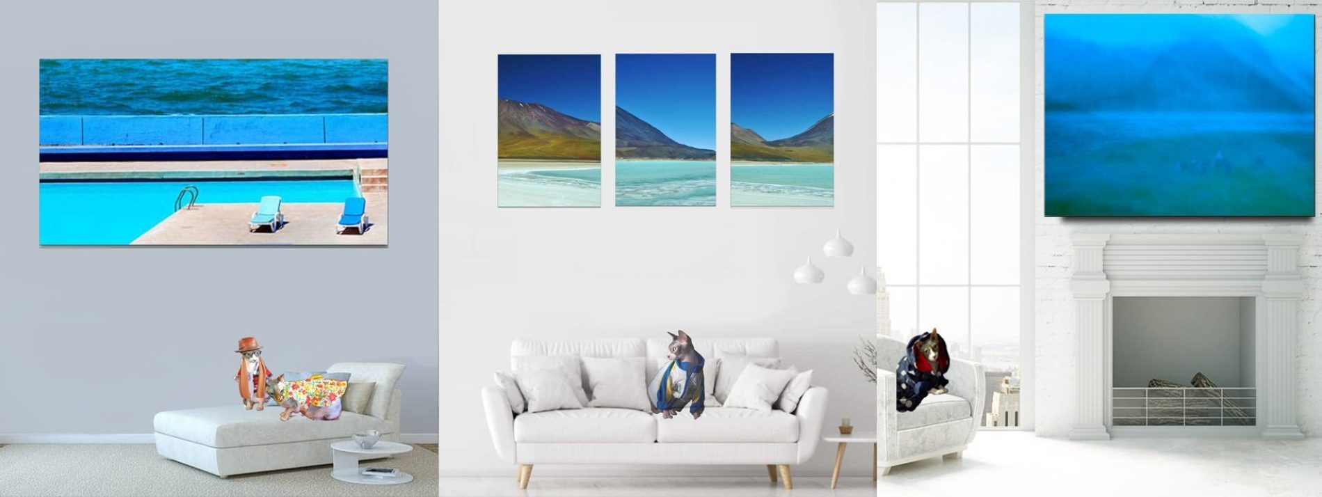
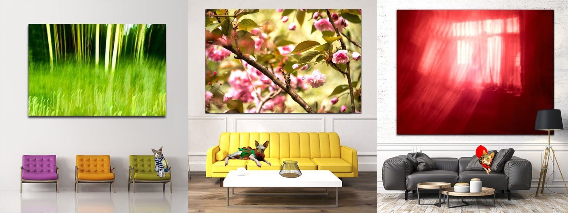
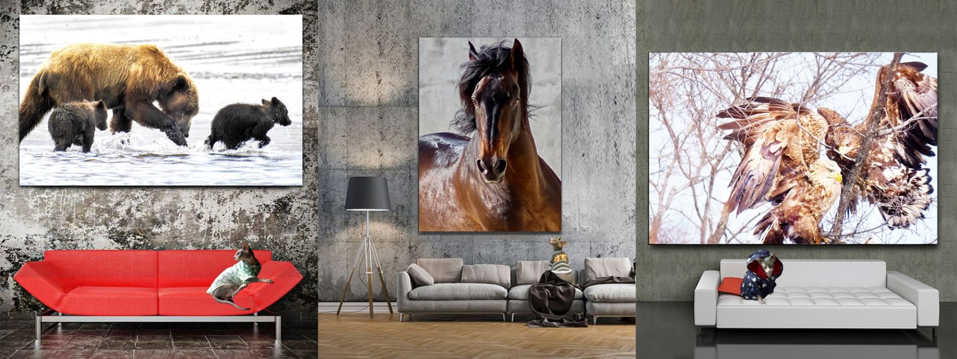
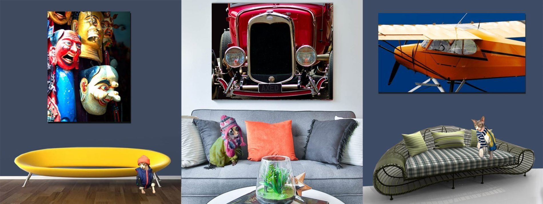
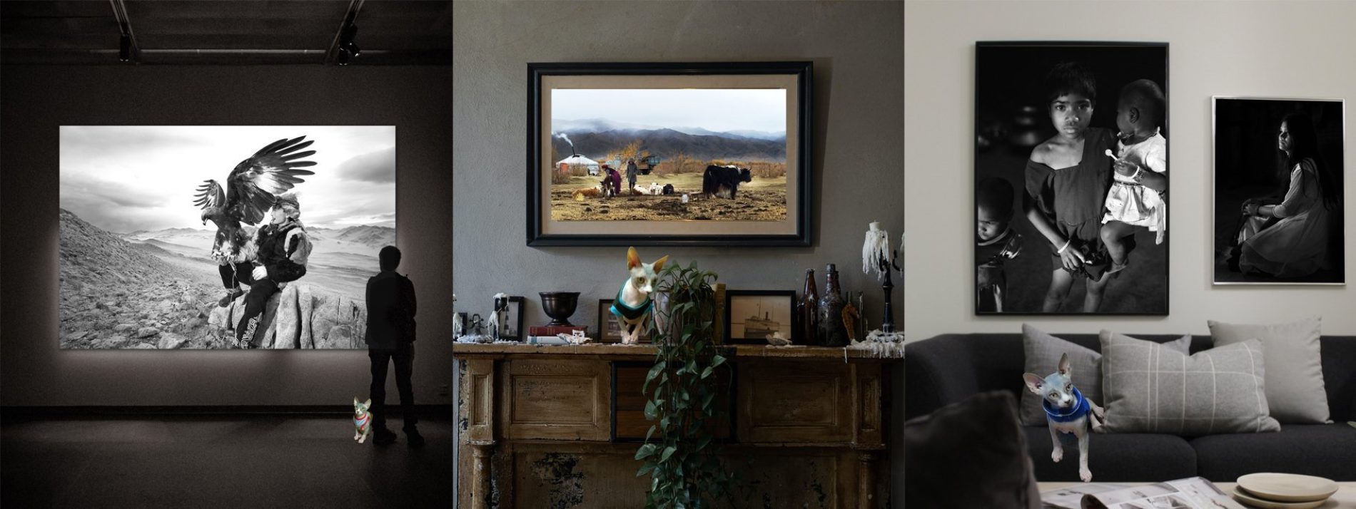
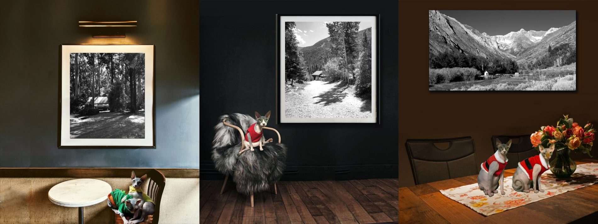
At Heart & Soul Whisperer Art Gallery, every coloured and black and white photograph tells a story beyond sight—an emotional journey captured in light, shadow, and soul. Founded by visionary artist Dr Zenaidy Castro, our curated collections—spanning landscapes, waterscapes, abstract art, and more—offer a timeless elegance that transcends fleeting trends. Whether enriching private residences, corporate offices, healthcare facilities, hospitals, or hospitality spaces, our artworks are designed to transform environments into sanctuaries of memory, beauty, and enduring inspiration. Let your walls whisper stories that linger—reflections of art, spirit, and the love that connects us all.

Limited Editions ➤ “Treasures of Time, Rare Whispers on Canvas — Art as Unique as Your Soul”
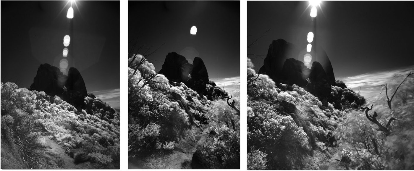
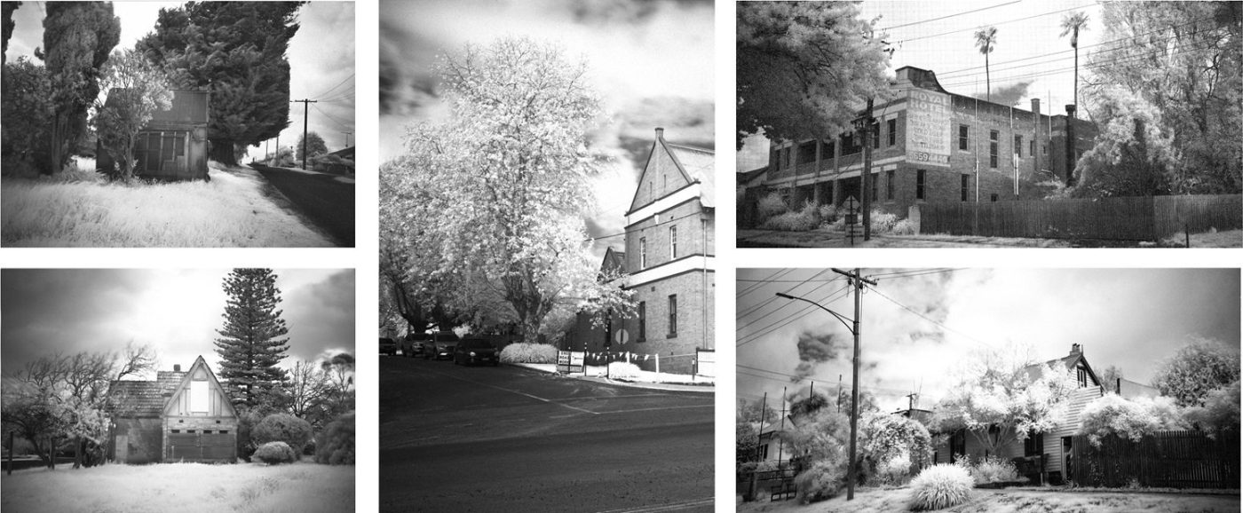
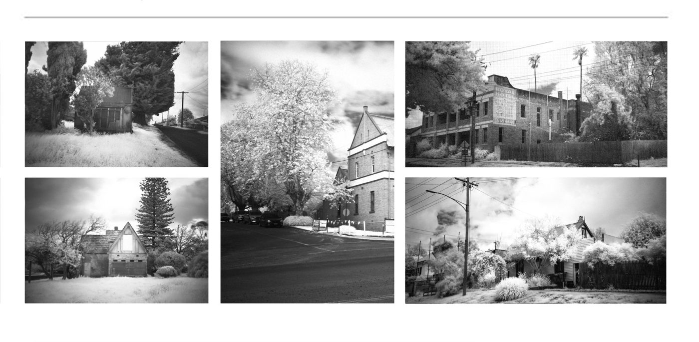
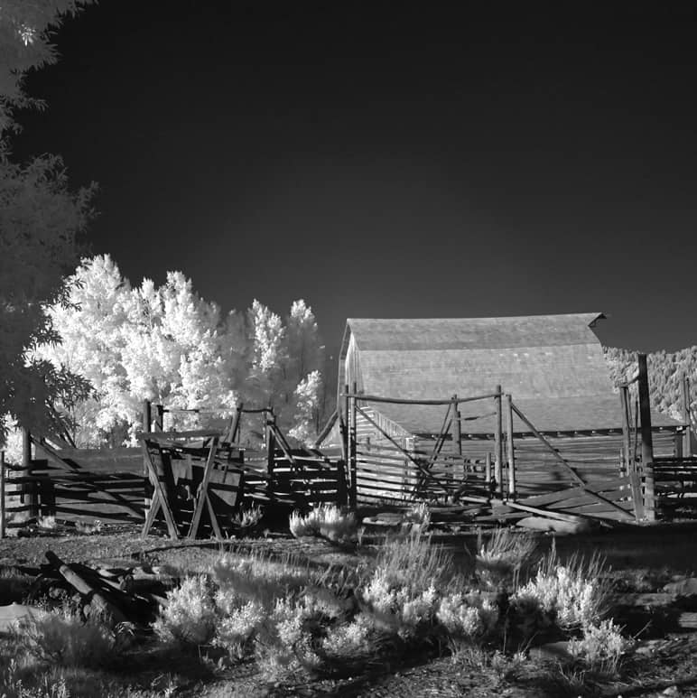
Infrared ➤ “Beyond the Visible: Worlds Revealed in Fiery Hues and Hidden Radiance”
Vintage & Retro ➤ “Echoes of Elegance, Timeless Stories Wrapped in Nostalgic Light”
Film Emulation Photography ➤ “Where Grain Meets Grace — Classic Souls Captured in Modern Frames”
Minimalism ➤ “Pure Essence, Quiet Power — Beauty Found in the Art of Less”
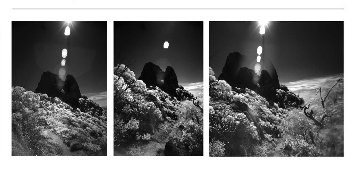
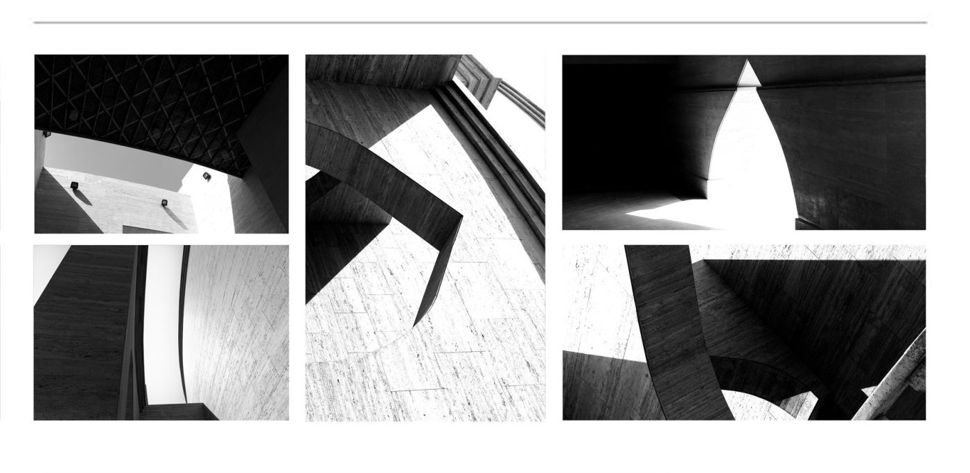
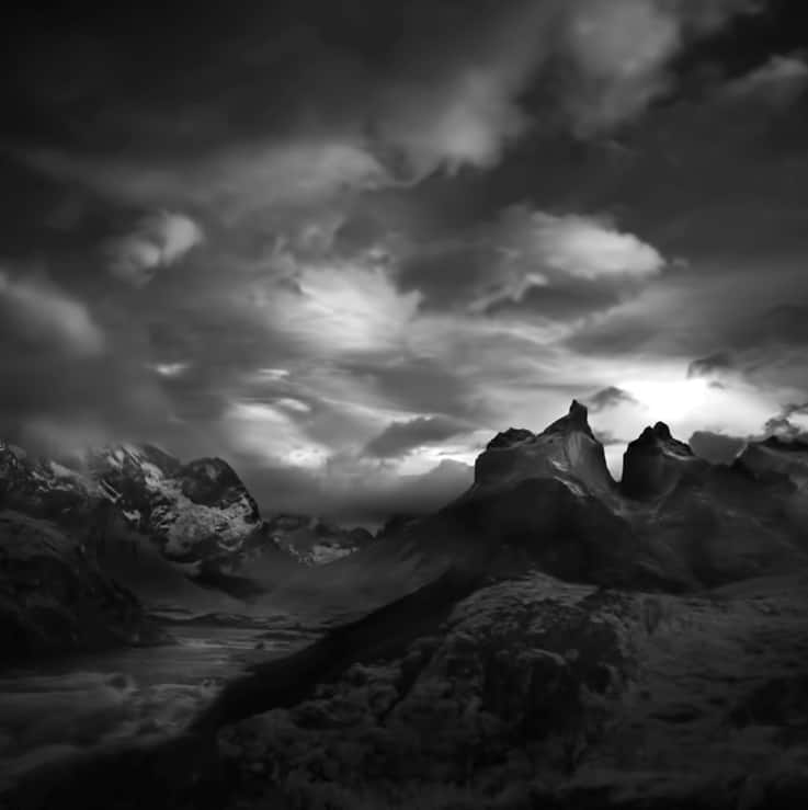
Chiaroscuro Landscapes ➤ “Light and Shadow’s Dance: Landscapes Painted in Dramatic Contrast”
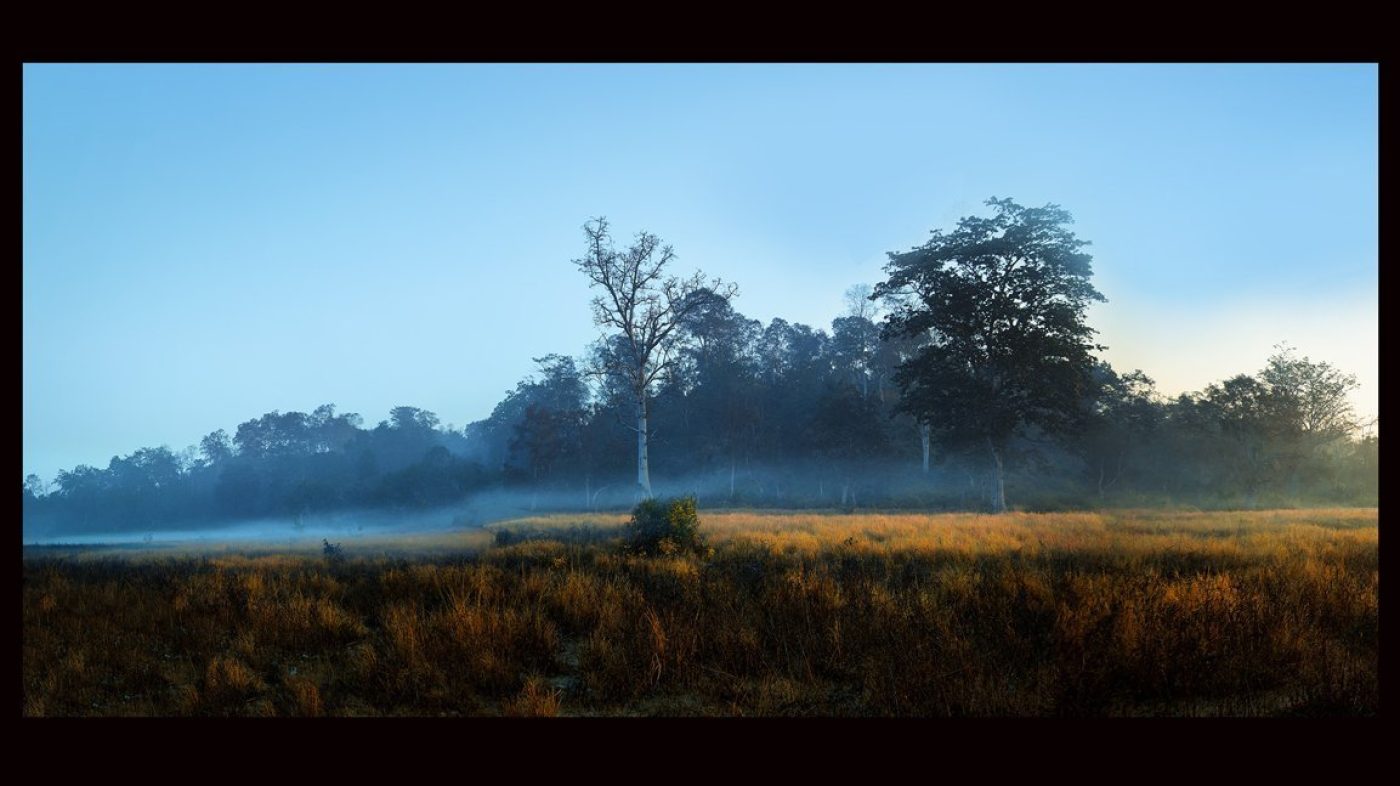
Moody Landscapes ➤ “Whispers of Storm and Silence — Nature’s Emotions in Every Frame”
Mystical Landscapes ➤ “Enchanted Realms Where Spirit Meets Horizon, Dream and Reality Blur”
Moody and Mystical ➤ “A Symphony of Shadows and Spirit — Landscapes That Speak to the Soul”
Country & Rural ➤ “Sun-kissed fields and quiet homesteads — where earth and heart meet in vibrant harmony”
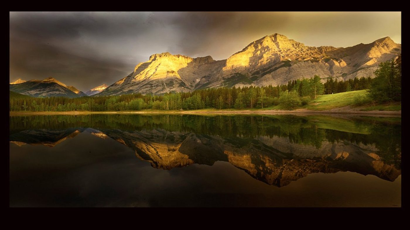
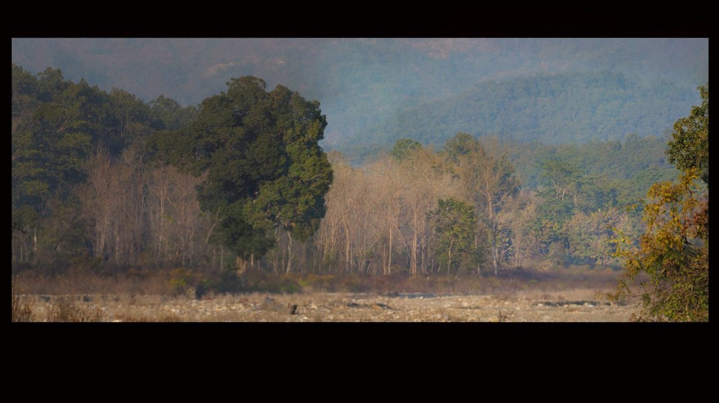
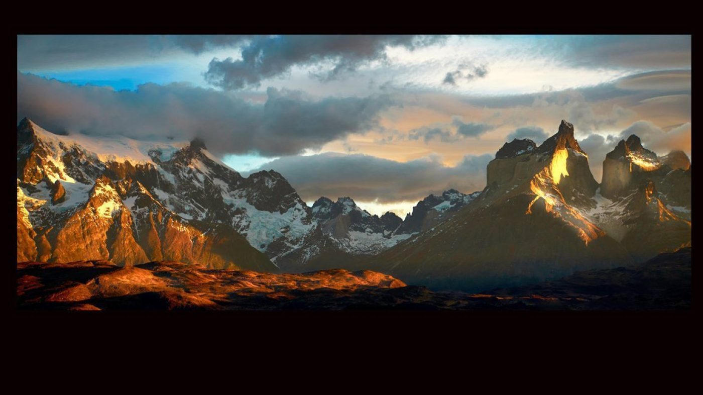
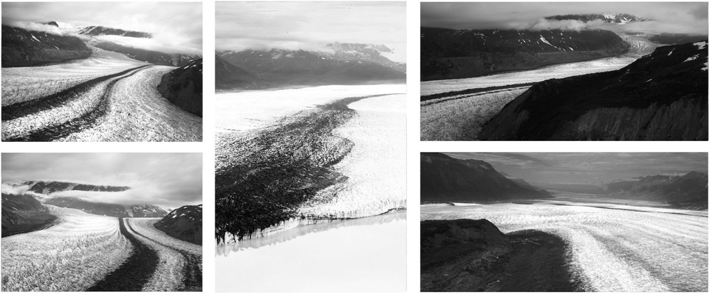
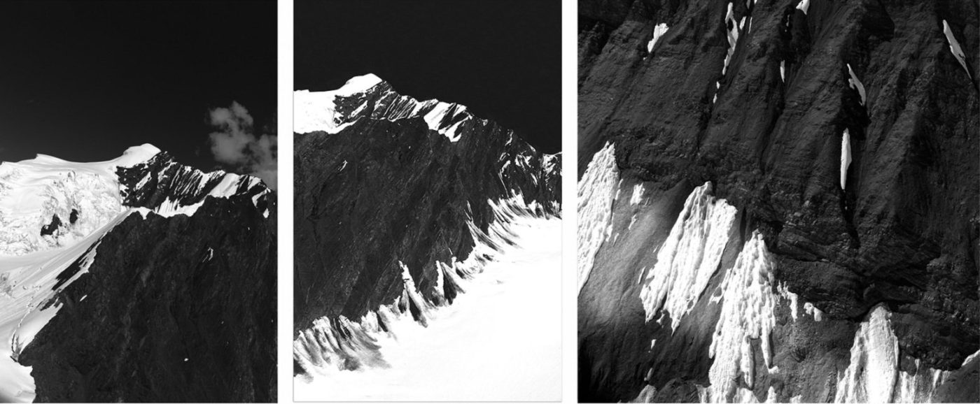
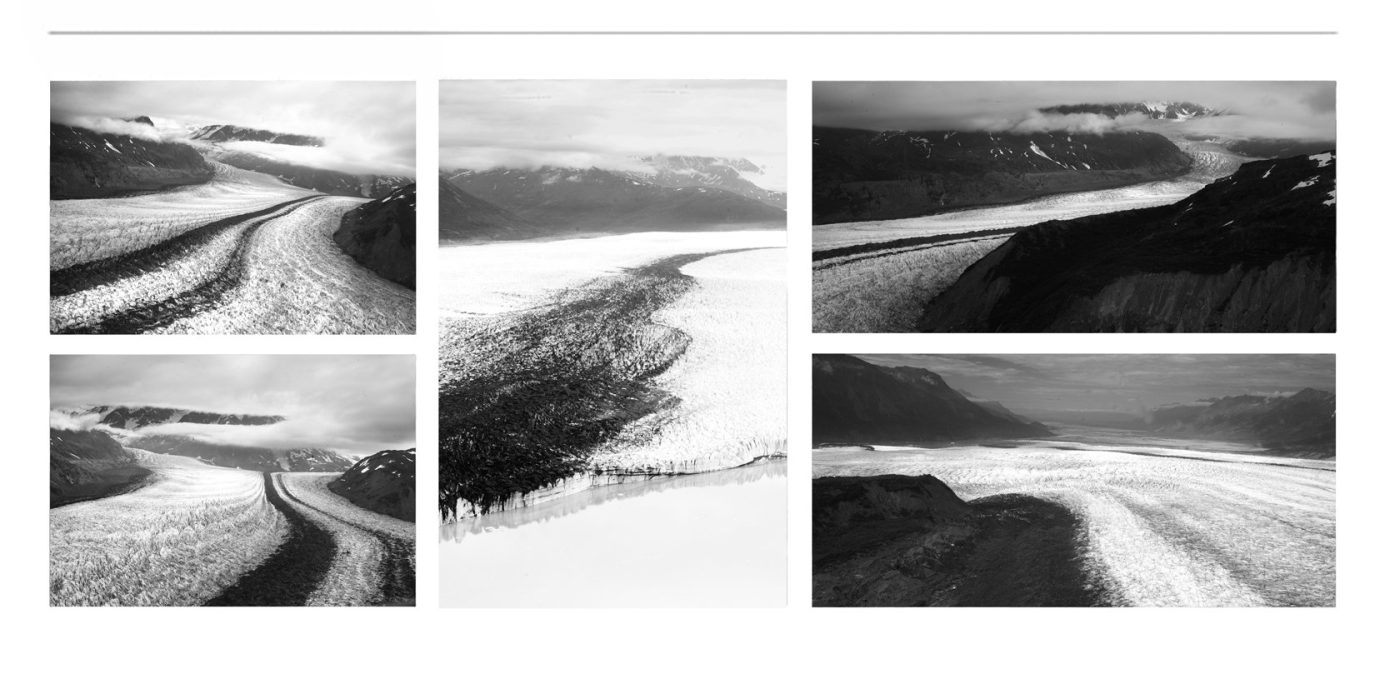
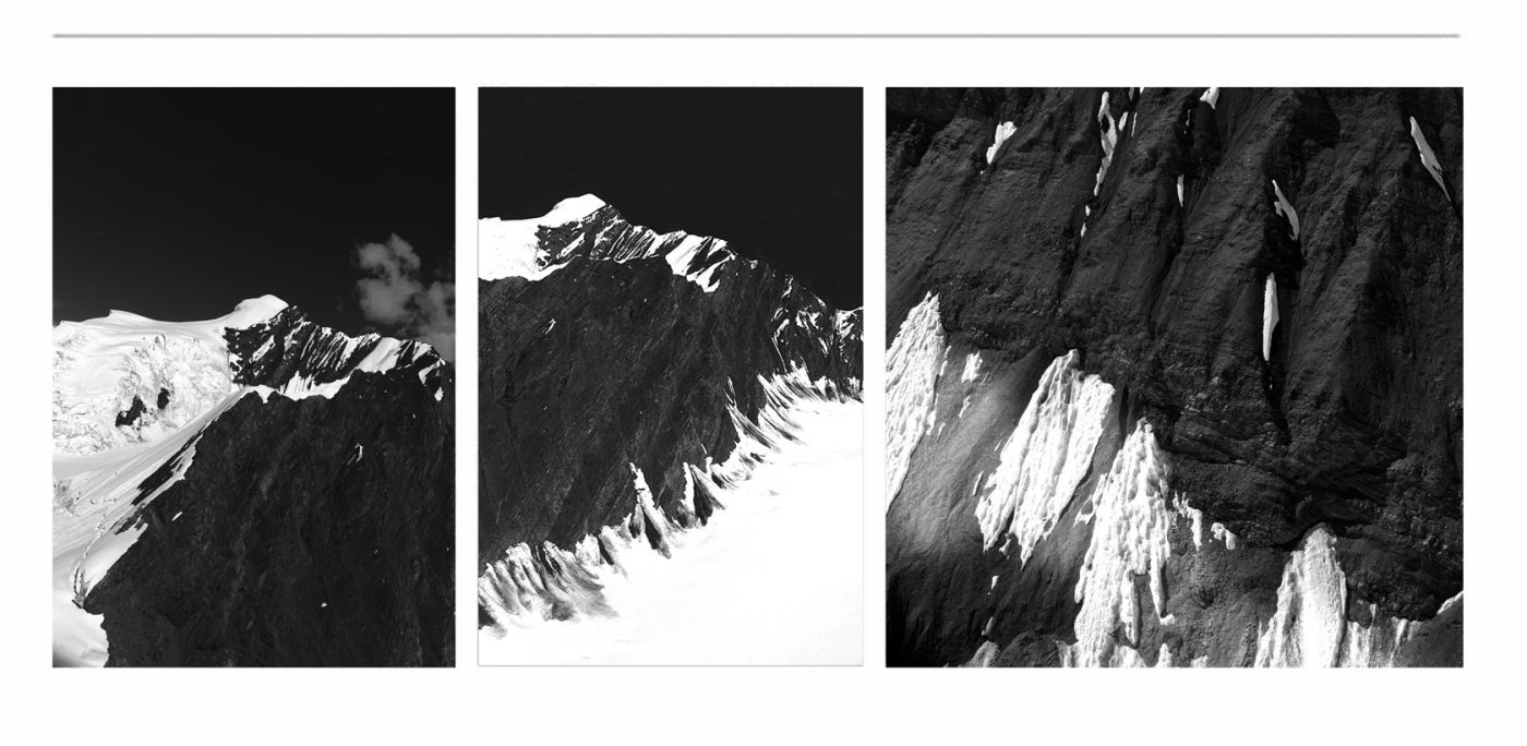
Mountain ➤ “Majestic peaks bathed in golden light — nature’s grandeur painted in every hue”
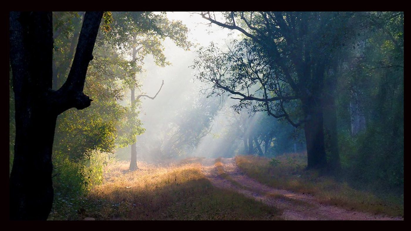
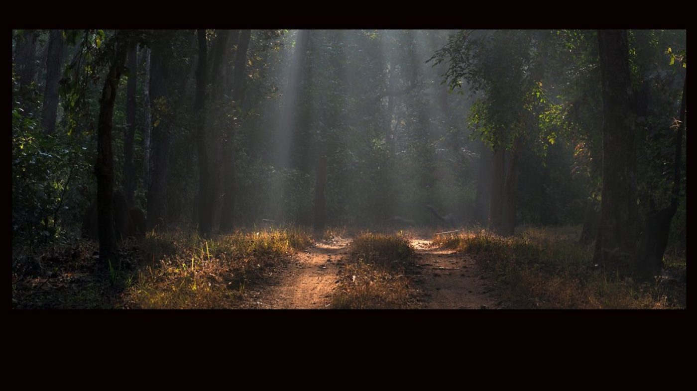
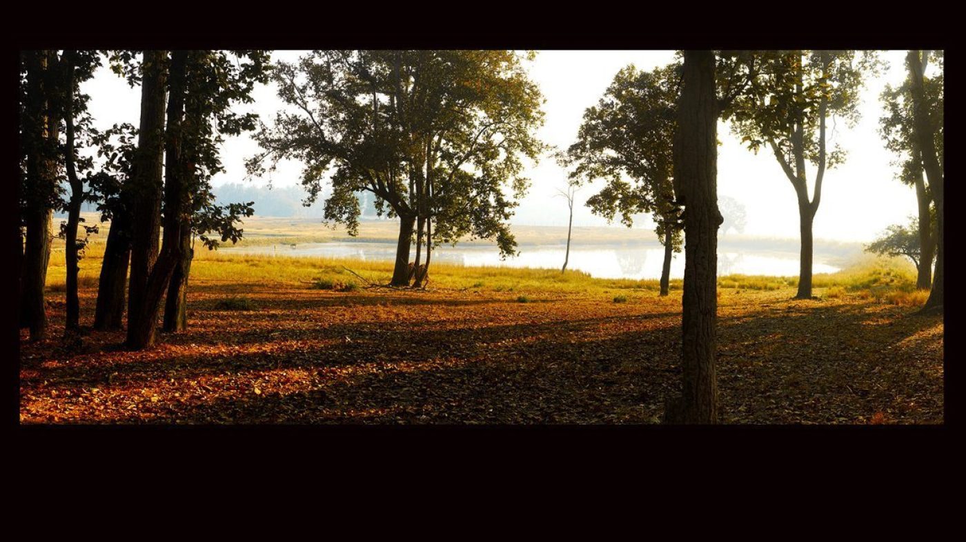
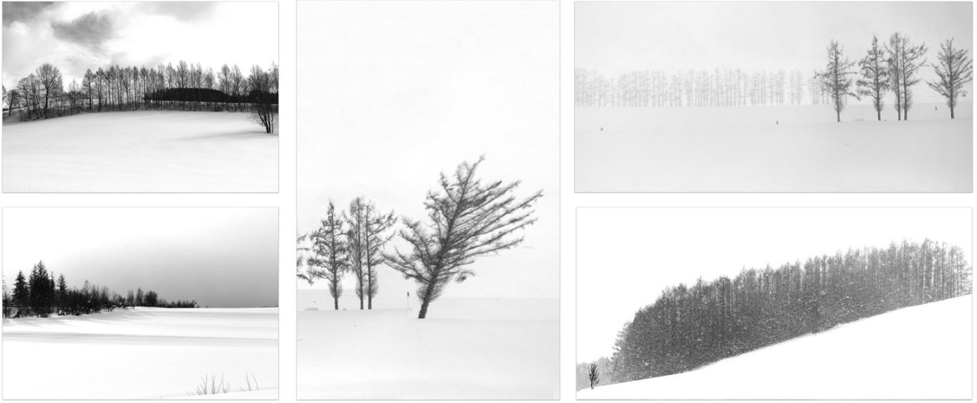
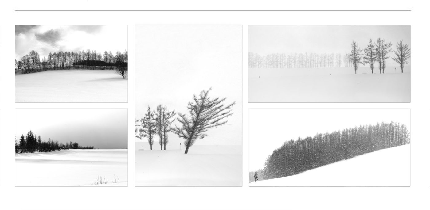
Trees & Woodlands ➤ “Whispers of leaves and dappled sunlight — a living tapestry of green and gold”
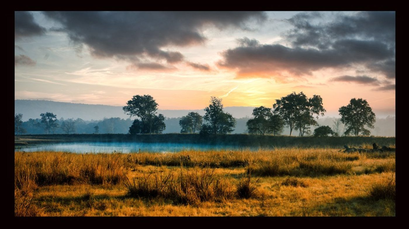
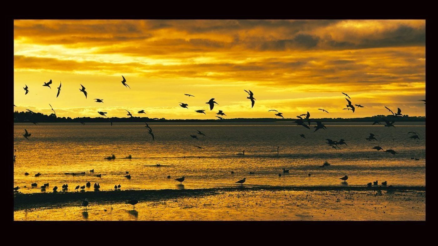
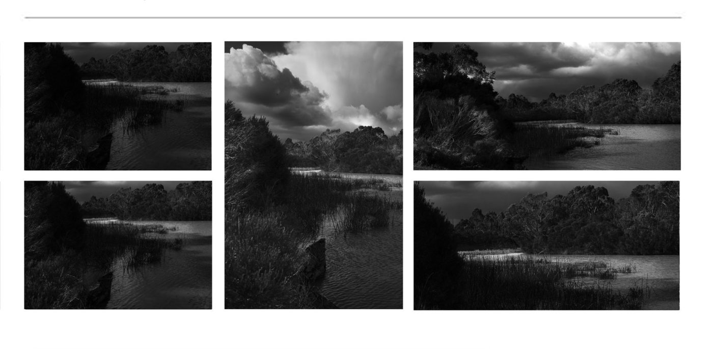
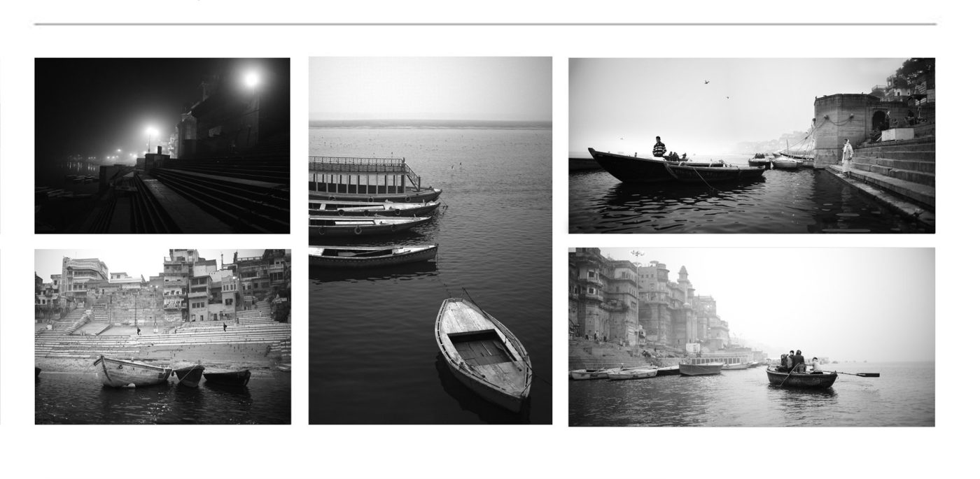
At The Water’s Edge ➤ “Ripples of color dance on tranquil shores — where land and liquid embrace in serene beauty”
Country & Rural Landscapes ➤ “Monochrome whispers of earth and toil — the quiet poetry of open lands”
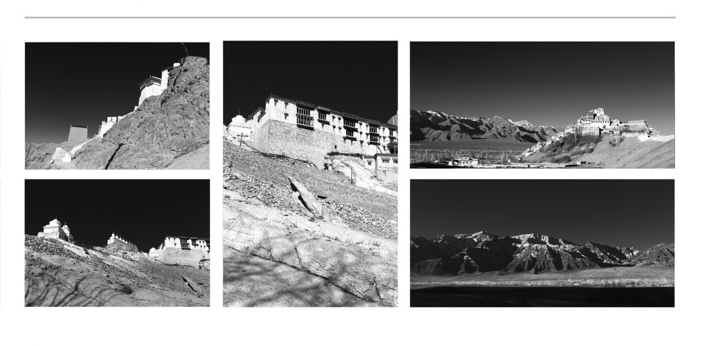
Australian Rural Landscapes ➤ “Shadowed vistas of sunburnt soil — raw beauty in timeless contrast”
The Simple Life – Country Living ➤ “Essence distilled — moments of calm in stark black and white”
Cabin Life & shacks ➤ “Silent shelters bathed in light and shadow — stories carved in wood and time”
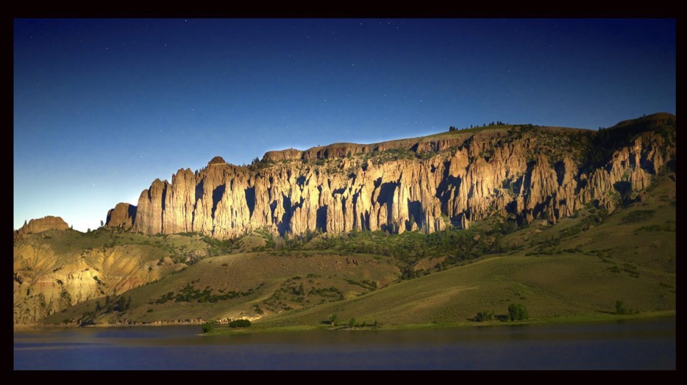
Mountain Landscapes ➤ “Peaks etched in silver and shadow — grandeur carved by nature’s hand”
Trees & Woodlands ➤ “Branches weaving tales in shades of gray — forests alive in monochrome breath”
At The Water’s Edge ➤ “Edges where light and dark meet — reflections of stillness and flow”
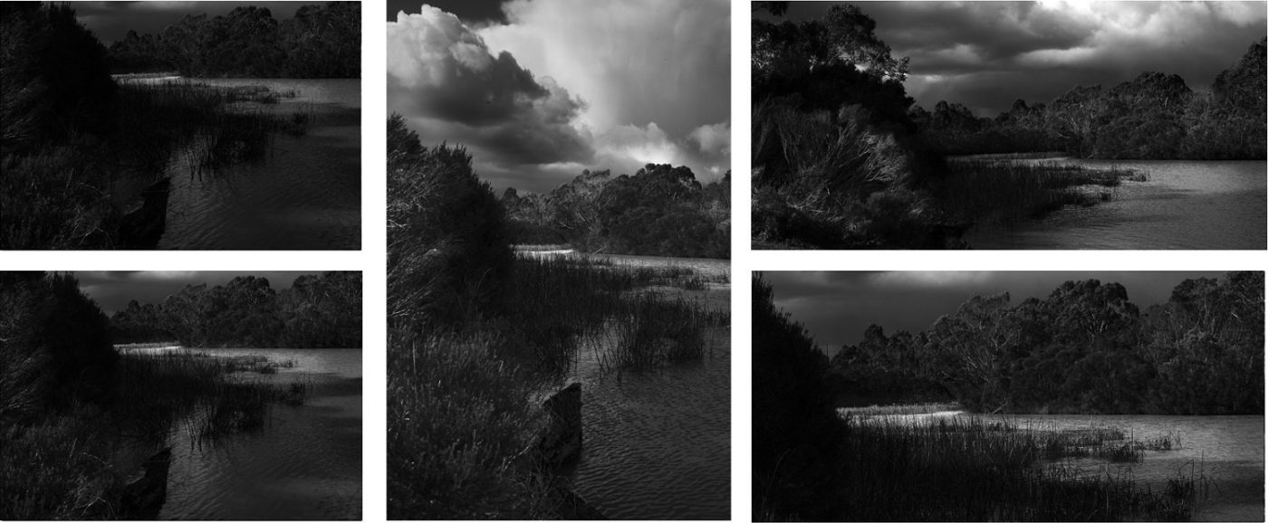
Lakes & Rivers ➤ “Flowing grace captured in stark clarity — water’s endless journey in shades of gray”
Waterfalls ➤ “Cascades frozen in black and white — movement captured in eternal pause”
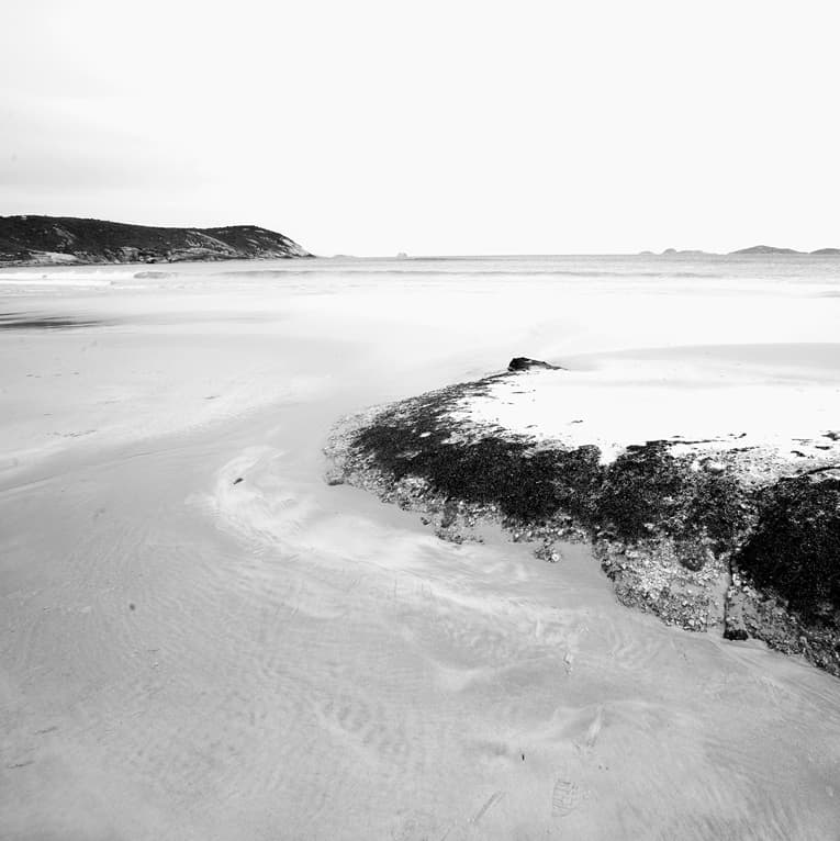
Beach, Coastal & Seascapes ➤ “Silent shores and textured tides — nature’s drama in monochrome waves”
Reflections ➤ “Mirrored worlds in shades of shadow — where reality blurs into dream”
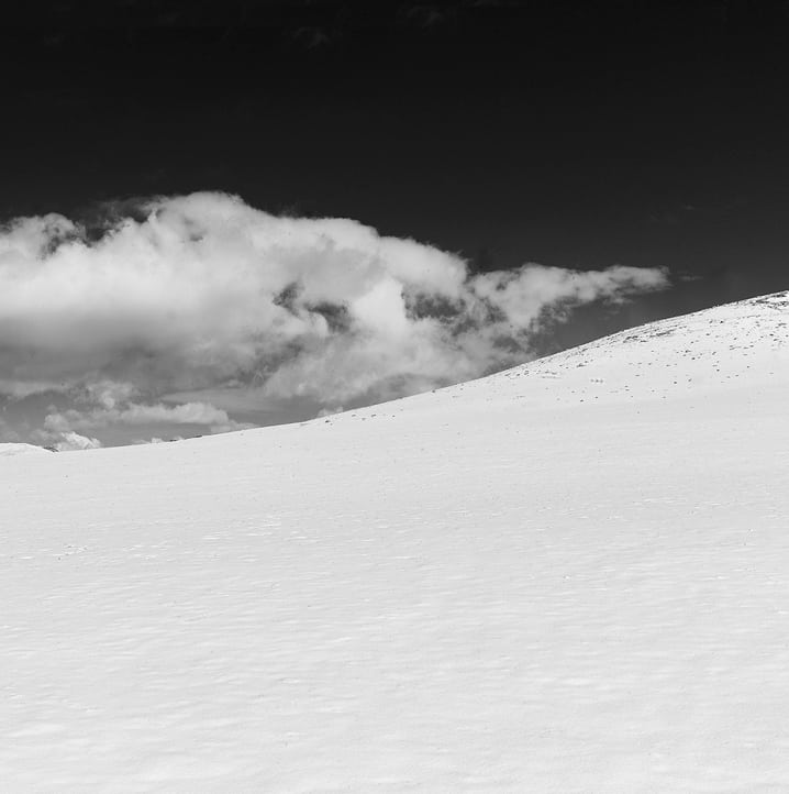
Snowscapes ➤ “White silence pierced by shadow — frozen landscapes of quiet wonder”
Desert & The Outback ➤ “Vastness distilled into contrast — endless horizons in black and white”
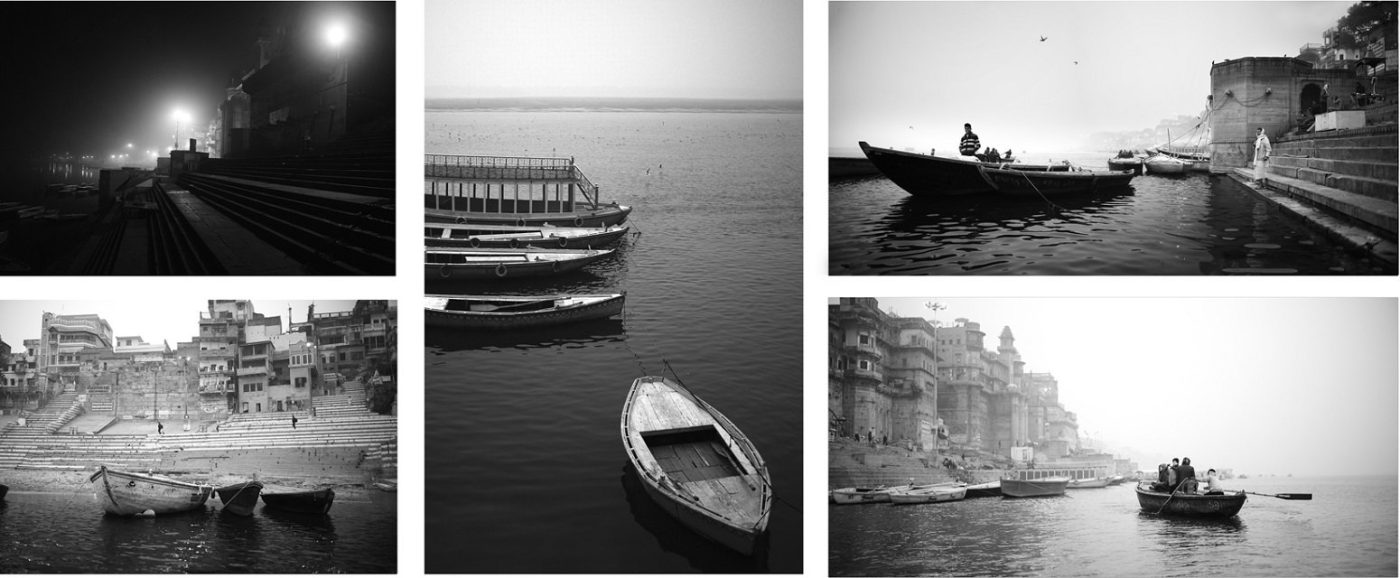
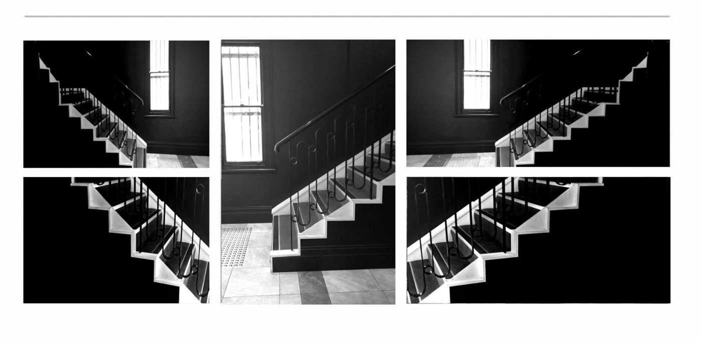
Black and White Photography ➤ “Timeless tales told in shadow and light — where every tone speaks a silent story”
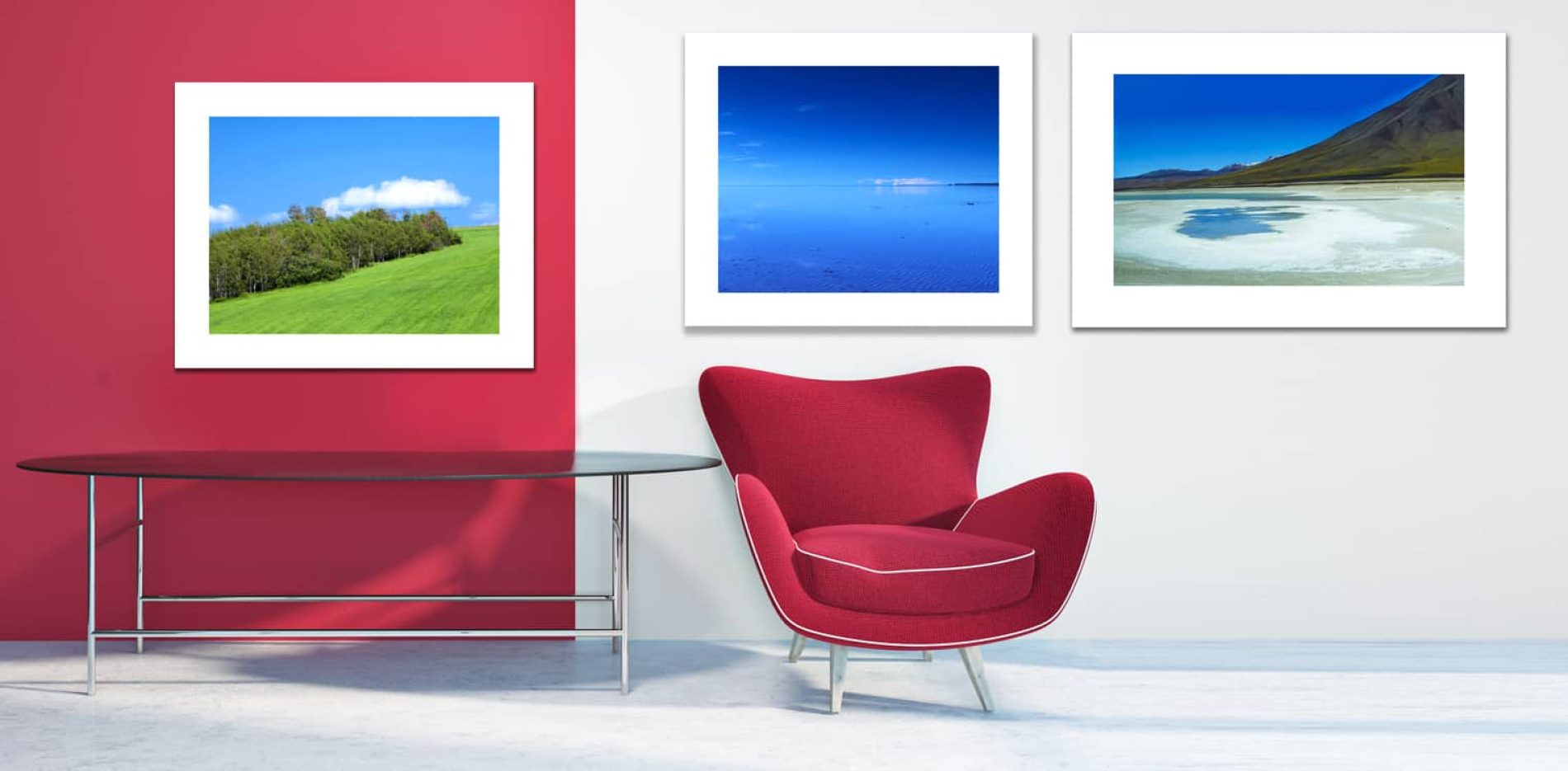
Colour Photography ➤ “A vivid symphony of hues — life captured in its most radiant form”
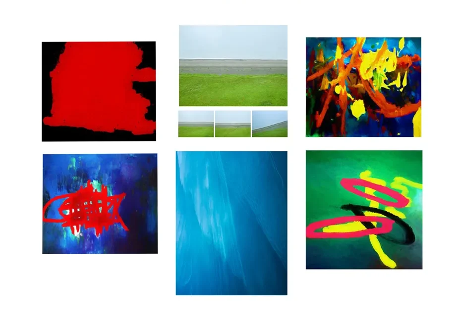
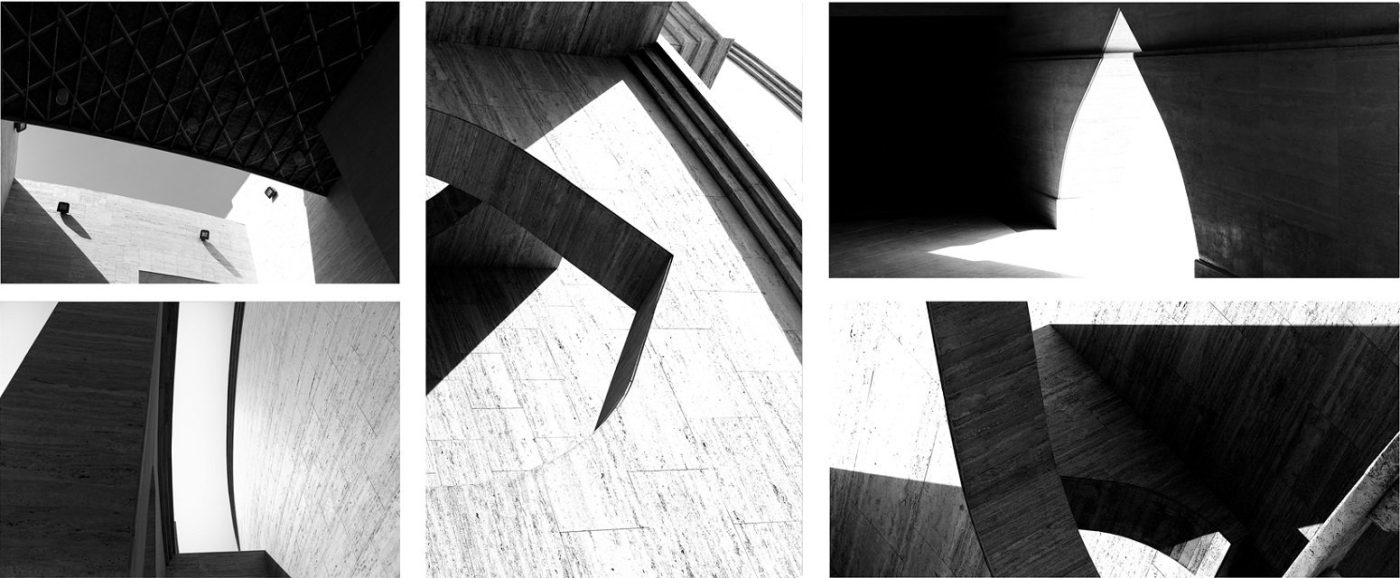
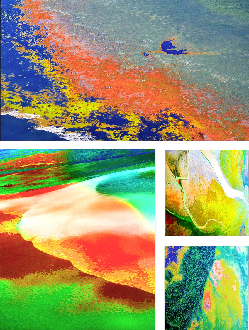
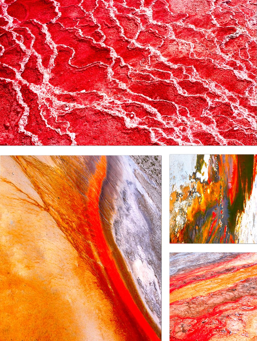
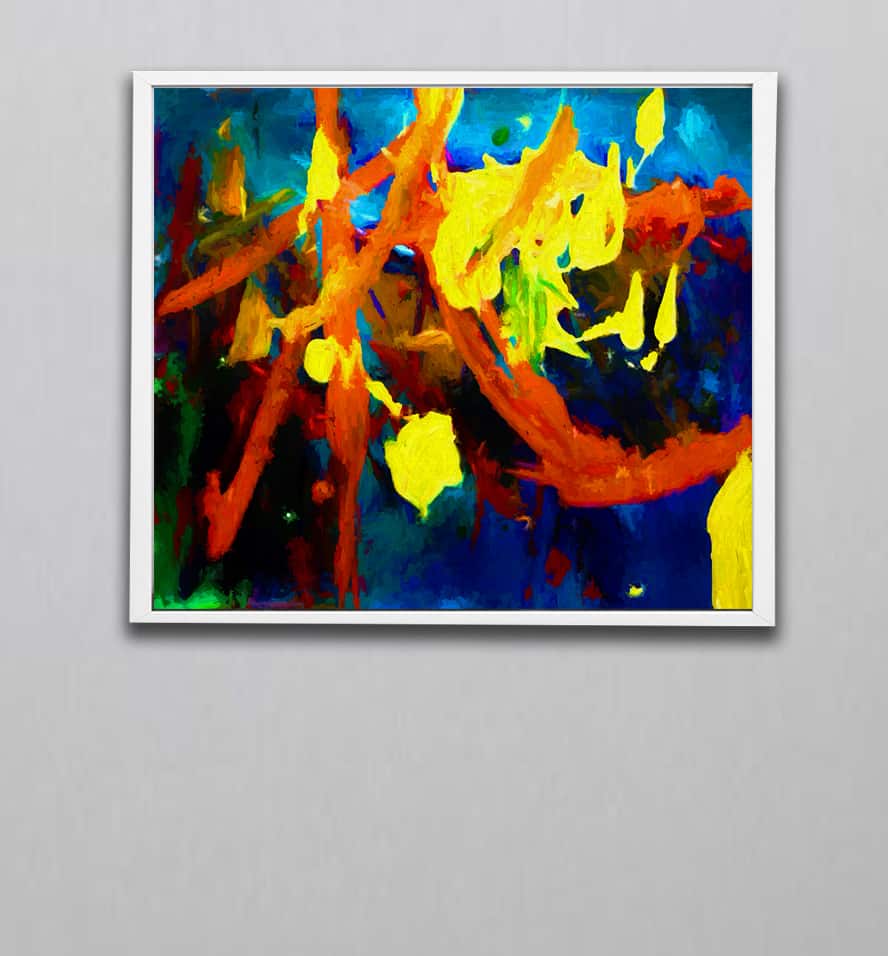
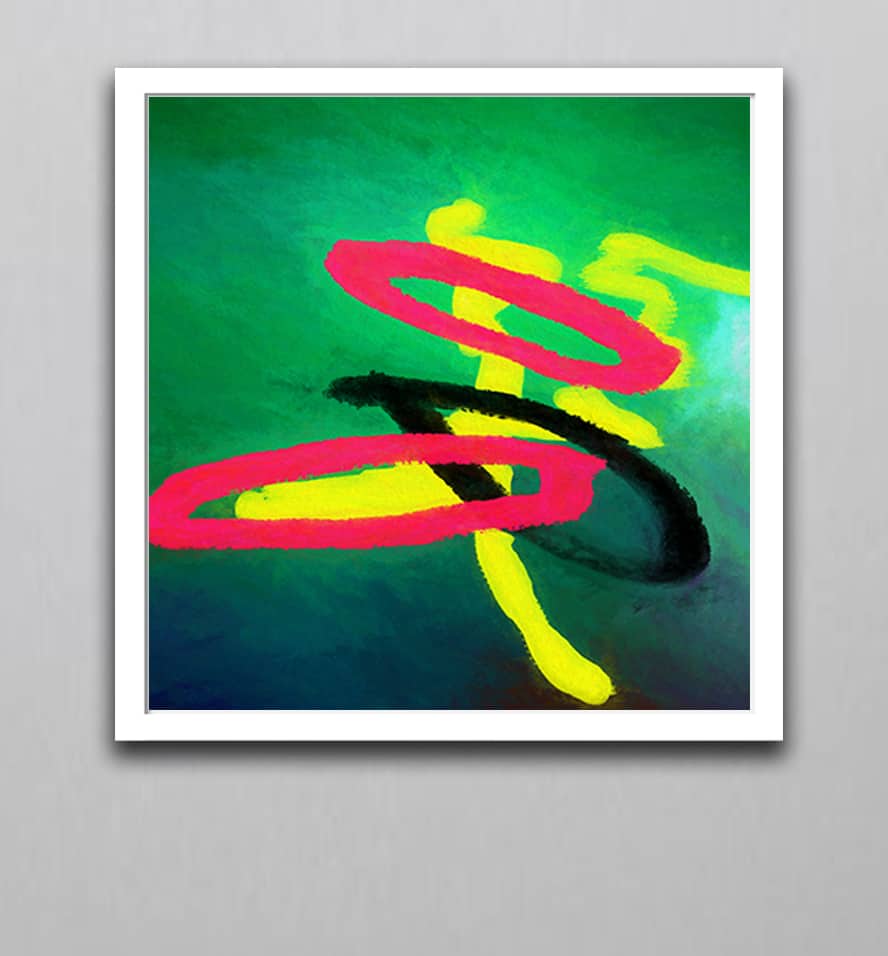
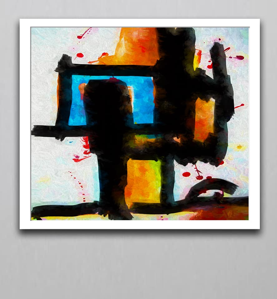
Abstract Art & Abstracted Labdscapes ➤ “Beyond form and figure — emotions and visions woven into pure expression”
Digital Artworks ➤ “Where imagination meets technology — digital dreams crafted with artistic soul”
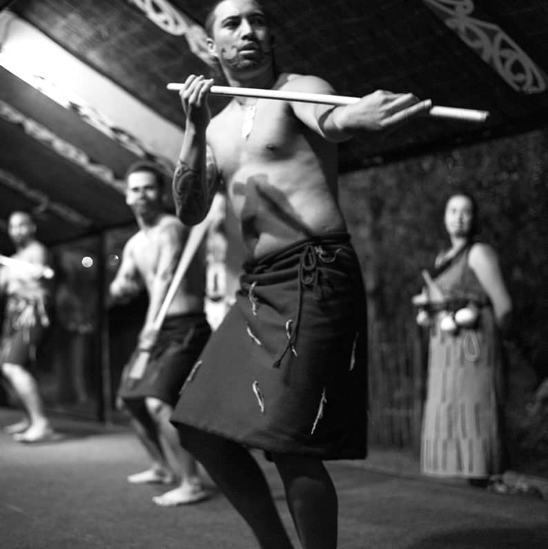
People ➤ “Portraits of the human spirit — stories told through eyes, expressions, and silent moments”
═══════════════════════════════════════════════════


No block ID is set
No block ID is set
SETISFACTION
AFTERPAY
TRADE COURTASY