
Wall Colour and Art: Inspire Every Room with Perfect Pairings
Table of Contents
1. The Psychology of Colour in Interior Design
Explore how colours influence human emotion, behaviour, and perception in various environments. Understand why colour choices matter in both private and public spaces.
2. Colour Meaning and Emotional Impact
Break down key colours—blue, green, white, grey, beige, yellow, red, and more—and their associations with calm, energy, professionalism, comfort, and clarity.
3. Best Wall Colours for Residential Interiors
Recommendations for living rooms, bedrooms, kitchens, bathrooms, and creative spaces, including ideal art pairings to complement each room’s function.
4. Colour Choices for Corporate Offices and Commercial Spaces
Focus on colours that enhance productivity, collaboration, and professionalism—plus what types of artworks best support workplace values and branding.
5. Optimal Colour Palettes for Hotel Interiors
Learn how colour is used to evoke luxury, relaxation, or vibrancy in different parts of a hotel—from lobbies and hallways to guest rooms and spas—with matching art strategies.
6. Healing with Colour: Best Wall Colours in Healthcare Settings
Examine how soft and non-invasive colours like pale blues, greens, and pastels promote healing and trust in hospitals, clinics, and therapy rooms—along with appropriate artwork styles.
7. Choosing Art That Complements Wall Colour
Guidelines for selecting art that enhances rather than clashes with background colour, including contrasts, tone matching, and subject matter alignment.
8. Trends in Colour and Art Pairings
A look at current design trends and expert insights on bold wall colours, monochromatic schemes, and art layering in modern interiors.
9. Common Colour Mistakes in Wall and Art Pairing
Warnings about over-saturation, mismatched tones, colour-temperature clashes, and other pitfalls that compromise space harmony.
10. Creating Atmosphere with Colour and Art
How to design a cohesive, mood-enhancing environment by synchronizing colour, lighting, art placement, and functional needs.
Get to Know the Creative Force Behind the Gallery
About the Artist ➤ “Step into the world of Dr. Zenaidy Castro — where vision and passion breathe life into every masterpiece”
Dr Zenaidy Castro’s Poetry ➤ "Tender verses celebrating the bond between humans and their beloved pets”
Creative Evolution ➤ “The art of healing smiles — where science meets compassion and craft”
The Globetrotting Dentist & photographer ➤ “From spark to masterpiece — the unfolding journey of artistic transformation”
Blog ➤ “Stories, insights, and inspirations — a journey through art, life, and creative musings”
As a Pet mum and Creation of Pet Legacy ➤ “Honoring the silent companions — a timeless tribute to furry souls and their gentle spirits”
Pet Poem ➤ “Words woven from the heart — poetry that dances with the whispers of the soul”
As a Dentist ➤ “Adventures in healing and capturing beauty — a life lived between smiles and lenses”
Cosmetic Dentistry ➤ “Sculpting confidence with every smile — artistry in dental elegance”
Founder of Vogue Smiles Melbourne ➤ “Where glamour meets precision — crafting smiles worthy of the spotlight”
Unveil the Story Behind Heart & Soul Whisperer
The Making of HSW ➤ “Journey into the heart’s creation — where vision, spirit, and artistry converge to birth a masterpiece”
The Muse ➤ “The whispering spark that ignites creation — inspiration drawn from the unseen and the divine”
The Sacred Evolution of Art Gallery ➤ “A spiritual voyage of growth and transformation — art that transcends time and space”
Unique Art Gallery ➤ “A sanctuary of rare visions — where each piece tells a story unlike any other”
1. The Psychology of Colour in Interior Design – Wall Colour and Art: Perfect Pairings for Every Space
???? Imagine stepping into a space where colour breathes life, and artwork whispers stories of calm, joy, or inspiration. Wall Colour and Art together craft atmospheres that heal, energize, and enchant every heart that enters.
Colour is not simply a decorative choice—it is a powerful psychological tool that shapes how people feel, think, and behave within a space. In interior design, colour is used to evoke emotion, signal intention, define function, and enhance atmosphere. Whether subtle or bold, the hues chosen for walls, floors, furniture, and artwork contribute directly to the overall experience of a room.
Psychological studies in colour theory consistently demonstrate that colour influences our physiological responses. It can alter heart rate, affect mood, and even influence decision-making. For example, warm colours like red and orange tend to stimulate energy and appetite, while cool colours like blue and green calm the mind and body. This makes understanding colour psychology critical for those designing spaces with specific emotional goals in mind—be it focus and productivity in offices, tranquility and wellness in hospitals, or hospitality and elegance in hotels.
Cognitive and Emotional Associations of Colour
Each colour family carries psychological symbolism rooted in both cultural and universal associations:
- Red signifies passion, urgency, or stimulation. It’s bold, energizing, and ideal for social or activity-driven areas.
- Blue evokes serenity, trust, and intelligence. It’s frequently used in bedrooms, offices, and medical settings.
- Yellow suggests cheerfulness and optimism but can also overstimulate if overused.
- Green symbolizes nature, balance, and calm. It’s healing and works well in bedrooms and healthcare environments.
- White implies purity, openness, and minimalism, but excessive use can feel sterile.
- Grey is neutral, professional, and subdued. It conveys calm but may appear cold without warmth in accents or artwork.
- Beige and earth tones foster groundedness, warmth, and hospitality.
These colour-emotion associations help designers craft environments that align with the psychological needs of their users.
Colour in Private vs. Public Spaces
The impact of colour shifts depending on context:
- In homes, colour choices often reflect personal identity and emotional comfort. The palette may vary widely between rooms—soothing in bedrooms, energizing in kitchens, creative in studios.
- In offices, colour becomes a strategic tool to boost productivity, focus, and brand identity.
- In hotels, it supports branding while creating atmospheric differentiation between spaces: vibrant in lobbies, soothing in guest rooms, luxurious in spas.
- In hospitals and clinics, colour plays a therapeutic role, creating reassurance, calm, and emotional safety.
Designers must always consider the space’s function, emotional tone, and lighting when selecting wall colour and corresponding artworks.
Colour as a Narrative and Spatial Guide
Beyond mood setting, colour helps structure movement and guide attention within a room. For instance:
- A boldly painted accent wall draws the eye and can spotlight a featured artwork.
- Gradual changes in wall tone from room to room help signal different functional zones (e.g., quiet reading nook vs. energetic gym area).
- Repetition of a colour theme throughout a home or hotel suite can provide continuity and a sense of intentional design.
In these cases, colour becomes part of the visual rhythm of the space, harmonizing with architecture and art.
Colour Sensitivity and Cultural Variations
It’s essential to consider that colour perception can be culturally specific:
- Red, while symbolizing danger or love in Western cultures, is associated with luck and prosperity in China.
- White, associated with purity in Western traditions, is linked to mourning in some Eastern cultures.
- Black, while chic and modern in urban interior design, may be associated with grief in traditional contexts.
Therefore, in spaces that serve multicultural populations—such as international hotels or hospitals—designers may choose a neutral, universally calming palette enhanced by localized accents.
Synchronizing Wall Colour and Artwork for Psychological Harmony
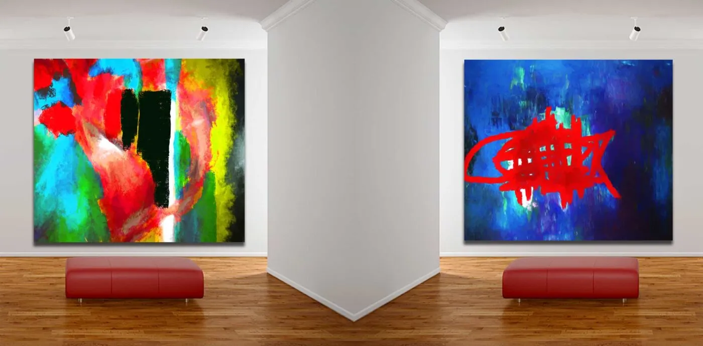
Art and colour should work in concert. An intense, emotive painting hung against a brightly coloured wall can feel overwhelming, while a subtle abstract print on a similarly hued background may vanish into the surroundings. The goal is to either enhance contrast for visibility or complement the tones for seamless integration.
Successful art-and-colour combinations consider:
- Contrast vs. harmony: Use contrasting colours for dramatic effect or analogous tones for calm.
- Tone and saturation: Muted art pairs better with deep wall tones, while vibrant pieces shine on neutral backgrounds.
- Content alignment: Abstract art can match bold or subtle walls, while photographic prints benefit from colour continuity.
Lesson:
Understanding the psychology of colour transforms art display into a tool for emotional, spatial, and cultural expression. Designers, curators, and homeowners who use colour intentionally can elevate the sensory and symbolic impact of any environment.
Summary of Key Points:
- Colour affects mood, behaviour, and perception.
- Every hue has specific emotional associations.
- Context—home, office, hotel, hospital—determines the ideal colour palette.
- Colour can guide movement, create continuity, and shape experience.
- Cultural meaning of colour should be considered for international or diverse environments.
- Colour and artwork should work in sync to avoid conflict or dilution of impact.
- The psychology of colour is central to successful and thoughtful interior design.
2. Colour Meaning and Emotional Impact
Colours are more than aesthetic decisions—they are emotional statements. Each hue has a specific psychological signature that influences how people feel, think, and behave in a space. Whether bold or muted, warm or cool, light or dark, colours speak silently yet powerfully in the background of our lives. When selected intentionally, wall colours can reinforce the purpose of a room and heighten the impact of any artwork displayed within it.
In interior environments, colour meaning is shaped by both biology and culture. Our brains are wired to associate certain colours with specific emotions or functions. At the same time, cultural backgrounds, personal memories, and even generational preferences shape how individuals respond to specific tones. For designers and curators, understanding these emotional nuances allows for spaces that are not only beautiful but psychologically attuned.
Red: Energy, Passion, and Attention
Red is perhaps the most emotionally intense colour. It stimulates the adrenal system and has been shown to increase heart rate and excitement levels.
- Ideal for: Dining rooms, social areas, restaurants, creative studios.
- Paired Art: Abstracts with dynamic lines, expressive figurative works, pop art.
Because red draws immediate attention, it works best as an accent wall or focal feature. Overuse can lead to tension or overstimulation, so moderation is key.
Blue: Trust, Calm, and Focus
Blue is associated with peace, reliability, and intellectual clarity. Lighter shades soothe and lower blood pressure, while darker blues suggest professionalism and authority.
- Ideal for: Bedrooms, offices, libraries, clinics.
- Paired Art: Minimalist compositions, fine art photography, monochromatic abstract work.
Blue creates a feeling of spaciousness and quiet authority. It harmonizes particularly well with grayscale art or cool-toned visuals.
Green: Balance, Restoration, and Renewal
As the colour most found in nature, green is inherently soothing. It balances emotional tone, encourages rest, and supports healing.
- Ideal for: Bedrooms, hospitals, meditation spaces, waiting rooms.
- Paired Art: Botanical illustrations, landscape photography, abstract organic forms.
Greens with warm undertones add comfort, while cooler greens foster contemplation. It’s a universally versatile colour with minimal emotional conflict.
Yellow: Optimism, Warmth, and Alertness
Yellow stimulates mental activity and encourages warmth and cheer. Bright yellows energize, while muted mustards and ochres add sophistication.
- Ideal for: Kitchens, entryways, learning environments, children’s spaces.
- Paired Art: Graphic prints, joyful figurative scenes, geometric abstracts.
Overuse of bright yellow can cause fatigue or anxiety, so balance with neutral tones or calming textures.
Orange: Sociability and Vibrancy
Orange is a combination of red’s energy and yellow’s friendliness. It promotes conversation, appetite, and social engagement.
- Ideal for: Cafés, coworking spaces, break rooms.
- Paired Art: Folk art, playful contemporary works, multi-colour mixed media.
Best used in lively spaces, orange is not ideal for rooms requiring focus or rest.
Purple: Creativity, Mystery, and Luxury
Historically linked with royalty and mysticism, purple creates a dramatic, artistic atmosphere. Lighter purples feel whimsical; darker tones feel regal.
- Ideal for: Creative spaces, luxury lounges, boutique hotel rooms.
- Paired Art: Surrealist work, conceptual photography, moody colour studies.
Used strategically, purple can define a space’s identity with elegance and intrigue.
White: Clarity, Simplicity, and Modernity
White is clean, reflective, and open. It expands visual space and offers neutrality, allowing art and furniture to stand out.
- Ideal for: Galleries, modern homes, healthcare facilities.
- Paired Art: Bold coloured works, large-scale black and white photography, minimalist sculptures.
However, too much white without texture or contrast can feel sterile or impersonal.
Grey: Sophistication, Restraint, and Professionalism
Grey is cool, controlled, and versatile. It serves as a stable base for nearly any colour palette.
- Ideal for: Corporate offices, executive suites, urban residences.
- Paired Art: Metallics, architectural photography, textural abstracts.
Balancing grey with warmer accents or vibrant artworks prevents spaces from feeling overly subdued.
Beige and Earth Tones: Comfort and Approachability
These neutrals offer warmth, familiarity, and safety. Earth tones create grounded environments that feel lived-in and welcoming.
- Ideal for: Hotels, family homes, lobbies.
- Paired Art: Figurative paintings, vintage prints, landscape or wildlife art.
These colours serve as a background for curated comfort and timeless appeal.
Black: Depth, Drama, and Focus
Black, when used thoughtfully, creates contrast and intimacy. It emphasizes other colours and adds a bold, grounding presence.
- Ideal for: Accent walls, contemporary galleries, urban interiors.
- Paired Art: Monochromes, metallics, light-based or neon works.
A little goes a long way—black works best as a framing device or dramatic base.
Colour Temperature and Emotional Tone
Colours also have temperature:
- Warm colours (red, orange, yellow) energize and create intimacy.
- Cool colours (blue, green, violet) calm and expand perceived space.
Warm palettes are great for sociable or small spaces, while cool palettes suit large or tranquil areas. A balance of both creates dimensional emotional layering.
Cultural Adaptability of Colour Symbolism
Though many colour meanings are universal, some shift by culture:
- Red is festive in China but often signals warning in the West.
- White means purity in many Western cultures but mourning in others.
- Black denotes elegance in fashion but is avoided in pediatric spaces.
Designers working globally must consider cultural diversity in choosing wall colour.
Pairing Art with Emotional Intent
Ultimately, colour isn’t just about wall paint—it’s about storytelling. Colour sets the tone, and art delivers the message. Their interplay must be deliberate:
- Choose artwork that either echoes the wall’s mood or provides an intentional contrast.
- Avoid artworks that compete with the wall for attention.
- Let colour guide the viewer’s emotional journey, from tension to relief, from stimulation to serenity.
Lesson:
Understanding the emotional meaning of colour empowers thoughtful, impactful design. Whether you’re crafting a tranquil retreat, a vibrant restaurant, or a professional boardroom, colour and art together create the emotional framework of the space.
Summary of Key Points:
- Each colour carries emotional meaning that influences perception and behaviour.
- Specific colours suit specific rooms and functions.
- Cultural context and personal preference must inform colour choices.
- Pairing artwork with wall colour amplifies psychological and aesthetic impact.
- Colour temperature affects atmosphere—warm for energy, cool for calm.
- Colour and art must work together to support the emotional purpose of a space.
???? Ready to elevate your interiors? Explore curated fine art designed to weave harmony, beauty, and emotion into every wall and every room.➤
═════════════════════════════════════════════════════
Transform your interiors into soulful sanctuaries. Discover fine art curated to bring balance, elegance, and warmth to every space you create.
Create interiors where colours and art unite in perfect harmony. Heart & Soul Whisperer Art Gallery offers curated artworks for corporate spaces, hospitality venues, and healing environments. Thoughtfully chosen pieces transform every wall into an expression of emotion, style, and serenity.
Design spaces that inspire — partner with Heart & Soul Whisperer for art that speaks to every room.
SHOP NOW FOR OUR LIMITED EDITIONS PHOTOGRAPHIC PRINTS & ABSTRACT ART
???? Request a Corporate Art Proposal | Start Your Custom Art Consultation ????
═════════════════════════════════════════════════════
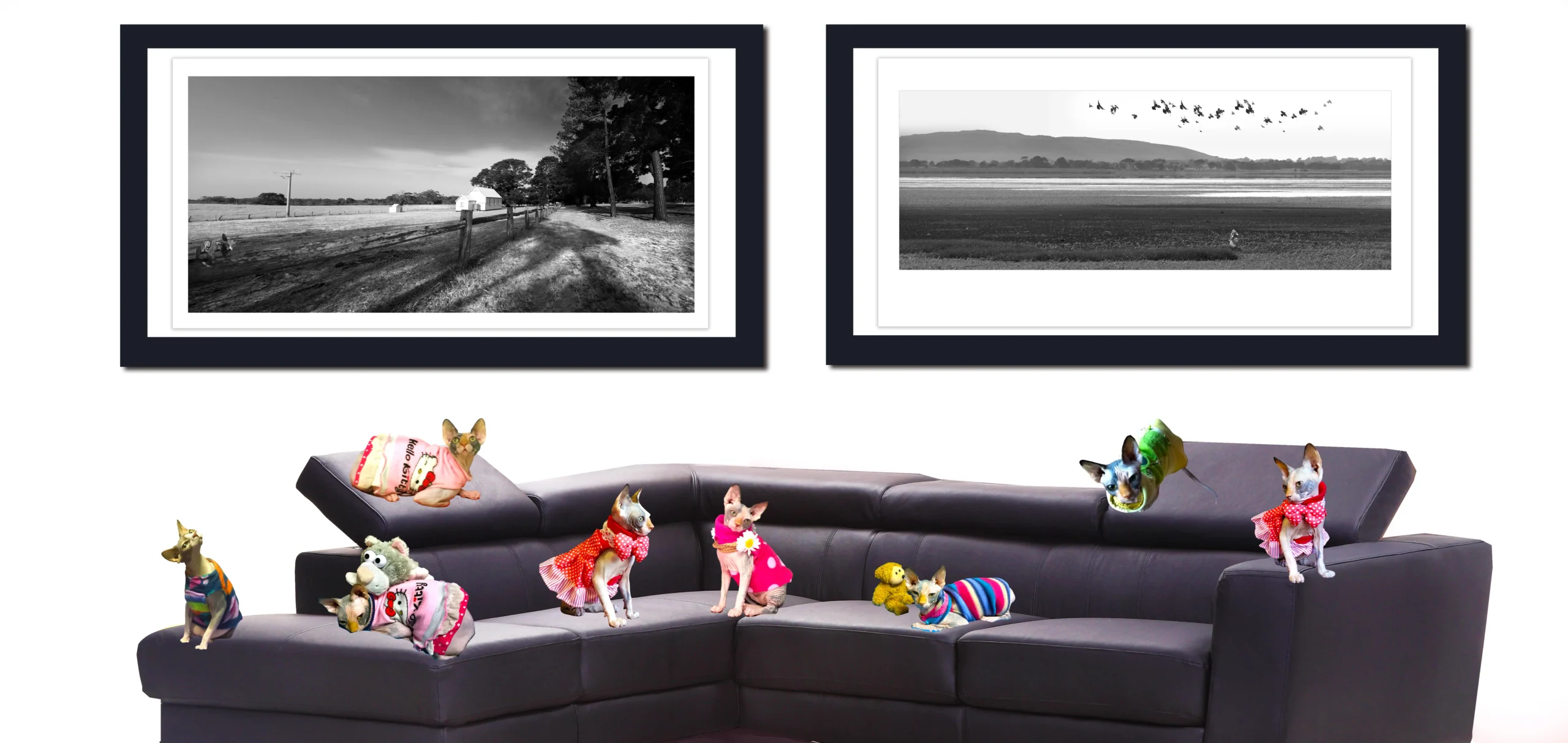
3. Best Wall Colours for Residential Interiors
When designing a home, colour choices are often deeply personal. Yet, beyond personal taste lies a more strategic layer of decision-making: selecting colours that enhance the function, mood, and aesthetic flow of each space. Residential interiors benefit the most from an informed balance of psychological intention, lifestyle consideration, and art curation. This section provides room-by-room guidance for wall colour selection and ideal art pairings to elevate domestic environments.
Living Room: Warmth, Sociability, and Elegance
The living room is often the centerpiece of the home—a space for entertaining, relaxing, and reflecting one’s personal taste. The wall colour should provide a versatile backdrop for various activities and shift comfortably between day and night lighting.
- Best Colours: Soft beige, dove grey, warm white, muted sage, navy blue.
- Effect: Neutral tones create a canvas for furniture and art, while deeper colours offer cozy sophistication.
- Ideal Art Pairings: Large-scale abstracts, family portraits, framed textiles, or black and white photography.
A mix of textures—canvas, metallic, wood framing—adds warmth. Avoid overly bright hues unless aiming for a statement wall.
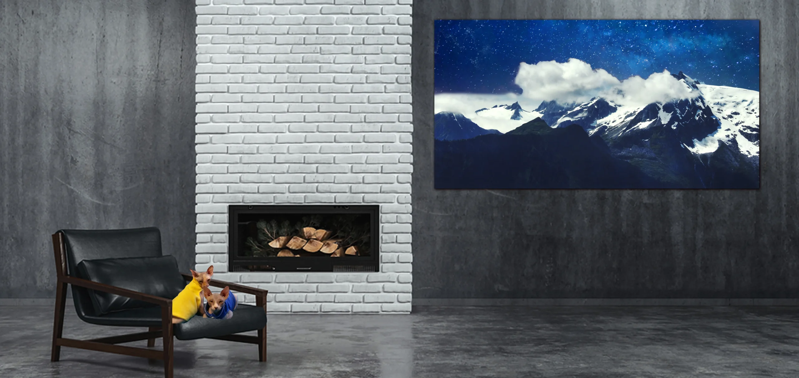
Bedroom: Tranquility and Comfort
Bedrooms are sanctuaries. The wall colour should promote calm, sleep, and restorative emotion. Lighting—often softer here—should also inform the palette.
- Best Colours: Pale blues, misty greens, soft lavender, charcoal, warm taupe.
- Effect: Calming, introspective, and nurturing atmospheres.
- Ideal Art Pairings: Minimalist prints, nature photography, abstract watercolors, or textured monochrome works.
Avoid high-stimulation colours like bright red or orange unless used sparingly in art or decor accents.
Kitchen: Energy, Cleanliness, and Brightness
Kitchens benefit from clean, fresh, and stimulating hues that inspire creativity and interaction while also feeling hygienic.
- Best Colours: Crisp white, buttery yellow, light sage, pale grey, terracotta.
- Effect: Uplifted energy, hygiene, and hospitality.
- Ideal Art Pairings: Culinary-themed illustrations, vintage posters, botanical prints, or food photography.
Choose art that can withstand humidity and frequent cleaning—framed behind glass or printed on durable materials.
Dining Room: Intimacy and Focus
Dining rooms are spaces for togetherness, meals, and rituals. Colour should promote warmth and concentration without overwhelming the senses.
- Best Colours: Burgundy, olive green, deep navy, mocha, warm taupe.
- Effect: Sophistication and intimacy.
- Ideal Art Pairings: Classic still lifes, local landscapes, portraiture, or geometric abstracts.
Dimmer lighting works well in these rooms—make sure wall colours look good under evening light.
Bathroom: Cleanliness, Clarity, and Space Expansion
Bathrooms benefit from colours that evoke hygiene, relaxation, and an illusion of space. Often compact, these rooms benefit from light-enhancing tones.
- Best Colours: Seafoam green, icy blue, soft white, greige, blush pink.
- Effect: Spa-like calm and cleanliness.
- Ideal Art Pairings: Ocean-themed works, botanical sketches, minimalist photography.
Moisture-resistant framing or glass is essential. Wall art should not crowd the space—one or two well-placed works are enough.
Home Office: Focus and Clarity
Productivity, clarity, and creative stimulation are essential in home workspaces. Colour should energize the mind while reducing visual distractions.
- Best Colours: Soft greys, pale green, warm white, dusty blue.
- Effect: Calm productivity and visual clarity.
- Ideal Art Pairings: Motivational quotes, minimalist prints, abstract landscapes, or photography of open spaces.
Stick to matte paints to reduce glare. Use colours that contrast your furniture and device tones without competing.
Children’s Rooms: Creativity and Comfort
These spaces should be imaginative yet grounding. Colour selection can vary based on age, but comfort and flexibility are essential.
- Best Colours: Mint green, sky blue, butter yellow, lilac, peach.
- Effect: Joy, safety, and adaptability.
- Ideal Art Pairings: Illustrated animals, whimsical themes, colourful collages, or interactive art.
Avoid oversaturation—opt for pastels or muted tones that can evolve with the child.
Entryways and Hallways: Transition and Tone Setting
These often-overlooked areas set the first impression. Colour should welcome, guide, and create continuity.
- Best Colours: Soft white, warm beige, slate grey, dusty rose, pale green.
- Effect: Flow, invitation, and cohesion with adjacent rooms.
- Ideal Art Pairings: Gallery-style photo collections, mirrors, curated prints, or travel photography.
Use consistent framing or colour schemes to establish visual rhythm across transitions.
Lesson:
In residential interiors, wall colour shapes emotional tone, functionality, and artistic potential. When matched with well-chosen art, each room becomes more than a space—it becomes an experience that resonates with the rhythms of daily life.
Summary of Key Points:
- Choose wall colours based on room function, lighting, and emotion.
- Match artworks to room tone—calm for bedrooms, bold for kitchens, focused for offices.
- Use texture and scale in art to complement or soften colour choices.
- Prioritize durability and visual clarity, especially in high-use areas.
- Coordinate art and colour to create continuity between rooms and enhance mood.
4. Colour Choices for Corporate Offices and Commercial Spaces
Corporate spaces and commercial interiors demand a strategic approach to colour. Unlike homes, which reflect personal identity, office environments must balance functionality, professionalism, branding, and employee well-being. Wall colour in these contexts communicates values, encourages productivity, and supports psychological comfort, making it a foundational component of workplace design. When paired with thoughtfully selected artwork, colour helps define a company’s culture and mood.
Reception and Lobby Areas: First Impressions and Branding
The lobby or reception area sets the tone for both clients and employees. It should reflect brand identity while promoting calm and confidence.
- Best Colours: Charcoal grey, navy, soft beige, modern white, brand-accent hues.
- Effect: Professionalism, authority, trust.
- Ideal Art Pairings: Large-scale corporate photography, abstract paintings in brand colours, historical or local cultural themes.
Avoid overly personal or whimsical artwork. These areas should signal strength and clarity.
Executive Offices: Authority and Focus
Senior offices benefit from a blend of gravitas and aesthetic refinement. Colour should support decision-making and reduce stress.
- Best Colours: Rich greys, taupe, olive green, muted navy, espresso.
- Effect: Grounded thinking, control, quiet power.
- Ideal Art Pairings: Architectural photography, monochrome abstracts, conceptual prints.
Use artworks that reflect leadership ideals, innovation, or aspirational values.
Open Plan Work Areas: Energy, Clarity, and Neutrality
Open layouts benefit from colours that stimulate focus without overwhelming the senses.
- Best Colours: Light grey, soft white, sky blue, pale green.
- Effect: Concentration, collaboration, stress reduction.
- Ideal Art Pairings: Modular art panels, nature-inspired abstracts, clean geometric art.
Avoid intense warm hues that may lead to fatigue or distraction.
Meeting and Conference Rooms: Neutrality and Collaboration
Spaces for discussion and strategy benefit from neutral tones that equalize mood and minimize hierarchy.
- Best Colours: Slate, warm beige, forest green, clean ivory.
- Effect: Calm, negotiation, clarity.
- Ideal Art Pairings: Map-based art, collaborative artwork (e.g., employee-sourced), inspirational photography.
Ensure visual balance behind screens or presentation areas to prevent distraction.
Break Rooms and Cafeterias: Invigoration and Social Energy
These spaces should encourage relaxation, refreshment, and positive interaction.
- Best Colours: Light orange, soft coral, mint green, pastel yellow.
- Effect: Cheerfulness, reset, social bonding.
- Ideal Art Pairings: Playful art, motivational prints, food-inspired illustrations, collaborative employee art.
Keep it lively but avoid clashing tones—use a dominant hue with complementary accents.
Hallways and Transitional Zones: Continuity and Orientation
Corridors and transitional spaces guide flow and unify the visual language of the office.
- Best Colours: Neutral gradients, brand colour bands, light warm grey.
- Effect: Wayfinding, unity, direction.
- Ideal Art Pairings: Framed awards, gallery-style company culture displays, art highlighting history or milestones.
These areas can support subtle branding and reinforce corporate storylines.
Creative Departments and Design Studios: Innovation and Flexibility
In departments that thrive on imagination, colour should fuel experimentation and joy.
- Best Colours: Lavender, deep teal, bright white, warm greys with accent walls.
- Effect: Playfulness, inspiration, momentum.
- Ideal Art Pairings: Contemporary mixed media, design-themed art, artist collaborations.
Consider writable walls or art installations that evolve over time.
Lesson:
Corporate colour decisions affect brand perception, employee mood, and visitor impression. When carefully paired with complementary art, wall colours enhance productivity, signal identity, and transform corporate interiors into purposeful, human-centred environments.
Summary of Key Points:
- Select colours based on departmental function and brand alignment.
- Use neutral tones in open areas and bold accents in lobbies or break rooms.
- Pair art and colour to reflect company culture, mission, and mood.
- Use lighting and layout to enhance colour performance and reduce visual fatigue.
- Let colour unify the workspace while allowing for flexibility across departments.
???? Transform your interiors into soulful sanctuaries. Discover fine art curated to bring balance, elegance, and warmth to every space you create.➤
═════════════════════════════════════════════════════
Transform your interiors into soulful sanctuaries. Discover fine art curated to bring balance, elegance, and warmth to every space you create.
Create interiors where colours and art unite in perfect harmony. Heart & Soul Whisperer Art Gallery offers curated artworks for corporate spaces, hospitality venues, and healing environments. Thoughtfully chosen pieces transform every wall into an expression of emotion, style, and serenity.
Design spaces that inspire — partner with Heart & Soul Whisperer for art that speaks to every room.
SHOP NOW FOR OUR LIMITED EDITIONS PHOTOGRAPHIC PRINTS & ABSTRACT ART
???? Request a Corporate Art Proposal | Start Your Custom Art Consultation ????
═════════════════════════════════════════════════════
5. Optimal Colour Palettes for Hotel Interiors
Hotel interiors are designed to provide comfort, escape, and atmosphere—often simultaneously. Each space within a hotel must fulfill a distinct emotional and functional role, from offering an inviting welcome at the lobby to promoting deep rest in the guest rooms and energizing the senses in dining areas or spas. Colour becomes a vital tool in achieving this multi-sensory experience. Strategic wall colours can enhance mood, reflect branding, and amplify luxury, especially when paired with the right artwork.
Lobby and Reception: First Impressions and Brand Identity
As the heart of any hotel, the lobby sets the tone. The colour should be both striking and soothing—welcoming yet memorable.
- Best Colours: Deep teal, warm greige, gold-accented taupe, charcoal, or jewel tones.
- Effect: Hospitality, grandeur, sophistication.
- Ideal Art Pairings: Oversized abstract canvases, regional cultural artworks, statement sculptures, or brand-themed photographic displays.
Use layering: neutral walls with vibrant art or bold walls with subdued textures. Lighting should highlight key focal points.
Guest Rooms: Comfort, Calm, and Rejuvenation
Guests seek refuge and restoration in their rooms. The palette should support relaxation and personalized luxury.
- Best Colours: Soft grey, ocean blue, creamy beige, dusty rose, warm olive.
- Effect: Peace, serenity, understated elegance.
- Ideal Art Pairings: Framed textiles, coastal or landscape photography, subtle mixed-media abstracts.
Art should be minimal but intentional—typically one or two well-placed pieces above beds or seating areas.
Corridors and Hallways: Continuity and Transition
These spaces are often overlooked but serve to connect different emotional zones within a hotel.
- Best Colours: Neutral gradients (warm grey to off-white), terracotta, muted navy.
- Effect: Calm transition, orientation, rhythmic pacing.
- Ideal Art Pairings: Repetitive visual motifs, numbered photographic series, framed maps, or vertical abstract panels.
Consistent art framing and spacing here create a visual rhythm that subtly guides guests to their destinations.
Dining Areas and Restaurants: Appetite and Atmosphere
These spaces benefit from colours that stimulate appetite, encourage conversation, and reflect the cuisine or brand personality.
- Best Colours: Deep red, burnt orange, smoky green, polished copper, soft mocha.
- Effect: Warmth, energy, richness.
- Ideal Art Pairings: Culinary-inspired photography, wine-themed prints, abstract still lifes, or local artisanal artwork.
Textures such as wood, stone, or metal can complement the art and deepen the sensory environment.
Bars and Lounges: Drama, Energy, and Mood
Colour here can be bolder and more experiential, especially when combined with dynamic lighting.
- Best Colours: Black, plum, gold, midnight blue, deep emerald.
- Effect: Intimacy, luxury, magnetism.
- Ideal Art Pairings: Neon art, reflective surfaces, metallic installations, or music-inspired visuals.
Experiment with unexpected formats like backlit art, digital installations, or shadow-box style framing.
Spa and Wellness Areas: Tranquility and Renewal
Wellness zones must support holistic healing. Colour and art should evoke natural calm and sensory quiet.
- Best Colours: Sage green, sand, pale lavender, icy blue, light stone.
- Effect: Cleansing, calm, balance.
- Ideal Art Pairings: Watercolour botanicals, nature photography, Zen-inspired patterns, or handmade textures.
Avoid sharp contrasts or over-decoration. Simplicity reinforces relaxation.
Event Spaces and Ballrooms: Versatility and Prestige
These areas must be flexible enough for weddings, business functions, and cultural gatherings.
- Best Colours: Warm neutrals, champagne, dove grey, pearl white.
- Effect: Formality, openness, refinement.
- Ideal Art Pairings: Large mirrored pieces, neutral-toned abstract art, symmetrical arrangements.
Wall colour should recede and allow for flexible theming. Art adds personality without dictating tone.
Lesson:
Every area of a hotel contributes to the guest experience. Wall colour and artwork must be curated with an understanding of emotional flow, brand identity, and multi-purpose design. Together, they turn temporary stays into memorable experiences.
Summary of Key Points:
- Use bold, branded colours in lobbies and reception for high impact.
- Opt for soft, neutral palettes in guest rooms to support relaxation.
- Design corridors with rhythm and continuity using consistent colour schemes.
- Enhance restaurants and bars with warm, immersive tones and experiential art.
- Reinforce spa zones with natural, healing colours and minimalist aesthetics.
- Ensure event spaces remain flexible, with subdued palettes and adaptable artwork.
6. Healing with Colour: Best Wall Colours in Healthcare Settings
In healthcare environments, colour plays a critical role not just in design—but in the patient experience itself. Hospitals, clinics, wellness centres, and therapy spaces require careful attention to colour psychology to promote trust, ease anxiety, support recovery, and enhance operational clarity. Wall colour selections must avoid overstimulation while also preventing the sterile, impersonal feel that can come from excessive use of clinical white. When paired with therapeutic, calming artwork, the result is a supportive, healing space for both patients and staff.
Waiting Rooms: Easing Anxiety and Creating Calm
Waiting areas are often charged with anxiety. Colour should help reduce tension and provide psychological comfort.
- Best Colours: Pale blue, sage green, light taupe, soft peach, muted lavender.
- Effect: Tranquility, reassurance, balance.
- Ideal Art Pairings: Botanical photography, serene landscapes, abstract forms with flowing movement.
Incorporate natural light where possible and avoid jarring contrasts or cold minimalism.
Patient Rooms: Recovery and Personalization
These spaces must feel safe, dignified, and warm. The goal is a restful atmosphere that supports healing and reduces stress.
- Best Colours: Warm greys, dusty rose, soft greens, cream tones, calming blues.
- Effect: Safety, emotional stability, sleep support.
- Ideal Art Pairings: Personalized nature-themed art, community-contributed pieces, photography of local landmarks or floral abstracts.
Avoid pure white or intense red, as these colours can elevate blood pressure or anxiety levels.
Therapy and Consultation Rooms: Openness and Emotional Clarity
In counseling spaces, colour should encourage trust, relaxation, and emotional processing.
- Best Colours: Powder blue, warm beige, blush, dove grey.
- Effect: Comfort, honesty, receptiveness.
- Ideal Art Pairings: Abstract watercolours, poetic typography, minimalist ink drawings, or soft horizon scenes.
Ensure art is non-confrontational and open to individual interpretation.
Corridors and Transitional Zones: Wayfinding and Continuity
These spaces connect clinical environments and must support orientation, reduce disorientation, and provide soft sensory stimulus.
- Best Colours: Pastel tones, soft gradients, neutral palettes.
- Effect: Guidance, ease, visual rest.
- Ideal Art Pairings: Sequential art series, nature-themed wall decals, gentle pattern repetition.
Floor-to-ceiling continuity in tone supports direction and lowers visual stress.
Pediatric Areas: Playful but Soothing
Children’s clinics require special consideration. Colour should be cheerful without being chaotic.
- Best Colours: Mint green, sky blue, soft orange, pastel yellow, warm pink.
- Effect: Safety, friendliness, emotional stimulation.
- Ideal Art Pairings: Illustrated animals, storybook art, friendly abstract creatures, or interactive wall art.
Overly saturated colours should be avoided. Keep designs modular and age-adaptive.
Staff Rooms and Clinical Offices: Rejuvenation and Efficiency
Staff zones should refresh, not deplete. Colour should support recovery and focus.
- Best Colours: Pale grey, light green, ivory, warm sandstone.
- Effect: Rejuvenation, neutrality, visual clarity.
- Ideal Art Pairings: Subtle textures, photographic series, inspirational typography, or meditative geometry.
Balance neutrality with warmth. Avoid cold, blue-leaning greys.
Lesson:
In healthcare, colour is medicine for the eyes and mind. With soft palettes and healing artwork, sterile clinical environments become therapeutic sanctuaries that nurture both patient and provider.
Summary of Key Points:
- Use calming, nature-inspired hues to reduce anxiety and promote healing.
- Avoid stark white and intense hues that may cause stress or fatigue.
- Personalize art to local culture, patient identity, or soothing visual themes.
- Maintain visual continuity in corridors to support navigation and rhythm.
- Tailor design strategies to the emotional needs of different user groups—children, patients, families, and staff.
???? Let your walls tell a story of grace and inspiration. Explore our curated art collection — crafted to enrich interiors with harmony and lasting beauty..➤
═════════════════════════════════════════════════════
Transform your interiors into soulful sanctuaries. Discover fine art curated to bring balance, elegance, and warmth to every space you create.
Create interiors where colours and art unite in perfect harmony. Heart & Soul Whisperer Art Gallery offers curated artworks for corporate spaces, hospitality venues, and healing environments. Thoughtfully chosen pieces transform every wall into an expression of emotion, style, and serenity.
Design spaces that inspire — partner with Heart & Soul Whisperer for art that speaks to every room.
SHOP NOW FOR OUR LIMITED EDITIONS PHOTOGRAPHIC PRINTS & ABSTRACT ART
???? Request a Corporate Art Proposal | Start Your Custom Art Consultation ????
═════════════════════════════════════════════════════
7. Choosing Art That Complements Wall Colour
Selecting artwork for a space isn’t just about personal taste—it’s about resonance with its environment. When art complements the colour of the wall it hangs on, the result is a cohesive visual experience that enhances mood, design, and purpose. Conversely, clashing tones or poorly matched palettes can create visual tension or undermine the artwork’s presence. This section explores key principles for pairing wall colours and artworks across different environments.
Understand Colour Harmony and Contrast
The relationship between wall colour and artwork begins with harmony or contrast:
- Harmonious combinations involve colours adjacent on the colour wheel (e.g., blue and green). These create soothing, unified visuals.
- Contrasting combinations involve complementary colours (e.g., blue and orange). These create dynamic tension and spotlight focal pieces.
Use harmony for spaces needing calm and cohesion; contrast to energize and draw attention.
Match Colour Temperature
Every colour has a temperature—warm or cool. Matching or mindfully contrasting these tones ensures visual comfort:
- Warm walls (yellow, terracotta, red) pair best with earthy art or gold-toned frames.
- Cool walls (blue, grey, green) suit black and white photography, silvers, or crisp minimalism.
Avoid temperature clashes unless the goal is dramatic effect.
Choose Artwork Based on Saturation and Intensity
Highly saturated artworks can overwhelm light walls. Conversely, soft or monochromatic works can disappear on bold-coloured walls.
- On vibrant walls, use art with strong framing, high contrast, or ample negative space.
- On soft-toned walls, delicate works shine best—pastels, watercolours, pencil drawings.
Balance ensures neither wall nor artwork dominates.
Use Framing as a Transition Tool
Frames act as bridges between the wall and the artwork. They can create necessary contrast or reinforce cohesion.
- Match frame tone to furniture or trim.
- Use wide white or off-white mats for colourful pieces on bold walls.
- Try black or metal frames for modern spaces or minimalist interiors.
The right frame gives breathing room between the artwork and wall colour.
Consider the Subject Matter and Mood
Artwork subject and tone should match the mood of the wall colour:
- Soft landscapes on muted greens or blues.
- Urban photography on charcoal or navy.
- Joyful, graphic prints on warm neutrals or pastel tones.
Context matters—ensure the pairing aligns with the emotional purpose of the space.
Work with Monochromatic and Analogous Palettes
A monochromatic look uses different shades of one colour (e.g., navy wall with light blue art). Analogous palettes use three colours next to each other on the colour wheel.
These palettes:
- Create a calming, immersive environment.
- Feel refined and curated.
- Allow texture and form to stand out more than colour.
Ideal for spas, bedrooms, and contemplative spaces.
Let Art Pop with High Contrast in Neutral Rooms
In all-white or soft-grey rooms, artwork can become the hero:
- Use vibrant abstracts or saturated photography.
- Try gallery walls with black frames on white walls.
- Add colour through textile-based works, tapestries, or mixed media.
Neutral rooms provide a canvas—let the art speak boldly.
Customize for Architectural Features and Lighting
Wall texture, shadow, and lighting affect how colour and artwork interact:
- In well-lit rooms, matte finishes reduce glare.
- In low-light spaces, use lighter-toned art or illuminated frames.
- Avoid art directly under spotlights on glossy painted walls.
Lighting should enhance—not distort—the colour dynamic.
Lesson:
Successful colour-art pairing requires an understanding of hue, tone, emotion, and composition. When chosen with intention, art and wall colour become collaborative elements that elevate both the space and the viewer’s experience.
Summary of Key Points:
- Use harmony or contrast depending on desired mood.
- Match or balance temperature and saturation between wall and art.
- Frames mediate contrast and highlight artwork.
- Let subject matter and emotion align with wall tone.
- Use monochromatic and analogous schemes for calm; contrast for drama.
- Adjust for lighting and architectural context to complete the pairing.
8. Trends in Colour and Art Pairings
As interior design continues to evolve, so too do the ways in which colour and art are integrated into spaces. From shifting cultural aesthetics to material innovations and a growing awareness of emotional wellness, the latest trends in wall colour and art pairings reflect a desire for harmony, boldness, identity, and experience. Understanding these trends enables homeowners, designers, hoteliers, and corporate stylists to keep their spaces both relevant and resonant.
Return to Earthy and Organic Tones
Earth-inspired hues have made a major comeback—burnt sienna, olive, clay, terracotta, sand, and moss green are now favourites across residential and commercial spaces.
- Why it matters: These tones connect indoor environments to nature and evoke calm.
- Art Pairings: Handcrafted prints, raw-textured abstracts, fibre art, botanical sketches.
These palettes often lean toward matte finishes and tactile pairings to enhance sensory comfort.
Monochromatic Colour Schemes
Designers are embracing single-colour room concepts—where walls, ceilings, furnishings, and selected artworks all reside within a specific tonal family.
- Why it matters: Creates depth, visual unity, and artistic drama.
- Art Pairings: Same-tone artworks in different materials—e.g., a navy canvas on a navy wall, textured or reflective to create contrast.
These spaces feel immersive and gallery-like.
High-Contrast Pairings for Impact
Bold contrast—such as black walls with neon or brightly coloured art—is becoming more popular, particularly in urban, eclectic, or contemporary interiors.
- Why it matters: It reclaims wall space as an artistic medium.
- Art Pairings: Pop art, graphic design pieces, statement collages, or light-based art.
Accent lighting and minimal distractions let the contrast shine.
Colour Blocking and Geometric Wall Designs
Rather than single-wall colours, some spaces use painted blocks or geometric patterns in multiple hues.
- Why it matters: Adds energy and rhythm, ideal for creative zones or boutique settings.
- Art Pairings: Minimalist black and white works, floating frames, or art that integrates into the pattern.
The wall becomes part of the artwork itself.
Biophilic Design and Nature-Inspired Pairings
Biophilia—design inspired by nature—is influencing both colour and content in interiors.
- Why it matters: Promotes wellness, reduces stress, and appeals to eco-conscious audiences.
- Art Pairings: Nature photography, earth-toned abstracts, botanical illustrations, or preserved moss panels.
Often paired with soft greens, browns, and off-whites for organic comfort.
Cultural and Narrative Integration
Designers are increasingly sourcing art and colour inspiration from heritage, tradition, and storytelling.
- Why it matters: Celebrates identity, roots, and local relevance.
- Art Pairings: Indigenous works, regional craft pieces, cultural symbolism in prints and textiles.
Ideal when paired with earth tones, jewel colours, or contextually meaningful palettes.
Digital and Interactive Artwork Trends
With the rise of tech-enabled interiors, digital art—sometimes changeable via screen or projector—is being used more.
- Why it matters: Adds dynamic content and modern flair.
- Wall Pairings: Neutral tones (greys, whites, soft blues) that won’t clash with the evolving screen-based imagery.
These walls act as digital canvases, often minimal and flexible.
Minimalism Meets Maximalism
Some designers blend minimalist colour schemes with highly detailed or textured artworks—and vice versa.
- Why it matters: Balances serenity with focal interest.
- Art Pairings: Intricate art on pale walls, or sparse art on richly coloured walls.
This trend is about visual curation: restraint in one area, expression in another.
Lesson:
Trends reflect both aesthetic movements and emotional shifts in how people want to feel in their spaces. Whether earthy, immersive, bold, or narrative-driven, today’s pairings of colour and art are more intentional, story-rich, and mood-conscious than ever.
Summary of Key Points:
- Earth tones and natural textures are back in vogue for warmth and calm.
- Monochromatic palettes create immersive and sophisticated environments.
- Bold contrasts and colour blocking offer dynamic, edgy aesthetics.
- Biophilic design integrates natural hues and themes to promote well-being.
- Culturally driven palettes and artworks personalize and localize interiors.
- Technology introduces flexibility with digital and interactive artwork.
- Successful pairings today reflect emotional intelligence and visual storytelling.
????Ready to elevate your interiors? Explore curated fine art designed to weave harmony, beauty, and emotion into every wall and every.➤
═════════════════════════════════════════════════════
Transform your interiors into soulful sanctuaries. Discover fine art curated to bring balance, elegance, and warmth to every space you create.
Create interiors where colours and art unite in perfect harmony. Heart & Soul Whisperer Art Gallery offers curated artworks for corporate spaces, hospitality venues, and healing environments. Thoughtfully chosen pieces transform every wall into an expression of emotion, style, and serenity.
Design spaces that inspire — partner with Heart & Soul Whisperer for art that speaks to every room.
SHOP NOW FOR OUR LIMITED EDITIONS PHOTOGRAPHIC PRINTS & ABSTRACT ART
???? Request a Corporate Art Proposal | Start Your Custom Art Consultation ????
═════════════════════════════════════════════════════
9. Common Colour Mistakes in Wall and Art Pairing
While colour and art can elevate any space when thoughtfully combined, mistakes in their pairing often lead to visual dissonance, emotional discomfort, or underwhelming aesthetics. These missteps typically arise from lack of planning, clashing tones, poor lighting considerations, or disregarding the purpose of the space. Understanding these common pitfalls ensures a more harmonious, emotionally attuned, and visually successful result.
Over-Saturation and Colour Overload
Using too many bright or intense colours in a single room creates chaos rather than cohesion.
- Why it’s a problem: Competes with the artwork, causes eye fatigue, and overwhelms viewers.
- Solution: Use bold hues sparingly—on a feature wall or in accent art—and balance with neutrals or pastels.
Mismatch Between Wall and Art Temperature
Warm-coloured walls paired with cool-toned artwork (or vice versa) often feel disconnected.
- Why it’s a problem: Disrupts visual flow and undermines harmony.
- Solution: Match colour temperatures or create intentional contrast with consistent accenting throughout the space.
Ignoring Lighting Conditions
Natural and artificial light change how both wall colour and art appear throughout the day.
- Why it’s a problem: A perfectly matched piece may look flat, washed out, or overly saturated under improper lighting.
- Solution: Test samples in daylight and evening light; use adjustable spotlights or ambient lighting to enhance both wall tone and artwork visibility.
Competing Focal Points
Too many high-impact elements—bold art on vibrant walls—cause visual confusion.
- Why it’s a problem: No single feature stands out; the space lacks hierarchy.
- Solution: Decide whether the wall or the art should take center stage, then scale back the other element to support, not compete.
Poor Art Scale and Placement
Placing small art on large walls or art too high/low throws off the balance and makes the piece feel lost.
- Why it’s a problem: Diminishes the impact of the artwork and interrupts spatial rhythm.
- Solution: Follow the rule of thirds, maintain eye-level placement, and use groupings or oversized art for large surfaces.
Unconsidered Framing Choices
The wrong frame colour, width, or material can create jarring transitions between wall and art.
- Why it’s a problem: Frames that blend into the wall too much or clash with the artwork disrupt continuity.
- Solution: Choose frame colours that either match the art’s dominant tones or contrast softly with the wall.
Incoherent Theme or Mood
Clashing emotional tones—such as serene wall colours with chaotic, high-energy art—can confuse the intended atmosphere.
- Why it’s a problem: Undermines the space’s purpose, such as relaxation in a bedroom or energy in a dining room.
- Solution: Align the emotional tone of the artwork with the room’s function and wall palette.
Neglecting Transitional Spaces
Ignoring colour and art in hallways or corridors disrupts the flow between rooms.
- Why it’s a problem: Makes these areas feel neglected or disconnected.
- Solution: Use consistent colour themes or art styles to guide the visual journey throughout the entire space.
Lesson:
Avoiding common colour and art pairing mistakes is just as important as following best practices. Awareness, testing, and emotional intention lead to more cohesive, human-centered interiors.
Summary of Key Points:
- Avoid oversaturation—use bold colours and art in moderation.
- Match or intentionally contrast colour temperature between walls and art.
- Adjust for lighting to preserve colour integrity and artwork presence.
- Choose a single focal point—art or wall—and support it accordingly.
- Ensure artwork scale fits wall size and eye-level placement.
- Frame selections should bridge art and wall, not jar the viewer.
- Align art mood with wall tone and room function.
- Maintain continuity in transitional zones for a cohesive experience.
10. Creating Atmosphere with Colour and Art
At the intersection of interior design and emotional storytelling lies the ultimate purpose of colour and art: to shape atmosphere. Whether it’s serenity in a bedroom, energy in a creative space, sophistication in a lobby, or healing in a clinic, atmosphere emerges when colour and visual art are curated in alignment with a space’s intention. It is through this intentional orchestration that interiors transcend decor and become experiences.
Define the Desired Emotional Outcome
Every room should begin with a question: How do I want people to feel in this space?
- Relaxation: Use cool tones like pale blue, sage, or lavender. Complement with soft abstract or nature-inspired art.
- Focus and clarity: Use greys, whites, or pale greens. Pair with minimalistic artwork or photography.
- Warmth and intimacy: Use terracotta, mustard, or deep green. Match with textured pieces or intimate portraiture.
- Luxury and drama: Use jewel tones or matte black. Offset with gold-accented art or sculptural works.
Define mood before selecting colour or art—never the reverse.
Synchronize Wall Colour, Art, and Function
The most successful interiors align design elements with function:
- Workspaces: Cool and neutral tones to support attention; motivational or abstract art to inspire.
- Hospitals and clinics: Soft pastels and natural imagery to promote calm and recovery.
- Retail: Colour palettes that reflect brand energy, with bold graphic art to drive identity.
Function gives context. Context determines atmosphere.
Use Lighting to Sculpt the Mood
Light transforms both colour and art.
- Warm lighting amplifies reds, oranges, and yellows, creating cozy spaces.
- Cool lighting enhances blues, greens, and whites, creating clarity and freshness.
- Spotlights elevate texture in art, enhancing drama or focus.
Layer lighting types (ambient, task, accent) to dynamically support mood throughout the day.
Consider Texture and Material in Art Selection
Beyond colour, atmosphere is shaped by texture:
- Fabric and textile art softens acoustics and adds warmth.
- Glass and metal pieces add refinement and luxury.
- Raw wood or clay works provide grounding and natural connection.
A harmonious space doesn’t only look right—it feels right.
Play with Visual Flow and Balance
Atmosphere can be disrupted by imbalance. Too much colour in one corner or oversized art on one wall makes a space feel unanchored.
- Distribute colour and visual weight evenly.
- Use art series or diptychs to spread emotion across walls.
- Let neutral walls act as breathing space to frame high-impact elements.
Create a rhythm in the room that moves the eye and calms the mind.
Incorporate Personal and Cultural Touches
The most atmospheric rooms are not just beautiful—they’re meaningful.
- Add pieces that reflect personal stories, cultural heritage, or local identity.
- Use colours that connect to memory, tradition, or place.
This authenticity adds emotional depth and resonance to any space.
Lesson:
Atmosphere is not accidental—it’s created. Through thoughtful alignment of colour, light, material, and artwork, a room can be transformed into an emotional landscape. The best spaces invite presence, evoke emotion, and support purpose—all through visual storytelling.
Summary of Key Points:
- Begin with the emotion you want the space to evoke.
- Choose colour and art that support both mood and function.
- Layer lighting to shape how colour and art are perceived.
- Use material and texture to deepen sensory impact.
- Balance visual weight and movement for calm or energy.
- Personal and cultural references enrich the emotional tone of a room.
???? Reimagine your interiors with art that moves the soul. Browse our curated collection — where each piece is paired to inspire beauty, balance, and serenity..➤
═════════════════════════════════════════════════════
Transform your interiors into soulful sanctuaries. Discover fine art curated to bring balance, elegance, and warmth to every space you create.
Create interiors where colours and art unite in perfect harmony. Heart & Soul Whisperer Art Gallery offers curated artworks for corporate spaces, hospitality venues, and healing environments. Thoughtfully chosen pieces transform every wall into an expression of emotion, style, and serenity.
Design spaces that inspire — partner with Heart & Soul Whisperer for art that speaks to every room.
SHOP NOW FOR OUR LIMITED EDITIONS PHOTOGRAPHIC PRINTS & ABSTRACT ART
???? Request a Corporate Art Proposal | Start Your Custom Art Consultation ????
═════════════════════════════════════════════════════
Conclusion: Designing with Emotion, Colour, and Art
Interior design has always been more than decoration—it is a visual language that speaks to the soul. When wall colour and artwork are curated with awareness, intention, and emotional clarity, a space becomes more than the sum of its parts. It transforms into a sanctuary, a stage, a canvas of lived experience.
Throughout homes, offices, hotels, and healthcare settings, we’ve seen how thoughtful pairings between colour and art can shape every element of the human experience—emotional, psychological, sensory, and even cultural. Each room becomes a reflection of purpose: the calming blue of a hospital recovery room, the energizing yellows in a kitchen, the stately greys and framed photography in a boardroom. When we apply colour and art deliberately, we tell stories not just about who we are, but who we aspire to be.
Effective interior environments are built from emotion outward. By first identifying how a space should feel—whether restful, productive, joyful, or grounding—we set a clear foundation for every aesthetic decision. From that emotional blueprint, wall colour becomes the environmental frame, and art becomes the soul—the expression within it.
We’ve also explored the science and psychology behind these decisions. Colour affects our hormones, blood pressure, memory, and decision-making. Art has the power to soothe trauma, inspire ideas, and make people feel at home in unfamiliar places. These are not superficial elements of design. They are foundational.
In modern design trends, we see the desire for connection and authenticity. Earthy palettes are returning. Biophilic design draws from nature. Minimalist spaces are balanced with expressive artworks. Spaces now demand both functionality and storytelling. This balance requires curation: colours that support purpose, art that amplifies mood, and placement that respects architecture and emotion alike.
Every great interior begins with listening—not just to design trends, but to people, to space, to intention. It asks: Who will use this space? What do they need to feel? How can colour and art shape their experience?
These questions are where design becomes transformative.
When we choose a soft grey for a home office wall and hang a seascape above the desk, we create calm and focus. When we line a hotel hallway with local art against terracotta tones, we embed narrative and memory. When we colour a hospital’s pediatric wing with pastels and add playful animal illustrations, we lessen fear and invite safety.
Design at this level isn’t about trends. It’s about people.
As you select colours and artworks for your next project—whether it’s a hallway, a hotel, or a healing space—pause and consider not just what looks good, but what feels right. What kind of energy are you offering? What kind of emotion do you want to cultivate?
Colour is the backdrop of feeling. Art is the expression of meaning. Together, they create the stage on which our daily lives unfold.
Let every wall be a whisper of intention. Let every artwork be a heartbeat of story. And let every space you create be not just seen—but felt.
That is the power of colour and art in design.
Lesson: The true artistry of interior design lies in the unity of psychology, story, and aesthetics. When we master the emotional rhythm of colour and art, we don’t just decorate rooms—we design human experience.
- Choose colour and art that support both mood and function.
- Layer lighting to shape how colour and art are perceived.
- Use material and texture to deepen sensory impact.
- Balance visual weight and movement for calm or energy.
- Personal and cultural references enrich the emotional tone of a room.
Why Buy Art at Heart & Soul Whisperer: The Ideal Choice for Luxurious, Premium Fine Art Decor
When choosing art that aligns with colour psychology and elevates workplace performance, Heart & Soul Whisperer Art Gallery offers unmatched value. As a destination for Luxury Art Decor: Fine Photography for Interior Designers, it caters to the nuanced needs of sophisticated commercial spaces.
Our collection of limited-edition fine art photography is designed for those who seek distinction. Whether you are a luxury interior designer sourcing for a high-profile client, an architect curating visual harmony, or a discerning buyer with an eye for emotional depth—our gallery offers you more than just beautiful images. We offer you legacy, meaning, and collectibility.
In the curated world of luxury interiors, art is not a finishing touch—it is the soul of the space. At Heart & Soul Whisperer Art Gallery, we believe fine art photography should do more than match a palette or fit a frame. It should inspire. It should elevate. It should linger in the hearts of those who experience it.
For interior decorators, architectural studios, and high-end furniture galleries, each piece from Heart & Soul Whisperer is crafted with emotional depth and visual harmony to complement premium interiors. Whether it’s calming black and white photography or abstract compositions designed to align with psychological design principles, every artwork enhances colour coordination and cognitive flow.
In the world of boutique hotels & luxury resorts, art becomes a branding tool. Heart & Soul Whisperer curates photographic artwork that tells stories—perfect for guest suites, lounges, or spa areas where ambiance is critical. Each piece complements colour palettes crafted to soothe, energize, or inspire.
Real estate developers & property stylists benefit from elegant, scalable pieces that increase visual appeal and emotional impact. Heart & Soul Whisperer’s artwork adds marketable sophistication to showrooms, model apartments, and commercial developments.
For hospitals and healthcare facilities, the gallery offers calming fine art photography that aligns with evidence-based design strategies aimed at improving patient comfort and recovery. Combined with therapeutic wall colours, this art enhances wellness outcomes and emotional tranquility.
In every case, Heart & Soul Whisperer provides gallery-quality works that are:
- Created by Dr. Zenaidy Castro with a deep understanding of art psychology and luxury presentation
- Ideal for pairing with office-specific wall colours to support mood and function
- Backed by a mission-driven ethos that includes philanthropic contributions to animal health research
Each artwork on our site has been meticulously created by visionary artist Dr. Zenaidy Castro and is printed to museum-grade archival standards. Every print comes with a Certificate of Authenticity, and many works are available in custom sizes or framing options tailored to the specific spatial and visual needs of your project.
When you purchase from Heart & Soul Whisperer, you’re not just acquiring a piece of décor—you’re investing in a story, in an atmosphere, in a timeless conversation between art and space. Our pieces have graced boutique hotels, luxury residences, and curated showrooms, quietly enriching environments with elegance, calm, and emotional resonance.
We invite you to explore the collection and discover photography that doesn’t just fit your walls—it transforms them.
From executive offices to reception spaces, Heart & Soul Whisperer is the smart choice for designers and decision-makers seeking beauty, wellness, and productivity in perfect balance.
Visit www.heartandsoulwhisperer.com.au to discover the full collection and customize your professional space with meaningful, museum-quality fine art.
Exclusive Benefits for Design & Hospitality Professionals
Tailored Fine Art Solutions
We understand the intricate needs of professionals. That’s why we offer more than a trade discount—we provide fully customized, concierge-style services built to support your creative and commercial success.
Explore the exclusive services we offer to:
- Interior Designers
- Architectural Studios
- Boutique Hotels & Luxury Resorts
- Real Estate Developers & Property Stylists
- High-End Furniture Galleries & Showrooms
1. White-Label & Private Branding Options
Present our artwork as part of your exclusive service offering. With unbranded packaging, discreet labeling, and optional co-branded certificates, our white-label solutions allow you to deliver elegance while keeping your brand front and center.
2. Designer-Exclusive Editions
Access limited-edition prints made only for trade collaborators. These artworks will not appear in our public collection, ensuring that your interiors are always one-of-a-kind and unmatched by off-the-shelf alternatives.
3. Bespoke Commissions with the Artist
Partner directly with Dr. Zenaidy Castro to co-create custom fine art photography. From conceptual development to print execution, we tailor the work to your client’s story, space, and design palette.
4. Consignment & On-Approval Art Placement
Borrow art on consignment for showrooms, staging, or luxury project previews. We’ll deliver selected pieces for trial placement—buy only what fits the vision, and return or refresh as needed
.
5. High-Resolution Mockups & Spatial Visualization
Pitch ideas or finalize room designs with photorealistic mockups. We provide layered, high-resolution art-on-wall renderings to insert into your interior presentations, helping clients visualize the finished space.
6. Designer Feature Opportunities
We proudly promote our creative collaborators through our website, blog, email campaigns, and social channels. Join our “Designers Who Inspire” series and position your firm as a tastemaker in curated environments.
7. VIP Invitations to Private Art Releases
Gain early access to new collections, private previews, and gallery events curated exclusively for our design and hospitality partners. Be first to source new work for your most exclusive projects.
Let’s Build Something Beautiful Together
Discover how Heart & Soul Whisperer can help you craft interiors that evoke emotion, elegance, and exclusivity.
Reach out today at heartandsoulwhisperer.com.au to schedule a private call, request samples, or access our exclusive designer portal.
════════════════════════════════════════════════════
Discover Helpful Office & Business Resources
Artwork for Every Healthcare Facility➤ “Transform healing spaces with art that nurtures the spirit and soothes the soul”
Colour Theraphy in Healthcare ➤ “Harnessing the power of color to heal, uplift, and inspire wellness”
Healing Wall Art for Every Room in the Hospital ➤“Visual balm for every space — art designed to comfort, calm, and restore”
Corporate Art For Business Offices- Office Wall Art for sale ➤ “Elevate your workspace with refined artistry that inspires success and creativity”
Office and Business Art – Corporate Spaces with Elegance ➤ “Where sophistication meets motivation — curated art for discerning professional spaces”
How to Choose Art for Your Office ➤ “A guide to selecting pieces that balance beauty, purpose, and productivity”
Office Wall Colours and Artwork Choices for Productivity ➤ “The subtle dance of hues and imagery — crafting environments that foster focus and flow”
Art and Colour in Architecture ➤ “Intertwining structure and soul — the art of integrating color into built spaces”
Styling Cruise Interiors with Fine Art Photography ➤ “Setting sail with elegance — bespoke art to enrich luxurious voyage interiors”
Affordable luxury art for corporate art procurement ➤ “Exquisite art within reach — premium pieces crafted for visionary businesses”
Hospitality Art ➤ “Creating welcoming atmospheres with art that invites, enchants, and delights”
Best Wall Art for Every Hotel Type ➤ “Tailored visual experiences for boutique charm, grand luxury, and everything between”
Art and Colour in Boutique Hotels & Luxury Resorts ➤ “Curated palettes and imagery that define elegance and comfort in exclusive spaces”
Inspiring Solutions for Interior Decorators & Stylists
B&W Photography ➤ “Timeless contrasts to craft spaces of depth, drama, and sophisticated elegance”
Celebrity Homes and B&W Photography: Iconic Style Secrets ➤ “Discover how monochrome masterpieces shape the allure of star-studded sanctuaries”
The Psychology of Visual Rhythm in Art Display ➤ “Unlocking harmony and flow — art arranged to resonate with mind and soul”
Emotional Luxury: Where Art Meets Interior Design ➤ “Elevate spaces with artworks that stir feeling, enrich atmosphere, and define opulence”
Art and Colour in Luxury Properties ➤ “The alchemy of hues and form — crafting immersive environments of refined taste”
Transform Interiors with Fine Art Photography and Style ➤ “From vision to reality — infusing interiors with narrative, emotion, and light”
Fine Art Photography: Capturing Emotion, Ideas, and Vision ➤ “Frames that transcend the image — storytelling through every captured moment”
Giclée Fine Art Print ➤ “Precision and passion united — prints that honor the artist’s original vision with unmatched clarity”
Balance, Flow & Energy — Feng Shui & Vastu Insights
Attract Good Luck with Lucky Feng Shui Art and Vastu Art ➤ “Harmonize your space, invite fortune — where sacred art meets ancient wisdom”
Harness Vastu Shastra and Art to Invite Good Fortune ➤ “Align your surroundings with cosmic flow — art that draws prosperity and peace”
Feng Shui Art to Attract Good Luck ➤ “Embrace balance and abundance — artworks designed to channel positive energy and blessings”
References
- Birren, Faber (1988). Color Psychology and Color Therapy: A Factual Study of the Influence of Color on Human Life. Citadel Press. ISBN 9780806500611
- Kwallek, Nancy et al. (1996). Work Week Productivity, Visual Complexity, and Individual Environmental Sensitivity in Three Offices of Different Color Interiors. Color Research and Application, 21(2), 121–132.
- Mahnke, Frank H. (1996). Color, Environment, and Human Response. Wiley. ISBN 9780471285521
- Morton, Jill (2004). Color Voodoo: A Guide to Color Meaning. Colorcom.
- Rider, Thomas (2019). Psychology of Interior Design: How Design Affects Your Mood, Mindset and Productivity. MindSpace Books. ISBN 9781793396335
- Wastiels, Lise et al. (2013). Colour in Healthcare Environments: A Critical Review of the Literature. Color Research and Application, 38(1), 32–41.
- Wong, Wucius (2011). Principles of Form and Design. Wiley. ISBN 9780471285521
__________________________________________________________
Create interiors that breathe emotion and elegance. Explore our fine art
collection —curated to balance colour, spirit, and soul across every space.


Globetrotting Dentist and Australian Artists and Emerging Photographer to watch in 2025 Dr Zenaidy Castro. She is a famous cosmetic dentist in Melbourne Australia. Australia’s Best Cosmetic Dentist Dr Zenaidy Castro-Famous cosmetic dentist in Melbourne Australia and award-winning landscape photographer quote: Trust me, when you share your passions with the world, the world rewards you for being so generous with your heart and soul. Your friends and family get to watch you bloom and blossom. You get to share your light and shine bright in the world. You get to leave a legacy of truth, purpose and love. Life just doesn’t get any richer than that. That to me is riched fulfilled life- on having to discovered your life or divine purpose, those passion being fulfilled that eventuates to enriching your soul. Famous Australian female photographer, Australia’s Best woman Photographer- Dr Zenaidy Castro – Fine Art Investment Artists to Buy in 2025. Buy Art From Emerging Australian Artists. Investing in Art: How to Find the Next Collectable Artist. Investing in Next Generation Artists Emerging photographers. Australian Artists to Watch in 2025. Australasia’s Top Emerging Photographers 2025. Globetrotting Dentist and Australian Artists and Emerging Photographer to watch in 2025 Dr Zenaidy Castro. She is a famous cosmetic dentist in Melbourne Australia.
Globetrotting Dentist and Australian Artists and Emerging Photographer to watch in 2025 Dr Zenaidy Castro. She is a famous cosmetic dentist in Melbourne Australia. Australia’s Best Cosmetic Dentist Dr Zenaidy Castro-Famous cosmetic dentist in Melbourne Australia and award-winning landscape photographer quote: Trust me, when you share your passions with the world, the world rewards you for being so generous with your heart and soul. Your friends and family get to watch you bloom and blossom. You get to share your light and shine bright in the world. You get to leave a legacy of truth, purpose and love. Life just doesn’t get any richer than that. That to me is riched fulfilled life- on having to discovered your life or divine purpose, those passion being fulfilled that eventuates to enriching your soul. Famous Australian female photographer, Australia’s Best woman Photographer- Dr Zenaidy Castro – Fine Art Investment Artists to Buy in 2025. Buy Art From Emerging Australian Artists. Investing in Art: How to Find the Next Collectable Artist. Investing in Next Generation Artists Emerging photographers. Australian Artists to Watch in 2025. Australasia’s Top Emerging Photographers 2025. Globetrotting Dentist and Australian Artists and Emerging Photographer to watch in 2025 Dr Zenaidy Castro. She is a famous cosmetic dentist in Melbourne Australia.
═══════════════════════════════════════════════════
At Heart & Soul Whisperer Art Gallery, every coloured and black and white photograph tells a story beyond sight—an emotional journey captured in light, shadow, and soul. Founded by visionary artist Dr Zenaidy Castro, our curated collections—spanning landscapes, waterscapes, abstract art, and more—offer a timeless elegance that transcends fleeting trends. Whether enriching private residences, corporate offices, healthcare facilities, hospitals, or hospitality spaces, our artworks are designed to transform environments into sanctuaries of memory, beauty, and enduring inspiration. Let your walls whisper stories that linger—reflections of art, spirit, and the love that connects us all.
Whispers in Monochrome — The Artist’s Signature Collection
Limited Editions ➤ “Treasures of Time, Rare Whispers on Canvas — Art as Unique as Your Soul”
Infrared ➤ “Beyond the Visible: Worlds Revealed in Fiery Hues and Hidden Radiance”
Vintage & Retro ➤ “Echoes of Elegance, Timeless Stories Wrapped in Nostalgic Light”
Film Emulation Photography ➤ “Where Grain Meets Grace — Classic Souls Captured in Modern Frames”
Minimalism ➤ “Pure Essence, Quiet Power — Beauty Found in the Art of Less”
Chiaroscuro Landscapes ➤ “Light and Shadow’s Dance: Landscapes Painted in Dramatic Contrast”
Moody Landscapes ➤ “Whispers of Storm and Silence — Nature’s Emotions in Every Frame”
Mystical Landscapes ➤ “Enchanted Realms Where Spirit Meets Horizon, Dream and Reality Blur”
Moody and Mystical ➤ “A Symphony of Shadows and Spirit — Landscapes That Speak to the Soul”
Discover the Vibrance of Landscapes and Waterscapes
Country & Rural ➤ “Sun-kissed fields and quiet homesteads — where earth and heart meet in vibrant harmony”
Mountain ➤ “Majestic peaks bathed in golden light — nature’s grandeur painted in every hue”
Trees & Woodlands ➤ “Whispers of leaves and dappled sunlight — a living tapestry of green and gold”
At The Water’s Edge ➤ “Ripples of color dance on tranquil shores — where land and liquid embrace in serene beauty”
Ethereal Landscapes and Waterscapes in Monochrome
Country & Rural Landscapes ➤ “Monochrome whispers of earth and toil — the quiet poetry of open lands”
Australian Rural Landscapes ➤ “Shadowed vistas of sunburnt soil — raw beauty in timeless contrast”
The Simple Life - Country Living ➤ “Essence distilled — moments of calm in stark black and white”
Cabin Life & shacks ➤ “Silent shelters bathed in light and shadow — stories carved in wood and time”
Mountain Landscapes ➤ “Peaks etched in silver and shadow — grandeur carved by nature’s hand”
Trees & Woodlands ➤ “Branches weaving tales in shades of gray — forests alive in monochrome breath”
At The Water’s Edge ➤ “Edges where light and dark meet — reflections of stillness and flow”
Lakes & Rivers ➤ “Flowing grace captured in stark clarity — water’s endless journey in shades of gray”
Waterfalls ➤ “Cascades frozen in black and white — movement captured in eternal pause”
Beach, Coastal & Seascapes ➤ “Silent shores and textured tides — nature’s drama in monochrome waves”
Reflections ➤ “Mirrored worlds in shades of shadow — where reality blurs into dream”
Snowscapes ➤ “White silence pierced by shadow — frozen landscapes of quiet wonder”
Desert & The Outback ➤ “Vastness distilled into contrast — endless horizons in black and white”
A Journey Through Curated Beauty
Black and White Photography ➤ “Timeless tales told in shadow and light — where every tone speaks a silent story”
Colour Photography ➤ “A vivid symphony of hues — life captured in its most radiant form”
Abstract Art & Abstracted Labdscapes ➤ “Beyond form and figure — emotions and visions woven into pure expression”
Digital Artworks ➤ “Where imagination meets technology — digital dreams crafted with artistic soul”
People ➤ “Portraits of the human spirit — stories told through eyes, expressions, and silent moments”
═══════════════════════════════════════════════════