The Psychology of Visual Rhythm in Art Display
Table of Contents
1. Understanding Visual Rhythm in Art Display
Defines visual rhythm and its psychological effects—how pacing, spacing, and repetition guide the viewer’s eye across a wall or room.
2. The Science Behind Viewer Engagement
Explores cognitive and neurological principles, such as how the brain processes symmetry, pattern, and balance in visual environments.
3. Types of Rhythmic Patterns in Art Placement
Breaks down types of rhythm (regular, alternating, flowing, progressive) with examples using grouped artworks or contrasting mediums.
4. How Spacing and Negative Space Shape Perception
Demonstrates how varied or consistent spacing creates either tension or calm, and how white space functions as a vital “rest” in visual flow.
5. Creating Visual Tempo with Color and Frame Consistency
Shows how frame style, color palette, and tone contribute to a consistent rhythm—or intentional disruption—in mixed art displays.
6. Achieving Harmony Through Repetition and Contrast
Combines minimalist and maximalist strategies—how to use repeated shapes, subjects, or hues alongside strategic variation.
7. Curating Movement and Pause in a Room
Reveals how the eye travels across walls, when and where it “rests,” and how to design with intentional pauses using blank space or anchor works.
8. Emotional and Atmospheric Effects of Visual Rhythm
Analyzes how rhythmic display impacts mood—from calming and meditative to energetic and immersive environments.
9. Common Mistakes That Disrupt Visual Rhythm
Covers overhanging, visual crowding, clashing frames, poor alignment, and mismatched pacing that make a display feel jarring or cluttered.
10. Designing for Flow: Practical Tips for Any Space
Offers room-by-room strategies for implementing rhythm—from linear hallway galleries to open-plan living rooms to rotating display areas.
11. Conclusion
12. Reference
Get to Know the Creative Force Behind the Gallery
About the Artist ➤ “Step into the world of Dr. Zenaidy Castro — where vision and passion breathe life into every masterpiece”
Dr Zenaidy Castro’s Poetry ➤ "Tender verses celebrating the bond between humans and their beloved pets”
Creative Evolution ➤ “The art of healing smiles — where science meets compassion and craft”
The Globetrotting Dentist & photographer ➤ “From spark to masterpiece — the unfolding journey of artistic transformation”
Blog ➤ “Stories, insights, and inspirations — a journey through art, life, and creative musings”
As a Pet mum and Creation of Pet Legacy ➤ “Honoring the silent companions — a timeless tribute to furry souls and their gentle spirits”
Pet Poem ➤ “Words woven from the heart — poetry that dances with the whispers of the soul”
As a Dentist ➤ “Adventures in healing and capturing beauty — a life lived between smiles and lenses”
Cosmetic Dentistry ➤ “Sculpting confidence with every smile — artistry in dental elegance”
Founder of Vogue Smiles Melbourne ➤ “Where glamour meets precision — crafting smiles worthy of the spotlight”
Unveil the Story Behind Heart & Soul Whisperer
The Making of HSW ➤ “Journey into the heart’s creation — where vision, spirit, and artistry converge to birth a masterpiece”
The Muse ➤ “The whispering spark that ignites creation — inspiration drawn from the unseen and the divine”
The Sacred Evolution of Art Gallery ➤ “A spiritual voyage of growth and transformation — art that transcends time and space”
Unique Art Gallery ➤ “A sanctuary of rare visions — where each piece tells a story unlike any other”
1. Understanding Visual Rhythm in Art Display
Visual rhythm is one of the most underappreciated yet powerful principles in the curation and presentation of artwork. Much like musical rhythm creates tempo and mood, visual rhythm shapes how a viewer emotionally and cognitively experiences a space filled with art. In the context of photographic and abstract displays, rhythm refers to the spatial flow, repetition, pacing, and transitional movement between visual elements—framing, spacing, alignment, color, and scale.
To understand visual rhythm is to understand how the eye travels. The viewer’s gaze is not static; it is kinetic, always searching, moving, and interpreting. Effective rhythm ensures this movement is graceful and intentional, not erratic or exhausting. It controls emphasis and pause, contrast and cohesion, tension and resolution. In short, visual rhythm in art display is the psychological choreography of the visual field.
Visual Rhythm as a Psychological Phenomenon
The human brain is wired to find patterns. Our eyes seek symmetry, spacing, alignment, and repetition as signs of meaning and order. When these are present, we feel at ease. When they’re disrupted, we feel energized—or unsettled. Visual rhythm taps into this mechanism, using structured arrangement to create moods such as calm, excitement, mystery, or stability.
In an art display, rhythm might manifest as:
- Repetition of similarly sized frames
- Alternating colors or styles
- Gradual transitions from large to small pieces
- Regular spacing between artworks
This rhythm invites the viewer into a visual journey, giving them both direction and emotional context.
The Impact of Rhythm on Viewer Experience
Displays that use visual rhythm effectively offer:
- Improved navigation: The eye moves comfortably through the space without fatigue.
- Heightened emotion: Rhythmic arrangement can elevate serenity, intensity, or drama.
- Better memory retention: Consistent rhythm reinforces visual memory and thematic cohesion.
- Enhanced interpretation: Viewers are more likely to reflect on meaning when display flow is thoughtful.
In contrast, disordered arrangements create friction. Viewers feel confused or overstimulated and may disengage entirely.
Establishing Rhythm Through Key Elements
Several elements work in concert to establish rhythm:
- Size and scale: Alternating large and small works can create a heartbeat effect.
- Color and tone: Consistent color temperatures or contrasts build progression.
- Negative space: Intentional use of whitespace gives rhythm room to breathe.
- Framing and alignment: Matching styles or grid systems signal order.
For example, in a hallway gallery, using ten identically framed black and white prints spaced evenly creates a meditative, slow rhythm. Meanwhile, mixing three oversized color abstracts with two minimalist photographs in alternating layout produces a bold, staggered rhythm with more movement.
Cultural and Emotional Associations
Visual rhythm also connects to cultural symbolism and emotional archetypes:
- Regular rhythms suggest stability, discipline, and contemplation.
- Irregular or syncopated rhythms evoke creativity, disruption, or play.
- Vertical rhythm (works hung in columns) suggests ascension and aspiration.
- Horizontal rhythm (works in rows) suggests journey or narrative flow.
Understanding these associations allows curators and collectors to influence how a space is felt—not just seen.
Lesson: The psychology of visual rhythm in art display lies in guiding the viewer through space with purpose, grace, and emotional clarity. It is the silent conductor behind every effective arrangement.
Summary of Key Points:
- Visual rhythm controls how viewers move and feel within a display space.
- It enhances memory, mood, and emotional engagement.
- Rhythm is achieved through spacing, repetition, scale, and alignment.
- The brain responds to rhythm as it does to music—seeking structure and variation.
- Thoughtful rhythm transforms walls into visual choreography.
3. Types of Rhythmic Patterns in Art Placement
Understanding the psychology of visual rhythm in art display requires an exploration of how the brain and body react to aesthetic stimuli. Beyond simply appreciating beauty, our neurological and emotional systems respond to rhythm, alignment, balance, and contrast in surprisingly complex ways. Whether viewers are conscious of it or not, their brains are constantly interpreting and reacting to the visual environment—seeking order, coherence, and flow.
This section dives into the cognitive science behind why visual rhythm matters and how it shapes emotional engagement, eye movement, and mental clarity during the viewing of artwork.
How the Eye Moves Across Art Displays
The human eye doesn’t look at a display in a straight line—it moves in saccades, or short, rapid jumps from one focal point to another. These saccades are influenced by contrast, shape, spacing, and salience. When visual rhythm is present—whether through repeated frames, consistent alignment, or directional arrangement—the eye moves smoothly across the display.
- Repetition creates predictability, making navigation more comfortable.
- Contrast introduces pauses, where the eye lingers to interpret.
- Spacing acts as visual punctuation, breaking information into digestible parts.
In galleries, well-arranged art walls induce a sense of visual “breathing,” preventing cognitive fatigue and promoting deeper contemplation.
Visual Processing and Pattern Recognition
Our brains are wired to detect patterns. The visual cortex rapidly sorts incoming information to identify shapes, symmetry, and rhythm. This innate pattern recognition is why certain displays feel “organized” and others feel “chaotic.”
- Symmetry and repetition create feelings of calm and satisfaction.
- Irregular patterns can excite the viewer but may also overwhelm without structure.
- Rhythm acts as a bridge between familiarity and novelty—drawing attention without confusion.
This is why evenly spaced photographs in uniform frames can create serenity, while staggered, uneven arrangements can produce dynamic tension. The brain appreciates both but reacts differently depending on the desired emotional tone.
Emotional Effects of Visual Flow
The layout of artworks affects mood:
- Horizontal rhythm tends to feel relaxed and narrative-driven.
- Vertical rhythm can feel aspirational or intense.
- Flow from light to dark or small to large builds momentum or evokes transformation.
Research in neuroaesthetics confirms that viewers have lower heart rates and more focused attention in environments with consistent visual rhythm—particularly those using minimal color shifts and aligned structure. Displays that are jarring, disorganized, or poorly lit may result in mental fatigue, eye strain, or emotional agitation.
The Role of Micro-Movements and Eye-Tracking Studies
Modern eye-tracking studies in museums and galleries reveal how visitors interact with art:
- Most viewers begin by scanning edges and alignments.
- Symmetry keeps attention longer.
- Irregular displays often cause viewers to move physically (leaning, stepping back).
These findings emphasize how spatial rhythm and artwork placement contribute to not only visual engagement but also physical interaction with the environment.
Narrative and Cognitive Engagement
Beyond structure, visual rhythm contributes to narrative flow. A well-curated wall can guide the viewer through:
- A thematic journey (e.g., identity, transformation, nature)
- A tonal shift (e.g., tranquility to disruption)
- A chronological evolution (e.g., early to recent works)
The brain engages differently with such storytelling cues. It doesn’t just see a picture—it experiences a sequence.
This is especially important in mixed-media or multi-style walls, where visual rhythm is the unifying thread that holds a diverse collection together.
Creating “Rest Points” to Avoid Viewer Fatigue
Even the most sophisticated rhythm must allow for breaks. In gallery design, curators intentionally leave wall space blank or insert minimal, low-detail artworks between intense pieces.
These “rest points”:
- Prevent cognitive overload
- Allow emotional absorption
- Give rhythm a pause, increasing contrast with surrounding pieces
Home curators and collectors can apply the same technique by leaving blank wall space, using soft-toned works as visual buffers, or rotating pieces periodically.
Lesson: Visual rhythm isn’t just about decoration—it’s about how the mind works. By understanding the science behind eye movement, pattern recognition, and emotional processing, artists and curators can create displays that not only look beautiful but feel intuitive and deeply engaging.
Different rhythmic patterns in art arrangement affect how viewers perceive flow, harmony, and emotional tone. Understanding each type empowers curators and collectors to create compelling, intentional visual experiences.
Summary of Key Points:
- The human brain seeks visual rhythm through symmetry, repetition, and flow.
- Eye movement across displays is influenced by contrast, alignment, and pacing.
- Visual rhythm promotes calm, clarity, and longer engagement.
- Disorganized layouts cause mental fatigue and disengagement.
- Rhythm builds narrative structure and enhances emotional immersion.
- Use rest points and structured pacing to keep viewer attention fresh and active.
═════════════════════════════════════════════════════
Elevate your collection, your spaces, and your legacy with curated fine art photography from Heart & Soul Whisperer. Whether you are an art collector seeking timeless investment pieces, a corporate leader enriching business environments, a hospitality visionary crafting memorable guest experiences, or a healthcare curator enhancing spaces of healing—our artworks are designed to inspire, endure, and leave a lasting emotional imprint. Explore our curated collections and discover how artistry can transform not just spaces, but lives.
Curate a life, a space, a legacy—one timeless artwork at a time. View the Heart & Soul Whisperer collection. ➤Elevate, Inspire, Transform ➔
═════════════════════════════════════════════════════
4. How Spacing and Negative Space Shape Perception
In the language of art display, silence is just as important as sound. Spacing and negative space function like the rests in a musical composition or the white margins in a book—they provide clarity, rhythm, and contrast. While visual rhythm relies on repeated forms and directional flow, spacing gives those rhythms room to resonate. Understanding how to use white space—empty zones between artworks or around their frames—is one of the most powerful tools in creating emotionally effective and psychologically inviting art displays.
Negative space is not empty. It is the breathing room that defines relationships between artworks, draws attention to focal pieces, and prevents sensory overload. Whether in minimalist gallery installations or eclectic home walls, its psychological impact cannot be overstated.
The Role of Negative Space in Visual Comfort
Studies in environmental psychology show that humans are more likely to engage, linger, and return to spaces where visual clarity and order are present. Clutter—especially visual clutter—leads to mental fatigue, higher heart rates, and emotional disengagement. Negative space offers relief.
- It separates visual elements, allowing the eye to focus.
- It creates rhythm by defining visual pauses.
- It makes each piece feel more intentional and elevated.
Even in dense salon-style arrangements, carefully planned gaps between frames act as buffers that prevent the display from feeling chaotic.
Creating Balance Through Spacing
Balance in spacing doesn’t mean uniformity—it means equilibrium. Depending on the size and nature of the work, spacing can change:
- Larger works need more wall space to breathe.
- Small works benefit from closer proximity to create intimacy.
- Grouped artworks require internal cohesion (tight spacing) and external separation (margin around the group).
Spacing also defines the “weight” of an artwork. A small photograph with generous negative space around it can feel just as commanding as a large abstract piece.
White Space as a Narrative Tool
In curated displays, white space helps direct the viewer’s mental and emotional pace:
- Pacing: Wide spacing slows down the viewer’s movement across the wall.
- Hierarchy: More space around a work signals its significance.
- Emotion: Sparse displays evoke calm and introspection; tight clusters suggest energy and sociability.
Strategic spacing can imply that a piece is more contemplative, mysterious, or emotionally charged.
Framing and Matting as Internal Spacers
Spacing doesn’t only exist between artworks—it also happens inside the frame. Mats, margins, and borderless mounts create internal breathing room:
- White mats extend the artwork’s field of vision and increase its visual impact.
- Thick mats create visual luxury and a sense of grandeur.
- Float mounting creates negative space around deckled edges or uniquely shaped pieces.
These choices give the eye room to pause, enhancing rhythm without adding clutter.
Architectural and Environmental Considerations
The perception of spacing changes based on surroundings:
- In narrow hallways, tighter arrangements feel immersive rather than crowded.
- In open-plan rooms, wide spacing can isolate and elevate focal works.
- Furniture placement, ceiling height, and sightlines all impact how negative space is read.
Spacing must be designed in relation to architecture—not in isolation.
Avoiding Visual Tension and Overcrowding
Too little space leads to visual confusion:
- Works compete for attention.
- The viewer feels overwhelmed or visually fatigued.
- The message of individual pieces is diluted.
To correct this:
- Reduce the number of displayed works.
- Enlarge gaps between pieces.
- Reframe or remount to introduce new proportions.
Even subtle increases in spacing can dramatically shift how a collection is experienced.
Lesson: Spacing and negative space are not afterthoughts—they are core compositional elements. When used thoughtfully, they elevate each work, clarify visual rhythm, and enhance the emotional resonance of a display.
Summary of Key Points:
- The human brain seeks visual rhythm through symmetry, repetition, and flow.
- Eye movement across displays is influenced by contrast, alignment, and pacing.
- Visual rhythm promotes calm, clarity, and longer engagement.
- Disorganized layouts cause mental fatigue and disengagement.
- Rhythm builds narrative structure and enhances emotional immersion.
- Use rest points and structured pacing to keep viewer attention fresh and active.
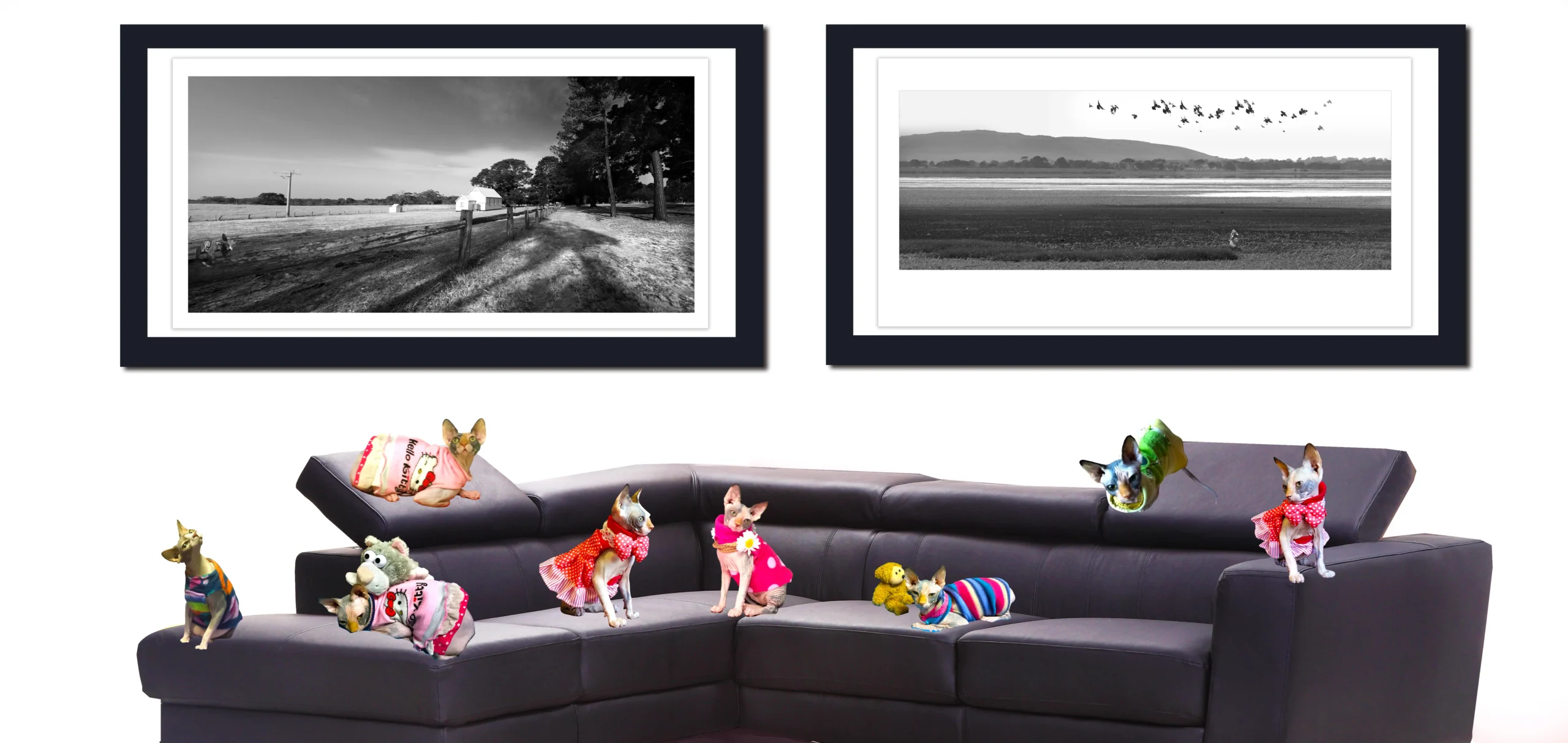
5. Creating Visual Tempo with Color and Frame Consistency
Just as rhythm in music is shaped by tempo and tone, rhythm in art display is deeply affected by the harmony of color and the uniformity—or deliberate variation—of frames. These two elements are among the most visible and emotionally immediate tools at a curator or collector’s disposal. They can either unify a diverse collection into a flowing experience or disrupt it with intentional emphasis and contrast.
The psychology of visual rhythm in art display is not only about spacing and arrangement—it’s about the sensory weight and resonance of what’s within and around the artwork. Color guides emotional response. Framing signals hierarchy, purpose, and genre. Used together, they establish visual tempo: the pace at which the eye moves, the mood it perceives, and the message it retains.
Color as Emotional Cue and Rhythmic Anchor
Color influences perception faster than almost any other visual element. In a wall display, it can be used to:
- Establish tone (cool vs. warm)
- Introduce progression (from monochrome to full spectrum)
- Create focal points or transition markers
Grouping similar color tones creates a steady visual tempo. Alternating high-contrast works with more muted ones introduces syncopation. A gradient arrangement—from dark to light or vivid to subdued—builds momentum and narrative direction.
For example:
- A series of blue-toned seascapes creates calm, oceanic rhythm.
- Interspersing bright abstracts among neutral-toned photographs brings a staccato effect, full of tension and release.
Color not only decorates the wall—it paces the journey.
Frame Consistency as a Rhythmic Foundation
Frames are like punctuation in a visual sentence. Consistency in frame material, thickness, and color creates cohesion and rhythm. Inconsistent frames, unless intentional, can disrupt flow and fragment the visual experience.
Use consistent framing to:
- Create a gallery-grade presentation across different mediums
- Maintain balance when displaying diverse subjects
- Enhance alignment and symmetry
Alternatively, use contrast in frame style to signal changes in mood or theme—such as switching from wood to metal when transitioning from photography to abstract works.
Establishing Tempo with Repetition and Variation
The brain responds to repeated visual cues by developing a sense of rhythm. A row of uniformly framed works, equally spaced and in tonal sequence, builds a slow, steady tempo—like a lullaby in visual form. Introducing one bold, color-rich piece in the middle of that row resets the rhythm—like a drumbeat.
To build effective visual tempo:
- Use 2–3 dominant colors repeated across works
- Maintain 1–2 framing styles across a wall
- Alternate high-impact and low-impact pieces
This approach ensures variety without chaos.
Transitions Between Different Series or Themes
Frame and color consistency can also help transition between visual narratives:
- Use white or neutral mats to soften the contrast between series
- Shift frame tone gradually (e.g., light to dark wood) to reflect thematic evolution
- Introduce bridging works that share color or framing elements from both neighboring pieces
This keeps rhythm flowing even when subject matter changes.
Environmental Influence on Color Perception
Lighting and wall color affect how color and frames are perceived:
- Warm lighting enhances red, orange, and brown frames
- Cool lighting accentuates blue, black, and metallic frames
- Neutral walls make color choices stand out; colored walls can amplify or mute certain tones
Always view works in the light and environment where they’ll be displayed before finalizing the arrangement.
Frame Texture and Depth in Abstract Displays
In abstract art, frame texture and depth also influence tempo:
- Float frames add lightness and spatial rhythm
- Deep shadow-box frames introduce dimensional pacing
- Raw wood or matte finishes create a natural, grounded cadence
Each frame style evokes a specific mood and contributes to the overall rhythm of the wall.
Lesson: The visual tempo of an art display is shaped not only by what you hang, but how you color and contain it. Frame consistency and color alignment are silent composers, guiding the viewer’s attention and emotion from one piece to the next.
Summary of Key Points:
- Color guides emotional flow and sets the tone of a display.
- Frame consistency builds rhythm and unity across diverse artworks.
- Alternating high and low-impact pieces controls visual pacing.
- Gradual transitions in frame tone or palette maintain flow between themes.
- Lighting and environment affect the perception of both color and frame.
- Frame texture adds to visual rhythm, especially in abstract presentations.
═════════════════════════════════════════════════════
Elevate your collection, your spaces, and your legacy with curated fine art photography from Heart & Soul Whisperer. Whether you are an art collector seeking timeless investment pieces, a corporate leader enriching business environments, a hospitality visionary crafting memorable guest experiences, or a healthcare curator enhancing spaces of healing—our artworks are designed to inspire, endure, and leave a lasting emotional imprint. Explore our curated collections and discover how artistry can transform not just spaces, but lives.
Curate a life, a space, a legacy—one timeless artwork at a time. View the Heart & Soul Whisperer collection. ➤Elevate, Inspire, Transform ➔
═════════════════════════════════════════════════════
6. Achieving Harmony Through Repetition and Contrast
In art display, harmony doesn’t always mean uniformity—it can arise from a careful interplay between repetition and contrast. These two visual principles work hand-in-hand to guide the viewer’s attention, create structure, and infuse rhythm into a gallery wall or curated room. While repetition builds unity and consistency, contrast introduces focal points, tension, and visual energy. Together, they offer balance—a measured choreography between calm and excitement.
The Psychology of Repetition in Visual Display
Repetition eases cognitive load. When the brain sees repeated elements—similar frames, aligned sizes, consistent spacing—it quickly establishes a visual pattern. This pattern gives the eye a comfortable path to follow and helps create a serene, stable viewing experience.
Common ways to use repetition include:
- Hanging works of identical size and orientation in a row or grid
- Using the same color palette across diverse subject matter
- Repeating framing styles or mat widths throughout a gallery
These repetitions create a rhythm of expectation and satisfaction, allowing the viewer to settle into the flow of the display.
Using Contrast to Create Emphasis and Movement
While repetition creates structure, contrast introduces variation—and variation attracts attention. Contrast can occur in many forms:
- Scale: placing a small piece next to a much larger one
- Color: inserting a bold, saturated work among muted tones
- Orientation: hanging a vertical piece beside a horizontal one
- Medium: mixing photography with abstract painting or mixed media
Contrast acts like a visual accent. It resets the rhythm and punctuates the arrangement, encouraging the viewer to pause, consider, and move with purpose.
Balancing Repetition and Contrast for Flow
Too much repetition can feel monotonous; too much contrast can feel chaotic. The key is to create a flow that alternates predictability with surprise.
For example:
- A series of black and white photographs can be punctuated by one color image that anchors the display.
- Three identically framed pieces can be followed by one float-mounted work to reset visual tempo.
- A wall of quiet minimalist abstracts can culminate in a richly textured piece to mark a narrative climax.
These alternating moments help create a story—a rise and fall, a build and release—that mirrors musical composition or poetic pacing.
Designing Visual Anchors with Contrast
Anchors are visual moments that hold the gaze longer. They’re often created through contrast:
- A large central piece framed in a bold color
- A highly detailed work surrounded by simpler ones
- A single circular composition within a grid of rectangles
These anchors give the wall structure and emotional punctuation. When strategically placed, they control movement and reinforce rhythm.
Repetition Across Diverse Media
Even when artworks differ in style or subject, rhythm can be maintained through subtle repetition:
- Repeated frame heights or frame finishes
- Shared negative space or margin widths
- Consistent alignment (e.g., all works centered at the same eye level)
This type of repetition creates invisible harmony—it’s felt more than seen.
Contrast to Reflect Emotional or Conceptual Tension
Some displays use contrast not just for aesthetics, but for meaning. Pairing a stark documentary photograph with a vibrant abstract can evoke thematic tension—truth versus interpretation, reality versus imagination.
In this context, contrast deepens engagement. It provokes questions and reveals layers in the narrative.
Lesson: Harmony is not the absence of contrast—it’s the intentional balance of repetition and difference. When used wisely, these tools create rhythm, structure, and emotional resonance in any display.
Summary of Key Points:
- Repetition provides order, stability, and visual comfort.
- Contrast introduces interest, emphasis, and directional flow.
- Balance is key: too much repetition dulls impact; too much contrast creates chaos.
- Visual anchors are created through deliberate contrasts in scale, color, or composition.
- Rhythm emerges from alternating repetition and variation.
- Both techniques support thematic storytelling and enhance emotional engagement.
7. Curating Movement and Pause in a Room
Visual rhythm is not just confined to the wall—it extends into the architecture and layout of the entire room. When you enter a space with art on display, your body and eyes begin a journey, guided by visual cues. Some artworks act as visual accelerators, drawing your attention quickly. Others function as pause points, offering rest, reflection, or transition. This ebb and flow—the alternation of movement and stillness—is what gives a curated space its breathing rhythm.
Curating movement and pause is a spatial storytelling technique. It transforms art display into experience design, where each artwork participates in guiding, slowing, or energizing the viewer’s passage through the space.
Establishing a Path for the Viewer’s Eye and Body
Movement is orchestrated through the placement of focal pieces, spatial gaps, lighting cues, and visual alignment. Consider:
- Leading lines: Arrange works to subtly direct the viewer’s eye in a desired path.
- Focal anchors: Position bold or contrasting pieces at key visual junctures, like doorways, hallway ends, or across from seating areas.
- Perspective cues: Place large works at a distance to create visual pull.
This intentional choreography creates a sense of journey, guiding visitors through the space while shaping their pace and attention.
The Power of Pause
Not all walls need to be filled. A blank wall, a softly lit photograph, or a grouping with generous negative space can act as a visual pause. These moments are essential for:
- Emotional digestion
- Shifting themes
- Preventing sensory fatigue
Think of pauses as visual punctuation—they break the flow just enough to heighten awareness of the next visual sentence.
Creating Zones of Engagement
Spaces that incorporate art benefit from having zones with different emotional and visual intensities:
- Quiet zones: Use minimal, contemplative works in bedrooms, hallways, or reading nooks.
- Energy zones: Use dynamic, colorful, or textured pieces in social areas like living rooms or kitchens.
- Transitional zones: Curate walls at stairwells or entryways with sequential or progressive pieces that mimic movement.
These spatial rhythms mirror human movement, encouraging viewers to linger, move, or reflect.
Using Furniture and Architecture as Rhythmic Partners
Room layout affects the perception of art:
- A sofa placed beneath a row of evenly spaced black-and-white prints reinforces visual symmetry and stillness.
- A bookshelf framed by two colorful abstracts creates a rhythmic entrance into a study or library zone.
- A vertical painting beside a tall window draws the eye upward, echoing architectural height.
This integration of decor, architecture, and art strengthens the sense of spatial flow.
Movement in Open-Plan Spaces
In large, open spaces, curating rhythm becomes even more essential. Without structural boundaries, the visual rhythm must guide movement:
- Use clusters of artworks to suggest “rooms within rooms.”
- Stagger focal pieces to direct line of sight.
- Employ rugs, lighting, and furniture placement to reinforce display rhythm.
In these settings, art display becomes spatial navigation.
Timing and Emotional Cadence
Good rhythm has a sense of timing—not everything is revealed at once. As viewers move through a space:
- Start with calm or familiar visuals
- Build to complex or emotionally intense pieces
- Conclude with a simple, resonant work to leave a lasting impression
This approach mirrors storytelling arcs and supports emotional engagement.
Lesson: The viewer’s journey through a room should feel like choreography—fluid, intentional, and punctuated with both energy and quiet. Art placement can dictate the tempo and tone of this movement, turning rooms into rhythmic compositions.
Summary of Key Points:
- Curated movement directs how viewers navigate and feel within a space.
- Pauses, gaps, and visual anchors create breathing space and emotional clarity.
- Different room zones can reflect different visual rhythms and moods.
- Furniture, architecture, and decor reinforce or disrupt spatial rhythm.
- Open spaces require visual cues to shape flow and segmentation.
- Movement and pause together form a visual cadence that enhances the viewer’s experience.
═════════════════════════════════════════════════════
Elevate your collection, your spaces, and your legacy with curated fine art photography from Heart & Soul Whisperer. Whether you are an art collector seeking timeless investment pieces, a corporate leader enriching business environments, a hospitality visionary crafting memorable guest experiences, or a healthcare curator enhancing spaces of healing—our artworks are designed to inspire, endure, and leave a lasting emotional imprint. Explore our curated collections and discover how artistry can transform not just spaces, but lives.
Curate a life, a space, a legacy—one timeless artwork at a time. View the Heart & Soul Whisperer collection. ➤Elevate, Inspire, Transform ➔
═════════════════════════════════════════════════════
8. Emotional and Atmospheric Effects of Visual Rhythm
Visual rhythm doesn’t just structure how viewers move through a space—it also deeply influences how they feel within it. Rhythm, in art display, has the ability to evoke specific emotional responses, set psychological tone, and subtly control the perceived atmosphere of a room. Whether tranquil or dynamic, cohesive or intentionally dissonant, the rhythm of a visual display can shape a viewer’s mood more than any single artwork on its own.
Curators and designers use this knowledge to craft emotionally intelligent environments—spaces where rhythm guides not only the eye but the heart.
Creating Mood with Visual Cadence
The pace and structure of visual rhythm can establish an environment’s dominant emotional tone:
- Slow, regular rhythms (e.g., evenly spaced, uniformly framed works) evoke calm, order, and introspection.
- Dynamic, syncopated rhythms (e.g., varied sizes, irregular spacing) create energy, surprise, and stimulation.
- Balanced rhythms with soft transitions tend to feel harmonious and soothing, ideal for relaxation areas.
Think of the visual experience like a metronome—fast beats energize, slow beats calm.
Impact on Viewer Psychology and Presence
Rhythmic environments influence how viewers feel about both the artwork and the space:
- A consistent rhythm builds trust and encourages engagement.
- Sudden changes or visual interruptions increase alertness and curiosity.
- Rhythmic tension—intentionally breaking the pattern—can spark introspection or emotional reaction.
These shifts control how long viewers stay, how deeply they look, and how they emotionally connect with the space.
Spatial Emotions: Open vs. Intimate Displays
- Open, spacious layouts with generous rhythm suggest freedom, peace, and spaciousness.
- Dense, compact arrangements with tight rhythm suggest intensity, intimacy, or urgency.
By adjusting spacing, repetition, and visual flow, designers can create emotional atmospheres suited to the room’s purpose—be it quiet contemplation, lively conversation, or personal reflection.
Color, Contrast, and Mood in Rhythmic Context
Color choices within rhythmic sequences significantly amplify emotional impact:
- Cool tones (blues, grays, muted greens) reinforce a soft, meditative rhythm.
- Warm tones (reds, oranges, yellows) heighten rhythmic intensity and tension.
- Contrasts—especially in color and brightness—function like emotional accents, signaling mood shifts.
Used together with pacing and arrangement, these elements orchestrate a psychological arc across the room.
The Role of Silence and Stillness
Just as negative space provides visual breathing room, emotional rhythm benefits from moments of stillness:
- A singular framed work on an otherwise empty wall allows for meditative engagement.
- Blank spaces between clusters of work offer viewers a moment of psychological reset.
These pauses are essential to avoid emotional overload and to heighten the viewer’s connection to individual pieces.
Cultural and Personal Resonance
Visual rhythm can also echo cultural values or personal identity:
- Some cultures favor symmetry and orderly rhythm (e.g., traditional Japanese design).
- Others embrace asymmetry and layered variation (e.g., maximalist bohemian or African diasporic design).
When rhythm reflects cultural patterns, it deepens the emotional authenticity of the space.
Lesson: Rhythm doesn’t just organize—it emotively orchestrates. By designing displays that alternate between energy and calm, density and space, repetition and contrast, curators can transform environments into immersive emotional landscapes.
Summary of Key Points:
- Visual rhythm influences mood, presence, and emotional tone in a space.
- Cadence—how fast or slow the eye travels—sets psychological atmosphere.
- Rhythm can be used to energize, relax, inspire, or provoke.
- Spacing, color, contrast, and repetition act as emotional levers.
- Stillness and silence are essential to deepen reflection and balance intensity.
- Emotionally intelligent rhythm personalizes space and enhances viewer connection.
9. Common Mistakes That Disrupt Visual Rhythm
While visual rhythm can elevate the impact of an art display, poor decisions or overlooked details can just as easily interrupt it. These disruptions often result in displays that feel chaotic, cluttered, or unbalanced. To maintain a consistent emotional and aesthetic flow, it’s essential to understand the common pitfalls that interfere with visual rhythm—and how to avoid them.
Overcrowding the Wall
One of the most frequent mistakes is overcrowding a space with too many artworks, leaving little to no breathing room:
- The eye lacks a clear path to follow.
- Artworks compete for attention.
- Visual fatigue sets in quickly.
Always respect negative space. It’s not just empty—it’s active space that helps define rhythm, set pace, and provide relief between focal points.
Inconsistent Framing or Sizing
Lack of cohesion in frame style, color, or size can break the visual harmony:
- Differently colored or mismatched frames distract from the artwork.
- Dramatically varying sizes placed without logic can feel jarring.
When displaying multiple pieces, maintain consistency or establish an intentional pattern of contrast. Frame irregularities should serve a purpose, not result from oversight.
Irregular Spacing and Alignment
Uneven spacing between artworks or off-center alignments undermine rhythm:
- The eye is forced to jump unpredictably.
- Viewers subconsciously sense disorder or imbalance.
Use measuring tools or layout templates to keep spacing consistent. Whether you’re creating a grid or a more organic salon-style wall, internal logic should be visible.
Lack of Visual Anchors
A wall that lacks emphasis points can feel directionless:
- No single piece draws attention or organizes the flow.
- All artworks feel equal in visual weight, causing monotony.
Visual anchors—bold pieces, large formats, or emotionally intense works—should guide the viewer through the sequence.
Ignoring Architectural Features
Disregarding room architecture (windows, ceiling slope, furniture) leads to awkward display rhythm:
- Artworks may hang too high, low, or in obstructed areas.
- Visual rhythm is broken by competing structural elements.
Always take into account the lines, shapes, and negative space of the surrounding architecture. Let rhythm complement—not fight—its context.
Clashing Color or Contrast Without Purpose
While contrast can energize a rhythm, uncontrolled or arbitrary color shifts break the flow:
- Placing a bright, saturated piece next to muted tones without transition creates jarring visual noise.
- Using too many competing hues or themes weakens narrative cohesion.
Ensure that contrast serves emotional or curatorial intent, not randomness.
Neglecting Viewer Perspective
Visual rhythm is experienced at a human level. Hanging art too high, placing it near reflective surfaces, or installing in areas with poor lighting diminishes the experience:
- Eye strain, misalignment, or glare disrupt perception.
- Movement feels forced rather than guided.
Test displays from multiple angles and lighting scenarios to ensure fluid, uninterrupted viewing.
Lesson: Strong visual rhythm requires restraint, cohesion, and clarity. Avoiding these common mistakes allows artworks to breathe, guide, and engage without distraction.
Summary of Key Points:
- Avoid overcrowding; negative space is essential to rhythm.
- Maintain framing and sizing consistency or use contrast deliberately.
- Keep spacing and alignment uniform and intentional.
- Include visual anchors to structure the viewer’s journey.
- Consider architectural elements in placement.
- Use color and contrast purposefully, not randomly.
- Ensure artworks are hung at optimal height and are easily viewable.
═════════════════════════════════════════════════════
Transform your spaces and collections with timeless curated photography. From art collectors and investors to corporate, hospitality, and healthcare leaders—Heart & Soul Whisperer offers artworks that inspire, elevate, and endure. Discover the collection today. Elevate, Inspire, Transform ➔
═════════════════════════════════════════════════════
10. Designing for Flow: Practical Tips for Any Space
Achieving visual rhythm in art display is as much about intention as it is about intuition. With the right design principles, any space—whether a narrow hallway, a sprawling loft, a private office, or a cozy living room—can be transformed into a visually engaging and emotionally resonant environment. Designing for flow means thinking about how the eye travels, how the body moves, and how atmosphere is constructed through arrangement.
Begin with a Plan
- Sketch the layout on paper or use a digital mockup tool.
- Identify key sightlines and architectural features.
- Choose a focal wall or corner to build the rhythm around.
Planning ahead helps avoid ad hoc decisions and ensures cohesion from the start.
Adapt Layouts to Room Type
- Hallways: Use sequential rhythm. Line works in rows at eye level to mimic movement.
- Living rooms: Anchor displays around furniture groupings. Balance between rhythm and casualness.
- Bedrooms: Keep rhythm soft and minimal to support rest and reflection.
- Dining areas: Use horizontal flow to support conversation and openness.
Each room has its own rhythm potential—match the display style accordingly.
Mix Static and Dynamic Elements
- Use uniform grids or straight lines for static calm.
- Introduce diagonals, clusters, or asymmetry for dynamic energy.
Juxtaposing these modes creates complexity and prevents monotony.
Create Entry and Exit Points
- Begin with a simple or familiar piece near the entrance.
- Build complexity or emotional intensity toward the center.
- Let the rhythm taper with a calm or minimal work near exits or transitions.
This sequencing mirrors natural movement and supports thematic storytelling.
Work With Natural Light and Shadow
- Position art to benefit from indirect natural light.
- Use artificial lighting to fill rhythm gaps and highlight anchors.
- Avoid placing sensitive pieces where light changes disrupt mood.
Light should reinforce—not interrupt—your display rhythm.
Frame the Space With Purpose
- Use rugs, furniture, and plants to echo the rhythm of the art.
- Let wall color and materials act as visual pacing tools.
- Consider ceiling height, wall length, and viewer proximity.
Your whole space is part of the rhythm—not just the wall.
Lesson: Designing for flow means treating the viewer’s journey as an emotional arc. When space, artwork, light, and architecture are curated in harmony, every room becomes a rhythmic experience.
Summary of Key Points:
- Plan layouts ahead and identify rhythm anchors.
- Match display rhythm to room function and emotional tone.
- Mix static structures with dynamic contrasts for complexity.
- Sequence artwork like a story—introduce, build, release.
- Use lighting to reinforce rhythm and reduce disruption.
- Integrate decor, color, and furniture to support the visual flow.
- Maintain framing and sizing consistency or use contrast deliberately.
- Keep spacing and alignment uniform and intentional.
- Include visual anchors to structure the viewer’s journey.
- Consider architectural elements in placement.
- Use color and contrast purposefully, not randomly.
- Ensure artworks are hung at optimal height and are easily viewable.
Conclusion: Turning Spaces Into Symphonies
Visual rhythm in art display is more than aesthetic discipline—it is a reflection of human experience, a language that transcends words and speaks directly to emotion. Whether in a gallery, a home, or a commercial space, how art is arranged matters. It shapes perception, mood, and meaning. And at its core, rhythm is the invisible thread that stitches images, spaces, and people together.
From the moment we step into a room, our senses seek structure. Our eyes naturally scan for balance, contrast, and movement. Visual rhythm satisfies this instinctual search, creating harmony between art and its surroundings, between artwork and observer. It provides a framework that not only organizes visual information but also choreographs an emotional journey.
When rhythm is applied with thoughtfulness, it provides both clarity and complexity. Repetition brings order and predictability, soothing the viewer into a state of receptiveness. Contrast provides sparks—moments of curiosity and alertness that challenge the senses. The interplay between these forces mirrors life itself: patterns we know, punctuated by events that shift our perspective.
But rhythm doesn’t end with spacing or alignment—it extends into the relationship between art and space, between viewer and narrative. A thoughtfully paced art wall doesn’t just “show” images. It guides us through them. Each pause, each variation, each repetition is part of a script meant to be felt as much as seen.
Art displayed rhythmically creates atmosphere. A corridor lined with evenly spaced black-and-white photographs invites calm and introspection. A living room arranged with colorful abstract canvases that rise and fall in size generates energy and conversation. A gallery where lighting, frame consistency, and spacing are all in sync becomes a sanctuary of immersive thought.
For artists, rhythm in display allows their work to be seen not as isolated creations, but as part of a greater story. For collectors, it turns acquisition into curation. For interior designers, it becomes a vital tool for mood and tone. And for the everyday appreciator, it becomes a way to find peace, inspiration, and meaning in the visual world.
The beauty of visual rhythm is that it doesn’t require expensive materials or professional training. It begins with observation and intention. It asks simple questions: How do I want this space to feel? Where should the eye go first? What should it rest upon? When should it pause? What should it remember?
As technology and digital media flood our senses with constant input, the stillness of a well-curated art display offers rare refuge. Rhythm gives structure to that stillness. It is the heartbeat of a silent visual narrative. It whispers rather than shouts, inviting the viewer to slow down, to reflect, to return again and again.
In honoring visual rhythm, we honor not just the artwork but the viewer. We design with empathy, with emotion, and with mindfulness. We give space for art to breathe and for people to breathe with it.
So let us not take for granted the placement of a single frame or the spacing of a series. These choices are not mundane—they are musical. They transform homes into havens, galleries into experiences, and blank walls into symphonies.
When we curate with rhythm, we compose more than a display—we create a language of presence.
═════════════════════════════════════════════════════
Transform your spaces and collections with timeless curated photography. From art collectors and investors to corporate, hospitality, and healthcare leaders—Heart & Soul Whisperer offers artworks that inspire, elevate, and endure. Discover the collection today. Elevate, Inspire, Transform ➔
═════════════════════════════════════════════════════
Why Buy Art at Heart & Soul Whisperer: The Ideal Choice for Luxurious, Premium Fine Art Decor
When choosing art that aligns with colour psychology and elevates workplace performance, Heart & Soul Whisperer Art Gallery offers unmatched value. As a destination for Luxury Art Decor: Fine Photography for Interior Designers, it caters to the nuanced needs of sophisticated commercial spaces.
Our collection of limited-edition fine art photography is designed for those who seek distinction. Whether you are a luxury interior designer sourcing for a high-profile client, an architect curating visual harmony, or a discerning buyer with an eye for emotional depth—our gallery offers you more than just beautiful images. We offer you legacy, meaning, and collectibility.
In the curated world of luxury interiors, art is not a finishing touch—it is the soul of the space. At Heart & Soul Whisperer Art Gallery, we believe fine art photography should do more than match a palette or fit a frame. It should inspire. It should elevate. It should linger in the hearts of those who experience it.
For interior decorators, architectural studios, and high-end furniture galleries, each piece from Heart & Soul Whisperer is crafted with emotional depth and visual harmony to complement premium interiors. Whether it’s calming black and white photography or abstract compositions designed to align with psychological design principles, every artwork enhances colour coordination and cognitive flow.
In the world of boutique hotels & luxury resorts, art becomes a branding tool. Heart & Soul Whisperer curates photographic artwork that tells stories—perfect for guest suites, lounges, or spa areas where ambiance is critical. Each piece complements colour palettes crafted to soothe, energize, or inspire.
Real estate developers & property stylists benefit from elegant, scalable pieces that increase visual appeal and emotional impact. Heart & Soul Whisperer’s artwork adds marketable sophistication to showrooms, model apartments, and commercial developments.
For hospitals and healthcare facilities, the gallery offers calming fine art photography that aligns with evidence-based design strategies aimed at improving patient comfort and recovery. Combined with therapeutic wall colours, this art enhances wellness outcomes and emotional tranquility.
In every case, Heart & Soul Whisperer provides gallery-quality works that are:
- Created by Dr. Zenaidy Castro with a deep understanding of art psychology and luxury presentation
- Ideal for pairing with office-specific wall colours to support mood and function
- Backed by a mission-driven ethos that includes philanthropic contributions to animal health research
Each artwork on our site has been meticulously created by visionary artist Dr. Zenaidy Castro and is printed to museum-grade archival standards. Every print comes with a Certificate of Authenticity, and many works are available in custom sizes or framing options tailored to the specific spatial and visual needs of your project.
When you purchase from Heart & Soul Whisperer, you’re not just acquiring a piece of décor—you’re investing in a story, in an atmosphere, in a timeless conversation between art and space. Our pieces have graced boutique hotels, luxury residences, and curated showrooms, quietly enriching environments with elegance, calm, and emotional resonance.
We invite you to explore the collection and discover photography that doesn’t just fit your walls—it transforms them.
From executive offices to reception spaces, Heart & Soul Whisperer is the smart choice for designers and decision-makers seeking beauty, wellness, and productivity in perfect balance.
Visit www.heartandsoulwhisperer.com.au to discover the full collection and customize your professional space with meaningful, museum-quality fine art.
Exclusive Benefits for Design & Hospitality Professionals
Tailored Fine Art Solutions
We understand the intricate needs of professionals. That’s why we offer more than a trade discount—we provide fully customized, concierge-style services built to support your creative and commercial success.
Explore the exclusive services we offer to:
- Interior Designers
- Architectural Studios
- Boutique Hotels & Luxury Resorts
- Real Estate Developers & Property Stylists
- High-End Furniture Galleries & Showrooms
1. White-Label & Private Branding Options
Present our artwork as part of your exclusive service offering. With unbranded packaging, discreet labeling, and optional co-branded certificates, our white-label solutions allow you to deliver elegance while keeping your brand front and center.
2. Designer-Exclusive Editions
Access limited-edition prints made only for trade collaborators. These artworks will not appear in our public collection, ensuring that your interiors are always one-of-a-kind and unmatched by off-the-shelf alternatives.
3. Bespoke Commissions with the Artist
Partner directly with Dr. Zenaidy Castro to co-create custom fine art photography. From conceptual development to print execution, we tailor the work to your client’s story, space, and design palette.
4. Consignment & On-Approval Art Placement
Borrow art on consignment for showrooms, staging, or luxury project previews. We’ll deliver selected pieces for trial placement—buy only what fits the vision, and return or refresh as needed
.
5. High-Resolution Mockups & Spatial Visualization
Pitch ideas or finalize room designs with photorealistic mockups. We provide layered, high-resolution art-on-wall renderings to insert into your interior presentations, helping clients visualize the finished space.
6. Designer Feature Opportunities
We proudly promote our creative collaborators through our website, blog, email campaigns, and social channels. Join our “Designers Who Inspire” series and position your firm as a tastemaker in curated environments.
7. VIP Invitations to Private Art Releases
Gain early access to new collections, private previews, and gallery events curated exclusively for our design and hospitality partners. Be first to source new work for your most exclusive projects.
Let’s Build Something Beautiful Together
Discover how Heart & Soul Whisperer can help you craft interiors that evoke emotion, elegance, and exclusivity.
Reach out today at heartandsoulwhisperer.com.au to schedule a private call, request samples, or access our exclusive designer portal.
════════════════════════════════════════════════════
Discover Helpful Office & Business Resources
Artwork for Every Healthcare Facility➤ “Transform healing spaces with art that nurtures the spirit and soothes the soul”
Colour Theraphy in Healthcare ➤ “Harnessing the power of color to heal, uplift, and inspire wellness”
Healing Wall Art for Every Room in the Hospital ➤“Visual balm for every space — art designed to comfort, calm, and restore”
Corporate Art For Business Offices- Office Wall Art for sale ➤ “Elevate your workspace with refined artistry that inspires success and creativity”
Office and Business Art – Corporate Spaces with Elegance ➤ “Where sophistication meets motivation — curated art for discerning professional spaces”
How to Choose Art for Your Office ➤ “A guide to selecting pieces that balance beauty, purpose, and productivity”
Office Wall Colours and Artwork Choices for Productivity ➤ “The subtle dance of hues and imagery — crafting environments that foster focus and flow”
Art and Colour in Architecture ➤ “Intertwining structure and soul — the art of integrating color into built spaces”
Styling Cruise Interiors with Fine Art Photography ➤ “Setting sail with elegance — bespoke art to enrich luxurious voyage interiors”
Affordable luxury art for corporate art procurement ➤ “Exquisite art within reach — premium pieces crafted for visionary businesses”
Hospitality Art ➤ “Creating welcoming atmospheres with art that invites, enchants, and delights”
Best Wall Art for Every Hotel Type ➤ “Tailored visual experiences for boutique charm, grand luxury, and everything between”
Art and Colour in Boutique Hotels & Luxury Resorts ➤ “Curated palettes and imagery that define elegance and comfort in exclusive spaces”
Inspiring Solutions for Interior Decorators & Stylists
B&W Photography ➤ “Timeless contrasts to craft spaces of depth, drama, and sophisticated elegance”
Celebrity Homes and B&W Photography: Iconic Style Secrets ➤ “Discover how monochrome masterpieces shape the allure of star-studded sanctuaries”
The Psychology of Visual Rhythm in Art Display ➤ “Unlocking harmony and flow — art arranged to resonate with mind and soul”
Emotional Luxury: Where Art Meets Interior Design ➤ “Elevate spaces with artworks that stir feeling, enrich atmosphere, and define opulence”
Art and Colour in Luxury Properties ➤ “The alchemy of hues and form — crafting immersive environments of refined taste”
Transform Interiors with Fine Art Photography and Style ➤ “From vision to reality — infusing interiors with narrative, emotion, and light”
Fine Art Photography: Capturing Emotion, Ideas, and Vision ➤ “Frames that transcend the image — storytelling through every captured moment”
Giclée Fine Art Print ➤ “Precision and passion united — prints that honor the artist’s original vision with unmatched clarity”
Balance, Flow & Energy — Feng Shui & Vastu Insights
Attract Good Luck with Lucky Feng Shui Art and Vastu Art ➤ “Harmonize your space, invite fortune — where sacred art meets ancient wisdom”
Harness Vastu Shastra and Art to Invite Good Fortune ➤ “Align your surroundings with cosmic flow — art that draws prosperity and peace”
Feng Shui Art to Attract Good Luck ➤ “Embrace balance and abundance — artworks designed to channel positive energy and blessings”
References
- Arnheim, Rudolf (1974). Art and Visual Perception: A Psychology of the Creative Eye. University of California Press. ISBN 9780520243835
- Leder, Helmut et al. (2004). A Model of Aesthetic Appreciation and Aesthetic Judgments. British Journal of Psychology, 95(4), 489–508.
- Kaplan, Stephen & Kaplan, Rachel (1989). The Experience of Nature: A Psychological Perspective. Cambridge University Press. ISBN 9780521341394
- Locher, Paul (2015). The Aesthetic Experience with Visual Art: Psychological Perspectives. In Art, Aesthetics and the Brain. Oxford University Press.
- Wong, Wucius (2011). Principles of Form and Design. Wiley. ISBN 9780471285521
- Ross, Stephen David (1982). The Aesthetic Paths of Philosophy: Presentation in Kant, Heidegger, Levinas and Others. Springer. ISBN 9789027714597 and identify rhythm anchors.
__________________________________________________________


Globetrotting Dentist and Australian Artists and Emerging Photographer to watch in 2025 Dr Zenaidy Castro. She is a famous cosmetic dentist in Melbourne Australia. Australia’s Best Cosmetic Dentist Dr Zenaidy Castro-Famous cosmetic dentist in Melbourne Australia and award-winning landscape photographer quote: Trust me, when you share your passions with the world, the world rewards you for being so generous with your heart and soul. Your friends and family get to watch you bloom and blossom. You get to share your light and shine bright in the world. You get to leave a legacy of truth, purpose and love. Life just doesn’t get any richer than that. That to me is riched fulfilled life- on having to discovered your life or divine purpose, those passion being fulfilled that eventuates to enriching your soul. Famous Australian female photographer, Australia’s Best woman Photographer- Dr Zenaidy Castro – Fine Art Investment Artists to Buy in 2025. Buy Art From Emerging Australian Artists. Investing in Art: How to Find the Next Collectable Artist. Investing in Next Generation Artists Emerging photographers. Australian Artists to Watch in 2025. Australasia’s Top Emerging Photographers 2025. Globetrotting Dentist and Australian Artists and Emerging Photographer to watch in 2025 Dr Zenaidy Castro. She is a famous cosmetic dentist in Melbourne Australia.
Globetrotting Dentist and Australian Artists and Emerging Photographer to watch in 2025 Dr Zenaidy Castro. She is a famous cosmetic dentist in Melbourne Australia. Australia’s Best Cosmetic Dentist Dr Zenaidy Castro-Famous cosmetic dentist in Melbourne Australia and award-winning landscape photographer quote: Trust me, when you share your passions with the world, the world rewards you for being so generous with your heart and soul. Your friends and family get to watch you bloom and blossom. You get to share your light and shine bright in the world. You get to leave a legacy of truth, purpose and love. Life just doesn’t get any richer than that. That to me is riched fulfilled life- on having to discovered your life or divine purpose, those passion being fulfilled that eventuates to enriching your soul. Famous Australian female photographer, Australia’s Best woman Photographer- Dr Zenaidy Castro – Fine Art Investment Artists to Buy in 2025. Buy Art From Emerging Australian Artists. Investing in Art: How to Find the Next Collectable Artist. Investing in Next Generation Artists Emerging photographers. Australian Artists to Watch in 2025. Australasia’s Top Emerging Photographers 2025. Globetrotting Dentist and Australian Artists and Emerging Photographer to watch in 2025 Dr Zenaidy Castro. She is a famous cosmetic dentist in Melbourne Australia.
═══════════════════════════════════════════════════
At Heart & Soul Whisperer Art Gallery, every coloured and black and white photograph tells a story beyond sight—an emotional journey captured in light, shadow, and soul. Founded by visionary artist Dr Zenaidy Castro, our curated collections—spanning landscapes, waterscapes, abstract art, and more—offer a timeless elegance that transcends fleeting trends. Whether enriching private residences, corporate offices, healthcare facilities, hospitals, or hospitality spaces, our artworks are designed to transform environments into sanctuaries of memory, beauty, and enduring inspiration. Let your walls whisper stories that linger—reflections of art, spirit, and the love that connects us all.
Whispers in Monochrome — The Artist’s Signature Collection
Limited Editions ➤ “Treasures of Time, Rare Whispers on Canvas — Art as Unique as Your Soul”
Infrared ➤ “Beyond the Visible: Worlds Revealed in Fiery Hues and Hidden Radiance”
Vintage & Retro ➤ “Echoes of Elegance, Timeless Stories Wrapped in Nostalgic Light”
Film Emulation Photography ➤ “Where Grain Meets Grace — Classic Souls Captured in Modern Frames”
Minimalism ➤ “Pure Essence, Quiet Power — Beauty Found in the Art of Less”
Chiaroscuro Landscapes ➤ “Light and Shadow’s Dance: Landscapes Painted in Dramatic Contrast”
Moody Landscapes ➤ “Whispers of Storm and Silence — Nature’s Emotions in Every Frame”
Mystical Landscapes ➤ “Enchanted Realms Where Spirit Meets Horizon, Dream and Reality Blur”
Moody and Mystical ➤ “A Symphony of Shadows and Spirit — Landscapes That Speak to the Soul”
Discover the Vibrance of Landscapes and Waterscapes
Country & Rural ➤ “Sun-kissed fields and quiet homesteads — where earth and heart meet in vibrant harmony”
Mountain ➤ “Majestic peaks bathed in golden light — nature’s grandeur painted in every hue”
Trees & Woodlands ➤ “Whispers of leaves and dappled sunlight — a living tapestry of green and gold”
At The Water’s Edge ➤ “Ripples of color dance on tranquil shores — where land and liquid embrace in serene beauty”
Ethereal Landscapes and Waterscapes in Monochrome
Country & Rural Landscapes ➤ “Monochrome whispers of earth and toil — the quiet poetry of open lands”
Australian Rural Landscapes ➤ “Shadowed vistas of sunburnt soil — raw beauty in timeless contrast”
The Simple Life - Country Living ➤ “Essence distilled — moments of calm in stark black and white”
Cabin Life & shacks ➤ “Silent shelters bathed in light and shadow — stories carved in wood and time”
Mountain Landscapes ➤ “Peaks etched in silver and shadow — grandeur carved by nature’s hand”
Trees & Woodlands ➤ “Branches weaving tales in shades of gray — forests alive in monochrome breath”
At The Water’s Edge ➤ “Edges where light and dark meet — reflections of stillness and flow”
Lakes & Rivers ➤ “Flowing grace captured in stark clarity — water’s endless journey in shades of gray”
Waterfalls ➤ “Cascades frozen in black and white — movement captured in eternal pause”
Beach, Coastal & Seascapes ➤ “Silent shores and textured tides — nature’s drama in monochrome waves”
Reflections ➤ “Mirrored worlds in shades of shadow — where reality blurs into dream”
Snowscapes ➤ “White silence pierced by shadow — frozen landscapes of quiet wonder”
Desert & The Outback ➤ “Vastness distilled into contrast — endless horizons in black and white”
A Journey Through Curated Beauty
Black and White Photography ➤ “Timeless tales told in shadow and light — where every tone speaks a silent story”
Colour Photography ➤ “A vivid symphony of hues — life captured in its most radiant form”
Abstract Art & Abstracted Labdscapes ➤ “Beyond form and figure — emotions and visions woven into pure expression”
Digital Artworks ➤ “Where imagination meets technology — digital dreams crafted with artistic soul”
People ➤ “Portraits of the human spirit — stories told through eyes, expressions, and silent moments”
═══════════════════════════════════════════════════