
Office Wall Colours and Artwork Choices for Productivity
Table of Contents
1. Introduction: The Role of Environment in Office Productivity
An overview of how interior design, especially colour and art, impacts mood, mental performance, and overall workweek efficiency.
2. Colour Psychology and Its Impact on Focus and Work Output
Breakdown of how specific wall colours like blue, grey, green, or white affect alertness, fatigue, and emotional tone in office spaces.
3. Visual Complexity: How Design Elements Shape Cognitive Load
Discussion of how over-designed or under-stimulating environments affect productivity, and how to balance colour, pattern, and artwork for cognitive clarity.
4. Individual Environmental Sensitivity and Colour Preferences
Explores how personality, neurodivergence, and sensitivity influence the ideal office palette and artistic selection for individuals and teams.
5. Comparing Three Office Colour Environments: A Case Study
Insight into a study comparing productivity and environmental response in red, white, and blue office spaces, with implications for modern design choices.
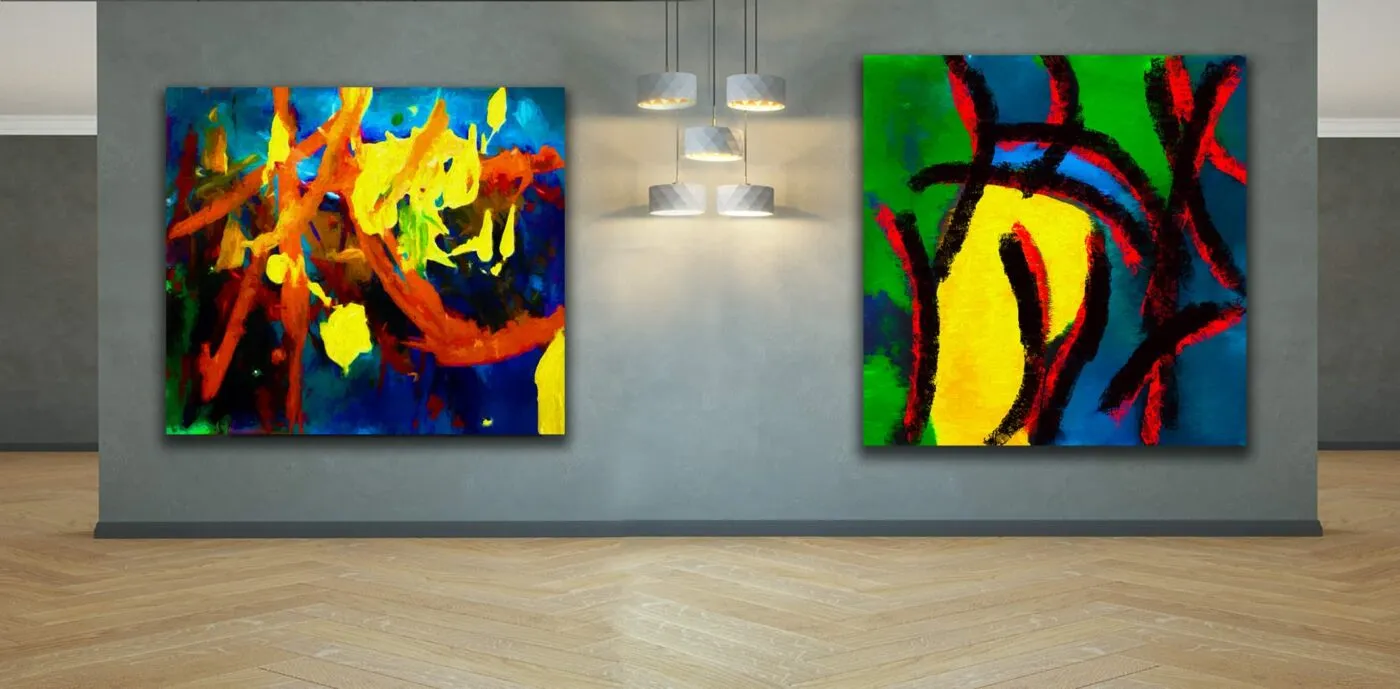
6. The Role of Artwork in Enhancing or Reducing Visual Complexity
Strategies for selecting artwork that aligns with wall colour, supports calm or creativity, and avoids cognitive overload.
7. Best Wall Colour and Artwork Combinations for Office Types
Practical advice for tailoring design by function: executive offices, open-plan workspaces, collaborative rooms, and break areas.
8. Design Recommendations Based on Sensory and Aesthetic Balance
Guidelines for balancing boldness and subtlety using colour, form, lighting, and curated art to support long-term productivity.
9. Common Mistakes in Office Colour and Art Selection
Avoiding visual clutter, overstimulation, poor lighting interaction, and irrelevant artwork that disrupts focus and mood.
10. Conclusion: Designing Workspaces That Work for the Mind
Final thoughts on creating productive office environments by aligning colour, art, and human needs in design strategy.
Get to Know the Creative Force Behind the Gallery
About the Artist ➤ “Step into the world of Dr. Zenaidy Castro — where vision and passion breathe life into every masterpiece”
Dr Zenaidy Castro’s Poetry ➤ "Tender verses celebrating the bond between humans and their beloved pets”
Creative Evolution ➤ “The art of healing smiles — where science meets compassion and craft”
The Globetrotting Dentist & photographer ➤ “From spark to masterpiece — the unfolding journey of artistic transformation”
Blog ➤ “Stories, insights, and inspirations — a journey through art, life, and creative musings”
As a Pet mum and Creation of Pet Legacy ➤ “Honoring the silent companions — a timeless tribute to furry souls and their gentle spirits”
Pet Poem ➤ “Words woven from the heart — poetry that dances with the whispers of the soul”
As a Dentist ➤ “Adventures in healing and capturing beauty — a life lived between smiles and lenses”
Cosmetic Dentistry ➤ “Sculpting confidence with every smile — artistry in dental elegance”
Founder of Vogue Smiles Melbourne ➤ “Where glamour meets precision — crafting smiles worthy of the spotlight”
Unveil the Story Behind Heart & Soul Whisperer
The Making of HSW ➤ “Journey into the heart’s creation — where vision, spirit, and artistry converge to birth a masterpiece”
The Muse ➤ “The whispering spark that ignites creation — inspiration drawn from the unseen and the divine”
The Sacred Evolution of Art Gallery ➤ “A spiritual voyage of growth and transformation — art that transcends time and space”
Unique Art Gallery ➤ “A sanctuary of rare visions — where each piece tells a story unlike any other”
1. Introduction: The Role of Environment in Office Productivity
???? Imagine an office where colour doesn’t just brighten walls — it stirs creativity, invites focus, and breathes life into every moment. At Heart & Soul Whisperer Art Gallery, we believe that the right colours and fine art can transform any workplace into a sanctuary of inspiration, well-being, and meaningful success.
???? Discover curated fine art collections perfect for corporate interiors here ➤
In the evolving landscape of business and corporate office design, there is growing awareness of the psychological and physiological effects of the physical environment on productivity. One of the most underutilized yet impactful aspects of workspace optimization lies in the interplay between Office Wall Colours and Artwork Choices for Productivity. The days of bland, whitewashed walls in sterile cubicles are gradually giving way to research-driven, aesthetically aligned workspaces that support creativity, clarity, motivation, and mental wellness.
Interior environments affect everything from stress levels to attention span, and subtle shifts in visual complexity can make or break an employee’s ability to stay focused across a demanding workweek. Colours evoke emotional responses that can energize or relax, while carefully chosen artwork can stimulate creativity or offer restorative mental pauses. This article explores how colour and corporate art strategies work together to enhance workplace performance, using scientific insights, case studies, and practical recommendations.
Designing an efficient workspace today means more than ergonomic desks and modern lighting. It means treating the walls as communicators—channels that influence mood, performance, and well-being. Strategic colour application and intentional Corporate Art for your Business and Office become silent allies in shaping productive environments.
Understanding the Power of Visual Stimuli
Our brains are hardwired to respond to colour and image. In high-pressure business environments, even a small degree of visual disruption—or uninspiring monotony—can impair workflow. Studies in environmental psychology show that the average employee spends approximately 90% of their day indoors, and visual surroundings deeply affect everything from concentration to decision-making.
Wall colour and Office Artworks act as environmental cues. Cool tones such as soft blues and greens are calming and ideal for focus-driven spaces, while warmer tones like yellow and terracotta promote optimism and collaboration. These effects multiply when combined with relevant, well-curated Artwork for Offices that reflects brand values, departmental function, or wellness goals.
The Relationship Between Colour, Art, and Human Behaviour
- Cognitive impact: Colours can either sharpen or dull cognitive performance. Artwork that’s too busy or mismatched with wall tones can create unnecessary cognitive load. Conversely, congruent combinations enhance neural efficiency and visual comfort.
- Emotional regulation: Calm-inducing hues paired with soothing or inspiring images help regulate mood, reduce stress, and foster positive emotional states throughout the workday.
- Spatial identity: Colour and art together define zones within an office—executive areas, open workstations, collaborative rooms, lounges—each with its own tone, rhythm, and psychological purpose.
This alignment between hue, purpose, and visual narrative is central to Corporate Art & Artwork for Office Walls and underpins how spaces are perceived and used.
Visual Complexity and the Office Workweek
The concept of visual complexity refers to the density and diversity of visual elements in a given space. A balance is key: too much complexity leads to overstimulation and fatigue, too little causes under-stimulation and disengagement.
This is especially important in the modern workweek. Inconsistent visual environments can strain attention spans, especially in open-plan offices where employees must filter out distractions. Thoughtful Corporate Office Art and calibrated wall colour reduce unnecessary complexity and encourage deep work.
Why Wall Colour Alone Isn’t Enough
Relying solely on colour to set the tone overlooks the additive emotional and cognitive power of art. For example:
- A soft sage green wall promotes calm, but pairing it with abstract nature-themed art can intensify that effect, reinforcing tranquility.
- A steel-blue corporate boardroom feels authoritative, but adding minimalist black-and-white photography introduces elegance and focus.
The choice of Corporate Office Wall Art isn’t decorative—it’s functional. Art acts as a psychological touchpoint that supports memory, pattern recognition, and emotional connection to the space.
Trends in Business and Corporate Office Environments
There’s an increasing move toward design strategies that integrate Corporate Art for Business / Offices into everyday workspace planning. Trends include:
- Brand-reflective installations: Art that mirrors the brand’s ethos or mission, framed against strategically chosen wall colours.
- Biophilic integration: Using colour palettes and imagery drawn from nature to create calming, wellness-oriented interiors.
- Sensory zoning: Defining rooms not just by function but by emotional tone, using both paint and curated visuals.
These shifts reflect a broader understanding of how environment supports—or hinders—professional output.
Corporate Art as a Communication Tool
Art in a corporate setting is more than a filler—it’s a medium of expression. It tells employees and visitors what the company values, how it sees the world, and what kind of culture it fosters. This makes the selection of Art to Corporate Clients a vital part of both interior design and brand psychology.
Wall art should:
- Complement the room’s primary function
- Echo the dominant colour palette
- Support the desired mood (focus, warmth, inspiration, etc.)
Whether you’re selecting abstract art for a creative agency or architectural photography for a law firm, these decisions send subtle messages that shape perception.
Beyond Aesthetics: The ROI of Colour and Art
Investment in wall colour and artwork yields tangible benefits:
- Increased productivity: Harmonized environments reduce stress and mental fatigue.
- Employee retention: Workers feel more valued and connected in environments designed for wellness.
- Client perception: First impressions are formed within seconds. Offices with well-coordinated aesthetics reflect professionalism and vision.
These outcomes illustrate why Corporate Art for your Business and Office is no longer a luxury but a strategic asset.
Setting the Stage for Deeper Exploration
This article will next explore the scientific reasoning behind specific colour selections, how to gauge and manage visual complexity, and real-world insights from studies comparing employee reactions in differently coloured office environments.
It will also offer practical advice on how to choose the right artwork for different types of workspaces—from individual focus zones to collaborative meeting rooms—always aligned with wall colour for maximum effect.
As we progress, you’ll gain a complete framework for using Office Wall Colours and Artwork Choices for Productivity to design workspaces that are not only functional and on-brand, but also emotionally intelligent and mentally nourishing.
Summary of Key Points:
- Office environments shape employee focus, well-being, and productivity.
- Wall colour influences mood, attention, and spatial function.
- Artwork amplifies or detracts from colour effects depending on visual complexity.
- Thoughtful pairing of colour and art communicates brand values and workplace purpose.
- Strategic use of design enhances employee satisfaction, retention, and professional image.
- Corporate art is not aesthetic filler—it is environmental strategy.
Transform workspaces with curated corporate art collections and photographic prints from Heart & Soul Whisperer. Style every wall with meaning, beauty, and purpose.
???? EXPLORE OUR FINE ART LANDSCAPES, WATERSCAPES, ABSTRACT ARTWORKS AND MORE➤

═════════════════════════════════════════════════════
Heart & Soul Whisperer Art Gallery offers curated corporate art collections designed to elevate focus, inspire emotional clarity, and enhance brand identity. From selecting the best office wall colours and artwork to sourcing motivational prints and abstract art for business spaces, our gallery provides bespoke solutions for corporate offices, home offices, and co-working environments.
Redefine your workspace with purpose — explore Heart & Soul Whisperer’s photographic print collections and discover artworks crafted to boost productivity, well-being, and visual storytelling.
????SHOP NOW FOR OUR LIMITED EDITIONS PHOTOGRAPHIC PRINTS & ABSTRACT ART????
???? Request a Corporate Art Proposal | Start Your Custom Art Consultation ????
═════════════════════════════════════════════════════
2. Colour Psychology and Its Impact on Focus and Work Output
In the realm of corporate interior design, colour is more than a visual preference—it’s a functional asset. The science of colour psychology reveals how different hues influence the human brain, affect decision-making, and support or disrupt concentration levels. For professionals aiming to optimize Office Wall Colours and Artwork Choices for Productivity, understanding these psychological effects is essential to create a space that nurtures cognitive performance and emotional resilience.
Numerous studies have established that specific colours can elevate attention, suppress fatigue, and even improve memory retention. When applied to business and corporate office environments, colour becomes an environmental cue that subtly guides behaviour and performance. Each shade contributes to the psychological ambience of the room, and its effect is significantly amplified or moderated by carefully selected corporate office art.
For example, blue tones—commonly used in corporate office wall art—promote calm and sustained attention, making them ideal for meeting rooms or executive suites. Yellow, often integrated into artwork for offices, stimulates creativity and positive mood, especially in design or innovation zones. Green hues help balance visual fatigue and are increasingly used in HR and wellness-oriented departments. These psychological responses are not just aesthetic—they’re functional, rooted in how colour impacts the nervous system and visual cortex.
Pairing the right colour with the appropriate corporate art for your business and office can drastically affect productivity. A calming grey wall adorned with abstract line drawings can reduce mental clutter, while a vivid accent wall with energizing art to corporate clients can inspire innovation and enthusiasm. These combinations aren’t just decorative—they’re tools for productivity and psychological well-being.
Moreover, understanding the emotional resonance of colour helps in selecting corporate art for business / offices that aligns with brand identity and workplace culture. Neutral tones with minimalist art evoke sophistication, while vibrant colour fields with expressive pieces reflect a creative, forward-thinking brand.
Ultimately, effective design means thinking beyond the paint swatch. It involves crafting an immersive environment where colour psychology and artwork for offices interact seamlessly to support strategic business goals. Whether calming or stimulating, restorative or inspiring, every choice in colour and corporate art helps craft a space that works with—not against—the people who inhabit it.
Blue: Clarity, Trust, and Analytical Focus
Blue is often associated with trustworthiness, calm, and mental clarity. It slows heart rate, reduces stress, and promotes steady focus.
- Best For: Executive offices, financial departments, legal teams, long-focus environments.
- Artwork Suggestions: Monochromatic photography, linear abstracts, ocean or skyline imagery.
Blue walls combined with minimalistic or nature-themed artwork for offices cultivate a cool, distraction-free zone ideal for deep work. However, too much dark blue without contrasting elements may feel somber or overly serious.
Green: Balance, Restoration, and Calm Productivity
Green, deeply rooted in nature, evokes harmony and renewal. It is known to reduce eye strain and is beneficial for employees who spend long hours in front of screens.
- Best For: Design studios, wellness-focused businesses, HR and training areas.
- Artwork Suggestions: Botanical prints, natural textures, biophilic designs.
Paired with soothing corporate office wall art, green helps regulate mood and encourages steady energy throughout the day, making it a favorite in biophilic workplace design.
Yellow: Creativity, Positivity, and Collaboration
Yellow stimulates optimism, idea generation, and social interaction. It’s especially useful in industries that rely on innovation and creativity.
- Best For: Brainstorming rooms, creative departments, open collaboration zones.
- Artwork Suggestions: Bold graphic prints, vibrant mixed-media, contemporary pop art.
Used strategically, yellow energizes a space. Too much, however, can cause fatigue or anxiety, particularly in high-stress settings. It should be tempered with neutral tones or calming artwork to avoid overstimulation.
Red: Urgency, Passion, and Stimulation
Red is a powerful hue associated with urgency, strength, and assertiveness. It boosts circulation and adrenaline, but prolonged exposure may lead to agitation.
- Best For: Sales areas, dynamic workstations, marketing zones.
- Artwork Suggestions: Expressive abstract art, motivational typography, movement-based themes.
In corporate settings, red works best as an accent colour or feature wall, supported by strong, cohesive corporate office art that provides balance and focus.
Grey: Neutrality, Sophistication, and Cognitive Rest
Grey is one of the most widely used colours in business and corporate offices, due to its neutrality and flexibility. It allows the mind to focus without distraction, creating a sophisticated canvas for creative or intellectual work.
- Best For: Meeting rooms, executive corridors, multi-use spaces.
- Artwork Suggestions: Black-and-white photography, muted palette abstracts, geometric prints.
Too much grey can feel cold or uninspiring. Balance it with warm-toned art to corporate clients that adds personality and emotional depth.
White: Cleanliness, Minimalism, and Spaciousness
White walls reflect light and expand perceived space. They offer psychological clarity and help declutter visual fields.
- Best For: Tech companies, architectural firms, wellness environments.
- Artwork Suggestions: Colour-saturated paintings, statement pieces, light-based installations.
White benefits greatly from contrasting corporate art for your business and office, allowing artwork to stand out as a focal point while maintaining simplicity.
Beige and Earth Tones: Warmth and Grounded Energy
Warm neutrals provide emotional comfort and familiarity, making them a safe option for client-facing or transitional spaces.
- Best For: Reception areas, executive lounges, customer waiting rooms.
- Artwork Suggestions: Landscape photography, framed textiles, culturally inspired pieces.
These tones work especially well with corporate art for business / offices that reinforces the brand’s values and welcomes diverse clientele.
Colour Temperature and Emotional Tone
Understanding warm versus cool tones allows designers to align colour temperature with workplace function:
- Warm colours (yellow, red, orange) stimulate energy and are ideal for high-engagement zones.
- Cool colours (blue, green, grey) support calm and concentration—ideal for private offices and focus areas.
A visually balanced office environment uses both colour families to define emotional and functional zones.
Lighting and Colour Interaction
Lighting dramatically affects how colour is perceived. Fluorescent light enhances blues and greens but can wash out warmer hues. Natural light deepens colour authenticity and brings artwork for offices to life.
Design strategies should include:
- Using matte paints in highly lit areas to avoid glare
- Adjusting colour intensity based on available daylight
- Placing corporate office art where light enhances detail and texture
Colour Sensitivity and Inclusivity
Not all employees respond to colour the same way. Individuals with high sensory sensitivity, ADHD, or neurodiverse traits may prefer neutral or muted tones.
This reinforces the need to:
- Offer visual variety across different office zones
- Use adaptable elements like rotating corporate office artworks
- Incorporate feedback from staff during redesigns
Inclusive colour strategies support psychological safety and individual productivity.
Lesson:
Colour is a powerful, cost-effective tool for shaping behaviour and enhancing workplace dynamics. By strategically aligning Office Wall Colours and Artwork Choices for Productivity, businesses can create visual ecosystems that drive performance, improve mood, and reflect organizational values.
Summary of Key Points:
- Each colour influences cognition and emotional state differently.
- Blue and green enhance calm and focus; yellow and red stimulate energy.
- Wall colour should complement artwork to avoid cognitive dissonance.
- Lighting alters colour perception and artwork impact.
- Neutral tones allow art to become the emotional centerpiece.
- Colour preferences vary among individuals—design for flexibility.
- Thoughtful use of colour and corporate office art reinforces brand, culture, and productivity goals.
Elevate your interior workplace with curated corporate art collections and fine art prints.
????Shop Heart & Soul Whisperer’s gallery today and style your space with timeless meaning.➤
═════════════════════════════════════════════════════
Transform your spaces and collections with timeless curated photography. From art collectors and investors to corporate, hospitality, and healthcare leaders—Heart & Soul Whisperer offers artworks that inspire, elevate, and endure. Discover the collection today. Elevate, Inspire, Transform ➔
═════════════════════════════════════════════════════
3. Visual Complexity: How Design Elements Shape Cognitive Load
Visual complexity refers to the level of intricacy in visual stimuli present in an environment. In office settings, this includes the interplay between wall colour, patterns, architectural features, furniture arrangements, and importantly, artwork for offices. When optimized, visual complexity supports attention, creativity, and productivity. When unmanaged, it can create cognitive overload, visual fatigue, or disengagement.
Balancing visual complexity is particularly crucial in the context of Office Wall Colours and Artwork Choices for Productivity. Understanding how design elements either elevate or impair focus allows business and corporate office designers to tailor spaces to enhance mental performance throughout the workweek.
The Science Behind Visual Complexity and Cognitive Load
Research in environmental psychology and neuroscience suggests that our brains are constantly filtering and processing visual information. When a space contains too many competing stimuli—such as intense colours, cluttered artwork, reflective surfaces, or chaotic layouts—it taxes working memory and increases cognitive load. This can lead to:
- Slower decision-making
- Reduced task efficiency
- Higher mental fatigue
- Decreased overall satisfaction with the workspace
By contrast, moderately stimulating environments that blend clarity with interest tend to:
- Improve concentration
- Foster creativity
- Enhance problem-solving ability
- Support emotional regulation
How Wall Colour Influences Visual Complexity
Wall colour plays a foundational role in setting the visual tone. Saturated colours like bright reds or intense purples demand more visual attention than soft greys or muted greens. In business and corporate office environments, overly stimulating colours can inadvertently increase complexity—especially when paired with detailed or brightly coloured art.
To manage this:
- Use low-saturation hues (e.g., dusty blue, warm beige) as the base
- Apply bold colours sparingly as accent walls or feature areas
- Coordinate colour palettes to create transitions rather than clashes
Art as a Complexity Enhancer or Moderator
Art selection can either harmonize with wall colour or disrupt it. Consider the following when selecting corporate art for business / offices:
- High-complexity art (e.g., densely detailed abstracts or mixed-media) should be displayed on minimal or solid-colour backgrounds
- Low-complexity art (e.g., monochromatic photography or minimalistic ink drawings) works well in more colour-rich environments
This pairing reduces cognitive dissonance and lets the artwork act as a complementary focal point rather than a visual battleground.
Balance Through Repetition and Rhythm
One effective way to reduce perceived complexity is to use repetition and visual rhythm. This includes:
- A consistent frame style across different artworks
- Themed art collections (e.g., a series of black-and-white architectural prints)
- Repetition of wall tones in artwork (e.g., blue elements in art against a blue-accented wall)
These elements create a sense of predictability and order that reduces cognitive load, especially in high-traffic or open-plan office areas.
Using Negative Space Strategically
Negative space—or the empty areas between design elements—acts as a visual pause, allowing the eye to rest. In corporate office design, this principle is crucial:
- Avoid overcrowding walls with too many artworks
- Use spacing to give each piece its own breathing room
- Let wall colour serve as a calm, uninterrupted backdrop where appropriate
In doing so, visual information is digested more easily, making the space feel open, intentional, and refined.
Furniture and Architectural Features as Visual Elements
While not directly part of wall colour or artwork, furnishings and architectural details contribute to the overall complexity of a space:
- Furniture with strong colour contrast against walls adds visual noise
- Open shelving with exposed storage increases information density
- Textured walls, glass panels, or decorative mouldings introduce complexity through pattern
Balancing these elements with cohesive corporate office art selections and aligned wall palettes can mitigate visual clutter.
Lighting and Its Influence on Visual Load
Harsh lighting (e.g., intense fluorescents) or uneven distribution can exaggerate visual inconsistencies. Proper lighting enhances the legibility of wall colour and art to corporate clients, improving their aesthetic and functional presence.
Recommendations include:
- Use ambient lighting to soften contrast
- Add directional lighting to highlight artwork and minimize shadows
- Test wall colours and art visibility at different times of the day
Adapting Visual Complexity for Different Roles
Not all office workers perform the same cognitive tasks. Tailor complexity based on departmental function:
- Creative teams may thrive in visually stimulating, art-rich environments
- Analytical teams benefit from simpler, muted spaces that reduce distractions
- Client-facing teams need warm, inviting spaces that balance interest with professionalism
Customizing visual complexity enhances task-specific performance and employee satisfaction.
Lesson:
Designing for productivity requires more than aesthetic sensibility—it demands an understanding of how visual complexity affects cognitive function. Balancing wall colour, artwork, texture, and light creates a more focused, user-friendly workspace.
Summary of Key Points:
- Visual complexity should be balanced to avoid cognitive overload
- Use neutral or low-saturation wall colours as a base
- Match artwork complexity with wall tone and space function
- Employ repetition and rhythm to reduce perceived chaos
- Leverage negative space to offer visual rest
- Customize design strategies by role and room purpose
- Coordinate all visual elements—including art, furniture, and light—for maximum productivity and mental clarity
Elevate your interior workplace with curated corporate art collections and fine art prints.
????Shop Heart & Soul Whisperer’s gallery today and style your space with timeless meaning.➤
═════════════════════════════════════════════════════
Heart & Soul Whisperer Art Gallery offers curated corporate art collections designed to elevate focus, inspire emotional clarity, and enhance brand identity. From selecting the best office wall colours and artwork to sourcing motivational prints and abstract art for business spaces, our gallery provides bespoke solutions for corporate offices, home offices, and co-working environments.
Redefine your workspace with purpose — explore Heart & Soul Whisperer’s photographic print collections and discover artworks crafted to boost productivity, well-being, and visual storytelling.
????SHOP NOW FOR OUR LIMITED EDITIONS PHOTOGRAPHIC PRINTS & ABSTRACT ART????
???? Request a Corporate Art Proposal | Start Your Custom Art Consultation ????
═════════════════════════════════════════════════════
4. Individual Environmental Sensitivity and Colour Preferences
While standard design principles guide the creation of effective corporate workspaces, not all individuals experience colour and visual environments in the same way. The concept of individual environmental sensitivity plays a vital role in tailoring Office Wall Colours and Artwork Choices for Productivity. Employees vary in how they respond to visual stimuli, based on temperament, cognitive style, and even neurodivergent traits such as ADHD, autism spectrum disorders, or sensory processing differences. For businesses aiming to design productive and inclusive workspaces, it is essential to understand how these sensitivities manifest and what design strategies can accommodate them.
Understanding Environmental Sensitivity in the Workplace
Environmental sensitivity refers to how acutely an individual perceives and reacts to sensory inputs—including light, colour, noise, texture, and visual complexity. Research has shown that some individuals are highly sensitive to changes in their visual environment, meaning that colour intensity, light contrast, or even a single bold piece of artwork for offices can positively or negatively affect their focus and well-being.
Key characteristics of high-sensitivity individuals:
- Discomfort in overstimulating environments
- Difficulty focusing in high-contrast or cluttered rooms
- Preference for muted tones, visual simplicity, and soft textures
- Elevated stress in harsh lighting or bold colour settings
For such employees, carefully designed colour and corporate office art strategies can significantly improve concentration and emotional regulation.
The Role of Personality in Colour Preference
Numerous studies in colour psychology reveal that personality traits affect colour preference and responsiveness:
- Introverts often prefer calming, low-saturation colours like soft blue, greige, or sage green, and minimalist, nature-inspired artwork.
- Extroverts may thrive in spaces with brighter colours like orange or yellow, and bold, expressive art pieces that stimulate conversation or idea generation.
Designing a one-size-fits-all office rarely meets the needs of diverse workstyles. A better approach involves designing colour “zones” or offering art to corporate clients that resonates with team-specific traits.
Design Implications for Neurodiverse Employees
Neurodiverse individuals—those with autism spectrum conditions, sensory integration differences, or attention-related challenges—often experience heightened reactions to environmental stimuli. This makes wall colour and artwork even more critical:
- Use neutral tones as a visual base to reduce overstimulation
- Limit use of bold patterns or visually chaotic corporate art for business / offices
- Prioritize soothing imagery, symmetry, and subdued contrast in office artworks
- Offer quiet work zones where colour and art are minimal and comforting
These strategies align with inclusive design standards and contribute to psychological safety and higher productivity.
Customizing Workspaces Based on Sensory Profiles
Forward-thinking companies are beginning to offer sensory-adjusted workspaces based on employee feedback. These personalized settings may include:
- Calm rooms with soft grey walls, acoustic panels, and monochromatic artwork for offices
- Stimulation zones with vibrant feature walls and energizing art for brainstorm sessions
- Nature-inspired rooms with earth-toned walls and biophilic prints to support restorative focus
This spectrum of spaces supports all working styles without alienating any demographic.
Balancing Team and Individual Needs
A central challenge in designing corporate office environments is accommodating individual preferences without losing cohesion. Effective solutions include:
- Using adjustable elements, such as rotating art collections or modular colour panels
- Allowing team input on art and colour selection
- Offering “escape rooms” for sensitive individuals to recharge
This level of personalization not only improves productivity but also boosts morale, employee retention, and creative output.
The Psychology of Choice and Control
When employees have a say in their environment—such as the ability to select the type of corporate office wall art in their workspace—it fosters a sense of ownership and autonomy. This autonomy has been linked to improved motivation, engagement, and emotional well-being.
Examples of low-cost implementation:
- Provide a catalogue of rotating art options employees can vote on
- Offer desk-level art or privacy panels with calming colours or patterns
- Create a “gallery wall” in shared areas where teams can display their selected art
Choice empowers—and design becomes a conversation, not a prescription.
Lesson:
Environmental sensitivity and personal aesthetic preferences are not barriers—they are opportunities. By designing inclusive, flexible environments that honor individual sensory needs, companies create cultures of empathy, respect, and optimal performance.
Summary of Key Points:
- Individual environmental sensitivity affects colour and art perception
- Introverts and extroverts respond differently to visual stimuli
- Neurodivergent employees need simplified, calming environments
- Customizing spaces supports well-being and inclusive design
- Offering choice in colour and art enhances employee engagement
- Balanced design accommodates both team identity and individual needs
Elevate your interior workplace with curated corporate art collections and fine art prints.
????Shop Heart & Soul Whisperer’s gallery today and style your space with timeless meaning.➤
═════════════════════════════════════════════════════
Transform your spaces and collections with timeless curated photography. From art collectors and investors to corporate, hospitality, and healthcare leaders—Heart & Soul Whisperer offers artworks that inspire, elevate, and endure. Discover the collection today. Elevate, Inspire, Transform ➔
═════════════════════════════════════════════════════
5. Comparing Three Office Colour Environments: A Case Study
One of the most insightful studies on the influence of environmental design on productivity comes from the field of colour psychology, particularly the 1996 research conducted by Nancy Kwallek and her colleagues. This seminal study, published in Color Research and Application, explored how different office wall colours affected work week productivity, visual complexity, and individual environmental sensitivity. The experiment compared red, white, and blue office settings over a full workweek, yielding results that have since shaped best practices in business and corporate office design.
This section explores the findings of the study and translates them into actionable insights for modern workspace environments—particularly as they relate to Office Wall Colours and Artwork Choices for Productivity.
Study Design and Environment
Kwallek’s study involved participants working in three colour-themed offices for five consecutive workdays. Each office was identical in terms of layout and furnishings, but the wall colours differed:
- Red Office: Saturated red walls
- White Office: Bright white walls
- Blue Office: Cool, soft blue walls
Participants were measured for productivity, mood, and environmental satisfaction. The study also accounted for personality traits and visual sensitivity—critical variables that determine how individuals experience space.
Findings: The Red Office
- Impact: The red environment was found to be the most stimulating but also the most fatiguing.
- Productivity: Individuals in the red room experienced increased alertness and short-term energy but reported higher levels of tension and visual fatigue by the end of the week.
- Implication: Red should be used as an accent colour or in moderation, not as a dominant wall colour in productivity-focused settings.
- Artwork Strategy: Use minimal, calming artwork for offices to balance the stimulation—e.g., soft-toned photography, abstract landscapes, or grayscale pieces.
Findings: The White Office
- Impact: Initially perceived as clean and neutral, the white room quickly became associated with monotony and boredom.
- Productivity: Participants reported lower creative engagement and emotional stimulation, particularly by midweek.
- Implication: While white provides a neutral canvas, it must be enriched with warm lighting, texture, and dynamic corporate art for your business and office.
- Artwork Strategy: Introduce high-colour artworks, motivational posters, or expressive paintings to energize the space without overwhelming the senses.
Findings: The Blue Office
- Impact: The blue environment was the most positively rated overall. Participants experienced calm, stability, and sustained mental focus.
- Productivity: Blue walls supported long-term workweek endurance, concentration, and cognitive clarity.
- Implication: Soft blue tones are ideal for offices requiring deep focus, such as accounting, programming, or research departments.
- Artwork Strategy: Complement with corporate office art in related tones or with cool colour harmony—such as line art, seascapes, or minimalist installations.
Overlaying Individual Sensitivity
An important part of the research was how different personality types and environmental sensitivities interacted with colour. For instance:
- High-sensitivity individuals fared poorly in red environments but thrived in blue.
- Extroverts performed better in the red office early in the week but declined in mood by Friday.
- Introverts showed consistent performance in the blue environment across all days.
These findings underscore the necessity of art to corporate clients and colour selection that respects not just general aesthetics but human variability.
Translation to Modern Design Strategy
So how do these insights apply to contemporary corporate interiors?
- Red: Use for branding accents, salesrooms, or collaborative brainstorming areas—never for focused work zones.
- White: Combine with vibrant office artworks and textural variety. Ideal as a transitional colour, not a dominant feature.
- Blue: Excellent for private offices and quiet workstations. Reinforce with art that maintains or amplifies calm.
Adding Artwork to the Case Study Environments
The original study did not incorporate artwork as a variable—but we now know that corporate art for business / offices plays a pivotal role in how a colour scheme is perceived and felt.
Imagine augmenting each room with specific artwork:
- Red Room: Soothing visuals to counterbalance stimulation
- White Room: Stimulating visuals to introduce emotional engagement
- Blue Room: Thematic visuals to maintain harmony
This concept reinforces the article’s central theme: wall colour and art function best in tandem, not in isolation.
Lesson:
Scientific evidence confirms that office wall colour significantly influences focus, energy, and emotional well-being. When combined with thoughtful artwork, these elements create emotionally intelligent environments that adapt to human variability.
Summary of Key Points:
- A landmark study showed red increases stimulation but causes fatigue
- White creates neutrality but may lead to monotony without visual accents
- Blue promotes long-term productivity and calm
- Individual traits influence colour preferences and performance
- Artwork enhances or offsets the emotional effects of wall colour
- Combining colour science and artistic strategy optimizes office design for real-world performance
Elevate your interior workplace with curated corporate art collections and fine art prints.
????Shop Heart & Soul Whisperer’s gallery today and style your space with timeless meaning.➤
═════════════════════════════════════════════════════
Heart & Soul Whisperer Art Gallery offers curated corporate art collections designed to elevate focus, inspire emotional clarity, and enhance brand identity. From selecting the best office wall colours and artwork to sourcing motivational prints and abstract art for business spaces, our gallery provides bespoke solutions for corporate offices, home offices, and co-working environments.
Redefine your workspace with purpose — explore Heart & Soul Whisperer’s photographic print collections and discover artworks crafted to boost productivity, well-being, and visual storytelling.
????SHOP NOW FOR OUR LIMITED EDITIONS PHOTOGRAPHIC PRINTS & ABSTRACT ART????
???? Request a Corporate Art Proposal | Start Your Custom Art Consultation ????
═════════════════════════════════════════════════════
6. The Role of Artwork in Enhancing or Reducing Visual Complexity
While wall colour lays the emotional and psychological foundation of a workspace, artwork plays a dynamic role in modulating how that colour is perceived and experienced. The relationship between colour and artwork for offices is not passive; it is interactive and can either enhance or disrupt the spatial harmony of a room. In the pursuit of Office Wall Colours and Artwork Choices for Productivity, understanding how art influences visual complexity becomes essential.
Defining Visual Complexity in the Context of Art
Visual complexity refers to how much visual information is present within a space. In corporate interiors, this includes not just the density of elements but their contrast, movement, texture, and spatial distribution. Artwork directly influences this complexity.
- High-complexity art includes detailed illustrations, multi-layered compositions, or vivid, contrasting colour schemes.
- Low-complexity art includes minimalist paintings, monochromatic photography, or geometric forms with limited palettes.
The key to visual harmony lies in balancing these elements with wall colour, space size, lighting, and function.
When to Use High-Complexity Artwork
High-complexity artwork can energize a room, promote creativity, and act as a focal point. It’s best suited to:
- Collaborative zones where creative thinking is encouraged
- Reception areas that aim to make a bold first impression
- Corporate lounges with neutral wall tones that need visual interest
In these cases, the wall colour should be subdued—such as warm white, light grey, or taupe—to provide contrast and let the art shine.
When to Use Low-Complexity Artwork
Low-complexity art fosters focus, calm, and mental clarity. Ideal for:
- Private offices and quiet workstations
- High-sensitivity environments where distraction must be minimized
- Meeting rooms where attention should be directed toward discussion and strategy
Wall colours can be slightly more expressive in these rooms—such as navy, sage green, or muted earth tones—so long as the art remains tonally integrated.
The Amplifying Effect of Contrast
Contrast between wall colour and artwork dramatically impacts visual perception. Strong contrasts can:
- Draw the eye quickly
- Increase spatial awareness
- Elevate the perceived value of the artwork
However, excessive contrast—such as a red abstract on a deep green wall—can create tension. For corporate office art, the aim is to command attention without causing strain.
The Soothing Effect of Coordination
Coordinated colour schemes between art and wall tone generate visual harmony. For example:
- Blue-gray walls with soft-toned photography of seascapes
- Beige walls with light, geometric line art in analogous colours
- White walls paired with black-and-white or monochrome art for a clean, modern aesthetic
These combinations reduce cognitive load, support emotional stability, and align well with branding.
Frame Selection as a Complexity Moderator
Frames are often overlooked in visual planning. They serve as transitional buffers between wall and artwork, helping moderate complexity.
- Black frames add weight and structure to light or colorful art
- White frames help art recede gently into pale walls
- Natural wood frames pair well with earthy palettes and biophilic themes
Frame uniformity across a gallery wall also reduces perceived chaos, especially in high-traffic business and corporate office environments.
Art Placement and Spatial Function
Where art is placed affects its impact. Overloading one wall while leaving others blank disrupts rhythm. Instead:
- Use symmetrical placement for formal rooms
- Stagger heights or sizes for casual, creative zones
- Allow negative space between frames to provide visual breathability
This intentional layout enhances the artwork’s message and keeps the room’s atmosphere functional.
Layering Artwork for Depth and Engagement
In larger spaces like open-plan offices or shared lounges, layering artworks across a wall—or incorporating dimensional pieces like sculptures or canvas textures—can add depth without overwhelming. Techniques include:
- Grid walls with consistent spacing
- Leaning framed art on shelves or credenzas
- Pairing two-piece or three-piece art sets with varying tone or scale
Layering adds richness, especially when coordinated with corporate brand colours or departmental identity.
Lesson:
Artwork is not simply aesthetic—it is functional. It sculpts mood, modulates visual complexity, and supports the cognitive goals of a space. When carefully matched with wall colour and room function, corporate art for your business and office becomes a strategic design asset.
Summary of Key Points:
- Art influences visual complexity and emotional perception of a space
- Use high-complexity art in neutral-toned, collaborative zones
- Use low-complexity art in focused or sensitive areas
- Contrast creates focal energy; coordination supports calm
- Frames and spacing moderate complexity and enhance clarity
- Art placement and layering contribute to room rhythm and depth
- Artwork should always align with wall colour, lighting, and functional intent
Elevate your interior workplace with curated corporate art collections and fine art prints.
????Shop Heart & Soul Whisperer’s gallery today and style your space with timeless meaning.➤
═════════════════════════════════════════════════════
Transform your spaces and collections with timeless curated photography. From art collectors and investors to corporate, hospitality, and healthcare leaders—Heart & Soul Whisperer offers artworks that inspire, elevate, and endure. Discover the collection today. Elevate, Inspire, Transform ➔
═════════════════════════════════════════════════════
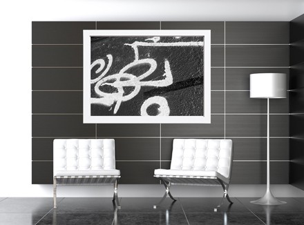
7. Best Wall Colour and Artwork Combinations for Office Types
Designing for productivity is not a one-size-fits-all endeavor. Different office functions demand different atmospheres, and both wall colour and artwork must adapt to support those specific emotional and cognitive needs. In this section, we match strategic Office Wall Colours and Artwork Choices for Productivity with common types of business spaces—bringing in the nuances of role-specific demands and environmental psychology.
Executive Offices
These spaces symbolize leadership, stability, and authority. They must inspire confidence while maintaining a sense of quiet focus.
- Best Wall Colours: Deep charcoal, navy, warm greige, or earthy tones.
- Ideal Artwork: Monochromatic photography, abstract paintings in corporate colours, architectural visuals, or landscape art with natural symmetry.
- Keywords Applied: These spaces benefit from corporate office art that subtly reflects power and clarity while staying visually refined.
Open-Plan Workstations
Designed for collaboration and high-efficiency workflows, open-plan spaces require visual consistency, minimal distraction, and flexibility.
- Best Wall Colours: Cool neutrals such as soft grey, blue-grey, pale green.
- Ideal Artwork: Repetitive prints, modular graphic designs, minimalist line drawings that create rhythm.
- Strategy: Use corporate art for business / offices to build brand identity while keeping overstimulation low.
Reception and Lobby Areas
First impressions count. These are public-facing zones where wall colour and art must immediately communicate brand ethos and professionalism.
- Best Wall Colours: Taupe, ivory, muted teal, or soft black.
- Ideal Artwork: Oversized company-inspired works, branded installations, curated artist collaborations.
- Tip: Incorporate art to corporate clients that reflects mission statements or company heritage.
Meeting and Boardrooms
These are the strategic nerve centers. The design must support discussion, negotiation, and calm decisiveness.
- Best Wall Colours: Slate grey, olive, warm beige, or cream.
- Ideal Artwork: Conceptual diagrams, modern art in soothing tones, or large-scale abstracts.
- Recommendation: Use corporate office wall art that encourages focus and offers a sense of structure.
Break Rooms and Staff Lounges
These are rejuvenation zones where relaxation and social connection are the goals. Colours and art should lower stress and encourage informal interaction.
- Best Wall Colours: Buttery yellow, mint green, blush, or soft coral.
- Ideal Artwork: Whimsical prints, food-themed art, community-submitted creations, or humorous visuals.
- Functionality: Make use of rotating artwork for offices to keep the space fresh and welcoming.
Private Workspaces and Focus Rooms
For deep work, emotional regulation, and autonomy, private offices need visual serenity and clarity.
- Best Wall Colours: Misty blue, matte sage, warm grey, or pale sand.
- Ideal Artwork: Minimalist photography, soft watercolours, nature scenes, or quote typography.
- Impact: These environments benefit most from calm-inducing corporate art for your business and office selections.
Creative Studios and Innovation Labs
These spaces thrive on idea generation and visual stimulation. Colour and art should provoke curiosity and spark dialogue.
- Best Wall Colours: Bold accents like cerulean, vibrant mustard, tangerine, or lime.
- Ideal Artwork: Colourful collages, mixed-media installations, experimental or student art.
- Guidance: Embrace visual contrast here—both wall and office artworks should challenge norms.
Corridors and Transitional Spaces
Often forgotten, these spaces can serve as storytelling tools and visual bridges between zones.
- Best Wall Colours: Neutral gradients, off-whites, and brand-accent hues.
- Ideal Artwork: Framed timeline graphics, wayfinding visuals, rotating photo essays.
- Best Practice: Align frame style and content with main office themes for visual continuity.
Lesson:
Each office type calls for a unique alignment of wall colour and artwork. When tailored properly, design serves not only a visual purpose but enhances the emotional tone, function, and productivity of each space.
Summary of Key Points:
- Match colour and art to the function of each workspace
- Executive offices need bold, quiet strength; lounges need warmth and fun
- Meeting rooms call for clarity and minimal distraction
- Corridors should maintain visual rhythm and narrative
- Creative spaces can handle contrast; focus rooms require harmony
- Let every zone reinforce brand, comfort, and productivity through thoughtful pairing of wall colour and corporate artwork
Elevate your interior workplace with curated corporate art collections and fine art prints.
????Shop Heart & Soul Whisperer’s gallery today and style your space with timeless meaning.➤
═════════════════════════════════════════════════════
Heart & Soul Whisperer Art Gallery offers curated corporate art collections designed to elevate focus, inspire emotional clarity, and enhance brand identity. From selecting the best office wall colours and artwork to sourcing motivational prints and abstract art for business spaces, our gallery provides bespoke solutions for corporate offices, home offices, and co-working environments.
Redefine your workspace with purpose — explore Heart & Soul Whisperer’s photographic print collections and discover artworks crafted to boost productivity, well-being, and visual storytelling.
????SHOP NOW FOR OUR LIMITED EDITIONS PHOTOGRAPHIC PRINTS & ABSTRACT ART????
???? Request a Corporate Art Proposal | Start Your Custom Art Consultation ????
═════════════════════════════════════════════════════
8. Design Recommendations Based on Sensory and Aesthetic Balance
Creating a productive and inspiring workplace hinges on more than applying trends or colour theory—it requires tuning into how people feel and perform within their environment. Sensory and aesthetic balance ensures that both Office Wall Colours and Artwork Choices for Productivity work in concert to support focus, engagement, and well-being. This section outlines universal recommendations based on visual comfort, emotional response, and corporate identity alignment.
1. Match Visual Stimulation to Cognitive Demand
- Use low-stimulation palettes (e.g., cool greys, sage green) and minimalist artwork in spaces where focus is critical.
- Introduce high-energy colours (e.g., coral, mustard) and bold art in innovation hubs, break rooms, or brainstorm spaces.
- Vary intensity by task: subdued for analytical work; dynamic for creative collaboration.
2. Balance Colour Temperature and Light Exposure
- Cool colours work best in well-lit, south-facing offices; warm tones in lower-lit or north-facing spaces.
- Adjust saturation to compensate for natural light—brighter walls in dim rooms, muted hues in sunlit zones.
3. Respect Emotional Tone and Team Culture
- Match colour-emotion to departmental goals: blue for finance and legal (calm, reliable), yellow or orange for marketing (energizing, creative).
- Let teams contribute to choosing art to corporate clients that reflects their ethos and motivates them.
- Avoid imposing generic decor across varied departments.
4. Maintain Visual Hierarchy and Spatial Clarity
- Designate visual focal points using artwork—especially in neutral-coloured environments.
- Use negative space intentionally around art to allow eyes to rest.
- Anchor rooms with one dominant hue and harmonize supporting tones through corporate art for business / offices.
5. Encourage Personalization Within Professional Boundaries
- Allow staff to select from pre-approved mini artworks or desktop decor.
- Use interchangeable gallery-style displays in communal areas.
- Balance individuality with cohesion through consistent frame styles or unifying visual themes.
6. Synchronize Colour, Art, and Acoustic Comfort
- Visually busy environments should integrate sound-dampening textures and calm-inducing tones.
- Pair abstract office artworks with acoustic panels in collaborative areas.
- Avoid hard surfaces and echo-chambers where intense colour and art are already stimulating.
7. Reinforce Brand Identity Subtly
- Incorporate brand colours sparingly into artwork, not just walls.
- Avoid literal branding (logos in art); opt for abstract expressions of company values.
- Showcase curated corporate art for your business and office that tells a story aligned with the mission.
Lesson:
Designing for sensory and aesthetic balance is not just about visual appeal—it’s about aligning purpose with perception. When colour, artwork, light, space, and sound work together, the result is a space that supports human performance and emotional resilience.
Summary of Key Points:
- Balance stimulation to suit work type and personality
- Coordinate colour temperature with lighting conditions
- Align emotional tone of design with departmental culture
- Use art and negative space to guide attention and reduce clutter
- Encourage controlled personalization to foster engagement
- Integrate visual and acoustic strategies for cohesive comfort
- Use artwork to communicate identity without oversaturation
Elevate your interior workplace with curated corporate art collections and fine art prints.
????Shop Heart & Soul Whisperer’s gallery today and style your space with timeless meaning.➤
═════════════════════════════════════════════════════
Elevate your collection, your spaces, and your legacy with curated fine art photography from Heart & Soul Whisperer. Whether you are an art collector seeking timeless investment pieces, a corporate leader enriching business environments, a hospitality visionary crafting memorable guest experiences, or a healthcare curator enhancing spaces of healing—our artworks are designed to inspire, endure, and leave a lasting emotional imprint. Explore our curated collections and discover how artistry can transform not just spaces, but lives.
Curate a life, a space, a legacy—one timeless artwork at a time. View the Heart & Soul Whisperer collection. ➤Elevate, Inspire, Transform ➔
═════════════════════════════════════════════════════
9. Common Mistakes in Office Colour and Art Selection
Even with the best intentions, design missteps in corporate environments are common—often undermining the effectiveness of an otherwise thoughtfully constructed space. Mistakes related to wall colour and artwork for offices can create distraction, visual discomfort, or emotional discord that hinders rather than enhances productivity. This section identifies frequent errors and provides solutions to help businesses avoid costly design flaws.
1. Overusing Bold or Saturated Wall Colours
While vibrant hues can energize a space, using them as dominant wall colours often leads to overstimulation.
- Problem: Causes eye fatigue and increases cognitive load.
- Solution: Use saturated colours as accents or feature walls only. Pair them with neutral surroundings and calming corporate office art.
2. Incoherent Colour Schemes Across Departments
A lack of unified colour planning can make an office feel disjointed and chaotic.
- Problem: Breaks visual flow and confuses branding.
- Solution: Create a master palette. Vary tones for departmental mood, but ensure cross-space harmony through complementary hues and consistent corporate office wall art themes.
3. Choosing Art That Competes with the Wall Colour
Artwork should complement, not clash with, its background.
- Problem: Poor contrast or mismatched tones make art feel lost or jarring.
- Solution: Align colour temperature and visual weight. Use frames and spacing to define boundaries. Match complex art with simple walls, and vice versa.
4. Ignoring Light Conditions When Selecting Colours or Art
Lighting dramatically alters how colours and artwork are perceived.
- Problem: Colour shifts or shadows distort visual balance.
- Solution: Test paint swatches and art to corporate clients under different light conditions (daylight, artificial, dim). Choose finishes that suit the room’s exposure.
5. Overcrowding Walls with Excessive Art
Too much visual input reduces focus and creates mental clutter.
- Problem: Dilutes the emotional impact of individual pieces.
- Solution: Prioritize quality over quantity. Use gallery spacing and allow negative space for clarity. Rotate collections seasonally.
6. Lack of Purpose-Driven Design Choices
Design elements that aren’t tied to the room’s function can cause confusion.
- Problem: Mood and energy levels don’t match the task.
- Solution: Select corporate art for business / offices and wall colour based on emotional goals (focus, collaboration, calm) for each room.
7. Neglecting Personalization Opportunities
Standardized décor may feel sterile or uninspiring to employees.
- Problem: Leads to disengagement and emotional detachment from the space.
- Solution: Offer curated options for desk art or localized wall pieces. Let staff contribute to communal displays.
8. Using Branding Too Literally in Art or Colour
Overuse of logos or corporate colours can feel forced or inauthentic.
- Problem: Reduces design sophistication and may create visual fatigue.
- Solution: Reflect brand identity through metaphor, colour accents, and abstract representations in office artworks.
Lesson:
Avoiding these common mistakes ensures that colour and artwork contribute to—not compete with—the productivity, mood, and cohesion of the corporate workspace. Design becomes most effective when rooted in intentionality, psychology, and user experience.
Summary of Key Points:
- Avoid overusing bold colours as dominant walls
- Maintain colour and art consistency across departments
- Pair artwork with wall tone for harmony, not competition
- Consider lighting conditions when choosing colour or art
- Limit visual clutter and overcrowding of art
- Align design decisions with each space’s emotional goal
- Allow for staff input and personalization
- Use branding as inspiration, not literal visual identity
Elevate your interior workplace with curated corporate art collections and fine art prints.
????Shop Heart & Soul Whisperer’s gallery today and style your space with timeless meaning.➤
═════════════════════════════════════════════════════
Elevate your collection, your spaces, and your legacy with curated fine art photography from Heart & Soul Whisperer. Whether you are an art collector seeking timeless investment pieces, a corporate leader enriching business environments, a hospitality visionary crafting memorable guest experiences, or a healthcare curator enhancing spaces of healing—our artworks are designed to inspire, endure, and leave a lasting emotional imprint. Explore our curated collections and discover how artistry can transform not just spaces, but lives.
Curate a life, a space, a legacy—one timeless artwork at a time. View the Heart & Soul Whisperer collection. ➤Elevate, Inspire, Transform ➔
═════════════════════════════════════════════════════
10. Conclusion: Designing Workspaces That Work for the Mind
Why Colour and Art Matter in Corporate Design
Investing in the right Office Wall Colours and Artwork Choices for Productivity is not just about decorating a space—it’s about shaping the emotional, cognitive, and professional performance of your entire organization. As workplaces evolve in the post-pandemic era, the demand for emotionally intelligent, psychologically aligned office environments has never been higher.
This article has shown that every wall, every shade, and every carefully curated piece of corporate office art plays a role in shaping how people think, feel, and perform. From calming blue tones that support concentration to energizing yellows that spark creativity, colour is a tool of business strategy. When thoughtfully paired with visually balanced, professionally curated artwork for offices, the results are profound: higher productivity, increased employee satisfaction, and stronger alignment with your brand’s values.
For business and corporate offices, effective design goes beyond furniture and lighting. It incorporates layered visual storytelling using both colour and art to reinforce the identity and purpose of each space. Whether you’re creating a quiet executive suite, an inspiring innovation lab, or a welcoming reception area, the right corporate art for your business and office completes the vision.
Furthermore, tailoring corporate art for business / offices based on departmental needs and individual environmental sensitivity creates inclusive spaces where all employees can thrive. Neurodivergent staff, introverts, extroverts, creatives, and analysts all benefit when wall colour and corporate office wall art reflect the psychological rhythm of their work.
Designing with intention means moving away from generic art and bland colour schemes. Instead, embrace art to corporate clients that is visually intelligent, brand-relevant, and emotionally resonant. This is the future of smart design—and it’s available to every business willing to prioritize well-being alongside performance.
At Heart & Soul Whisperer Art Gallery, we specialize in creating spaces that matter. Our curated collections of artwork for offices, inspired by calm, intellect, and emotional power, help your brand tell its story—quietly, beautifully, and with lasting impact.
Final Summary of Key Lessons:
- Colour affects mood, focus, memory, and interpersonal connection.
- Art enhances or tempers these effects depending on complexity and placement.
- Each type of office (executive, creative, collaborative) needs tailored visual strategy.
- Lighting, personality types, and cognitive load must be factored into design decisions.
- Visual harmony improves productivity and reduces fatigue.
- Branding should be subtle and expressive, not overt or distracting.
- Inclusivity means offering flexibility—through art, colour, and spatial zoning.
- Design is not just decoration; it’s a business performance tool.
Lesson: When colour and art are designed with human intention, they become more than decoration. They become instruments of clarity, creativity, and connection in the modern workplace.
Elevate your interior workplace with curated corporate art collections and fine art prints.
????Shop Heart & Soul Whisperer’s gallery today and style your space with timeless meaning.➤
═════════════════════════════════════════════════════
Elevate your collection, your spaces, and your legacy with curated fine art photography from Heart & Soul Whisperer. Whether you are an art collector seeking timeless investment pieces, a corporate leader enriching business environments, a hospitality visionary crafting memorable guest experiences, or a healthcare curator enhancing spaces of healing—our artworks are designed to inspire, endure, and leave a lasting emotional imprint. Explore our curated collections and discover how artistry can transform not just spaces, but lives.
Curate a life, a space, a legacy—one timeless artwork at a time. View the Heart & Soul Whisperer collection. ➤Elevate, Inspire, Transform ➔
═════════════════════════════════════════════════════
Why Choose Heart & Soul Whisperer for Corporate Artworks
When it comes to elevating your office environment with meaningful, impactful, and visually intelligent artwork, Heart & Soul Whisperer Art Gallery stands apart as the premier choice for modern businesses. Created by visionary artist Dr. Zenaidy Castro, the gallery offers more than art—it offers emotional resonance, aesthetic refinement, and design alignment tailored to professional spaces.
Here’s why Heart & Soul Whisperer is the trusted partner for corporate art for business and offices:
- Purpose-Driven Artwork: Each piece is created with emotional depth and visual clarity to complement a range of workplace settings—from focus-driven executive suites to dynamic collaboration zones.
- Elegant, Minimalist Sophistication: The gallery’s curated collections embody timeless beauty, making them the perfect companion for modern, neutral, or luxury corporate interiors.
- Wellness-Focused Design: Inspired by themes of harmony, nature, and emotional intelligence, the artworks support mental well-being, reduce visual fatigue, and enhance the sensory experience of work.
- Tailored for Productivity: Whether you’re outfitting a boardroom, a reception area, or an innovation hub, the right artwork can reinforce your company’s mission while encouraging creativity and focus.
- Philanthropic Impact: A portion of each purchase supports animal welfare and hypertrophic cardiomyopathy research in memory of Zucky, the beloved Sphynx cat who inspired the founding of the gallery. Your purchase supports both beauty and purpose.
Heart & Soul Whisperer understands the nuanced demands of business environments and provides art that is as intelligent as it is inspiring. When designing for productivity, emotional connection, and brand legacy, there is no better artistic partner.
Visit www.heartandsoulwhisperer.com.au/shop/ to explore curated collections and request corporate consultations.
Let’s Build Something Beautiful Together
Your space is more than just a place—it’s a story waiting to be told. At Heart & Soul Whisperer Art Gallery, we believe that the right artwork and colour palette can elevate any environment into a sanctuary of emotion, elegance, and meaning. Whether you’re designing a luxury office, a healing healthcare space, or a refined residential interior, our bespoke collections are crafted to help you create lasting impressions and transformative experiences.
Founded by Dr Zenaidy Castro, a Melbourne-based cosmetic dentist and visionary artist, our gallery offers curated fine art, commercial wall art, and emotionally resonant visual solutions tailored to your brand, function, and audience. Each piece we offer is more than decoration—it is a reflection of identity, purpose, and atmosphere.
Let’s turn walls into experiences and spaces into stories—start your journey with Heart & Soul Whisperer today.
════════════════════════════════════════════════════
Discover Helpful Office & Business Resources
Artwork for Every Healthcare Facility➤ “Transform healing spaces with art that nurtures the spirit and soothes the soul”
Colour Theraphy in Healthcare ➤ “Harnessing the power of color to heal, uplift, and inspire wellness”
Healing Wall Art for Every Room in the Hospital ➤“Visual balm for every space — art designed to comfort, calm, and restore”
Corporate Art For Business Offices- Office Wall Art for sale ➤ “Elevate your workspace with refined artistry that inspires success and creativity”
Office and Business Art – Corporate Spaces with Elegance ➤ “Where sophistication meets motivation — curated art for discerning professional spaces”
How to Choose Art for Your Office ➤ “A guide to selecting pieces that balance beauty, purpose, and productivity”
Office Wall Colours and Artwork Choices for Productivity ➤ “The subtle dance of hues and imagery — crafting environments that foster focus and flow”
Art and Colour in Architecture ➤ “Intertwining structure and soul — the art of integrating color into built spaces”
Styling Cruise Interiors with Fine Art Photography ➤ “Setting sail with elegance — bespoke art to enrich luxurious voyage interiors”
Affordable luxury art for corporate art procurement ➤ “Exquisite art within reach — premium pieces crafted for visionary businesses”
Hospitality Art ➤ “Creating welcoming atmospheres with art that invites, enchants, and delights”
Best Wall Art for Every Hotel Type ➤ “Tailored visual experiences for boutique charm, grand luxury, and everything between”
Art and Colour in Boutique Hotels & Luxury Resorts ➤ “Curated palettes and imagery that define elegance and comfort in exclusive spaces”
Inspiring Solutions for Interior Decorators & Stylists
B&W Photography ➤ “Timeless contrasts to craft spaces of depth, drama, and sophisticated elegance”
Celebrity Homes and B&W Photography: Iconic Style Secrets ➤ “Discover how monochrome masterpieces shape the allure of star-studded sanctuaries”
The Psychology of Visual Rhythm in Art Display ➤ “Unlocking harmony and flow — art arranged to resonate with mind and soul”
Emotional Luxury: Where Art Meets Interior Design ➤ “Elevate spaces with artworks that stir feeling, enrich atmosphere, and define opulence”
Art and Colour in Luxury Properties ➤ “The alchemy of hues and form — crafting immersive environments of refined taste”
Transform Interiors with Fine Art Photography and Style ➤ “From vision to reality — infusing interiors with narrative, emotion, and light”
Fine Art Photography: Capturing Emotion, Ideas, and Vision ➤ “Frames that transcend the image — storytelling through every captured moment”
Giclée Fine Art Print ➤ “Precision and passion united — prints that honor the artist’s original vision with unmatched clarity”
Balance, Flow & Energy — Feng Shui & Vastu Insights
Attract Good Luck with Lucky Feng Shui Art and Vastu Art ➤ “Harmonize your space, invite fortune — where sacred art meets ancient wisdom”
Harness Vastu Shastra and Art to Invite Good Fortune ➤ “Align your surroundings with cosmic flow — art that draws prosperity and peace”
Feng Shui Art to Attract Good Luck ➤ “Embrace balance and abundance — artworks designed to channel positive energy and blessings”
References
- Kwallek, N., Soon, K., & Lewis, C. M. (2007). Work week productivity, visual complexity, and individual environmental sensitivity in three offices of different color interiors. Color Research & Application, 32(2), 130–143.
- Mahnke, F. H. (1996). Color, Environment, and Human Response: An Interdisciplinary Understanding of Color and Its Use as a Beneficial Element in the Design of the Architectural Environment. Wiley. ISBN 978-0471285521
- Morton, J. (2004). Color Voodoo: A Guide to Color Meaning. Colorcom.
- Rider, T. (2019). Psychology of Interior Design: How Design Affects Your Mood, Mindset and Productivity. MindSpace Books. ISBN 9781793396335
- Birren, F. (1988). Color Psychology and Color Therapy: A Factual Study of the Influence of Color on Human Life. Citadel Press. ISBN 9780806500611
- Wastiels, L., Schifferstein, H., Wouters, I., & Heylighen, A. (2013). Colour in healthcare environments: A critical review of the literature. Color Research and Application, 38(1), 32–41.
__________________________________________________________
Let every wall in your workplace whisper inspiration. Discover curated fine art from Heart & Soul Whisperer —
pieces thoughtfully paired to elevate colour, ignite creativity, and shape spaces where success feels effortless.
???? Explore our Corporate Art Collection here. ➤


Globetrotting Dentist and Australian Artists and Emerging Photographer to watch in 2025 Dr Zenaidy Castro. She is a famous cosmetic dentist in Melbourne Australia. Australia’s Best Cosmetic Dentist Dr Zenaidy Castro-Famous cosmetic dentist in Melbourne Australia and award-winning landscape photographer quote: Trust me, when you share your passions with the world, the world rewards you for being so generous with your heart and soul. Your friends and family get to watch you bloom and blossom. You get to share your light and shine bright in the world. You get to leave a legacy of truth, purpose and love. Life just doesn’t get any richer than that. That to me is riched fulfilled life- on having to discovered your life or divine purpose, those passion being fulfilled that eventuates to enriching your soul. Famous Australian female photographer, Australia’s Best woman Photographer- Dr Zenaidy Castro – Fine Art Investment Artists to Buy in 2025. Buy Art From Emerging Australian Artists. Investing in Art: How to Find the Next Collectable Artist. Investing in Next Generation Artists Emerging photographers. Australian Artists to Watch in 2025. Australasia’s Top Emerging Photographers 2025. Globetrotting Dentist and Australian Artists and Emerging Photographer to watch in 2025 Dr Zenaidy Castro. She is a famous cosmetic dentist in Melbourne Australia.
Globetrotting Dentist and Australian Artists and Emerging Photographer to watch in 2025 Dr Zenaidy Castro. She is a famous cosmetic dentist in Melbourne Australia. Australia’s Best Cosmetic Dentist Dr Zenaidy Castro-Famous cosmetic dentist in Melbourne Australia and award-winning landscape photographer quote: Trust me, when you share your passions with the world, the world rewards you for being so generous with your heart and soul. Your friends and family get to watch you bloom and blossom. You get to share your light and shine bright in the world. You get to leave a legacy of truth, purpose and love. Life just doesn’t get any richer than that. That to me is riched fulfilled life- on having to discovered your life or divine purpose, those passion being fulfilled that eventuates to enriching your soul. Famous Australian female photographer, Australia’s Best woman Photographer- Dr Zenaidy Castro – Fine Art Investment Artists to Buy in 2025. Buy Art From Emerging Australian Artists. Investing in Art: How to Find the Next Collectable Artist. Investing in Next Generation Artists Emerging photographers. Australian Artists to Watch in 2025. Australasia’s Top Emerging Photographers 2025. Globetrotting Dentist and Australian Artists and Emerging Photographer to watch in 2025 Dr Zenaidy Castro. She is a famous cosmetic dentist in Melbourne Australia.
═══════════════════════════════════════════════════
At Heart & Soul Whisperer Art Gallery, every coloured and black and white photograph tells a story beyond sight—an emotional journey captured in light, shadow, and soul. Founded by visionary artist Dr Zenaidy Castro, our curated collections—spanning landscapes, waterscapes, abstract art, and more—offer a timeless elegance that transcends fleeting trends. Whether enriching private residences, corporate offices, healthcare facilities, hospitals, or hospitality spaces, our artworks are designed to transform environments into sanctuaries of memory, beauty, and enduring inspiration. Let your walls whisper stories that linger—reflections of art, spirit, and the love that connects us all.
Whispers in Monochrome — The Artist’s Signature Collection
Limited Editions ➤ “Treasures of Time, Rare Whispers on Canvas — Art as Unique as Your Soul”
Infrared ➤ “Beyond the Visible: Worlds Revealed in Fiery Hues and Hidden Radiance”
Vintage & Retro ➤ “Echoes of Elegance, Timeless Stories Wrapped in Nostalgic Light”
Film Emulation Photography ➤ “Where Grain Meets Grace — Classic Souls Captured in Modern Frames”
Minimalism ➤ “Pure Essence, Quiet Power — Beauty Found in the Art of Less”
Chiaroscuro Landscapes ➤ “Light and Shadow’s Dance: Landscapes Painted in Dramatic Contrast”
Moody Landscapes ➤ “Whispers of Storm and Silence — Nature’s Emotions in Every Frame”
Mystical Landscapes ➤ “Enchanted Realms Where Spirit Meets Horizon, Dream and Reality Blur”
Moody and Mystical ➤ “A Symphony of Shadows and Spirit — Landscapes That Speak to the Soul”
Discover the Vibrance of Landscapes and Waterscapes
Country & Rural ➤ “Sun-kissed fields and quiet homesteads — where earth and heart meet in vibrant harmony”
Mountain ➤ “Majestic peaks bathed in golden light — nature’s grandeur painted in every hue”
Trees & Woodlands ➤ “Whispers of leaves and dappled sunlight — a living tapestry of green and gold”
At The Water’s Edge ➤ “Ripples of color dance on tranquil shores — where land and liquid embrace in serene beauty”
Ethereal Landscapes and Waterscapes in Monochrome
Country & Rural Landscapes ➤ “Monochrome whispers of earth and toil — the quiet poetry of open lands”
Australian Rural Landscapes ➤ “Shadowed vistas of sunburnt soil — raw beauty in timeless contrast”
The Simple Life - Country Living ➤ “Essence distilled — moments of calm in stark black and white”
Cabin Life & shacks ➤ “Silent shelters bathed in light and shadow — stories carved in wood and time”
Mountain Landscapes ➤ “Peaks etched in silver and shadow — grandeur carved by nature’s hand”
Trees & Woodlands ➤ “Branches weaving tales in shades of gray — forests alive in monochrome breath”
At The Water’s Edge ➤ “Edges where light and dark meet — reflections of stillness and flow”
Lakes & Rivers ➤ “Flowing grace captured in stark clarity — water’s endless journey in shades of gray”
Waterfalls ➤ “Cascades frozen in black and white — movement captured in eternal pause”
Beach, Coastal & Seascapes ➤ “Silent shores and textured tides — nature’s drama in monochrome waves”
Reflections ➤ “Mirrored worlds in shades of shadow — where reality blurs into dream”
Snowscapes ➤ “White silence pierced by shadow — frozen landscapes of quiet wonder”
Desert & The Outback ➤ “Vastness distilled into contrast — endless horizons in black and white”
A Journey Through Curated Beauty
Black and White Photography ➤ “Timeless tales told in shadow and light — where every tone speaks a silent story”
Colour Photography ➤ “A vivid symphony of hues — life captured in its most radiant form”
Abstract Art & Abstracted Labdscapes ➤ “Beyond form and figure — emotions and visions woven into pure expression”
Digital Artworks ➤ “Where imagination meets technology — digital dreams crafted with artistic soul”
People ➤ “Portraits of the human spirit — stories told through eyes, expressions, and silent moments”
═══════════════════════════════════════════════════