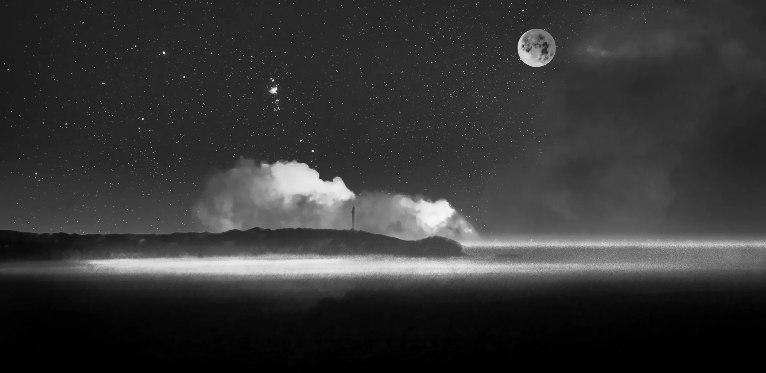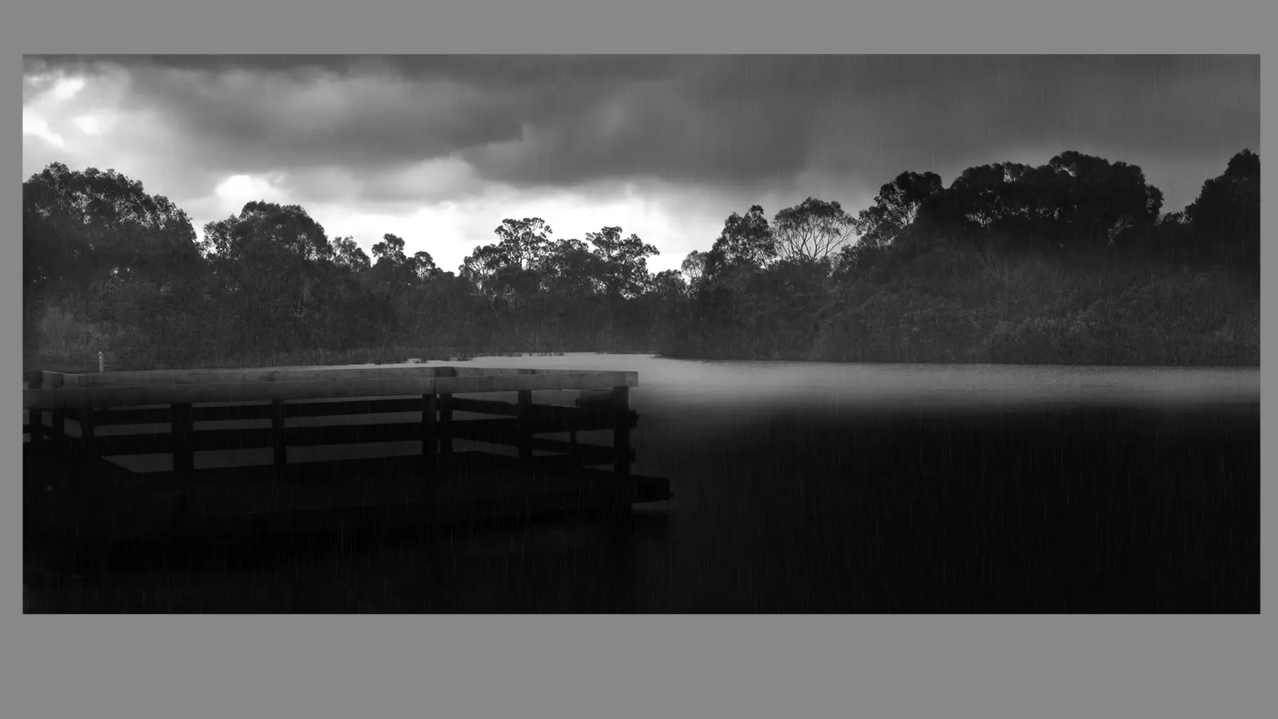


Displaying Photography and Abstract Art with Impact
Table of Contents
1. Framing Small vs. Large Artworks
Tips on proportion, visual weight, and choosing appropriate frame depths and materials for miniature works vs. oversized prints or canvases.
2. Grouping Multiple Artworks: Strategies for Cohesion
Guidelines on hanging photographs in clusters, grids, or salon-style layouts. Covers spacing, alignment, and creating flow through tonal or thematic harmony.
3. Mixing Color, Black & White, and Abstract Art
Explores whether and how to display color with monochrome and abstract pieces—what works visually and emotionally in mixed-media walls.
4. Combining Different Subjects and Media
Can a cityscape hang next to a figurative portrait or a surreal abstraction? Learn how to create unity when curating diverse photographic content.
5. Ideal Locations for Displaying Photographs and Abstract Prints
Discusses room selection (e.g., hallways, bedrooms, offices, galleries), wall scale, and what kinds of images suit each context.
6. Lighting Conditions for Color, Black & White, and Abstracts
Explains how color temperature, intensity, and direction of light affect the perception of contrast, depth, and vibrancy across different types of artworks.
7. Wall Colors and Surrounding Decor
What backgrounds enhance photographic prints? Should you choose neutral or bold walls? Learn how to let your art breathe or command attention.
8. Display Rotation and Seasonal Refresh
How to rotate works in and out of display to keep your space dynamic, while protecting prints from prolonged exposure.
9. Museum and Gallery Display Secrets You Can Use at Home
Practical techniques inspired by curatorial and conservation standards—how to replicate them affordably for domestic or professional spaces.
Get to Know the Creative Force Behind the Gallery
About the Artist ➤ “Step into the world of Dr. Zenaidy Castro — where vision and passion breathe life into every masterpiece”
Dr Zenaidy Castro’s Poetry ➤ "Tender verses celebrating the bond between humans and their beloved pets”
Creative Evolution ➤ “The art of healing smiles — where science meets compassion and craft”
The Globetrotting Dentist & photographer ➤ “From spark to masterpiece — the unfolding journey of artistic transformation”
Blog ➤ “Stories, insights, and inspirations — a journey through art, life, and creative musings”
As a Pet mum and Creation of Pet Legacy ➤ “Honoring the silent companions — a timeless tribute to furry souls and their gentle spirits”
Pet Poem ➤ “Words woven from the heart — poetry that dances with the whispers of the soul”
As a Dentist ➤ “Adventures in healing and capturing beauty — a life lived between smiles and lenses”
Cosmetic Dentistry ➤ “Sculpting confidence with every smile — artistry in dental elegance”
Founder of Vogue Smiles Melbourne ➤ “Where glamour meets precision — crafting smiles worthy of the spotlight”
Unveil the Story Behind Heart & Soul Whisperer
The Making of HSW ➤ “Journey into the heart’s creation — where vision, spirit, and artistry converge to birth a masterpiece”
The Muse ➤ “The whispering spark that ignites creation — inspiration drawn from the unseen and the divine”
The Sacred Evolution of Art Gallery ➤ “A spiritual voyage of growth and transformation — art that transcends time and space”
Unique Art Gallery ➤ “A sanctuary of rare visions — where each piece tells a story unlike any other”
1. Framing Small vs. Large Artworks
Framing decisions are not one-size-fits-all—particularly when it comes to the scale of the artwork. Whether dealing with a petite 8×10-inch black-and-white photograph or a commanding 60-inch wide abstract canvas, the size of the piece directly affects how it should be mounted, displayed, and visually balanced within its environment. This section explores the nuanced differences in framing and displaying small versus large photographic prints and abstract artworks, along with practical tips and aesthetic considerations that ensure each piece shines in its intended space.
Framing Small Artworks: Elegance in Restraint
Smaller artworks often invite closer viewing, drawing the viewer into an intimate dialogue with the image. However, their scale can sometimes pose challenges in terms of visual impact—particularly in large rooms or high-ceilinged spaces.
To enhance their presence, consider the following framing strategies:
- Wider mat borders: A thick white or off-white mat can create breathing space around the image and make a small work feel important. This is particularly effective for black and white photographs or minimalist abstracts.
- Oversized frames: Pairing a small artwork with a proportionally larger frame helps anchor it on a wall and avoids it appearing like a “floating” speck. This also creates a gallery-grade effect often seen in museums.
- Float mounting: A popular technique in contemporary presentation, float mounting reveals the edges of a small print, especially effective when the paper itself has texture or deckled edges.
- Grouped display: Small works can be arranged in diptychs, triptychs, or grids to create visual rhythm and volume. They work well in stairwells, hallways, and reading nooks where viewers tend to linger.
Framing Large Artworks: Balance, Weight, and Structural Integrity
Larger artworks have a built-in advantage: they command attention. But their framing requires both technical precision and architectural awareness.
Key considerations include:
- Frame strength and rigidity: Oversized prints require more robust frame mouldings to support their weight and prevent warping. Metal or hardwood frames are preferred over composite options.
- Reinforced corners and backings: For large-scale photographic or abstract works, backing boards must be acid-free and structurally sound to prevent bowing over time.
- Spacing from the wall: For depth and dimension, especially in float-mounted or canvas works, consider using shadow-box frames or spacers.
- Glazing weight: Museum acrylic is the top choice for large works due to its shatterproof and lightweight nature, reducing strain on hanging hardware and wall anchoring systems.
Matting Proportions: Scaling for Balance
Matting plays a different role depending on the artwork size:
- For small works, matting offers visual breathing room and gives prominence.
- For large works, a slim mat or no mat at all may be preferable to avoid overwhelming the composition.
- Mat width can be used to subtly shift viewer focus upward or downward, depending on how it is weighted.
Wall Placement by Size
- Small works should be placed at eye level or slightly below to invite close inspection.
- Large works should be centered both vertically and horizontally on a prominent wall, avoiding placement that’s too low or high unless for dramatic effect in a two-story space.
- Use painter’s tape or cardboard cutouts to test placements before committing.
Installation and Anchoring Tips
Large works require proper anchoring:
- Use wall studs and dual-point hanging systems.
- French cleats are ideal for heavier framed pieces.
- Always account for the added weight of museum acrylic or glazing.
For small works:
- Standard hooks may suffice.
- Consider gallery rails for collections or rotating displays.
Lighting Considerations
- Small pieces benefit from targeted lighting such as picture lights or adjustable LED spots.
- Large works should be evenly lit using wall washers or ceiling-mounted track lighting with beam spread calibrated for width.
Material Choices by Size
- Paper type: Heavier GSM papers are ideal for larger prints to avoid curling.
- Canvas and acrylic mounts: Suitable for large-scale works that are frameless or float-mounted.
- Framing finishes: Minimalist metal for modern pieces; rich woods for warmth and gravitas.
Aesthetic Framing Rules of Thumb
- Don’t overcrowd small pieces with heavy mouldings.
- Don’t underplay large pieces with thin, flimsy frames.
- Contrast frame color with wall tone, or echo dominant artwork hues.
- For abstract works, especially large ones, consider floating or tray frames to let the canvas “breathe.”
Lesson: Artwork size determines not only the visual balance but also the structural needs of framing and display. Matching the frame’s weight, profile, and presentation to the scale of the work ensures both safety and visual harmony.
Summary of Key Points:
- Small works benefit from oversized mats, float mounting, and grouping strategies.
- Large works need reinforced frames, rigid backings, and lightweight glazing.
- Matting should be scaled for balance, not one-size-fits-all.
- Wall placement, hardware, and lighting must be adapted to scale.
- Matching frame material and thickness to size avoids visual or structural imbalance.
- Use scale to elevate visual drama while maintaining archival protection.
═════════════════════════════════════════════════════
Elevate your collection, your spaces, and your legacy with curated fine art photography from Heart & Soul Whisperer. Whether you are an art collector seeking timeless investment pieces, a corporate leader enriching business environments, a hospitality visionary crafting memorable guest experiences, or a healthcare curator enhancing spaces of healing—our artworks are designed to inspire, endure, and leave a lasting emotional imprint. Explore our curated collections and discover how artistry can transform not just spaces, but lives.
Curate a life, a space, a legacy—one timeless artwork at a time. View the Heart & Soul Whisperer collection. ➤Elevate, Inspire, Transform ➔
═════════════════════════════════════════════════════
2. Grouping Multiple Artworks: Strategies for Cohesion
Whether you are curating a gallery wall or arranging a few artworks in a living space, the way multiple pieces are grouped determines the visual rhythm, thematic coherence, and overall emotional tone of the room. Grouping is not just about placing works side by side—it’s about orchestrating a visual conversation among them.
A cohesive display encourages the eye to move fluidly from one piece to the next, while still allowing each work to maintain its individuality. This is particularly important when combining pieces of various sizes, formats, and subjects.
Plan the Layout Before Hanging
Before hammering any nails, lay the artwork out on the floor or use paper cutouts to simulate each piece’s size and position on the wall.
- Grid layouts offer structure and symmetry and work well for pieces of the same size and frame style.
- Salon-style arrangements allow for more playful or eclectic mixes of artwork, especially with diverse frame styles or mediums.
- Linear arrangements, either horizontal or vertical, are effective for series or narratives.
Use painter’s tape, string, or virtual layout apps to visualize the flow before committing.
Anchor the Arrangement Around a Focal Piece
Every group display benefits from a focal point—a single work that anchors the entire arrangement.
- Choose the largest, most striking, or most emotionally resonant piece as the anchor.
- Build the rest of the arrangement outward, adjusting visual weight and spacing accordingly.
This technique prevents the arrangement from feeling random or disconnected.
Create Balance Through Visual Weight
Balance is about more than symmetry. A small, dark photograph might carry more visual weight than a larger, light-toned abstract. Consider:
- Color contrast
- Subject intensity
- Frame thickness
- Negative space
Distribute visual weight evenly to prevent one side of the arrangement from feeling heavier.
Maintain Consistent Spacing
Inconsistent spacing can disrupt the rhythm of a display. As a rule of thumb:
- Keep 2 to 4 inches between smaller works
- Use 4 to 6 inches between medium-to-large works
Leave at least 8 inches of breathing room from furniture, moldings, or ceilings. Grouped artworks should feel intentional, not cramped.
Align Edges or Centers for Visual Order
Aligning the top, bottom, or center lines of frames helps unify the grouping:
- Center alignment creates a more organic flow, often used in salon walls.
- Edge alignment (top or bottom) is more formal and suited for modern or minimalist interiors.
Use a laser level or measuring tape to ensure accuracy.
Unify Through Theme, Color, or Mood
You don’t need uniform frames or identical subjects to achieve cohesion. Instead, find unifying threads:
- Color palette: Muted tones, high contrast, or black and white schemes
- Subject matter: Landscapes, portraits, abstract forms
- Mood: Serene, energetic, mysterious
This allows for visual dialogue without rigid uniformity.
Respect the Negative Space
Whitespace is as important as the artwork. Overcrowding diminishes impact.
- Let bold pieces stand alone or with ample space.
- Group smaller works into clusters with generous margins around the outer edges.
- Don’t be afraid of an asymmetrical layout if it feels intentional and balanced.
Lesson: A well-curated group display is about more than proximity—it’s about creating harmony through scale, spacing, alignment, and visual rhythm. Each piece should have room to breathe, while collectively contributing to a cohesive visual story.
Summary of Key Points:
- Plan the layout in advance using mockups or templates.
- Use a focal piece to anchor the arrangement.
- Balance visual weight through tone, color, and frame thickness.
- Maintain consistent spacing and alignment.
- Unify pieces through color, subject, or emotional tone.
- Use negative space to prevent visual overcrowding.
- A cohesive arrangement guides the eye while honoring each individual piece
3. Mixing Color, Black & White, and Abstract Art
Displaying artworks of different visual languages together—such as color photographs, black and white images, and abstract pieces—can elevate a space with complexity, nuance, and dynamism. However, this mix also poses curatorial challenges. Without careful consideration, such diversity may create visual tension or disunity. When done well, though, mixed displays can result in stunning contrasts that feel fresh and deeply engaging.
Understand the Purpose of the Space
Before mixing different styles of artwork, consider the atmosphere you want to create:
- Do you want bold energy or quiet reflection?
- Is the room formal, relaxed, or high-traffic?
Color photography can energize a room with vibrancy, while black and white can add sophistication and restraint. Abstract art introduces ambiguity and often invites emotional or intellectual interpretation. Together, these can create an aesthetic arc—if the room’s tone and function are kept in mind.
Use Color Strategically
When mixing color with black and white photography:
- Position color pieces to lead the eye or create a sense of movement.
- Keep highly saturated pieces from overwhelming soft grayscale works.
- Anchor the display with one or two colorful works and distribute others to maintain equilibrium.
Balance doesn’t mean symmetry—it’s about weighting the visual narrative evenly.
Find Common Threads Beyond Color
To create unity across diverse media:
- Theme: Use shared themes like urban landscapes, nature, or human expression.
- Mood: Select works that evoke similar emotions—e.g., serenity, drama, playfulness.
- Composition: Echo line movement, framing perspective, or spatial arrangement.
A color abstract beside a black and white photograph can work beautifully if both have strong vertical lines or open negative space.
Frame Consistently, or Use Frame Styles to Create Order
Framing is a powerful unifier:
- Use matching frames to create cohesion across divergent art styles.
- For eclectic presentations, keep frame colors consistent (e.g., all white or black), even if materials vary.
- Alternatively, separate styles by frame type—e.g., wood for black and white, metal for color photography—to subtly group visual categories.
Mind the Matting
- White mats create breathing room and help balance intensity between artworks.
- Mats can also set boundaries between color clashes or unify small groupings within a larger mixed wall.
Control Lighting Intentionally
Mixed displays demand flexible lighting:
- Color images benefit from higher Kelvin lighting (4000–5000K) to enhance vibrancy.
- Black and white prints prefer softer, warmer light (3000K) to deepen tonal gradients.
- Abstract pieces may react differently depending on texture—side lighting can emphasize brushstrokes or print surface quality.
Consider track lighting with adjustable heads or a combination of ambient and accent light.
Curate the Sequence and Placement
The order of placement matters. Avoid abrupt visual jumps:
- Alternate between color and monochrome to create rhythm.
- Group similar formats or tones before transitioning to contrasting elements.
- Place visually intense works where the eye naturally lands, like across from entryways or seating areas.
A successful mixed wall is curated like a symphony—variations in tone and tempo bring it to life.
Lesson: You don’t have to choose between color, black and white, or abstract. When intentionally arranged, mixed displays celebrate contrast and enrich visual storytelling without sacrificing unity.
Summary of Key Points:
- Match artwork type to the room’s purpose and emotional tone.
- Use color strategically to guide or balance the viewer’s eye.
- Unify diverse works through shared mood, theme, or composition.
- Choose consistent frames or use style contrasts to subtly organize.
- Matting and lighting should support harmony and visual clarity.
- Sequence pieces thoughtfully to maintain flow across contrasts.
- Mixed displays succeed when guided by balance, intention, and visual rhythm.
═════════════════════════════════════════════════════
Elevate your collection, your spaces, and your legacy with curated fine art photography from Heart & Soul Whisperer. Whether you are an art collector seeking timeless investment pieces, a corporate leader enriching business environments, a hospitality visionary crafting memorable guest experiences, or a healthcare curator enhancing spaces of healing—our artworks are designed to inspire, endure, and leave a lasting emotional imprint. Explore our curated collections and discover how artistry can transform not just spaces, but lives.
Curate a life, a space, a legacy—one timeless artwork at a time. View the Heart & Soul Whisperer collection. ➤Elevate, Inspire, Transform ➔
═════════════════════════════════════════════════════
4. Ideal Locations for Displaying Photographs and Abstract Prints
The location where a photograph or abstract artwork is displayed greatly affects its visual impact, emotional tone, and longevity. Placement is not only about physical space—it’s about how environmental conditions and interior design enhance or diminish the power of the piece. Different types of works—color vs. black and white, figurative vs. abstract—respond differently to light, space, and audience proximity. This section explores how to choose the best rooms, walls, and sightlines for a wide variety of art types.
Understand the Viewing Context
Before selecting a display location, consider:
- Who will be viewing the work (family, guests, collectors, clients)?
- Is the room formal or casual, quiet or high-traffic?
- Will the art be seen up close or across a room?
Black and white photographs often benefit from closer viewing in quieter, contemplative spaces like libraries, hallways, or bedrooms. Color photography thrives in rooms with more ambient light and social energy, such as living rooms or dining spaces. Abstract works, depending on their scale and palette, can function as anchors in minimalist interiors or accent points in maximalist rooms.
Match Mood and Energy to Room Function
- Place calm, introspective pieces in restful spaces like bedrooms or meditation rooms.
- Choose bold, high-contrast works for energetic areas like offices or entryways.
- Use surreal or experimental abstracts to punctuate transitional spaces like stairwells or loft corridors.
Art should interact with the emotional language of the room.
Factor in Natural and Artificial Light
- Black and white prints are more forgiving of variable light but can fade in prolonged direct sun.
- Color images may lose vibrancy over time without UV protection—avoid sun-drenched walls unless framed with museum glass.
- Abstracts with texture or reflective media require directional lighting to enhance depth and surface detail.
Track lighting or adjustable LED spots are ideal to fine-tune brightness and temperature.
Ideal Wall Locations by Artwork Type
- Black and White Photography: Quiet corners, above bookshelves, narrow walls that invite closer inspection.
- Color Photography: Prominent central walls, opposite large windows (with filtered light), dining rooms, or gallery-like corridors.
- Abstracts: Over fireplaces, in stairwells, at the end of hallways, or as statement pieces above furniture.
Avoid Problematic Areas
- Avoid bathrooms unless fully ventilated—humidity warps paper and canvas.
- Keep works away from heat sources like radiators or direct vents.
- Don’t place glazed artworks where direct light hits at steep angles—glare may distort visibility.
Account for Wall Scale and Proportions
- Small works get lost on oversized walls unless paired or given oversized mats.
- Large works overwhelm small walls unless they’re given dominant placement.
- Keep surrounding furniture, ceiling height, and negative space in balance.
Create Focal Points in Each Room
Designate one primary wall per room to feature art:
- Use this area to showcase your most significant piece.
- Let surrounding decor remain neutral or complementary.
- Keep other art minimal to prevent dilution of visual focus.
This turns your artwork into a destination, not just decoration.
Lesson: Displaying photography and abstract art is about more than wall space—it’s about aligning mood, lighting, and scale with the image’s emotional and aesthetic message.
Summary of Key Points:
- Match art placement to the room’s mood, function, and audience.
- Black and white thrives in quiet spaces; color works better in active, bright rooms.
- Adjust lighting to suit the tonal and textural needs of the work.
- Avoid damp or overly hot areas and limit sun exposure unless properly glazed.
- Let wall scale guide your decisions on artwork size and arrangement.
- Create focal points for maximum impact and to guide viewer attention.
5. Lighting Conditions for Color, Black & White, and Abstracts
Light isn’t just a technical element—it is one of the most expressive tools in an art display. The way a photograph or abstract work is illuminated influences not only its visibility but also its emotion, texture, and depth. Color, black and white, and abstract artworks all respond differently to light based on tonal range, surface finish, and material reflectivity. This section explores how to optimize lighting for each medium to preserve and elevate the viewing experience.
Recognize How Each Artwork Type Reacts to Light
Different types of art require distinct lighting strategies:
- Color photographs benefit from bright, balanced lighting to bring out saturation and clarity.
- Black and white prints require more nuanced lighting to reveal tonal depth without flattening contrast.
- Abstract works—especially those with texture or sheen—demand directional lighting to emphasize brushwork or surface dimension.
Understanding these unique behaviors is essential to avoid common lighting pitfalls.
Choose the Right Color Temperature
Color temperature affects how art is perceived:
- 3000K (warm white) is often ideal for black and white, adding warmth without yellowing.
- 3500K–4000K (neutral white) works well for both color and abstract works by maintaining accuracy.
- 5000K (daylight balanced) is useful for vibrant color photography but can be too stark for subtle pieces.
Consistency is crucial—using a mix of temperatures in the same room can result in jarring shifts in tone.
Use the Appropriate Light Source Type
Avoid incandescent or fluorescent lights, which can distort color and emit UV rays that damage prints. Instead, opt for:
- LED bulbs with high CRI (Color Rendering Index) of 90+ for true-to-life color.
- Track lighting for adjustable, focused beams.
- Wall washers or recessed lights for general ambient support.
Dimmable fixtures offer control over intensity and ambiance.
Avoid Glare and Reflection
Glare is particularly disruptive on glossy and metallic surfaces. Prevent it by:
- Using angled lighting to minimize direct reflection.
- Choosing non-reflective museum acrylic glazing.
- Avoiding overhead lights that shine directly onto the artwork.
For high-gloss or textured works, side-lighting can create dimensional highlights without visual interference.
Accent Lighting for Visual Focus
Accent lights turn artwork into focal points. Guidelines include:
- Position lights at a 30-degree angle from the vertical plane to reduce shadow and glare.
- Use a beam spread appropriate for artwork size—narrow beams for small pieces, wider spreads for larger works.
- Consider multiple lights for large abstracts to ensure even coverage.
Proper accent lighting draws attention without overwhelming the room.
Lighting Zones for Mixed Displays
If displaying a mix of color, B&W, and abstract pieces:
- Use separate lighting zones for each to adjust output and direction as needed.
- Layer ambient and task lighting to adapt throughout the day.
- Rotate high-intensity lighting between pieces to reduce long-term exposure.
Smart lighting systems can help automate these transitions.
Maintenance and Conservation Tips
- Dust light fixtures regularly to avoid dimming.
- Replace bulbs with consistent output types to prevent uneven lighting.
- Monitor UV output—even LEDs labeled “safe” may emit trace amounts over time.
Art lighting is not “set and forget”—it requires ongoing attention to preserve both aesthetics and integrity.
Lesson: Great lighting doesn’t just show the art—it shapes the experience. Understanding how different artwork types interact with light allows for intentional design, deeper emotional connection, and lasting preservation.
Summary of Key Points:
- Tailor lighting by artwork type: color, B&W, and textured abstracts respond differently.
- Choose LEDs with high CRI and appropriate color temperature.
- Use directional lighting to reduce glare and enhance depth.
- Apply 30-degree angles and beam spreads to optimize visual focus.
- Use separate lighting zones for mixed displays and rotate intensity as needed.
- Maintain fixtures and monitor long-term UV exposure to ensure archival protection.
═════════════════════════════════════════════════════
Elevate your collection, your spaces, and your legacy with curated fine art photography from Heart & Soul Whisperer. Whether you are an art collector seeking timeless investment pieces, a corporate leader enriching business environments, a hospitality visionary crafting memorable guest experiences, or a healthcare curator enhancing spaces of healing—our artworks are designed to inspire, endure, and leave a lasting emotional imprint. Explore our curated collections and discover how artistry can transform not just spaces, but lives.
Curate a life, a space, a legacy—one timeless artwork at a time. View the Heart & Soul Whisperer collection. ➤Elevate, Inspire, Transform ➔
═════════════════════════════════════════════════════
6. Wall Colors and Surrounding Decor
The background against which an artwork is viewed plays a significant role in how it is perceived. Wall color, nearby textures, furnishings, and decorative elements either amplify or mute the presence of a photograph or abstract piece. While many people focus on lighting and framing, the surrounding decor—especially the wall surface—acts as the canvas upon which your framed artwork is seen. This section explains how wall colors and decor impact the aesthetics, balance, and clarity of a display.
Neutral Walls for Clarity and Versatility
Neutral wall colors—white, off-white, light gray, soft beige—remain the top choice for most photography and abstract art. They:
- Allow high contrast and saturated colors to pop
- Enhance tonal range in black and white imagery
- Work with a wide variety of frame types and styles
- Provide a gallery-style environment that doesn’t compete with the art
Neutral backdrops are ideal for changing displays or rotating collections, as they offer a stable foundation regardless of the image’s subject or palette.
Bold or Dark Walls for Drama and Mood
While riskier, darker or more saturated walls can add dramatic flair and mood to a space. Deep tones such as navy, forest green, charcoal, or even black can:
- Highlight bright or high-contrast works with a glowing effect
- Create intimacy in portrait displays or narrative-driven pieces
- Support modern or minimalistic abstract presentations
However, strong wall colors should be chosen with care, as they can overpower subtler images or distort how colors are perceived under certain lighting.
Use Wall Color to Echo the Artwork
Harmonizing wall color with dominant hues in the artwork creates a sense of unity. For example:
- Soft blush or terracotta walls can bring out warm tones in color portraits
- Pale blue or taupe can complement seascapes and landscape photography
- Cream or sage walls pair well with earth-toned abstract canvases
This approach supports a more immersive and aesthetically blended room experience.
Frame and Mat Pairing With Wall Colors
The relationship between wall color and framing/matting materials is crucial:
- Dark frames pop best on lighter walls; light frames pop on darker walls
- White mats offer clarity and separation, especially on colored walls
- Black mats or no mats may disappear into dark walls unless outlined with strong frame lines
Consider wall color as part of the frame design—not just a background.
Patterns and Textures Near Artworks
Visual noise from patterned wallpapers, stone, or heavy furnishings near an artwork can compete with its message. Solutions include:
- Keeping the immediate space around the artwork clean and uncluttered
- Using floating shelves or shadow-box-style framing to elevate the piece off a busy surface
- Choosing frames that contrast in texture (e.g., matte black wood against a gloss wall)
Let the eye rest around the work so the message within the frame has full voice.
Scaling Decor to Artwork Size
Match the scale of the surrounding decor to the size of the artwork:
- Large works pair well with simple, expansive wall spaces
- Small works may need compositional support—minimal shelving, lamps, or furniture to draw attention
- Avoid placing oversized furniture next to tiny frames without matting or spatial emphasis
Proportional balance is key.
Lesson: Walls and surrounding decor are not neutral—they either lift or suppress a work’s impact. By choosing the right wall color, balancing visual scale, and creating quiet zones around the piece, you amplify its voice and preserve its clarity.
Summary of Key Points:
- Neutral walls suit most art styles and create a flexible, gallery-style look
- Dark or bold walls add drama but must complement the work’s tone and lighting
- Harmonize wall color with dominant artwork hues for aesthetic continuity
- Balance frame and mat color with wall tone to ensure proper contrast
- Avoid pattern-heavy or cluttered backdrops that compete with the image
- Scale furniture and decorative elements in proportion to artwork size
7. Display Rotation and Seasonal Refresh
Displaying art is not a one-time decision—it’s an ongoing, living relationship between the space, the artwork, and the people who engage with it. By rotating and refreshing your art displays, you not only prevent visual fatigue but also extend the life of your prints by reducing prolonged exposure to light and environmental stress. This approach allows a collection to feel dynamic, evolving, and seasonally attuned.
Why Rotate Your Art?
The benefits of rotation go beyond aesthetics:
- Preservation: Even archival materials can suffer from extended light exposure—especially color photography and delicate surfaces like metallic paper or watercolors.
- Emotional renewal: Changing art alters the mood of a room, helping occupants engage anew with their environment.
- Creative freedom: It allows the collector or artist to explore new narratives or themes throughout the year.
Rotation transforms a static display into an evolving story.
Seasonal Themes and Mood Shifts
Art can reflect the rhythm of the seasons:
- Spring: Choose bright color work, blooming nature photography, or light-toned abstracts.
- Summer: Showcase seascapes, golden light, vivid city photography.
- Autumn: Earth-toned abstracts, portraits with warm backdrops, foggy landscapes.
- Winter: Monochrome, minimalism, introspective pieces with cooler palettes.
Pair these shifts with changes in furniture throws, plants, or lighting to harmonize the space.
Establish a Rotation Schedule
- Rotate every 3–6 months for conservation and engagement.
- Align rotation with seasonal solstices or life events (birthdays, anniversaries, holidays).
- Keep a simple art logbook or digital catalog to track where each piece is stored or displayed.
Regular updates create a curatorial rhythm that keeps your space fresh and intentional.
Storage Tips for Off-Rotation Artworks
To protect artworks not currently on display:
- Store in acid-free archival boxes, flat files, or vertical art racks.
- Use interleaving tissue between prints to avoid abrasion.
- Keep storage areas cool, dry, and away from direct sunlight or HVAC vents.
- Label carefully and avoid rolling unless absolutely necessary.
Proper off-rotation care ensures that artworks retain their original quality.
Create Modular Hanging Systems
To ease the rotation process:
- Install gallery rails or hanging systems that allow quick swaps without wall damage.
- Use magnetic mounts or Velcro panels for lightweight, temporary displays.
- Standardize frame sizes to allow artwork swaps without needing new hardware.
This makes updating art an effortless, enjoyable ritual.
Invite Interaction and Seasonal Curation
Art rotation can be a collaborative or community-based experience:
- Let family members or colleagues curate a rotating wall.
- In shared workspaces or galleries, tie displays to cultural or community events.
- Use QR codes or placards to give context for seasonal selections.
Engagement deepens emotional connection to the collection.
Lesson: Regularly rotating and refreshing artwork not only protects its longevity but also renews the aesthetic and emotional resonance of your living space. When curation becomes seasonal and intentional, your art becomes part of life’s ongoing rhythm.
Summary of Key Points:
- Art rotation preserves prints by reducing prolonged light exposure.
- Seasonal curation adds emotional depth and visual freshness.
- Rotate every 3–6 months and track works with a catalog.
- Store off-display works in archival conditions to maintain integrity.
- Use modular systems for easy, damage-free rotation.
- Invite interaction to turn art display into a living, shared experience.
═════════════════════════════════════════════════════
Transform your spaces and collections with timeless curated photography. From art collectors and investors to corporate, hospitality, and healthcare leaders—Heart & Soul Whisperer offers artworks that inspire, elevate, and endure. Discover the collection today. Elevate, Inspire, Transform ➔
═════════════════════════════════════════════════════
8. Museum and Gallery Display Secrets You Can Use at Home
Museums and galleries have perfected the art of exhibition. Every detail—from lighting angle to frame selection to wall spacing—is designed to honor the work, guide the viewer, and preserve the piece for decades or even centuries. Many of these professional practices can be adapted for home or private settings, allowing collectors, artists, and decorators to elevate presentation quality to institutional standards.
Use Archival Standards as the Foundation
Professional galleries never compromise on materials:
- Use acid-free mats, backing boards, and hinges.
- Choose UV-protective glazing such as museum acrylic.
- Ensure artworks do not directly touch glazing—use spacers or matting.
These practices not only preserve the artwork but increase its value and lifespan.
Plan Sightlines and Viewer Experience
Museum curators consider how viewers encounter artwork in a sequence:
- Place powerful or bold pieces at natural stopping points (e.g., ends of halls).
- Use transitions to move from one emotional tone to another.
- Install at eye-level (typically 57–60 inches from floor to artwork center).
These spatial cues help viewers engage, not just observe.
Maintain Cohesion Across a Collection
Museums create cohesion in multi-artist or multi-genre shows through:
- Uniform framing and matting
- Consistent lighting temperature and intensity
- Matching label styles and positioning
At home, this translates to thoughtful grouping, matched frame tones, and consistency in hanging height and spacing.
Use Negative Space Generously
One of the most effective gallery tactics is to avoid overcrowding:
- Give each piece room to breathe
- Allow spacing between works to reset viewer focus
- Avoid “filling walls”—curate instead
This makes each piece feel important and gives the space elegance.
Install Flexible Hanging Systems
Galleries rely on adjustable hanging hardware to allow fluid re-curation:
- Picture rail systems
- Adjustable wall-mounted rods or cleats
- Modular partitions for rotating displays
Homeowners can use these systems to support seasonal rotation or future acquisitions without damage.
Label Thoughtfully (Optional)
Museums label art to offer insight, not distraction:
- Include title, artist name, year, and medium
- Keep labels minimal, discreetly placed
- Optional QR codes for deeper exploration in digital spaces
Collectors with large or rotating collections may benefit from quiet labeling to enrich context.
Practice Environmental Control
Museums are obsessive about climate—so should you be, when possible:
- Avoid direct sunlight, heat vents, or high humidity areas
- Monitor rooms with sensitive or high-value works
- Use blackout shades, humidity control, and air purification if feasible
Even modest steps toward conservation-grade conditions increase an artwork’s resilience.
Lesson: You don’t need a museum to apply museum standards. With careful attention to materials, layout, lighting, and climate, any home can display art with elegance, longevity, and curatorial sophistication.
Summary of Key Points:
- Adopt archival framing standards for professional-grade preservation.
- Install artworks at eye-level and along natural sightlines.
- Create cohesion with matched frames, mats, and lighting schemes.
- Use negative space and avoid visual overcrowding.
- Add modular or adjustable hanging systems for display flexibility.
- Label discreetly to enrich understanding without distraction.
- Monitor environmental conditions to preserve artworks long-term.
9. Conclusion: Elevating Art Display to a Curated Experience
The act of displaying photographic and abstract artworks—whether within a home, gallery, or institutional space—transcends the superficial function of decoration. It becomes an act of storytelling, of creating spatial intimacy, of constructing a contemplative visual rhythm that harmonizes artwork with architectural space, lighting, color, and emotion. When done with intentionality, every display decision becomes a brushstroke in a broader canvas—the canvas of atmosphere, memory, and meaning.
Over the course of this guide, we’ve explored how small and large artworks demand different framing strategies, how lighting can elevate or flatten a piece’s emotional resonance, and how visual balance—achieved through negative space, grouping logic, or color coordination—shapes how art lives within a space. But more than technical insights, these practices point to something deeper: the philosophy of care and attention that great curation demands.
To frame and display an artwork properly is to respect it. This respect is not limited to preservation—it extends into how the piece communicates with its viewer, how it coexists with its neighbors, and how it is integrated into the life and rhythm of its surroundings. A well-framed photograph hung at the correct height in softly controlled lighting speaks differently than one arbitrarily placed in a dim hallway. The former draws the viewer into a relationship; the latter remains a decorative object.
Color, black and white, and abstract artworks each bring their own unique dialogue to the room. Color photography, often vibrant and expressive, can energize and animate a space. Black and white images create serenity, invite introspection, and accentuate form and mood. Abstracts—sometimes bold, sometimes cryptic—challenge viewers to engage with emotion, shape, and tone in non-literal ways. The juxtaposition and conversation among these forms can either be chaotic or symphonic, depending on how well the curator—professional or amateur—understands the underlying structure of visual storytelling.
Museum and gallery environments provide a valuable model. Their meticulous application of archival framing, environmental controls, modular hanging systems, and sightline optimization reflect decades of studied expertise. By bringing elements of this professional approach into personal or commercial spaces, we can dramatically elevate the way art is perceived and preserved. From UV-protective glazing and cotton rag mats to spaced gallery rails and non-reflective lighting, even a modest home can echo the curatorial sophistication of a major exhibition.
Yet the soul of good display is not merely technical—it is empathetic. It considers how people move through a space, where their gaze naturally lands, and what emotional tones are desirable in different rooms. It adapts seasonally to create freshness and maintain emotional relevance. It protects while presenting, amplifies without overwhelming.
Art is inherently slow. It asks us to stop, notice, and feel. The world, in contrast, is fast. In curating the space around our artworks—be they black and white portraits, vibrant landscapes, or minimalist abstractions—we create an invitation to linger. We create space for stillness, imagination, memory, and meaning.
And so, whether you’re an emerging collector, a practicing photographer, an interior designer, or simply someone who treasures beauty, the process of displaying artwork is your chance to build not just a gallery, but a sanctuary. A place where visual clarity and emotional coherence live side by side. A space where materials meet meaning, and where design decisions become acts of homage to the quiet, enduring power of photographic and abstract art.
In this ongoing curatorial journey, let each wall become a stage, each frame a vessel, and each moment of viewing a dialogue between light, shadow, and soul.
Summary of Final Takeaway Points:
- Every display decision impacts emotional, aesthetic, and archival outcomes.
- Use gallery practices—like spacing, eye-level hanging, and lighting design—to elevate impact.
- Rotate artwork to preserve quality and refresh emotional resonance.
- Harmonize frame, lighting, color, and wall treatment with the spirit of each piece.
- Thoughtful display transforms photography and abstract art into immersive, enduring experiences.
═════════════════════════════════════════════════════
Transform your spaces and collections with timeless curated photography. From art collectors and investors to corporate, hospitality, and healthcare leaders—Heart & Soul Whisperer offers artworks that inspire, elevate, and endure. Discover the collection today. Elevate, Inspire, Transform ➔
═════════════════════════════════════════════════════
Why Buy Art at Heart & Soul Whisperer: The Ideal Choice for Luxurious, Premium Fine Art Decor
When choosing art that aligns with colour psychology and elevates workplace performance, Heart & Soul Whisperer Art Gallery offers unmatched value. As a destination for Luxury Art Decor: Fine Photography for Interior Designers, it caters to the nuanced needs of sophisticated commercial spaces.
Our collection of limited-edition fine art photography is designed for those who seek distinction. Whether you are a luxury interior designer sourcing for a high-profile client, an architect curating visual harmony, or a discerning buyer with an eye for emotional depth—our gallery offers you more than just beautiful images. We offer you legacy, meaning, and collectibility.
In the curated world of luxury interiors, art is not a finishing touch—it is the soul of the space. At Heart & Soul Whisperer Art Gallery, we believe fine art photography should do more than match a palette or fit a frame. It should inspire. It should elevate. It should linger in the hearts of those who experience it.
For interior decorators, architectural studios, and high-end furniture galleries, each piece from Heart & Soul Whisperer is crafted with emotional depth and visual harmony to complement premium interiors. Whether it’s calming black and white photography or abstract compositions designed to align with psychological design principles, every artwork enhances colour coordination and cognitive flow.
In the world of boutique hotels & luxury resorts, art becomes a branding tool. Heart & Soul Whisperer curates photographic artwork that tells stories—perfect for guest suites, lounges, or spa areas where ambiance is critical. Each piece complements colour palettes crafted to soothe, energize, or inspire.
Real estate developers & property stylists benefit from elegant, scalable pieces that increase visual appeal and emotional impact. Heart & Soul Whisperer’s artwork adds marketable sophistication to showrooms, model apartments, and commercial developments.
For hospitals and healthcare facilities, the gallery offers calming fine art photography that aligns with evidence-based design strategies aimed at improving patient comfort and recovery. Combined with therapeutic wall colours, this art enhances wellness outcomes and emotional tranquility.
In every case, Heart & Soul Whisperer provides gallery-quality works that are:
- Created by Dr. Zenaidy Castro with a deep understanding of art psychology and luxury presentation
- Ideal for pairing with office-specific wall colours to support mood and function
- Backed by a mission-driven ethos that includes philanthropic contributions to animal health research
Each artwork on our site has been meticulously created by visionary artist Dr. Zenaidy Castro and is printed to museum-grade archival standards. Every print comes with a Certificate of Authenticity, and many works are available in custom sizes or framing options tailored to the specific spatial and visual needs of your project.
When you purchase from Heart & Soul Whisperer, you’re not just acquiring a piece of décor—you’re investing in a story, in an atmosphere, in a timeless conversation between art and space. Our pieces have graced boutique hotels, luxury residences, and curated showrooms, quietly enriching environments with elegance, calm, and emotional resonance.
We invite you to explore the collection and discover photography that doesn’t just fit your walls—it transforms them.
From executive offices to reception spaces, Heart & Soul Whisperer is the smart choice for designers and decision-makers seeking beauty, wellness, and productivity in perfect balance.
Visit www.heartandsoulwhisperer.com.au to discover the full collection and customize your professional space with meaningful, museum-quality fine art.
Exclusive Benefits for Design & Hospitality Professionals
Tailored Fine Art Solutions
We understand the intricate needs of professionals. That’s why we offer more than a trade discount—we provide fully customized, concierge-style services built to support your creative and commercial success.
Explore the exclusive services we offer to:
- Interior Designers
- Architectural Studios
- Boutique Hotels & Luxury Resorts
- Real Estate Developers & Property Stylists
- High-End Furniture Galleries & Showrooms
1. White-Label & Private Branding Options
Present our artwork as part of your exclusive service offering. With unbranded packaging, discreet labeling, and optional co-branded certificates, our white-label solutions allow you to deliver elegance while keeping your brand front and center.
2. Designer-Exclusive Editions
Access limited-edition prints made only for trade collaborators. These artworks will not appear in our public collection, ensuring that your interiors are always one-of-a-kind and unmatched by off-the-shelf alternatives.
3. Bespoke Commissions with the Artist
Partner directly with Dr. Zenaidy Castro to co-create custom fine art photography. From conceptual development to print execution, we tailor the work to your client’s story, space, and design palette.
4. Consignment & On-Approval Art Placement
Borrow art on consignment for showrooms, staging, or luxury project previews. We’ll deliver selected pieces for trial placement—buy only what fits the vision, and return or refresh as needed
.
5. High-Resolution Mockups & Spatial Visualization
Pitch ideas or finalize room designs with photorealistic mockups. We provide layered, high-resolution art-on-wall renderings to insert into your interior presentations, helping clients visualize the finished space.
6. Designer Feature Opportunities
We proudly promote our creative collaborators through our website, blog, email campaigns, and social channels. Join our “Designers Who Inspire” series and position your firm as a tastemaker in curated environments.
7. VIP Invitations to Private Art Releases
Gain early access to new collections, private previews, and gallery events curated exclusively for our design and hospitality partners. Be first to source new work for your most exclusive projects.
.
Let’s Build Something Beautiful Together
Discover how Heart & Soul Whisperer can help you craft interiors that evoke emotion, elegance, and exclusivity.
Reach out today at heartandsoulwhisperer.com.au to schedule a private call, request samples, or access our exclusive designer portal.
════════════════════════════════════════════════════
Discover Profiles of Legendary Photographers and Find Inspiration
Andreas Gursky: Visionary Art & Lessons for Photographers ➤
Cindy Sherman: Visionary Art & Lessons for Photographers ➤
Peter Lik: Landscape Master & Lessons for Photographers ➤
Ansel Adams: Iconic Landscapes & Lessons for Photographers ➤
Richard Prince: Influence & Lessons for Photographers ➤
Jeff Wall: Constructed Realities & Lessons for Photographers ➤
Edward Steichen: Modern Photography & Artistic Legacy ➤
Sebastião Salgado: Humanitarian Vision Through the Lens ➤
Edward Weston: Modern Form and Pure Photography Legacy ➤
Man Ray: Surrealist Vision and Experimental Photography ➤
Helmut Newton: Provocative Glamour in Fashion Photography ➤
Edward Steichen: Pioneer of Art and Fashion Photography ➤
Richard Avedon: Defining Style in Portrait and Fashion ➤
Alfred Stieglitz: Champion of Photography as Fine Art ➤
Irving Penn: Elegance and Precision in Studio Photography ➤
Robert Mapplethorpe: Beauty, Provocation, and Precision ➤
Peter Beard: The Wild Visionary of Photographic Diaries ➤
Thomas Struth: Architect of Collective Memory in Photography ➤
Hiroshi Sugimoto: Time, Memory, and the Essence of Light ➤
Barbara Kruger: Power, Text, and Image in Contemporary Art ➤
Gilbert and George: Living Sculptures of Contemporary Art ➤
Elliott Erwitt: Iconic Master of Candid Street Photography ➤
Henri Cartier-Bresson: Mastermind of the Decisive Moment ➤
Diane Arbus: Unmasking Truth in Unusual Portraits ➤
Yousuf Karsh: Legendary Portraits That Shaped History ➤
Eugene Smith: Photo Essays That Changed the World ➤
Dorothea Lange: Portraits That Defined American Hardship ➤
Jim Marshall: Rock & Roll Photography’s Ultimate Insider ➤
Annie Leibovitz: Iconic Portraits That Shaped Culture ➤
Dan Winters: Brilliant Visionary of Modern Portraiture ➤
Steve McCurry: Iconic Storyteller of Global Humanity ➤
Michael Kenna: Masterful Minimalist of Silent Landscapes ➤
Philippe Halsman: Bold Innovator of Expressive Portraiture ➤
Ruth Bernhard: Visionary Icon of Sensual Light and Form ➤
James Nachtwey: Unflinching Witness to Global Tragedies ➤
George Hurrell: Master of Timeless Hollywood Glamour ➤
Lewis Hine: Visionary Who Changed the World Through Images ➤
Robert Frank: Revolutionary Eye That Redefined America ➤
Harold Edgerton: Capturing the Invisible with Precision ➤
Garry Winogrand: Bold Street Vision That Shaped America ➤
Arnold Newman: Master of Environmental Portraiture ➤
Andy Warhol: Revolutionary Eye of Pop Portrait Photography ➤
Resources for Visual Artists and Photographers
Signs a Photographer Is Bound for Fame and Success ➤
Building an Artist Reputation: Key to Success in the Art Market ➤
Secrets of Photography’s Most Successful Icons Revealed PART 1 ➤
Secrets of Photography’s Most Successful Icons Revealed PART 2 ➤
Artist’s Guide to Getting Gallery and Curator Attention ➤
Art and Intellectual Property Rights Explained - Intellectual Property Rights in Art ➤
Concise Guide to Art Law for Artists, Collectors, and Curators ➤
How Artists Can Build a Thought Leadership Brand ➤
History of Photography, Modern Cameras, and Buyer’s Guide ➤
Art Market Players - Key Industry Professionals & Roles ➤
The Role of Artist Reputation in Artwork Pricing ➤
Legal Guidance for Art Collection Ownership and Sales ➤
Photographic Legacy Planning for Artists and Collectors ➤
Posthumous Fame: The Lives & Lessons of Lost Masters ➤
Protecting Your Photographic Prints for Generations ➤
Legacy Lessons from Iconic Photographers Through the Ages
Best-Selling Fine Art Photographs and Their Stories ➤
Mastering Landscape : Top 50 Photographers & Their Traits ➤
Enduring Legacy of Iconic Landscape Photographers ➤
Lik Claims Most Expensive Photo with ‘Phantom’ ➤
The Canvas of Trauma: 1940s Arts and Artists After War ➤
The Introspective Decade: 1950s Art Demystified ➤
Icons and Irony: The Visual Language of 1960s Pop Art ➤
1970s Pop Art: Bold Icons and Cultural Shifts ➤
The Flashy Visual Language of 80s Pop Art and Artist ➤
Iconic & Influential Artist of the 1930s to 1970s: A Decade-by-Decade Look. Part 1 ➤
70S - 90S RETRO STYLE ART RETURNS TO MODERN WORLD ➤
A Journey Through 1930s–70s Photography Legends - Part 1 ➤
Art Legends of the 1980s to 2020s: A Decade-by-Decade Look ➤
════════════════════════════════════════════════════
References
- Wilhelm, Henry (1993). The Permanence and Care of Color Photographs. Preservation Publishing. ISBN 978-0911515007
- Tru Vue Inc. (2022). Glazing Products for Museum and Archival Framing. Tru Vue Technical Guides.
- Getty Conservation Institute (2002). The Atlas of Water Damage on Photographic Materials. Getty Publications. ISBN 0892367004
- Hahnemühle FineArt (2023). Paper and Ink Compatibility Standards for Archival Printing. Hahnemühle White Paper Series.
- Library of Congress (2023). Care, Handling, and Storage of Photographs. www.loc.gov/preservation
- Canson Infinity (2023). Choosing the Right Paper for Fine Art and Photography. Canson Technical Resources.
- Epson (2022). Fine Art Printmaking: Pigment Ink & Paper Selection Guide. Epson Pro Imaging.
- MoMA (2020). Exhibition Planning and Display Principles. Museum of Modern Art Education Series.
- Smithsonian Institution Archives (2018). Best Practices for Framing and Displaying Archival Materials. Smithsonian Technical Notes.
- Cooper, Jackie (2021). Art at Home: Display Techniques and Design Harmony. Studio Press. ISBN 978-1909399221
__________________________________________________________


Globetrotting Dentist and Australian Artists and Emerging Photographer to watch in 2025 Dr Zenaidy Castro. She is a famous cosmetic dentist in Melbourne Australia. Australia’s Best Cosmetic Dentist Dr Zenaidy Castro-Famous cosmetic dentist in Melbourne Australia and award-winning landscape photographer quote: Trust me, when you share your passions with the world, the world rewards you for being so generous with your heart and soul. Your friends and family get to watch you bloom and blossom. You get to share your light and shine bright in the world. You get to leave a legacy of truth, purpose and love. Life just doesn’t get any richer than that. That to me is riched fulfilled life- on having to discovered your life or divine purpose, those passion being fulfilled that eventuates to enriching your soul. Famous Australian female photographer, Australia’s Best woman Photographer- Dr Zenaidy Castro – Fine Art Investment Artists to Buy in 2025. Buy Art From Emerging Australian Artists. Investing in Art: How to Find the Next Collectable Artist. Investing in Next Generation Artists Emerging photographers. Australian Artists to Watch in 2025. Australasia’s Top Emerging Photographers 2025. Globetrotting Dentist and Australian Artists and Emerging Photographer to watch in 2025 Dr Zenaidy Castro. She is a famous cosmetic dentist in Melbourne Australia.
Globetrotting Dentist and Australian Artists and Emerging Photographer to watch in 2025 Dr Zenaidy Castro. She is a famous cosmetic dentist in Melbourne Australia. Australia’s Best Cosmetic Dentist Dr Zenaidy Castro-Famous cosmetic dentist in Melbourne Australia and award-winning landscape photographer quote: Trust me, when you share your passions with the world, the world rewards you for being so generous with your heart and soul. Your friends and family get to watch you bloom and blossom. You get to share your light and shine bright in the world. You get to leave a legacy of truth, purpose and love. Life just doesn’t get any richer than that. That to me is riched fulfilled life- on having to discovered your life or divine purpose, those passion being fulfilled that eventuates to enriching your soul. Famous Australian female photographer, Australia’s Best woman Photographer- Dr Zenaidy Castro – Fine Art Investment Artists to Buy in 2025. Buy Art From Emerging Australian Artists. Investing in Art: How to Find the Next Collectable Artist. Investing in Next Generation Artists Emerging photographers. Australian Artists to Watch in 2025. Australasia’s Top Emerging Photographers 2025. Globetrotting Dentist and Australian Artists and Emerging Photographer to watch in 2025 Dr Zenaidy Castro. She is a famous cosmetic dentist in Melbourne Australia.
═══════════════════════════════════════════════════
At Heart & Soul Whisperer Art Gallery, every coloured and black and white photograph tells a story beyond sight—an emotional journey captured in light, shadow, and soul. Founded by visionary artist Dr Zenaidy Castro, our curated collections—spanning landscapes, waterscapes, abstract art, and more—offer a timeless elegance that transcends fleeting trends. Whether enriching private residences, corporate offices, healthcare facilities, hospitals, or hospitality spaces, our artworks are designed to transform environments into sanctuaries of memory, beauty, and enduring inspiration. Let your walls whisper stories that linger—reflections of art, spirit, and the love that connects us all.
Whispers in Monochrome — The Artist’s Signature Collection
Limited Editions ➤ “Treasures of Time, Rare Whispers on Canvas — Art as Unique as Your Soul”
Infrared ➤ “Beyond the Visible: Worlds Revealed in Fiery Hues and Hidden Radiance”
Vintage & Retro ➤ “Echoes of Elegance, Timeless Stories Wrapped in Nostalgic Light”
Film Emulation Photography ➤ “Where Grain Meets Grace — Classic Souls Captured in Modern Frames”
Minimalism ➤ “Pure Essence, Quiet Power — Beauty Found in the Art of Less”
Chiaroscuro Landscapes ➤ “Light and Shadow’s Dance: Landscapes Painted in Dramatic Contrast”
Moody Landscapes ➤ “Whispers of Storm and Silence — Nature’s Emotions in Every Frame”
Mystical Landscapes ➤ “Enchanted Realms Where Spirit Meets Horizon, Dream and Reality Blur”
Moody and Mystical ➤ “A Symphony of Shadows and Spirit — Landscapes That Speak to the Soul”
Discover the Vibrance of Landscapes and Waterscapes
Country & Rural ➤ “Sun-kissed fields and quiet homesteads — where earth and heart meet in vibrant harmony”
Mountain ➤ “Majestic peaks bathed in golden light — nature’s grandeur painted in every hue”
Trees & Woodlands ➤ “Whispers of leaves and dappled sunlight — a living tapestry of green and gold”
At The Water’s Edge ➤ “Ripples of color dance on tranquil shores — where land and liquid embrace in serene beauty”
Ethereal Landscapes and Waterscapes in Monochrome
Country & Rural Landscapes ➤ “Monochrome whispers of earth and toil — the quiet poetry of open lands”
Australian Rural Landscapes ➤ “Shadowed vistas of sunburnt soil — raw beauty in timeless contrast”
The Simple Life - Country Living ➤ “Essence distilled — moments of calm in stark black and white”
Cabin Life & shacks ➤ “Silent shelters bathed in light and shadow — stories carved in wood and time”
Mountain Landscapes ➤ “Peaks etched in silver and shadow — grandeur carved by nature’s hand”
Trees & Woodlands ➤ “Branches weaving tales in shades of gray — forests alive in monochrome breath”
At The Water’s Edge ➤ “Edges where light and dark meet — reflections of stillness and flow”
Lakes & Rivers ➤ “Flowing grace captured in stark clarity — water’s endless journey in shades of gray”
Waterfalls ➤ “Cascades frozen in black and white — movement captured in eternal pause”
Beach, Coastal & Seascapes ➤ “Silent shores and textured tides — nature’s drama in monochrome waves”
Reflections ➤ “Mirrored worlds in shades of shadow — where reality blurs into dream”
Snowscapes ➤ “White silence pierced by shadow — frozen landscapes of quiet wonder”
Desert & The Outback ➤ “Vastness distilled into contrast — endless horizons in black and white”
A Journey Through Curated Beauty
Black and White Photography ➤ “Timeless tales told in shadow and light — where every tone speaks a silent story”
Colour Photography ➤ “A vivid symphony of hues — life captured in its most radiant form”
Abstract Art & Abstracted Labdscapes ➤ “Beyond form and figure — emotions and visions woven into pure expression”
Digital Artworks ➤ “Where imagination meets technology — digital dreams crafted with artistic soul”
People ➤ “Portraits of the human spirit — stories told through eyes, expressions, and silent moments”
═══════════════════════════════════════════════════